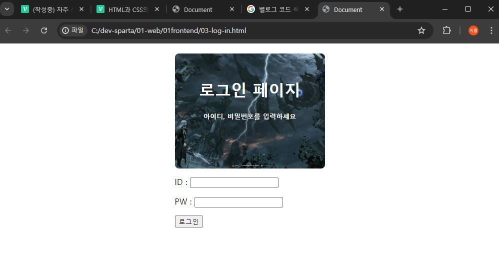
로그인 페이지에 사용해 볼 이미지
(출처: 스마일게이트 로스트아크)
자주 쓰는 CSS
1. 간단한 로그인 페이지
<!DOCTYPE html>
<html lang="en">
  <head>
    <meta charset="UTF-8" />
    <meta name="viewport" content="width=device-width, initial-scale=1.0" />
    <title>로그인</title>
  </head>
  <body>
    <h1>로그인 페이지</h1>
    <p>ID : <input type="text" /></p>
    <p>PW : <input type="text" /></p>
    <button>로그인</button>
  </body>
</html>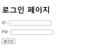
2. 자주 쓰이는 CSS
width : 가로 길이
height : 세로 길이
color : 글씨 색상
text-align : 텍스트 정렬
margin : 대상 요소의 테두리를 기준으로 바깥 여백
padding : 대상 요소의 테두리를 기준으로 안쪽 여백
border-radius : 대상 요소 테두리의 모서리 둥글기
background-image : 배경 이미지
background-position : 배경 위치
background-size : 배경 사이즈
3. 로그인 페이지 꾸며보기
<!DOCTYPE html>
<html lang="en">
<head>
    <meta charset="UTF-8">
    <meta name="viewport" content="width=device-width, initial-scale=1.0">
    <title>Document</title>
    <style>
        .mytitle {
            width:300px;
            height:200px;

            color: white;
            text-align: center;

            padding-top: 30px;
            border-radius: 8px;

            background-image: url('https://velog.velcdn.com/images/cdr4733/post/d8bb811d-7824-4b62-a5ef-0f8e83c76690/image.jpg');
            background-position: center;
            background-size: cover;
        }
    </style>
</head>
<body>
    <div class="mytitle">
        <h1>로그인 페이지</h1>
        <h5>아이디, 비밀번호를 입력해주세요</h5>
    </div>
    <p>ID : <input type="text" /></p>
    <p>PW : <input type="text" /></p>
    <button>로그인</button>
</body>
</html>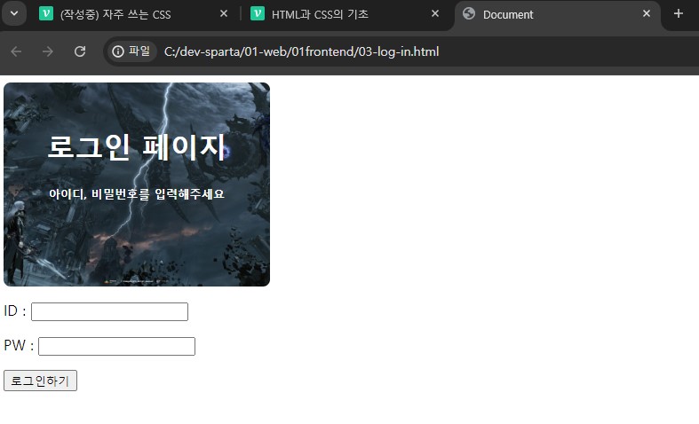
완성되고 보니 로그인 구성요소들이 화면 왼쪽에 쏠려있는 것을 볼 수 있다. 이번에는 이것을 가운데로 정렬하는 방법을 생각해보자.
4. div를 활용하여 구역 지정
<body>

    <div class="mytitle">
        <h1>로그인 페이지</h1>
        <h5>아이디, 비밀번호를 입력해주세요</h5>
    </div>
    <p>ID : <input type="text" /></p>
    <p>PW : <input type="text" /></p>
    <button>로그인</button>

</body>
현재 로그인 부분을 <div> 로 한번 더 감싸준다. 그리고 클래스명을 자신의 의도에 맞게 지정해주자. 나는 저 부분을 감싼다는 의미로 wrap이라고 이름을 지어보았다.
<body>
    <div class="wrap">
        <div class="mytitle">
            <h1>로그인 페이지</h1>
            <h5>아이디, 비밀번호를 입력하세요</h5>
        </div>
        <p>ID : <input type="text" /></p>
        <p>PW : <input type="text" /></p>
        <button>로그인</button>
    </div>
</body>
다음으로는 저 감싼 부분에 대한 CSS를 작성해주어야 한다. 위에 <head> 부분으로 올라가서 <style>에서 .wrap {} 부분을 만들어준다.
    <style>
        .mytitle {
            background-color: green;

            width: 300px;

            border-radius: 10px;
            color: white;

            text-align: center;

            padding: 30px 0px 0px 0px;

            background-image: url('https://www.ancient-origins.net/sites/default/files/field/image/Agesilaus-II-cover.jpg');
            background-position: center;
            background-size: cover;
        }
        .wrap {
            width: 300px;
            margin: 20px auto 0px auto;
        }
    </style>
이렇게 <div> 로 원하는 구역을 묶어주고 클래스명을 정해준 후, CSS에서 해당 클래스를 꾸며주면 원하는대로 화면에 보여줄 수 있게 된다.

매일 성장하는 개발자