인프런에서 무료로 풀려있는 인터랙티브 웹 강의를 들었는데, 아니..너무너무...재밌잖아...? 이거이거 리액트 5기 때 과제에도 적용해보면 너무너무 재밌을 것 같앙 포항항
으음 만들어보고 싶은 프로젝트가 너무너무 많다 행복해
하고싶은 게 너무너무너무 많아서 행복해
더 열공해보자고🔥
(1) HTML 구조
대충 이런 식
<header class="header">
    <div class="global-width">
        인트로
    </div>
</header>

<<section class="scroll-content">
    <div class="scroll-graphic">
        <div class="graphic-item">
            이미지
        </div>
    </div>

    <div class="scroll-text global-width">
        <div class="step">
            <p>
                말풍선
            </p>
        </div>
    </div>
</section>

<section class="normal-content global-width">
    정상 콘텐츠
</section>

<footer class="global-footer"></footer>
(2) CSS
wrapper
.global-width {
	max-width: 620px; /*모바일*/
	margin: 0 auto;
	padding: 0 1rem;
}
img
.graphic-item {
	display: flex;
	align-items: center;
	justify-self: center;
	position: absolute;
	left: 0;
	top: 0;
	width: 100%;
	height: 100%;
}
sticky
.scroll-graphic {
	position: sticky;
	top: 0;
	height: 100vh;
}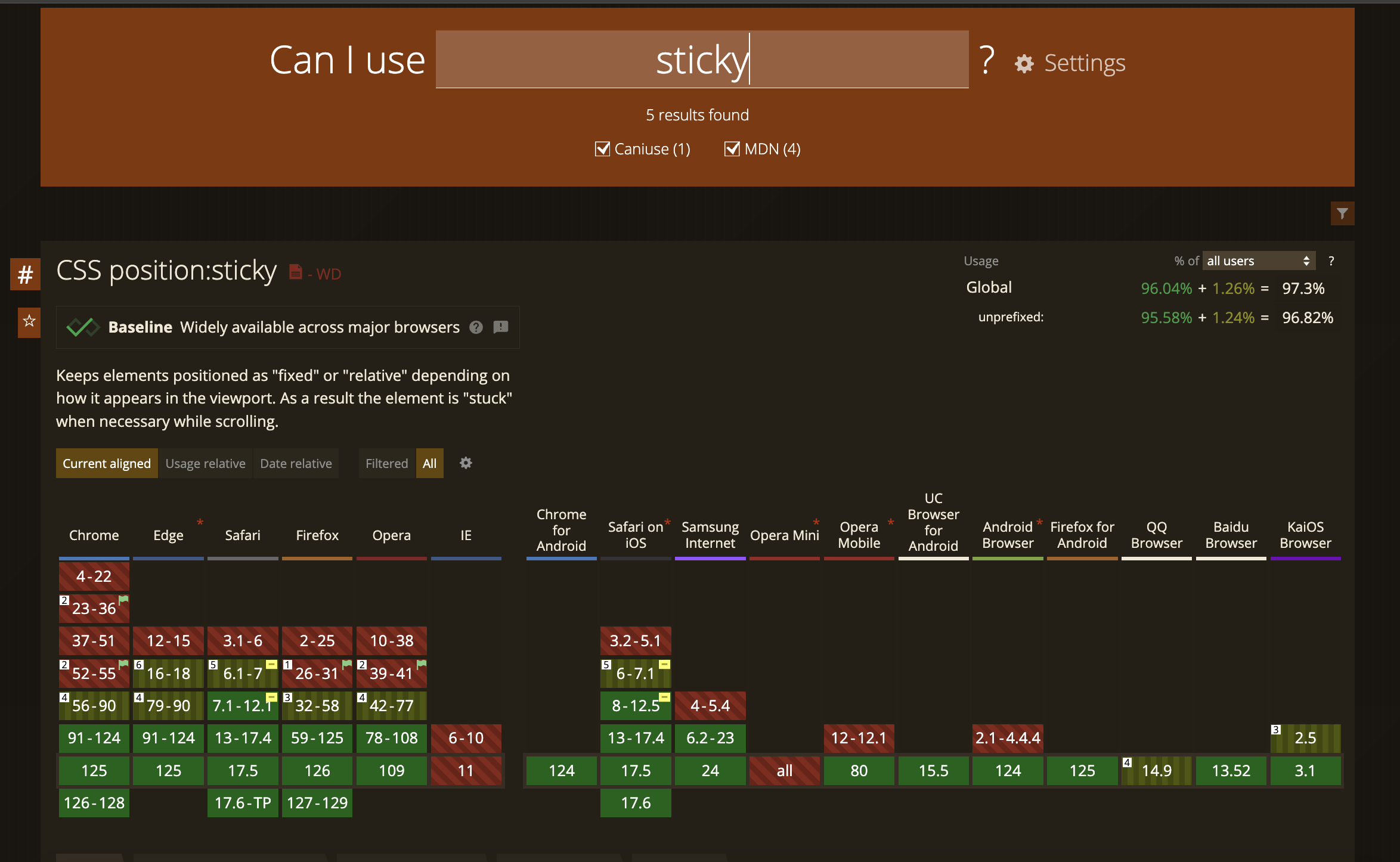
항상 익스플로러가 문제야 문제
그래도 방법은 있다!!
position: sticky 대신 position: fixed를 사용하면 되는데, JS로 고정했다가 위치계산해서 position: static으로 바꿔주면 됨.. 그건 나중에
pos/relative
.scroll-text {
	position: relative;
	padding-bottom: 1px;
}
position는 기본값인 static을 가지므로 따로 z-index을 지정해주지 않으면 => 뒤에거가 올라옴
이미지에 max-height 지정
.scene-img {
	max-height: 100vh;
}
현실적인 몽상가
결과물 사진도 올려주심 안되나요~ 너무 궁금한데~
리액트 5기 작품 벌써 기대되네요 🔥