🐸 Flexbox Froggy 하러가기
🐸 Solution
/* 1번 */
justify-contetn: flex-end;

/* 2번 */
justify-content: center;

/* 3번 */
justify-content: space-around;

/* 4번 */
justify-content: space-between;

/* 5번 */
align-items: flex-end;

/* 6번 */
justify-content: center;
align-items: center;

/* 7번 */
justify-content: space-around;
align-items: end;

/* 8번 */
flex-direction: row-reverse;

/* 9번 */
flex-direction: column;

/* 10번 */
flex-direction: row-reverse;
justify-content: flex-end;

/* 11번 */
flex-direction: column;
justify-content: end;

/* 12번 */
justify-content: space-between;
flex-direction: column-reverse;

/* 13번 */
flex-direction: row-reverse;
justify-content: center;
align-items: end;

/* 14번 */
order:3;

/* 15번 */
order: -1;

/* 16번 */
align-self: flex-end;

/* 17번 */
order: 1;
align-self: flex-end;

/* 18번 */
flex-wrap: wrap;

/* 19번 */
flex-direction: column;
flex-wrap: wrap;

/* 20번 */
flex-flow: column wrap;

/* 21번 */
align-content: flex-start;

/* 22번 */
align-content: flex-end;

/* 23번 */
flex-direction: column-reverse;
align-content: center;

/* 24번 */
flex-direction: column-reverse;
justify-content: center;
flex-wrap: wrap-reverse;
align-content: space-between;
CSS : Flexbox 를 공부한 뒤 속성 배우기 게임을 해보았다.
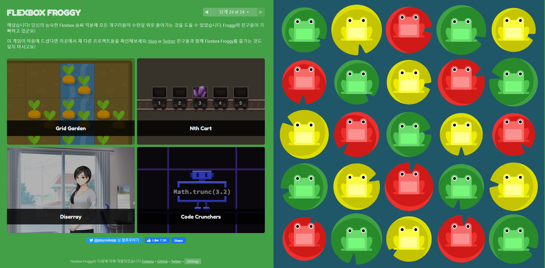
총 24단계까지 있는데 1단계 부터 23단계까지는 쉽다. 24단계는 조금 생각해보며 풀은듯 .. 그래도 솔루션을 보지 않았다는것에 의의를 두기로 했다!! 다푸니까 같은 시리즈인 당근게임도 추천해준다. 당근게임은 grid게임인것 같다ㅋㅎㅋㅎ

이사중입니다!🌟https://velog.io/@devkyoung2