🧐 Grid란 ?
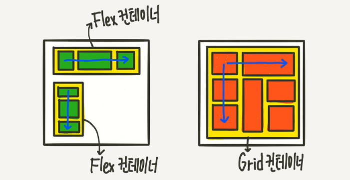
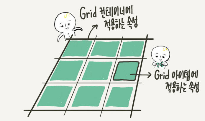
Flex(한 방향 레이아웃)와 유사한Grid는 두 방향(가로-세로) 레이아웃 메서드이다. 따라서Flex보다 더 복합적인 레이아웃 표현이 가능하다!Grid는Flex와 마찬가지로container와item만 있으면 되며container에 적용하는속성,item에 적용하는 속성으로 나누어진다.. 또한Grid는container에display: grid;를 설정하는 것으로부터 시작된다.
.container {
	display: grid;
}
📌 용어 정리
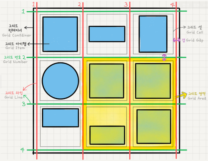
그리드 컨테이너 (Grid Container)
display: grid를 적용하는Grid의 전체 영역
그리드 아이템 (Grid Item)
Grid컨테이너의 자식 요소. 이item들이Grid규칙에 의해 배치된다.
그리드 트랙 (Grid Track)
Grid의 행(Row) 또는 열(Column)
그리드 셀 (Grid Cell)
Grid의 한 칸.<div>같은 실제html요소는 그리드 아이템이고, 이런Grid아이템 하나가 들어가는 “가상의 칸(틀)”이라고 생각하면 된다.
그리드 라인(Grid Line)
Grid셀을 구분하는 선
그리드 번호(Grid Number)
Grid라인의 각 번호
그리드 갭(Grid Gap)
Grid셀 사이의 간격
그리드 영역(Grid Area)
Grid라인으로 둘러싸인 사각형 영역, 그리드 셀의 집합
📐 Grid container의 속성
✔ display: grid;
- 해당 컨테이너를
grid로 사용하겠다고 설정
.container {
	display: grid;
	/* display: inline-grid; */
}
/* 그리고 아무 일도 일어나지 않았다 */
✔ grid-template-rows / grid-template-columns 그리드 형태 정의
grid트랙의 크기들을 지정해주는 속성repeat함수는 repeat(반복횟수, 반복값)으로 반복되는 값을 자동으로 처리한다.minimax함수는 최솟값과 최댓값을 지정할 수 있는 함수이다.auto-fill은column의 개수를 미리 정하지 않고, 설정된 너비가 허용하는 한 최대한 셀을 채운다.auto-fit은 남는 공간을 채운다.
.container {
	grid-template-columns: 200px 200px 500px;
	/* grid-template-columns: 1fr 1fr 1fr */
	/* grid-template-columns: repeat(3, 1fr) */
	/* grid-template-columns: 200px 1fr */
	/* grid-template-columns: 100px 200px auto */

	grid-template-rows: 200px 200px 500px;
	/* grid-template-rows: 1fr 1fr 1fr */
	/* grid-template-rows: repeat(3, 1fr) */
	/* grid-template-rows: 200px 1fr */
	/* grid-template-rows: 100px 200px auto */
}
✔ row-gap/column-gap/ gap 간격 만들기
- 그리드 셀 사이의 간격을 설정한다.
.container {
	row-gap: 10px;
	/* row의 간격을 10px로 */
	column-gap: 20px;
	/* column의 간격을 20px로 */
}

.container {
	gap: 10px 20px;
	/* row-gap: 10px; column-gap: 20px; */
}

.container {
	gap: 20px;
	/* row-gap: 20px; column-gap: 20px; */
}
✔ grid-auto-column/grid-auto-rows 그리드의 형태를 자동으로 정의
grid-template-columns(또는grid-template-rows)의 통제를 벗어난 위치에 있는 트랙의 크기를 지정하는 속성
.container {
	grid-template-rows: repeat(3, minmax(100px, auto));
}
✔ align-items 세로 방향 정렬
- 아이템들을 세로(
column축) 방향으로 정렬한다.
.container {
	align-items: stretch;
	/* align-items: start; */
	/* align-items: center; */
	/* align-items: end; */
}
✔ justify-items 가로 방향 정렬
- 아이템들을 가로(
row축) 방향으로 정렬한다.
.container {
	justify-items: stretch;
	/* justify-items: start; */
	/* justify-items: center; */
	/* justify-items: end; */
}
✔ place-items
align-items와justify-items를 같이 쓸 수 있는 단축 속성이다.
.container {
	place-items: center start;
}
✔ align-content 아이템 그룹 세로 정렬
Grid아이템들의 높이를 모두 합한 값이Grid컨테이너의 높이보다 작을 때Grid아이템들을 통째로 정렬한다.
.container {
	align-content: stretch;
	/* align-content: start; */
	/* align-content: center; */
	/* align-content: end; */
	/* align-content: space-between; */
	/* align-content: space-around; */
	/* align-content: space-evenly; */
}
✔ justify-content 아이템 그룹 가로 정렬
Grid아이템들의 너비를 모두 합한 값이Grid컨테이너의 높이보다 작을 때Grid아이템들을 통째로 정렬한다.
.container {
	justify-content: stretch;
	/* justify-content: start; */
	/* justify-content: center; */
	/* justify-content: end; */
	/* justify-content: space-between; */
	/* justify-content: space-around; */
	/* justify-content: space-evenly; */
}
✔ place-content
align-content와justify-content를 같이 쓸 수 있는 단축 속성이다.
.container {
	place-content: space-between center;
}
📐 Grid item의 속성
✔ grid-column/grid-row 각 셀의 영역 지정
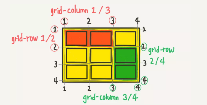
- 위의 그림은 grid 라인번호가 매겨져 있는데 이 번호를 이용해서
column과row의 범위를 결정한다. 빨간색 영역을 코드로 쓰면 아래와 같다.
.item:nth-child(1) {
	grid-column-start: 1;
	grid-column-end: 3;
	grid-row-start: 1;
	grid-row-end: 2;
}
.item:nth-child(1) {
	grid-column: 1 / 3;
	grid-row: 1 / 2;
}
- 몇 개의 셀을 차지하게 할 것인지도 지정할 수 있다.
.item:nth-child(1) {
	/* 1번 라인에서 2칸 */
	grid-column: 1 / span 2;
	/* 1번 라인에서 3칸 */
	grid-row: 1 / span 3;
}
✔ grid-template-areas 영어 이름으로 그리드 정의
- 직관적으로 각 영역에 이름을 붙인뒤 각자 차지하는 셀의 개수만큼 해당 위치에 이름을 써주면된다. 각 셀은 공백으로 구분되며, 빈칸은 마침표나
none을사용한다.
.container {
	grid-template-areas:
		"header header header"
		"   a    main    b   "
		"   .     .      .   "
		"footer footer footer";
}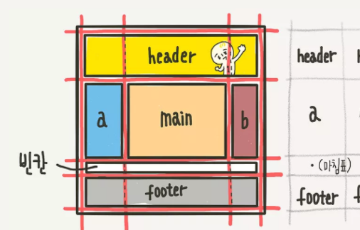
✔ grid-areas 영역 이름 매칭
grid-area속성을 사용해 해당item요소에 이름을 지정해주면 된다.
.header { grid-area: header; }
.sidebar-a { grid-area: a; }
.main-content { grid-area: main; }
.sidebar-b { grid-area: b; }
.footer { grid-area: footer; }
/* 이름 값에 따옴표가 없는 것에 주의하세요 */
✔ grid-auto-flow 자동 배치
- 아이템이 자동 배치되는 흐름을 결정하는 속성
.container {
	display: grid;
	grid-template-columns: repeat(auto-fill, minmax(25%, auto));
	grid-template-rows: repeat(5, minmax(50px,auto));
	grid-auto-flow: dense;
}
item:nth-child(2) { grid-column: auto / span 3; }
item:nth-child(5) { grid-column: auto / span 3; }
item:nth-child(7) { grid-column: auto / span 2; }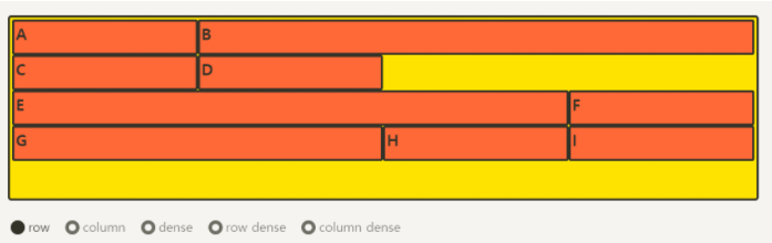
✔ align-self 개별 아이템 세로 정렬
- 아이템들을 세로(
column축) 방향으로 정렬한다.
.item {
	align-self: stretch;
	/* align-self: start; */
	/* align-self: center; */
	/* align-self: end; */
}
✔ justify-self 개별 아이템 가로 정렬
- 아이템들을 가로(
row축) 방향으로 정렬한다.
.item {
	justify-self: stretch;
	/* justify-self: start; */
	/* justify-self: center; */
	/* justify-self: end; */
}
✔ place-self
align-self와justify-self를 같이 쓸 수 있는 단축 속성이다.
.item {
	place-self: start center;
}
✔ order 배치 순서
- 각
item들의 시각적 나열 순서를 결정한다.html자체의 구조를 바꾸는것이 아니므로, 시각장애인분들이 스크린 리더로 화면을 읽을때는 의미가 없어지는 속성이므로 주의한다.
.item:nth-child(1) { order: 3; } /* A */
.item:nth-child(2) { order: 1; } /* B */
.item:nth-child(3) { order: 2; } /* C */
✔ z-index
- 숫자가 클수록 위로 올라온다.
.item:nth-child(5) {
	z-index: 1;
	transform: scale(2);
}
/* z-index를 설정 안하면 0이므로, 1만 설정해도 나머지 아이템을 보다 위로 올라온다 */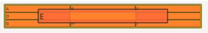
📚 Ref

이사중입니다!🌟https://velog.io/@devkyoung2