
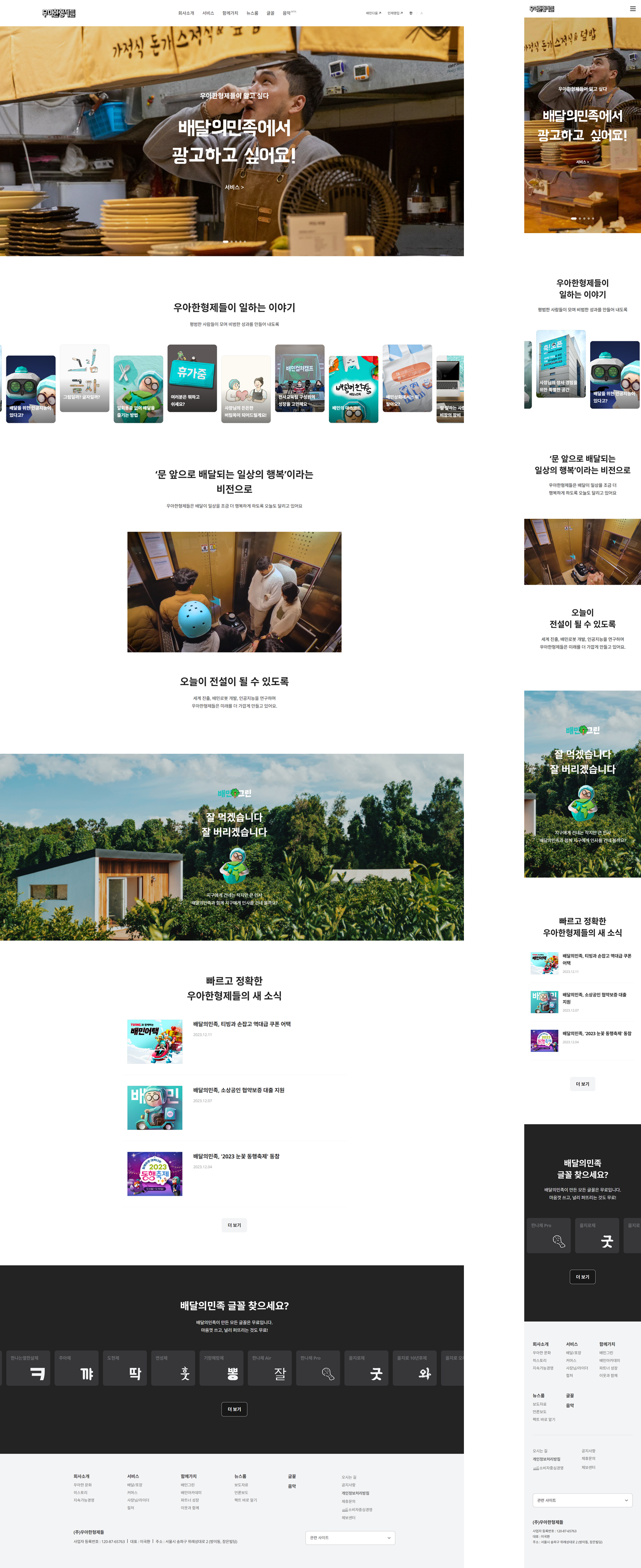
프로젝트👩💻 : 우아한형제들
사용언어🛠️ : HTML5, CSS3, JAVASCRIPT
라이브러리📁 : Swiper
타입⚙️ : 반응형
⏱️ : 3일 소요
✅ W3C Markup · CSS3 Pass
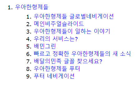
📌<h>태그 outline📌
✨KEY POINT
- css 변수 활용
- 반응형에 맞는 picture tag
- swiper transform
- video 컨트롤
- card swiper autoplay
- 무한 루프 배너
- select 대체하기
css 변수 활용
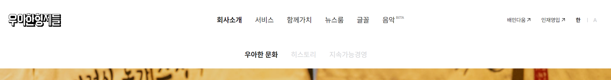
헤더영역 메뉴에 hover하면 서브메뉴가 나옴과 동시에 white box가 같이 나옵니다.
✨gnb영역이 아닌 header 영역만큼의 너비를 가지기때문에 header의 가상선택자 before를 사용했습니다.
.header::before {
    content: '';
    position: absolute;
    top: 100%;
    width: 100%;
    height: 0;  👈변경
    background-color: #fff;
    transition: height 0.4s;
}✨header > gnb-item:hover 해야만 .header::before 의 height 가 변하는 구조라,
CSS 변수 & 스크립트를 활용했습니다.
.header {
    position: fixed;
    top: 0;
    left: 0;
    z-index: 100;
    width: 100%;
    height: 95px;
    background-color: #fff;

    --height: 0; 👈
}
.header::before {
    content: '';
    position: absolute;
    top: 100%;
    width: 100%;
    height: var(--height); 👈
    background-color: #fff;
    transition: height 0.4s;
}✨mouseover, mouseleave 이벤트가 일어나면 setProperty메소드로 속성값이 재세팅되도록 하였습니다.
마우스를 올리면 64px값이 css변수로 할당되고, 내리면 다시 0값이 할당됩니다.
메뉴 중 '글꼴', '음악' 부분은 서브메뉴가 없기때문에 hover되도 white box가 나오지 않게끔 if문을 사용했습니다.
//gnb hover
const gnbItems = document.querySelectorAll('.gnb-item');
const header = document.querySelector('.header');
const H = '--height'; //css변수
gnbItems.forEach(item => {
    item.addEventListener('mouseover', function () {
        //item-box 유무확인
        if (this.querySelector('.item-box')) {
            header.style.setProperty(H, '64px'); //css변수 세팅
        }
    });
    item.addEventListener('mouseleave', function () {
        header.style.setProperty(H, '0'); //css변수 재세팅
    });
});
반응형에 맞는 picture tag
💡picture 태그를 사용하면 서로 다른 화면 크기 및 장치에 맞게, 다른 이미지를 제공하여 사용자 경험을 최적화할 수 있다.
picture를 쓰지않고 img만을 사용한다면 반응형에 맞는 이미지를 세팅해두고 css 또는 스크립트로 변경해줘야만 하는 번거로움이 생깁니다.
<div class="img-box">
  <img src="../visual_pc.jpg" alt />
  <img src="../visual_m.jpg" alt />
</div>
✨이를 반응형에 맞게 이미지가 자동 제공되도록 picture 태그를 사용하여 해결했습니다.
source에는 원하는 media속성과 이미지 경로를 입력합니다.- 그 외 기본이 될
img를 써줍니다. media조건에서 벗어날 경우 기본이미지가 보여지게 됩니다.
<picture class="img-box">
  <!-- 751px이상의 화면에서는 pc이미지 -->
  <source media="(min-width: 751px)" srcset="../visual_pc.jpg" />
  <!-- default setting 이미지-->
  <img src="../visual_m.jpg" alt />
</picture>
swiper transform
우아한형제들 클론코딩을 하며 가장 시간을 쏟은 부분입니다🥲
슬라이드가 변경될 때마다 비주얼 이미지가 스무스하게 왼쪽 또는 위로 움직이고 텍스트의 두 번째 라인이 한글자씩 나타나야 합니다.
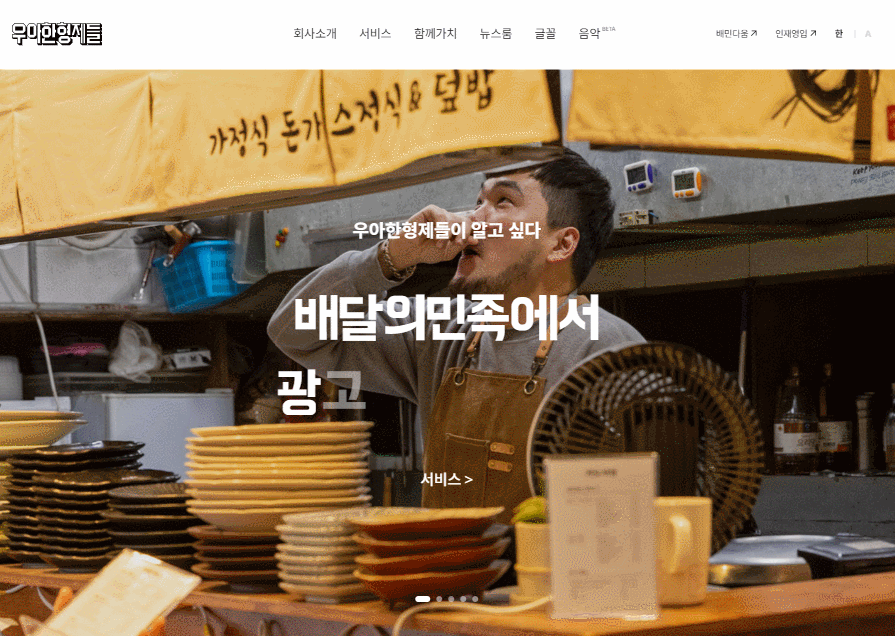
저는 홀수번 슬라이드에서는 이미지가 왼쪽으로, 짝수번 슬라이드에서는 이미지가 위쪽으로 흘러가게끔 transform을 넣어주고 싶어 애니메이션을 사용했습니다.
@keyframes slideMoveX {
        0% {
            transform: scale(1.7) translateX(0);
        }
        100% {
            transform: scale(1.7) translateX(-100px);
        }
    }

@keyframes slideMoveY {
        0% {
            transform: scale(1.7) translateY(0);
        }
        100% {
            transform: scale(1.7) translateY(100px);
        }
   }
처음엔 슬라이드가 변경될 때마다 애니메이션 클래스가 붙도록 slideChange, activeIndexChange, slideChangeTransitionEnd, slideChangeTransitionStart, realIndex 등등 swiper 기능을 활용하려 전부 시도해봤지만 여러 문제들이 발생했습니다.
제일 큰 문제는 loop 로 인해 realIndex가 제대로 잡히지 않는다는게 문제였습니다.
const MainVisual = new Swiper('.sc-visual .swiper', {
    loop: true,
    pagination: {
        el: '.pagination',
    },
    autoplay: {
        delay: 5000,
        disableOnInteraction: false,
    },
  	slideChange: function(){
    	//슬라이드 변경될 시 실행될 코드
    }
});
이러한 문제는 다소 간단한 방법으로 해결할 수 있었습니다.
✨swiper가 실행될 때 자체적으로 붙는 .swiper-slide-active 클래스를 이용하는 방법입니다.
✨또한 loof로 인해 slide:nth-child 를 사용해도 순서를 인식하지 못하기때문에 dataset을 사용하여 짝수번의 슬라이드에만 원하는 애니메이션을 넣어주었습니다.
.sc-visual .swiper-slide-active .img-box img {
        animation: slideMoveY 3s ease-in-out;
        animation-fill-mode: forwards;
    }

.sc-visual .swiper-slide-active[data-slide='odd'] .img-box img {
        animation: slideMoveX 3s ease-in-out;
        animation-fill-mode: forwards;
    }
무작정 swiper 이벤트를 사용해야하는건 아니구나, 깨달은 순간이었습니다✍️
===============================================
한글자씩 나오는 텍스트 효과도 위와 같은 방식으로 구현했습니다.
<strong class="onetxt">
  <span>한</span>
  <span>답</span>
  <span>니</span>
  <span>다</span>
</strong>
✨효과를 위해 텍스트를 쪼개주고, animation의 delay를 사용하여 시간차 효과를 주었습니다.
.swiper-slide-active .onetxt span {
    animation: onetxtEffect 0.3s;
    animation-fill-mode: forwards;
    will-change: opacity;
}
@keyframes onetxtEffect {
    0% {
        opacity: 0;
    }
    100% {
        opacity: 2;
    }
}
.onetxt span:nth-child(2) {
    animation-delay: 0.3s;
}
.onetxt span:nth-child(3) {
    animation-delay: 0.6s;
}
.onetxt span:nth-child(4) {
    animation-delay: 0.9s;
}
video 컨트롤
video 에 mouseover 하면 컨트롤 버튼이 나타납니다.
버튼을 클릭하면 중지, 다시 버튼을 클릭하면 영상의 첫부분부터 재시작되고
mouseleave 하면 컨트롤 버튼이 사라집니다.
 <div class="video-wrap">
   	 <video autoplay muted="muted" loop="loop" playsinline>
      	<source src="경로/링크" type="video/mp4">
     </video>
   	 <button class="video-control">
      	<svg class="video-stop"></svg> 👈
      	<svg class="video-play"></svg> 👈
     </button>
 </div>
.sc-service .video-control {
position: absolute;
top: 50%;
left: 50%;
transform: translate(-50%, -50%);
visibility: hidden;
opacity: 0;
}
.sc-service .video-wrap:hover .video-control {
visibility: visible;
opacity: 1;
}✨css의 hover로 버튼 컨트롤 스타일의 유무를 나타내고,
영상 컨트롤은 스크립트로 구현했습니다.
stop 클래스 : 버튼의 svg 변경
구현에 사용한 메소드들입니다👇
contains: 노드 간의 계층적인 포함 여부를 확인.pause(): 비디오 정지.play(): 비디오 재시작currentTime: 비디오의 현재 재생 위치를 반환
const videoBtn = document.querySelector('.sc-service .video-control');
const video = document.querySelector('.sc-service video');
videoBtn.addEventListener('click', function () {
    if (this.classList.contains('stop')) {
        this.classList.remove('stop');
        video.play();
        video.currentTime = 0; //비디오 재생위치 (0=처음)
    } else {
        this.classList.add('stop');
        video.pause();
    }
});
우아한형제들 클론코딩을 통해 비디오를 컨트롤하는 법을 알게 되었습니다✍️
card swiper autoplay
자동으로 무한 루프되며 자유롭게 드래그되는 카드 배너입니다.
swiper를 이용해 간단하게 구현했지만 추가적인 코드가 필요합니다.
카드에 mouseover 하면 카드의 움직임이 멈추고, mouseout 되면 다시 움직여야 합니다.

const workCard = new Swiper('.sc-workcard .swiper', {
    pagination: {
        el: '.pagination',
    },
    autoplay: {
        delay: 0,
        disableOnInteraction: false,
    },
    speed: 3000,
    loop: true,
    loopAdditionalSlides: 1,
    slidesPerView: 'auto',
    freeMode: true,
});
✨카드의 자동 움직임을 제어하는 autoplay 속성으로 이를 해결했습니다.
{+swiper에서 제공되는 stop, start 메소드}
swiper.autoplay.stop(): 자동 슬라이드 정지swiper.autoplay.start(): 자동 슬라이드 시작
let cards = document.querySelectorAll('.sc-workcard .card');
cards.forEach(function (card) {
    card.addEventListener('mouseover', function () {
        workCard.autoplay.stop();
    });
    card.addEventListener('mouseout', function () {
        workCard.autoplay.start();
    });
});
무한 루프 배너
카드배너와 동일하게 자동으로 무한 루프되는 글꼴 배너입니다. 드래그는 되지않고 단순히 흘러가는 배너입니다.
✨swiper를 사용하지않고 css의 transform과 animation을 활용했습니다.
끊김없는 움직임을 위해 ul 안에, 글꼴 수만큼의 li 를 2배로 넣어줬습니다.
코드가 길어짐으로 스크립트로 clone복제하여 사용해도 좋겠지만 css로만 구현해보고 싶어 이 점은 감수했습니다.
<div class="font-slide">
	<ul>
    	<li></li>
		<li></li>
        <!-- 이하 글꼴수만큼 li -->
    </ul>
</div>
css는 비교적 단순하게 작성했습니다.
✨li가 2배임으로 ul의 -50%너비만큼만 translateX축으로 움직이게 했습니다.
.sc-font .font-slide ul {
    animation: fontSlide 18s linear infinite;
}
@keyframes fontSlide {
    to {
        transform: translateX(-50%);
    }
}
처음에는 첫번째 li요소를 ul의 50%너비만큼 margin-left로 밀어내는 방식의 코드를 작성했었지만, 비효율적이고 렌더링 단계에서 부담이 될 뿐더러 애니메이션이 느리게 동작할 경우를 대비해 위와 같이 수정했습니다✍️
transform 에 대해 더 자세히 알게된 계기가 되었습니다.
select 대체하기
처음에는 패밀리사이트를 select와 option 으로 마크업하고 스타일링하려 했지만,
option 의 고유스타일을 바꾸는게 한정되다보니 select 를 대체하는 코드로 다시 작업해야 했습니다.
✨아래와 같이 select와 option 을 대체하는 코드로 구성했습니다.
<div class="footer-family">
  <button type="button" class="btn-select"></button>
  <ul class="select">
     <li class="option"></li>
     <li class="option"></li>
     <li class="option"></li>
     <li class="option"></li>
     <li class="option"></li>
     <li class="option"></li>
     <li class="option"></li>
     <li class="option"></li>
     <li class="option"></li>
  </ul>
</div>
✨기본 스타일과 transform을 사용한 ul.select의 fadeIn, fadeOut 효과를 넣어 마무리했습니다.
.footer-family .select {
    position: absolute;
    bottom: 100%;
    left: 0;
    overflow: auto;
    width: 100%;
    max-height: 215px;
    margin-bottom: 4px;
    box-sizing: border-box;
    box-shadow: 2px 4px 10px rgba(0, 0, 0, 0.08);
    border: 1px solid #a6a7a9;
    border-radius: 8px;
    background: #fff;
    font-size: 14px;
    transition: transform 0.5s, opacity 0.5s;
    transform: translateY(10px);
    opacity: 0;
}
.footer-family .select.active {
    transform: translateY(0px);
    opacity: 1;
}
.footer-family .option a {
    display: flex;
    align-items: center;
    height: 50px;
    margin: 0 16px;
}
.footer-family .option a:hover {
    margin: 0;
    padding: 0 16px;
    background-color: #f3f4f5;
}
.footer-family .option + .option a {
    border-top: 1px solid #f3f4f5;
}