뭐임?
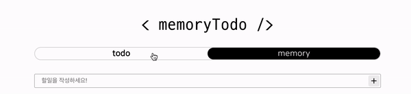
- 대충 이런 걸 만들었습니다.
→ 이런 효과를 정확하게 뭐라고 하는지 모르겠다….
- 유튜브를 돌아다니면서 최대한 비슷한 효과를 찾아보았고, css와 클래스를 이용하는 것만으로도 가능했지만…
styled-components 와 props 를 이용하여 만드는 방법이 더 간편 할 것 같아 해당 방법을 선택했고, 유튜브 영상에서 보았던 transform 속성을 활용하기로 했다.
개요
상태관리
- 내가 어떤 메뉴를 클릭했고, 이동했는지에 대해 컴포넌트에 알려야 위치를 그에 맞게 이동 시켜 줄 수 있을 것이라 생각했다.
- 그래서 상태를 만들어 현재 내가 위치해 있는 경로를 저장하여 관리하기로 했다.
const [currentPath, setCurrentPath] = useState<string>('');
- 메뉴 버튼을 누를 때 마다 해당 상태를 갱신 시켜주었다.
  <Link to="todo" ref={todoBtn} onClick={() => setCurrentPath('/todo')}>
    todo
  </Link>
  <Link to="memory" ref={memoryBtn} onClick={() => setCurrentPath('/memory')}>
    memory
  </Link>
- 새로고침이 발생한 경우에도 현재 위치를 가져오기 위해
useEffect 를 이용하여 상태를 갱신 시켜주었다.
useEffect(() => {
    setCurrentPath(window.location.pathname);
  }, []);
props 타입 지정하기
- 하위 컴포넌트에 props 를 내려 줄 때 타입을 지정하는 것처럼,
styled-components 의 컴포넌트에 props 를 내려 줄 때도 타입을 선언해주어야 한다.
const Indicator = styled.div<{ currentPath: string }>``;
첫 결과물
Indicator 라는 컴포넌트가 메뉴와 형제요소로 배치하고, position: absolute; 를 이용하여 메뉴 버튼의 뒤에 위치하게 했다.- 버튼이 두 개 이므로 부모요소의 너비 50% 만큼을 가지고, 전달받은 props 에 따라 그 위치를
transform : translateX() 를 이용하여 이동 시키는 방식을 사용하였다.
const Indicator = styled.div<{ currentPath: string }>`
position: absolute;
width: 50%;
height: 100%;
background-color: #000;
border-radius: calc(1.5rem + 10px);
z-index: -1;
transition: 0.3s;
transform: ${(props) => props.currentPath === '/todo' && 'translateX(0)'};
transform: ${(props) =>
props.currentPath === '/memory' && 'translateX(100%)'};
`;
<div className="buttonWrapper">
<Indicator currentPath={currentPath} />
<SLink to="todo" ref={todoBtn} onClick={() => setCurrentPath('/todo')}>
todo
</SLink>
<SLink to="memory" ref={memoryBtn} onClick={() => setCurrentPath('/memory')}>
memory
</SLink>
</div>;
수정
- 이번엔 동일한 크기의 wrapper 를 메뉴와 형제요소로 배치시키고, 메뉴의 뒤에 위치 시킨 뒤 내부의 다른 요소를 인디케이터로 사용하는 방식을 사용했다.
- 기존의 방식도 원하는 대로 동작하지만, 너비를 부모를 기준으로 %를 이용하여 지정하다 보니 메뉴의 수가 많아진다면 정확하지 않은 경우가 생길 수도 있다고 판단하였다.
- 박스를 grid 를 이용하여 나누기 때문에, 혹시나 메뉴의 수가 늘어난다 해도,
grid-template-columns 를 이용하여 수정해주면 원하는 너비만큼 인디케이터를 가져갈 수 있다.
→ 물론 적용하고자 하는 메뉴도 grid 여야 정확하겠지만…
- 추가로
translateX 도 calc() 함수를 이용하여 계산하는 방식으로 수정하였다.
const IndicatorWrapper = styled.div<{ currentPath: string }>`
position: absolute;
display: grid;
grid-template-columns: 1fr 1fr;
width: 100%;
height: 100%;
z-index: -1;
.indicator {
height: 100%;
background-color: #000;
border-radius: calc(1.5rem + 10px);
transition: 0.5s;
transform: ${(props) =>
props.currentPath === '/todo' && 'translateX(calc(100% * 0))'};
transform: ${(props) =>
props.currentPath === '/memory' && 'translateX(calc(100% * 1))'};
}
`;
<div className="buttonWrapper">
<IndicatorWrapper currentPath={currentPath}>
<div className="indicator" />
</IndicatorWrapper>
<Link to="todo" ref={todoBtn} onClick={() => setCurrentPath('/todo')}>
todo
</Link>
<Link to="memory" ref={memoryBtn} onClick={() => setCurrentPath('/memory')}>
memory
</Link>
</div>;
+
- 간단 할 줄 알았는데…. 생각보다 그렇지 못했다…!