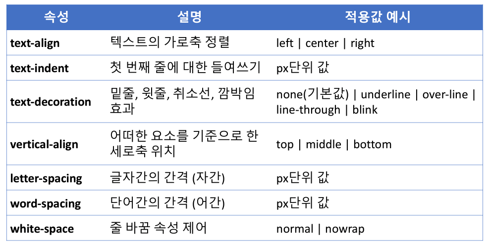
1. text-align
- left
-right
-center
-justift
2. text-shadow
셀렉터 {
	text-shadow : x-offset, y-offset y-offset blur-radius color;
}
- x-offset : 본체와 그림자의 가로축 거리
- y-offset : 본체와 그림자의 세로축 거리
- blur-radius : 번짐 정동
- color : 그림자의 색상
3. 코드
<!DOCTYPE html>
<html lang="en">
<head>
    <meta charset="UTF-8">
    <meta name="viewport" content="width=device-width, initial-scale=1.0">
    <title>Document</title>
    <style>
        li {
            color: tomato !important;
        }
        .classsel {
            color: green;
        }
        #idsel {
            color: powderblue;
        }
    </style>
</head>
<body>
    <ul>
        <li>html</li>
        <li id="idsel" class="classsel">css</li>
        <li>javascript</li>
    </ul>
</body>
</html>
<!DOCTYPE html>
<html lang="en">
<head>
    <meta charset="UTF-8">
    <meta name="viewport" content="width=device-width, initial-scale=1.0">
    <title>Document</title>
    <style>
        #container {
            color: purple;
        }
        #container #title {
            color: blue !important;
        }
        .box {
            color: orange;
        }
        li:nth-child(1) {
            color: tomato;
        }
        li:nth-child(2) {
            color: green;
        }
        li:nth-child(3) {
            color: black;
        }
    </style>
</head>
<body>
    <div id="container">
        <h1 id="title">구체성단위</h1>
        구체성단위를 알아봅시다.
        <div class="box">
           CSS의 표현기법에 따라서 점수가 부여됩니다.
        </div>
        <ul>
           <li class="item" id="active">id: 100점</li>
           <li class="item">class: 10점</li>
           <li>tag: 1점</li>
        </ul>
     </div>
</body>
</html>