1. block vs inline
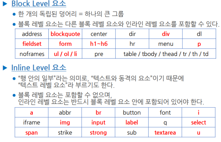
- 엘리먼트들은 크게 두 가지로 구분됨
- block element : 화면 전체를 사용하는 태그
- inline level element : 화면의 일부를 차지하는 태그
2. 박스의 기본 크기를 결정하는 특성
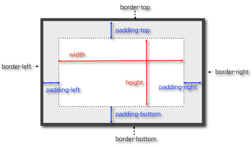
- 가로축 : 부모를 가득 채움
- 세로축 : 자신이 포함하고 있는 내용만큼 설정(내용이 없을 경우 높이가 형성되지 않음)
3. 코드
<!DOCTYPE html>
<html lang="en">
<head>
    <meta charset="UTF-8">
    <meta name="viewport" content="width=device-width, initial-scale=1.0">
    <title>Document</title>
    <style>
        h1, a {
            border: 1px, solid tomato;
        }
        h1 {
            display: inline;
        }
        a {
            display: block;
        }
    </style>
</head>
<body>
    <h1>Hello World</h1>
    안녕하세요. <a href="http://www.naver.com">네이버</a>입니다.
</body>
</html>
<!DOCTYPE html>
<html lang="en">
<head>
    <meta charset="UTF-8">
    <meta name="viewport" content="width=device-width, initial-scale=1.0">
    <title>Document</title>
    <style>
        #box1 {
            background-color: tomato;
        }
        #box2 {
            background-color: greenyellow;
        }
        #box3 {
            background-color: powderblue;
        }
    </style>
</head>
<body>
    <div id="box1">빨강 박스</div>
    <div id="box2"></div>
    <div id="box3">파란 박스</div>
</body>
</html>
<!DOCTYPE html>
<html lang="en">
<head>
    <meta charset="UTF-8">
    <meta name="viewport" content="width=device-width, initial-scale=1.0">
    <title>Document</title>
    <style>
        p, a {
            border: 10px solid tomato;
            padding: 50px;
            margin: 40px;
            width: 120px;
            height: 150px;
        }
    </style>
</head>
<body>
    <p>Contrary to popular belief, Lorem Ipsum is not simply random text. </p>
    <p>Contrary to popular belief, Lorem Ipsum is not simply random text. </p>
    안녕하세요. <a href="http://www.naver.com">네이버 이동</a>
</body>
</html>
<!DOCTYPE html>
<html lang="en">
<head>
    <meta charset="UTF-8">
    <meta name="viewport" content="width=device-width, initial-scale=1.0">
    <title>Document</title>
    <style>
        * {
            box-sizing: border-box;
        }
        div {
            margin: 10px;
            width: 150px;
        }
        #small {
            border: 10px solid black;
        }
        #large {
            border: 30px solid black;
        }
    </style>
</head>
<body>
    <div id="small">Hello</div>
    <div id="large">Hello</div>
</body>
</html>
border
1. border 속성
border : 굵기 종류 색상;
2. 표시 위치에 따른 border 속성의 세분화
- 테두리의 상/하, 좌/우 영역을 각각 개별적으로 지정하기 위해 다음과 같이 세분화됨
border-top : 굵기 종류 색상;
border-right: 굵기 종류 색상;
border-bottom : 굵기 종류 색상;
border-left : 굵기 종류 색상;
padding 속성
padding : px값;
1. 표시 위치에 따른 값의 세분화
padding-top : 상단 여백 px단위로 지정;
padding-right: : 우측 여백 px단위로 지정;
padding-bottom : 하단 여백 px단위로 지정;
padding-left : 왼쪽 여백 px단위로 지정;
2. 값의 지정 형식 (공백 구분)
- 1개의 값 : 상/ 하/ 좌/ 우 모두 같은 크기의 여백 지정
- 2개의 값 : 공백으로 구분하여 2개의 값을 지정한 경우, 첫번재 값은 "상/ 하" 두번째 값은 "좌/ 우"
- 4개의 값 : 공배으로 구분하여 4개의 값을 지정할 경우, 첫번째 값이 상단 여백, 그 후 우측, 하단, 좌측 순서인 시계 방향으로 적용