시계열 데이터
- 일정한 시간별로 수집된 데이터
- 행 간에 시간 순서가 있는 데이터
- 시간의 흐름에 따라 특정 패턴을 갖고있는지 중점으로 분석해야한다.
아래의 분석 예시는 야후 금융에서 제공하는 코스피 데이터셋(22.09 ~ 23.09)을 사용하여 제작하였습니다.
패턴 찾기
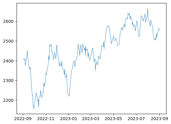
시각화 - 라인차트
plt.plot(x, y, df)
# datetime으로 변경
kospi['Date'] = pd.to_datetime(kospi['Date'])

# 일자별 kospi 종가 비교
plt.plot('Date', 'Close', data=kospi, linewidth=.7)
plt.xlabel('Date')
plt.ylabel('Close')
plt.show()
sns.lineplot(x, y, df)
sns.lineplot(x='Date', y='Close', data=kospi, linewidth = .7)
plt.xlabel('Date')
plt.ylabel('Close')
plt.show()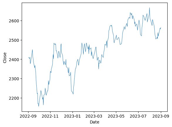
라인차트 여러 개 동시에 그리기 : twinx()
# 축을 2개로 분리해야 한다.
# 왼쪽 : 종가
axis1 = sns.lineplot(x='Date', y='Close', data=kospi, label='Close', color='blue', linewidth= .5)
plt.legend(loc='upper left')

 # 오른쪽 : 거래량
axis2 = axis1.twinx()
sns.lineplot(x='Date', y='Volume', data=kospi, label='Volume', color='green', linewidth= .5)
plt.legend(loc='upper right')

plt.show()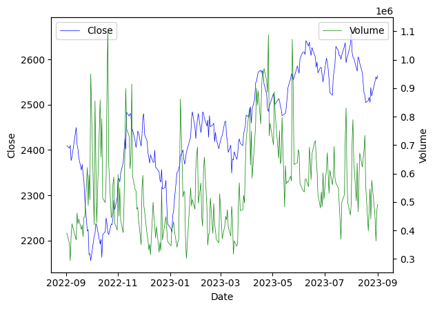
데이터 분해 (decomposition)
- period, freq 옵션을 조절하여 계절성(seasonal)을 확인할 수 있다.
- 계절성은 사계절을 의미하는 것이 아니라, 특정 주기로 반복된다는 의미이다.
Trend
- 지속적으로 상승하거나 하강하는 추세
Seasonal
- 주기적으로 반복되는 패턴
seasonal_decompose()
- 시계열 분해 결과를 아래와 같이 데이터프레임으로 저장할 수 있다.
result = pd.DataFrame({'observed':decomp.observed,  # 실제 데이터
					   'trend':decomp.trend,        # 전체 기간 트렌드
                       'seasonal':decomp.seasonal,  # (이 예시에서는 24시간) 주기
'residual':decomp.resid}) # 오차- 시계열 분해 결과가 저장된 데이터프레임
result를 활용하면 각각에 대한 라인차트를 그릴 수 있다.
import statsmodels.api as sm
from statsmodels.graphics.tsaplots import plot_acf, plot_pacf

# 종가를 24시간 주기로 분해
decomp = sm.tsa.seasonal_decompose(kospi['Close'], model = 'additive', period=24)

# 라인차트 그리기
# 1) 실제 데이터
plt.subplot(4,1,1)
plt.plot(result['observed'])
plt.ylabel('observed')

# 2) 전체 기간 트렌드
plt.subplot(4,1,2)
plt.plot(result['trend'])
plt.ylabel('trend')

# 3) 24시간 주기
plt.subplot(4,1,3)
plt.plot(result['seasonal'])
plt.ylabel('seasonal')

# 4) 오차
plt.subplot(4,1,4)
plt.plot(result['residual'])
plt.ylabel('residual')

plt.show()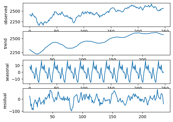
패턴의 데이터화
df.shift()
- 시계열 데이터에서 특정 단위로 정보를 이동시킬 때 사용한다.
temp = kospi[['Date', 'Close']].copy()  # 보기 쉽도록 따로 복사

temp['lag1'] = temp['Close'].shift() # 1칸 밀기
temp['lag2'] = temp['Close'].shift(2) # 2칸 밀기
temp['lag3'] = temp['Close'].shift(-1) # 1칸 당기기

temp.head()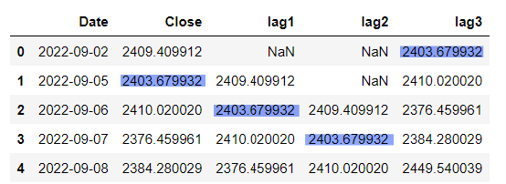
df.rolling().mean()
- 시계열 데이터에서 일정 기간 동안의 평균, 최대 등을 확인할 때 사용한다.
temp = kospi[['Date', 'Close']].copy()  # 보기 쉽도록 따로 복사

temp['3day_mean'] = temp['Close'].rolling(3).mean()   # 3일 간의 종가 평균
temp['3day_max'] = temp['Close'].rolling(3).max()    # 3일 중 종가 최대값
temp['3day_mean2'] = temp['Close'].rolling(3, min_periods=1).mean() # min_peroid : 계산할 최소 크기
# min_period를 1로 설정하면 가장 앞에 생기는 NaN값도 채워진다.

temp.head()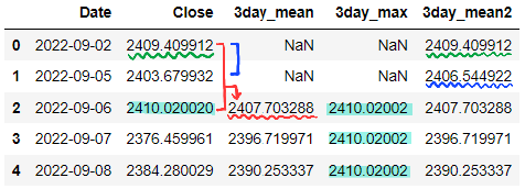
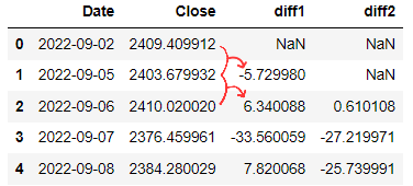
차분(df.diff())
- 시계열 데이터에서 특정 시점 데이터와의 차이를 구할 때 사용한다.
- 차분을 시각화했을 때 패턴이 잘 나타나는 경우도 있다.
temp = kospi[['Date', 'Close']].copy()  # 보기 쉽도록 따로 복사

temp['diff1'] = temp['Close'].diff()  # 직전 대비 증감
temp['diff2'] = temp['Close'].diff(2) # 직직전 대비 증감

temp.head()