1. 숫자 -> 숫자
시각화 : 산점도(Scatter)
수치화 : 상관계수spst.pearsonr
판단 기준 :p-value < 0.05이고|r|이 1에 가까울수록강한 상관관계
시각화
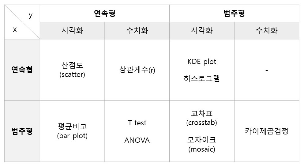
산점도
- 각각의 변수를 축으로 하여 데이터가 위치하는 곳에 점을 찍는다.
plt.scatter(x, y)
plt.scatter(titanic['Age'], titanic['Fare'])
plt.xlabel('Age')
plt.ylabel('Fare')
plt.ylim([0, 100])  # 극단적인 fare를 갖는 값을 빼기위해 y축 범위 조정
plt.show()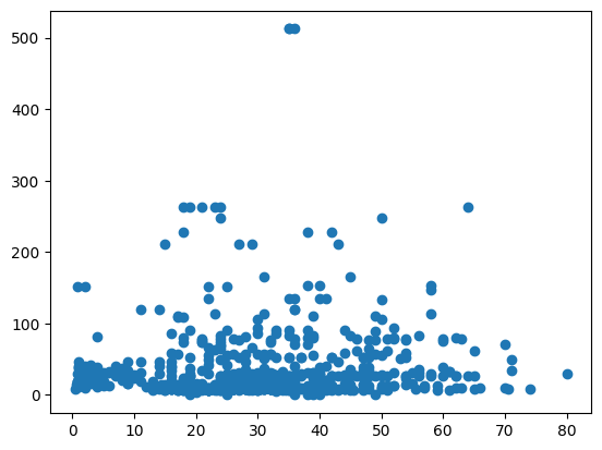
sns.pairplot(df)
- 데이터 프레임에 포함된 숫자형 변수들에 대한 산점도를 한꺼번에 볼 수 있다.
- 데이터가 많다면 시간이 많이 걸리고, 오히려 한 눈에 보기 어렵다. (아래의 예시 참고)
sns.pairplot(titanic)
plt.show()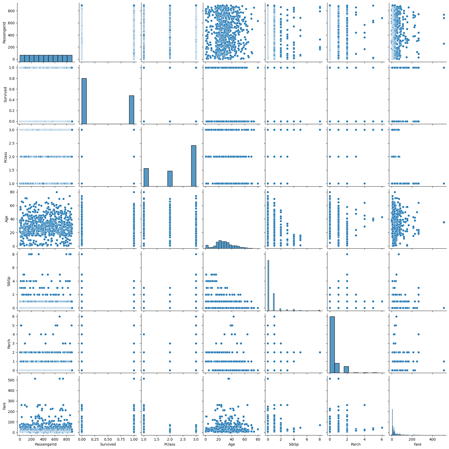
수치화
- 산점도의 점이 직선에 모여있는 정도를 계산한다.
- 공분산을 이용하여 상관계수(correlation coefficient, r)를 계산하고, 이 상관계수가 유의미한지 상관분석으로 검정한다.
상관계수
- 선형의 관계만 수치화할 수 있다.
- -1과 1사이의 값을 가지며, 절대값이 1에 가까울수록 강한 상관관계를 의미한다.
scipy.stats
- 가설 검정에 필요한 다양한 통계함수를 제공한다.
spst.pearsonr(x, y)
- 피어슨 상관분석 함수
- 결측치를 채우거나, 결측치를 제외(
.notnull())하고 적용해야 한다.
import scipy.stats as spst
spst.pearsonr(titanic['Age'].notnull(), titanic['Fare'])
# PearsonRResult(statistic=0.10070709787796146, pvalue=0.002616756065905484)- titanic 데이터의 Age와 Fare의 경우, pvalue가 0.05보다 작긴하지만, 상관계수가 0에 가깝기 때문에 두 변수 간에는 거의 관계가 없다고 볼 수 있다.
df.corr()
- 데이터 프레임에 포함된 숫자형 변수들에 대한 상호간 상관계수를 한꺼번에 볼 수 있다.
- 대각선의 1은 자기 자신과의 상관계수이기 때문에 의미가 없다.
titanic.corr()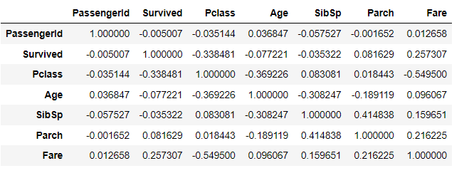
sns.heatmap(df.corr())
- 전체 상관계수를 heatmap으로 시각화할 수 있다.
- 칼라맵은 여기에서 원하는 색상을 선택할 수 있다.
sns.heatmap(titanic.corr(),
            annot = True,          # 상관계수 표기
            fmt = '.2f',           # 소숫점 자릿수
            cmap =  'RdYlBu_r',    # 칼라맵
            vmin = -1, vmax = 1)   # 최소, 최대값 지정
plt.show()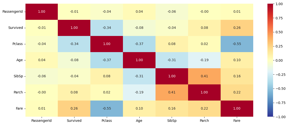
- (당연한 이야기이지만) Pclass와 Fare간의 상관계수가 가장 크다.
2. 범주 -> 숫자
시각화 : 각 범주별 평균 비교 - barplot
수치화 : t-test, ANOVA
판단 기준 :p-value < 0.05이고,|t통계량| > 2혹은|f통계량| > 2~3, 그래프상에서 평균 차이가 크고, 신뢰구간이 좁고 서로 겹치지 않을 때 상관관계가 있음
시각화
Bar Plot
- 각 범주별 평균값을 비교한다.
- 평균 차이가 크고, 신뢰구간(95%)이 겹치지 않을 때 강한 상관관계가 있다.
- 신뢰구간이 좁을수록 신뢰도가 높다.
- 데이터가 많고 편차가 적을수록 신뢰구간은 좁아진다.
sns.barplot(x, y)
sns.barplot(x=titanic['Survived'], y=titanic['Age'])
plt.xlabel('Survived')
plt.ylabel('Age')
plt.grid()
plt.show()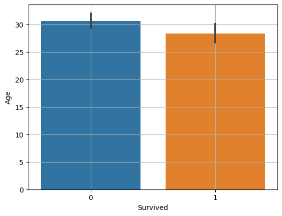
수치화
범주가 2개일 때 -> t-test
- 두 범주간의 평균 차이를 비교한다.
T통계량
- 두 범주의 평균 차이를 표준 오차로 나눈 값
- T 통계량의 절대값이 2이상일 때 차이가 있다고 판단한다.
spst.ttest_ind(x1, x2)
# 1. 데이터 전처리 (결측치 처리)
temp = titanic.loc[titanic['Age'].notnull()]

# 2. 범주별로 데이터 저장
died = temp.loc[temp['Survived']==0, 'Age']
survived = temp.loc[temp['Survived']==1, 'Age']

# 3. t-test
spst.ttest_ind(died, survived)
# Ttest_indResult(statistic=2.06668694625381, pvalue=0.03912465401348249)- titanic 데이터의 Age와 Survived의 경우, pvalue가 0.05보다 작긴하지만 t통계량이 2보다 아주 조금 크기 때문에 두 변수 간에는 약한 상관 관계가 있다고 볼 수 있다.
범주가 3개 이상일 때 -> ANOVA(분산분석)
- 전체 평균과 각 범주 간 평균의 차이를 분산을 사용하여 비교한다.
F통계량

- 집단 간 분산이 크고 (집단별 평균 차이가 많이 나고) 집단 내 분산이 작을수록(집단 내부의 값이 모두 평균과 비슷할 때) F 통계량이 크다.
- F 통계량값이 2~3 이상일 때 차이가 있다고 판단한다.
spst.f_oneway(x1, x2, ...)
# 1. 데이터 전처리 (결측치 처리)
temp = titanic.loc[titanic['Age'].notnull()]

# 2. 범주별로 데이터 저장
p1 = temp.loc[temp['Pclass']==1, 'Age']
p2 = temp.loc[temp['Pclass']==2, 'Age']
p3 = temp.loc[temp['Pclass']==3, 'Age']

# 3. ANOVA
spst.f_oneway(p1, p2, p3)
# F_onewayResult(statistic=57.443484340676214, pvalue=7.487984171959904e-24)- titanic 데이터의 Age와 Pclass의 경우, pvalue가 0.05보다 작고 F통계량이 큰 것으로 보아 각 범주 간 차이가 있다는 것을 알 수 있다.
- 다만, 어떤 범주 간 차이가 있는지 알기 위해서는 2개씩 조합을 나누어 각각 t-test를 해보아야 한다.(사후분석)
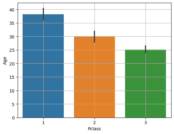
- barplot으로 보아도 Age와 Pclass간에 차이가 있다는 것을 시각적으로 확인할 수 있다.
3. 범주 -> 범주
시각화 : 교차표(Crosstab) -> 모자이크(mosaic)
수치화 : 카이제곱검정
판단 기준 :p-value < 0.05이고, 전체 평균과 각 범주별 평균의 차이가 크고,카이제곱통계량이 자유도의 2배 이상일 때 상관관계가 있다.
교차표
pd.crosstab(x, y)
pd.crosstab(titanic['Survived'], titanic['Sex'])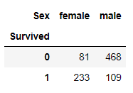
# 컬럼별 비율
pd.crosstab(titanic['Survived'], titanic['Sex'], normalize='columns')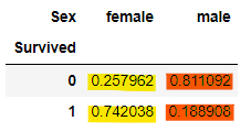
# 행 별 비율
pd.crosstab(titanic['Survived'], titanic['Sex'], normalize='index')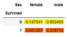
# 전체 비율
pd.crosstab(titanic['Survived'], titanic['Sex'], normalize='all')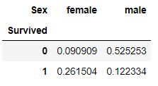
시각화
모자이크
- 범주별 양과 비율을 나타낸다.
- 전체 평균을 선으로 나타내주면 비교가 용이하다.
- 각 축의 범주별 길이는 비율을 의미한다.
- 두 범주형 변수 간 상관이 없다면 범주별 비율 차이가 거의 없어진다.
- 전체 평균과 범주별 평균이 비슷하다.
- 서로 영향을 미치지 않는다고 볼 수 있다.
mosaic(df, [x, y])
from statsmodels.graphics.mosaicplot import mosaic
mosaic(titanic, ['Pclass', 'Survived'])
plt.axhline(titanic['Survived'].mean(), color='r') # 전체 생존율
plt.show()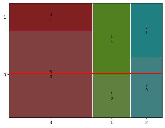
100% Stacked Bar
- crosstab에서 행 별 비율로 집계한 후 plot.bar를 이용한다.
temp = pd.crosstab(titanic['Pclass'], titanic['Survived'], normalize = 'index')
print(temp)
'''
Survived         0         1
Pclass
1         0.370370  0.629630
2         0.527174  0.472826
3         0.757637  0.242363
'''

temp.plot.bar(stacked=True)
plt.axhline(titanic['Survived'].mean(), color = 'r') # 전체 생존율
plt.show()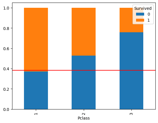
수치화
카이제곱검정
카이제곱통계량
- x와 y가 서로 확률적으로 독립일 때 기대되는 기대빈도와 실제 데이터간의 차이
- 카이제곱통계량이 클수록 기대값과 실제값 사이의 차이가 크다.
- 즉, x와 y는 상관관계가 있다.
- 일반적으로 카이제곱통계량이 자유도의 2배 이상일 때 상관관계가 있다고 판단한다.
- 범주형 변수의 자유도 :
범주의 수 - 1 - 카이제곱검정에서의 자유도 :
각 범주형 변수의 자유도의 곱
- 범주형 변수의 자유도 :
- 카이제곱분포표에 대한 참고 영상 : 카이제곱 분포와 검정
spst.chi2_contingency(crosstab)
# 1. 교차표 집계
cross = pd.crosstab(titanic['Survived'], titanic['Pclass'])

print(cross)
print('-------------------------------------------------------')

# 2. 카이제곱검정
spst.chi2_contingency(cross)

'''
Pclass      1   2    3
Survived
0          80  97  372
1         136  87  119
-------------------------------------------------------

Chi2ContingencyResult(statistic=102.88898875696056, pvalue=4.549251711298793e-23, dof=2, expected_freq=array([[133.09090909, 113.37373737, 302.53535354],
       [ 82.90909091,  70.62626263, 188.46464646]]))
'''- 카이제곱통계량(statistic)이 자유도(dof)의 2배 이상이고, p-value가 0.05보다 작기 때문에 Pclass와 Survived간에는 강한 상관관계가 있다고 할 수 있다.
4. 숫자 -> 범주
시각화 : KDE plot, Histogram, Box plot 등
수치화 : 그때그때 다름
시각화
KDE plot
- 각 KDE plot 그래프가 멀리 떨어져 있을수록 강한 상관관계를 갖는다.
sns.kdeplot(x, df, hue, common_norm, multiple)
# common_norm=False : 각 범주(hue)별로 따로 kde plot을 그린다.
# 그래프 아래 면적 = 1
sns.kdeplot(x='Age', data=titanic, hue='Survived', common_norm=False)
plt.show()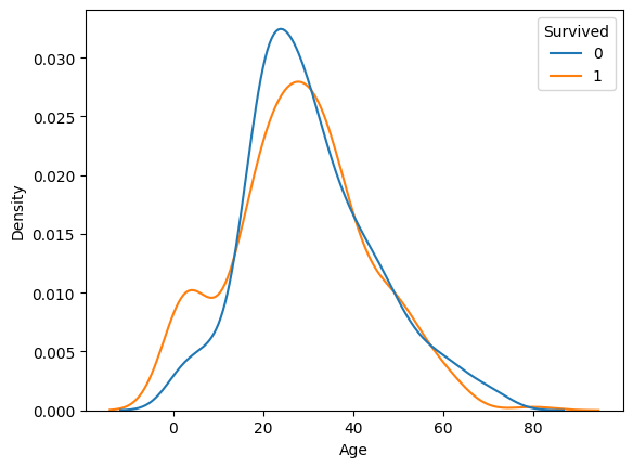
# x에 따른 y의 비율을 비교할 수 있다.
sns.kdeplot(x='Age', data=titanic, hue='Survived', multiple='fill')
# 이 옵션의 경우 전체 평균을 그려주면 비교가 더욱 용이하다.
plt.axhline(titanic['Survived'].mean(), color='r')   # 전체 생존율
# 기초통계량을 확인하여 나이의 최대 최소 선을 그어주었다.
plt.axvline(0, color='r')
plt.axvline(80, color='r')
plt.show()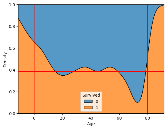
Histogram
- bin 수를 조정하여 특이한 분포를 확인할 수 있다.
sbs.histplot(x, df, bins, hue, multiple)
sns.histplot(x='Age', data=titanic, bins=16, hue='Survived', multiple='fill')
plt.axhline(titanic['Survived'].mean(), color='r')
plt.show()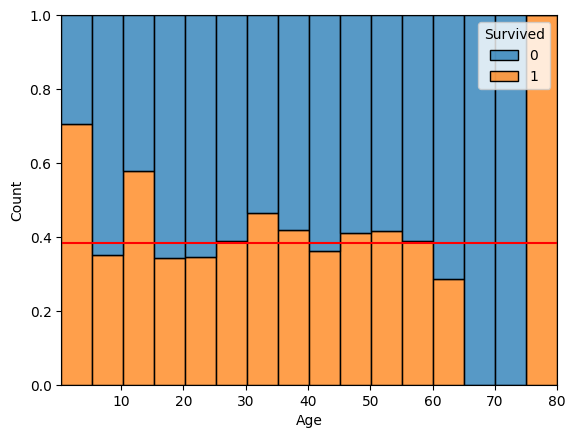
수치화
- 데이터의 특성에 따라 수치화 할 수 있는 방법이 달라진다.
예시
- 숫자를 범주로 변환한 뒤, 범주->범주로 비교
- 연령 -> 연령대로 변환
- 역으로 범주 -> 숫자로 변경하여 비교
- 단, x와 y간 선후관계가 있어서는 안된다.
- 로지스틱 회귀모델 생성 및 회귀계수 검정 등
[예시] 숫자를 범주로 변환하여 비교하기
- 위에서 Age와 Survived를 나타낸 kde plot의 경우, 최대 나이인 80대 이상에서 마치 생존자가 많은 것처럼 보여서 연령대로 나눈 Age_grp 컬럼을 만든 뒤 모자이크 플롯으로 다시 비교해보았다.
# 최대 최소 나이를 확인한 후 연령대별로 cut
bin = [-np.inf, 10, 20, 30, 40, 50, 60, 70, 80]
label=[0, 10, 20, 30, 40, 50, 60, 70]
titanic['Age_grp'] = pd.cut(titanic['Age'], bins=bin, labels=label)

# plt.rcParams["figure.figsize"]=(15, 6)  # 세션 전체의 사이즈가 변경되므로 주의
from statsmodels.graphics.mosaicplot import mosaic
mosaic(titanic, ['Age_grp', 'Survived'])
plt.axhline(titanic['Survived'].mean(), color='r') # 전체 생존율
plt.show()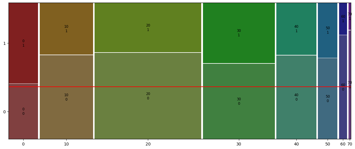
- 60대 이상 노년층의 사망률이 전체 연령대중 가장 높은 것을 확인할 수 있다.