Don't make me think
My definition of usability.
- Useful: Does it do something people need done?
- Learnable: Can people figure out how to use it?
- Memorable: Do they have to relearn it each time they use it?
- Effective: Does it get the job done?
- Efficient: Does it do it with a reasonable amount of time and effort?
- Desirable: Do people want it? and recently even
- Delightful: Is using it enjoyable, or even fun?
Usability
A person of average (or even below average) ability and experience can figure out how to use the thing to accomplish something without it being more trouble than it’s worth.
Chapter 1
“Don’t make me think!” – 자명하게 만들어야 한다
it should be self-evident. Obvious. Self-explanatory.
I should be able to “get it”—what it is and how to use it—without expending any effort thinking about it.
Things that make us think
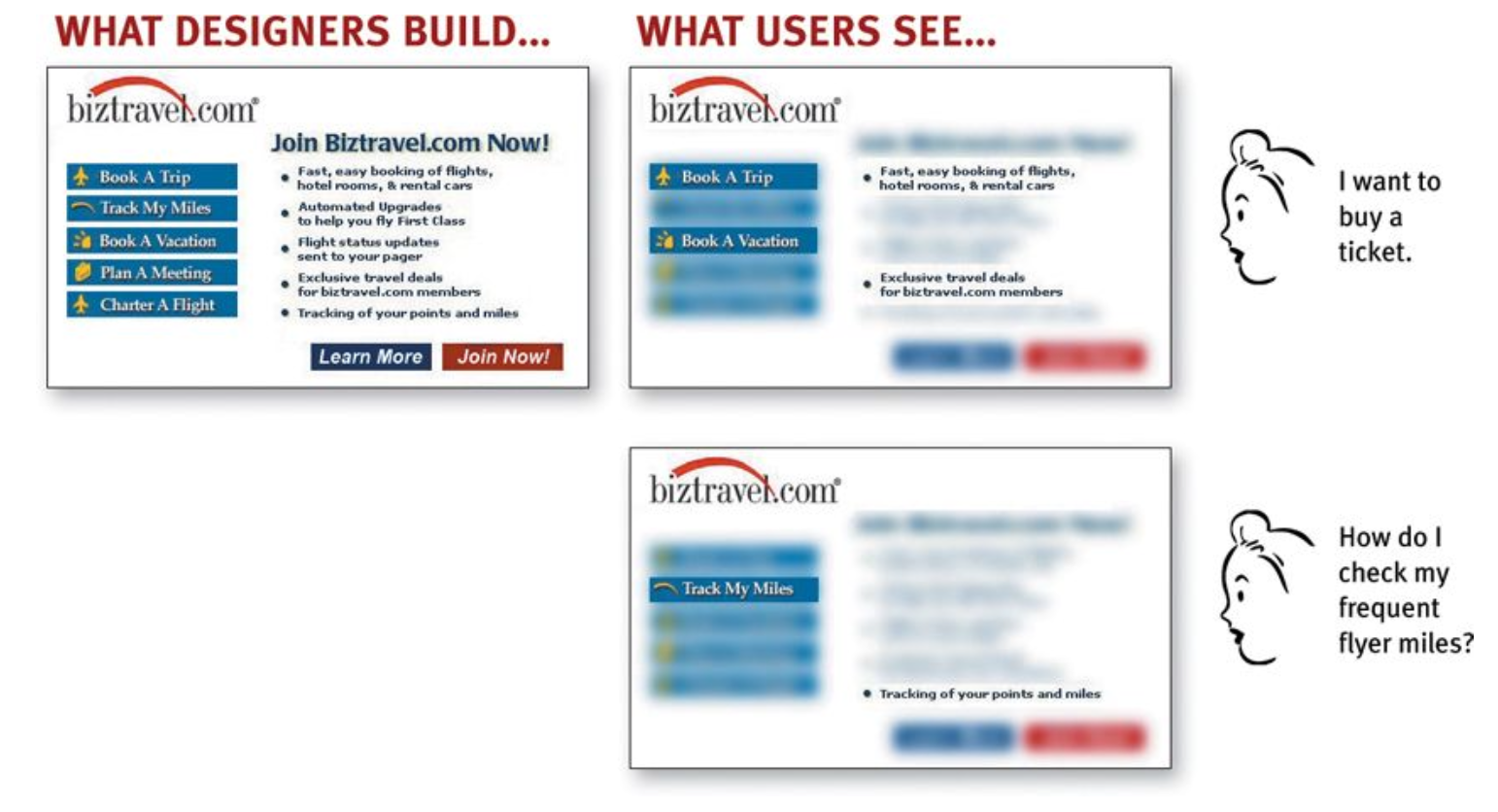
All kinds of things on a Web page can make us stop and think unnecessarily
1. name
- Note that these things are always on a continuum somewhere between “Obvious to everybody” and “Truly obscure,” and there are always tradeoffs involved.
- My main point is that the tradeoffs should usually be skewed further in the direction of “Obvious” than we think.
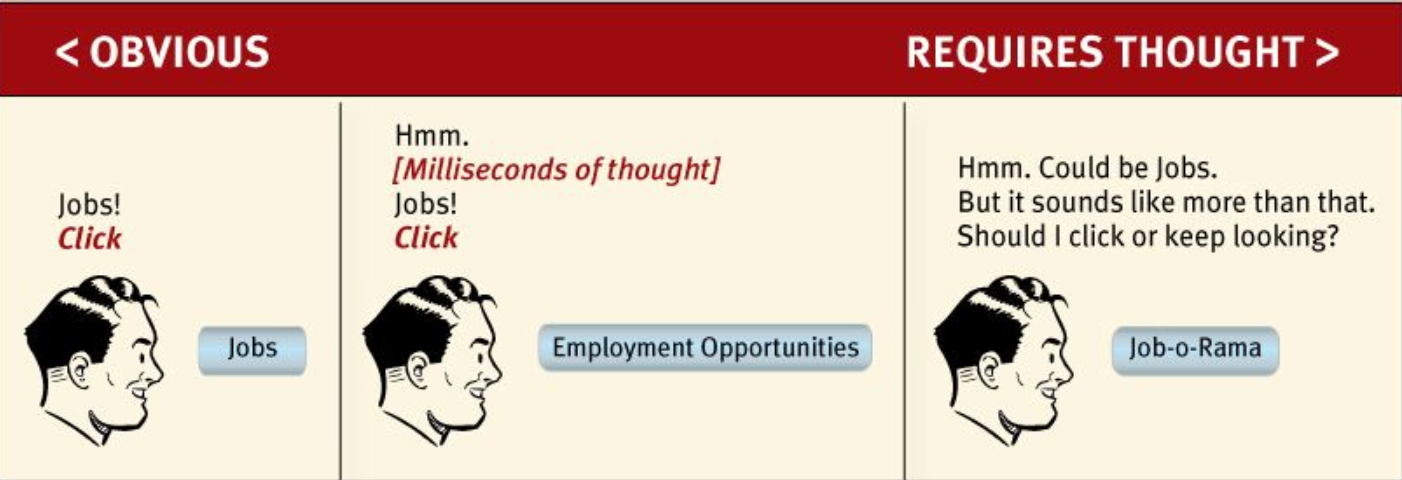
2. links and buttons that aren’t obviously clickable
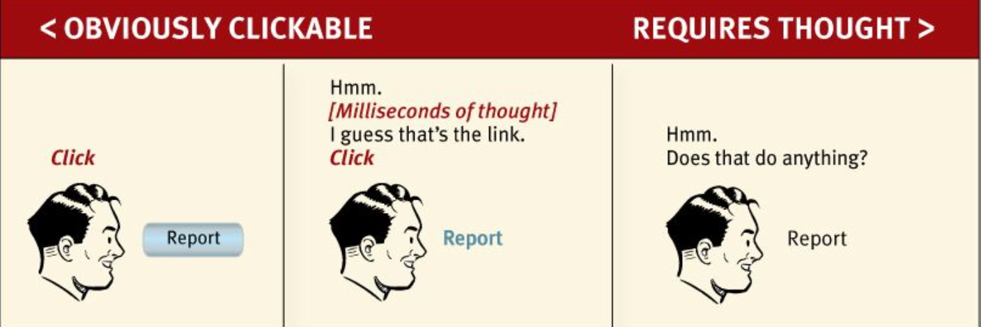
conclusion - As a user, I should never have to devote a millisecond of thought to whether things are clickable —or not.
question: Well, it really doesn’t matter that much. If you click or tap it and nothing happens, what’s the big deal?”
answer: The point is that every question mark adds to our cognitive workload, distracting our attention from the task at hand.
Bad
Granted, most of this “mental chatter” takes place in a fraction of a second, but you can see that it’s a pretty noisy process, with a lot of question marks.
Good
No question marks. No mental chatter. And no errors.
The most important thing you can do is to understand the basic principle of eliminating question marks.
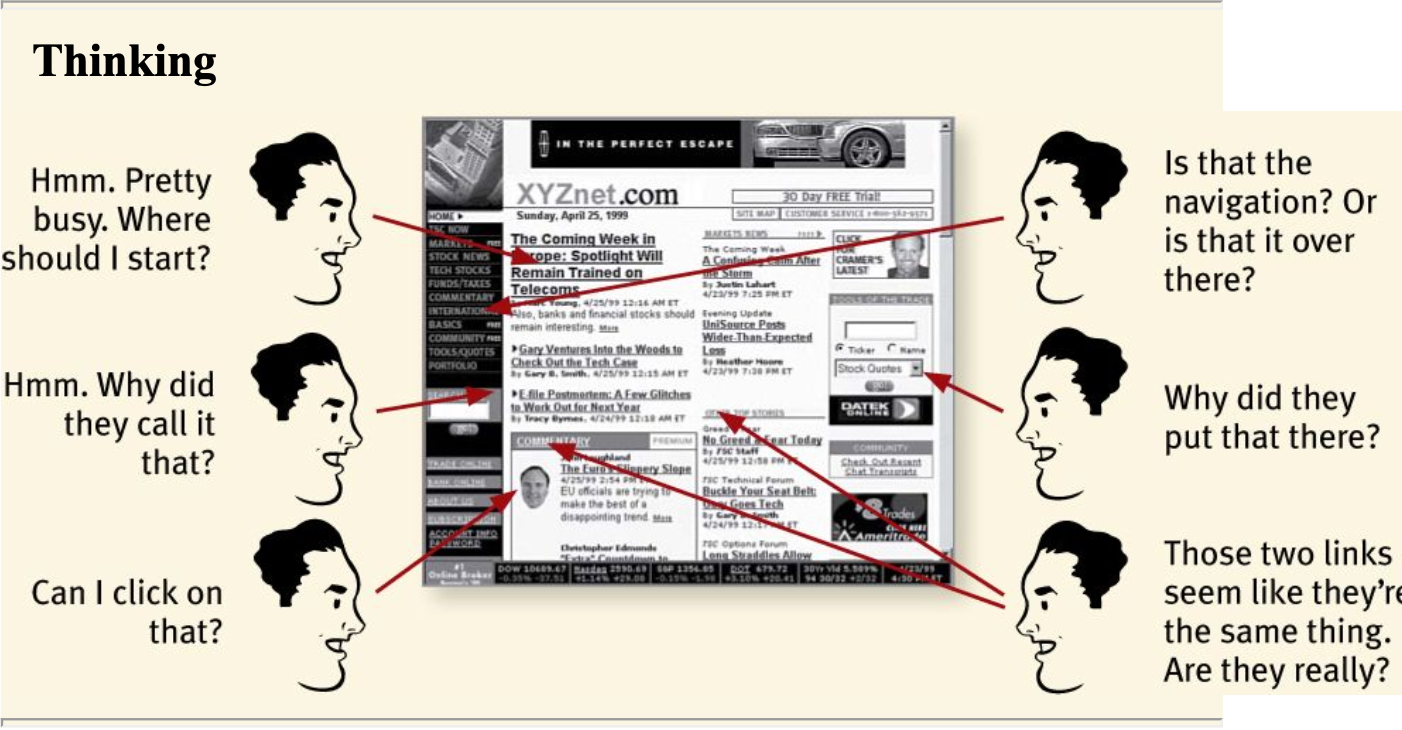
- Where am I?
- Where should I begin?
- Where did they put _?
- What are the most important things on this page? Why did they call it that?
- Is that an ad or part of the site?
You can’t make everything self-evident
when? something original or groundbreaking or something that’s inherently complicated
solution self-explanatory(nearly effortless understanding.)
: On a self-explanatory page, it takes a little thought to “get it”—but only a little. The appearance of things (like size, color, and layout), their well-chosen names, and the small amounts of carefully crafted text
Why is all of this so important?(왜 자명해야 하는가)
most people are going to spend far less time looking at the pages we design than we’d like to imagine.
Chapter 2
People scan not read
Of course it depends on the kind of page, what the user is trying to do, how much of a hurry she’s in, and so on. But this simplistic view is much closer to reality than most of us imagine.
Real-world Web use
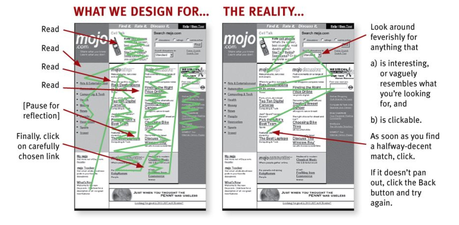
FACT OF LIFE #1: We don’t read pages. We scan them.
- looking for words or phrases that catch our eye
exception: news stories, reports, or product descriptions
: but even then, they’re often alternating between reading and scanning.
Why do we scan?
We’re good at it.
We’ve been scanning newspapers, magazines, and books—or if you’re under 25, probably reddit, Tumblr, or Facebook—all our lives to find the parts we’re interested in, and we know that it works.
We focus on
(a) the task at hand
(b) our current or ongoing personal interests.
(c) the trigger words that are hardwired into our nervous systems, like “Free,” “Sale,” and “Sex,”
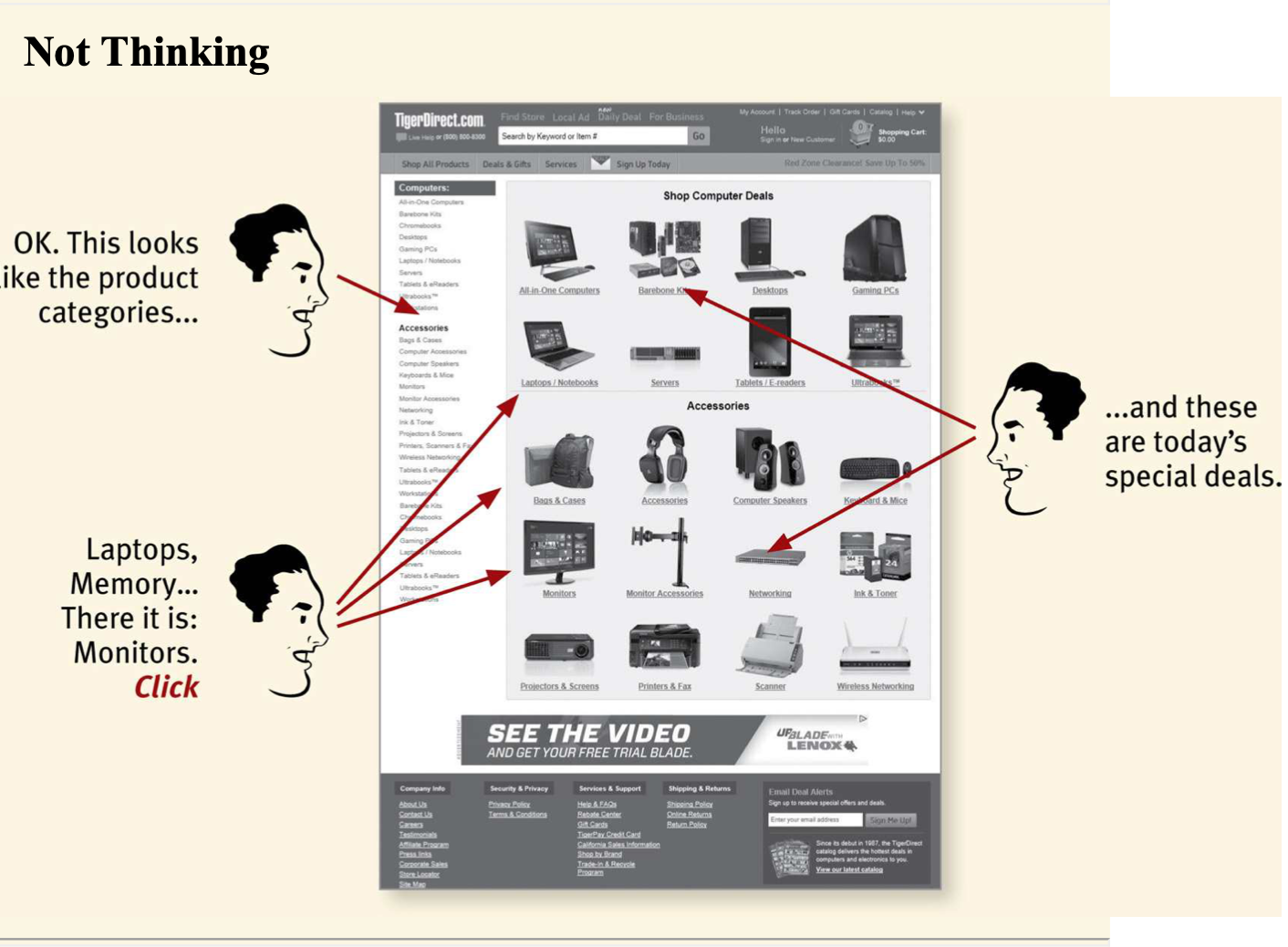
FACT OF LIFE #2: We don’t make optimal choices. We satisfice.(사용자는 최선의 선택을 하지 않는다. 최소 조건만 충족되면 만족한다)
designer's assumption: users will scan the page, consider all of the available options, and choose the best one.
user's choice: we choose the first reasonable option, a strategy known as satisficing.
As soon as we find a link that seems like it might lead to what we’re looking for, there’s a very good chance that we’ll click it.
So why don’t Web users look for the best choice?
- We’re usually in a hurry.
- There’s not much of a penalty for guessing wrong.
: (Back is the most-used button)- Guessing is more fun.
: It’s less work than weighing options, and if you guess right, it’s faster.
FACT OF LIFE #3: We don’t figure out how things work. We muddle through.
example: web browser
Many people use the Web extensively without knowing that they’re using a browser. What they know is you type something in a box and stuff appears.
But it doesn’t matter to them: They’re muddling through and using the thing successfully.
not for lack of intelligence,It’s just not important to us.
Chapter 3
DESIGNING FOR SCANNING, NOT READING
- Take advantage of conventions
- Create effective visual hierarchies
- Break pages up into clearly defined areas Make it obvious what’s clickable
- Eliminate distractions
- Format content to support scanning
1. Take advantage of conventions
- Stop signs
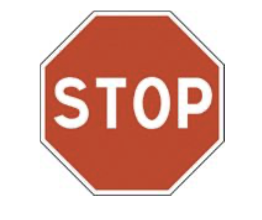
typical shape, color, size, height, location
- Where things will be located on a page
example: location of logo
- How things work
example: the metaphor of a shopping cart
you can understand without knowing Japandese thanks to conventions
Innovate when you know you have a better idea, but take advantage of conventions when you don’t.(새로운 아이디어가 더 낫다는 것을 확신 할 때 혁신해라)
example(easy, fun, creative)
the creators were smart enough to understand that the fun might wear off after a while so they also included a more conventional category-based navigation.
be as creative and innovative as you want, and add as much aesthetic appeal as you can, as long as you make sure it’s still usable.
CLARITY TRUMPS CONSISTENCY
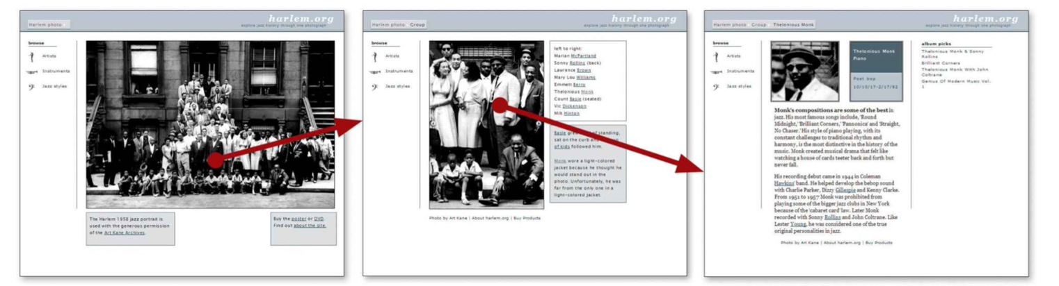
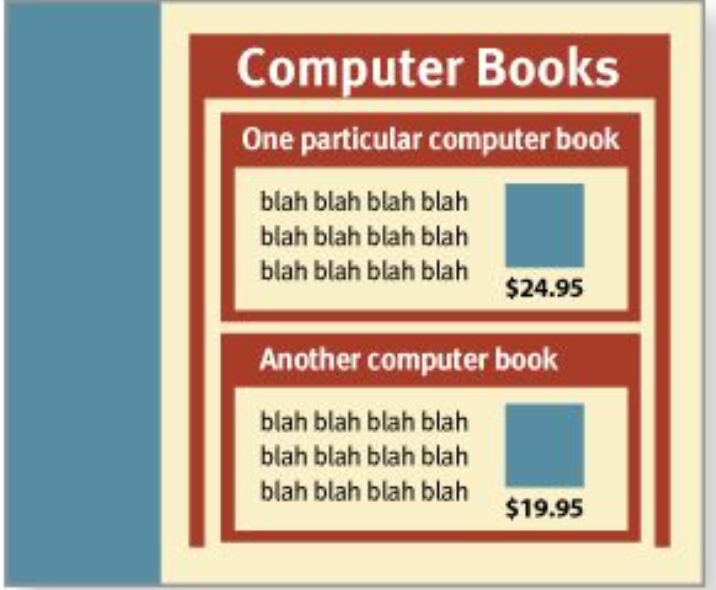
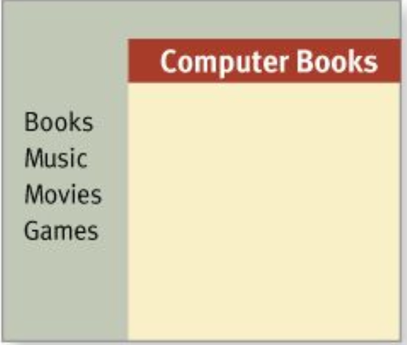
2. Create effective visual hierarchies
- The more important something is, the more prominent it is.
larger, bolder, in a distinctive color, set off by more white space, or nearer the top of the page
- I’m Things that are related logically are related visually.
- Things are “nested” visually to show what’s part of what.
visual hierarchies in newspaper
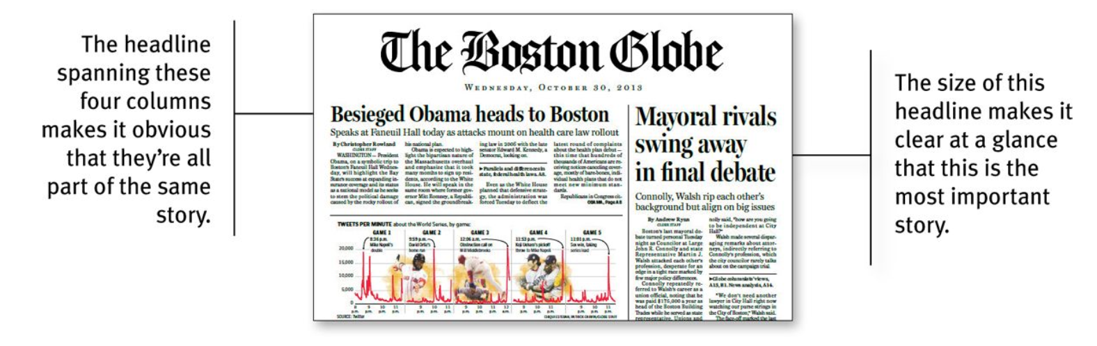
bad
good
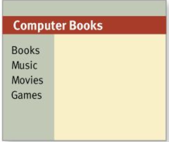
3. Break up pages into clearly defined areas
Dividing the page into clearly defined areas is important because it allows users to decide quickly which areas of the page to focus on and which areas they can safely ignore.
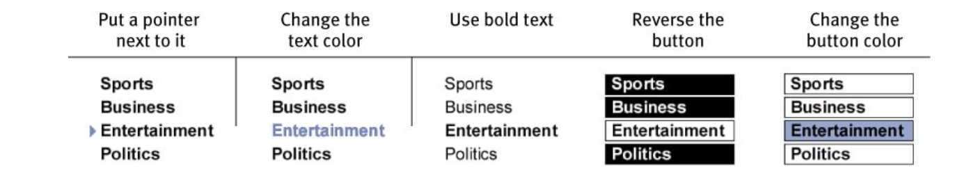
4. Make it obvious what’s clickable
- shape (buttons, tabs, etc.)
- location (in a menu bar, for instance)
- formatting (color and underlining)
5. Keep the noise down to a dull roar
start with the assumption that everything is visual noise (the “presumed guilty until proven innocent” approach) and get rid of anything that’s not making a real contribution
6. Format text to support scanning
- Use plenty of headings.
- Keep paragraphs short.
- Use bulleted lists.
- Highlight key terms.
recommended book - Ginny Redish’s book Letting Go of the Words.
Chapter 4
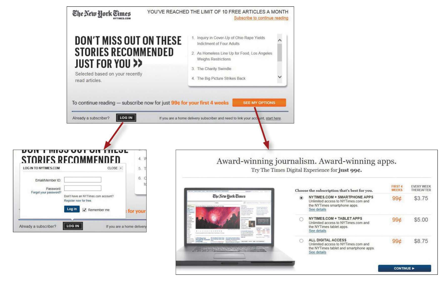
- users don’t mind a lot of clicks
as long as each click is painless and they have continued confidence that they’re on the right track
bad
They put all the details at once
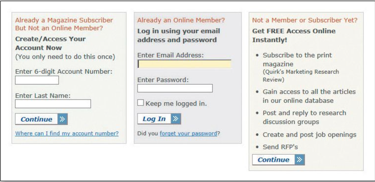
good
- Making an initial selection (to log in or to see your options for subscribing)
- takes you to another screen where you see only the relevant questions or information for that selection.
Some assistance may be required
- Brief: The smallest amount of information that will help me
- Timely: Placed so I encounter it exactly when I need it
- Unavoidable: Formatted in a way that ensures that I’ll notice it
example
tips adjacent to form fields, “What’s this?” links, and even tool tips.
Chapter 5
Omit needless words
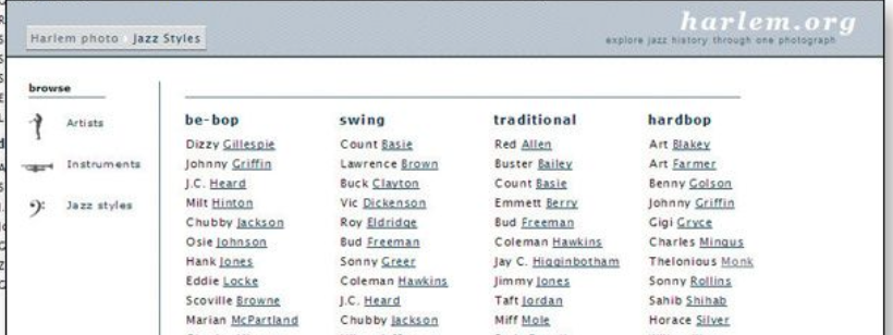
Chapter 6 - Street signs and Breadcrumbs
Web Navigation 101
“search-dominant” users
almost always look for a search box
"link-dominant” users
almost always browse first(훑어본다)
The unbearable lightness of browsing
No sense of direction
- This is one reason why bookmarks—stored personal shortcuts—are so important, and why the Back button is the most used button in Web browsers.
- Home pages are— comparatively—fixed places. When you’re in a site, the Home page is like the North Star
Importance of Navigation
- It help us find whatever it is we’re looking for
- It tell us where we are.
- It tells us what’s here.
- It tells us how to use the site
- It gives us confidence in the people who built it.
web navigation convention
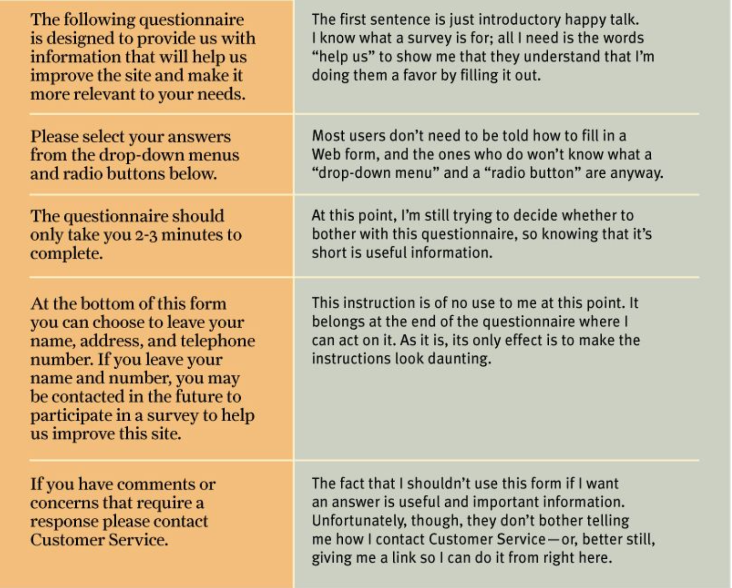
Don’t look now, but I think it’s following us(navigation)
exception : form (navigation is disturbing element)
it’s useful to have a minimal version of the persistent navigation with just the Site ID, a link to Home, and any Utilities that might help me fill out the form.
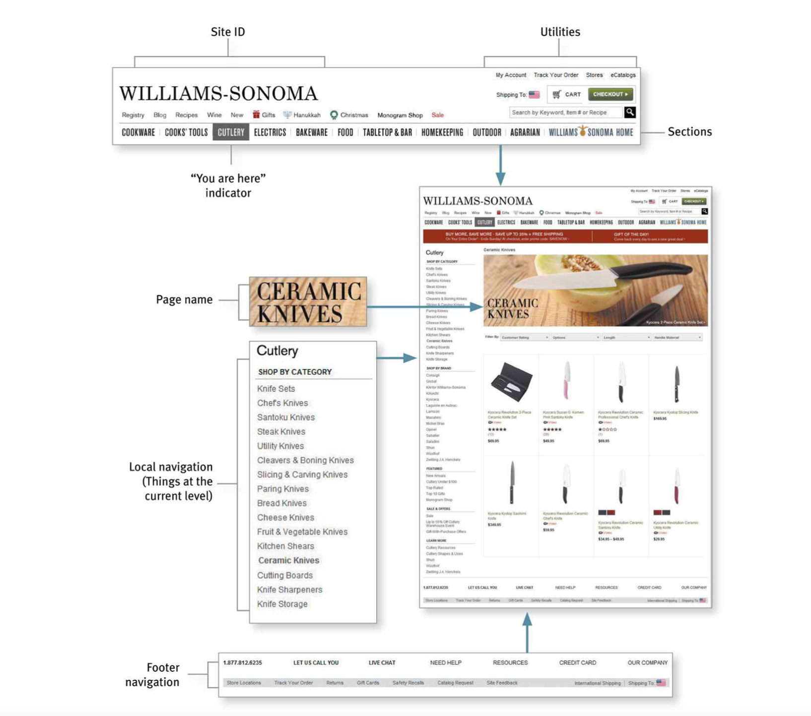
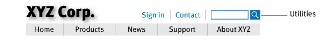
The Sections
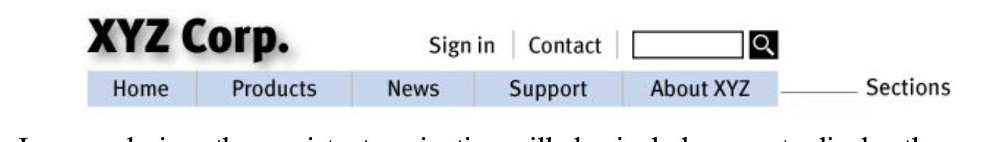
The Utilities
Utilities are the links to important elements of the site that aren’t really part of the content hierarchy.
These are things that either can help me use the site (like Sign in/Register, Help, a Site Map, or a Shopping Cart) or provide information about its publisher (like About Us and Contact Us).
the persistent navigation can accommodate only four or five Utilities
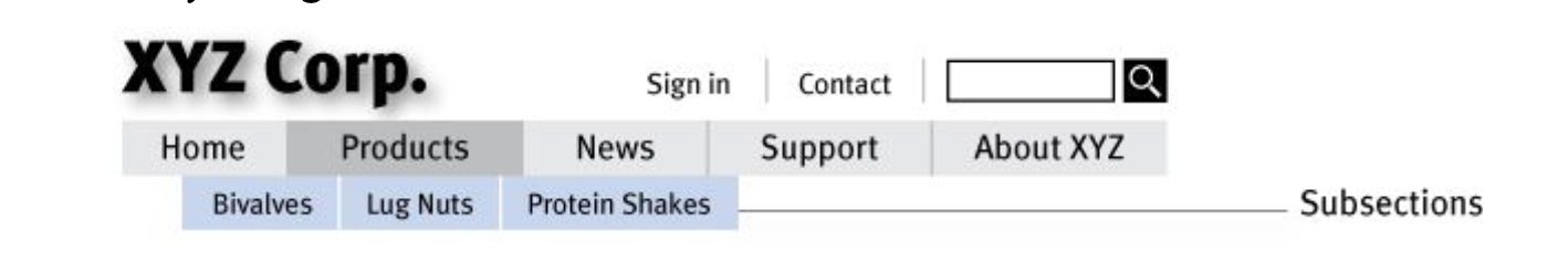
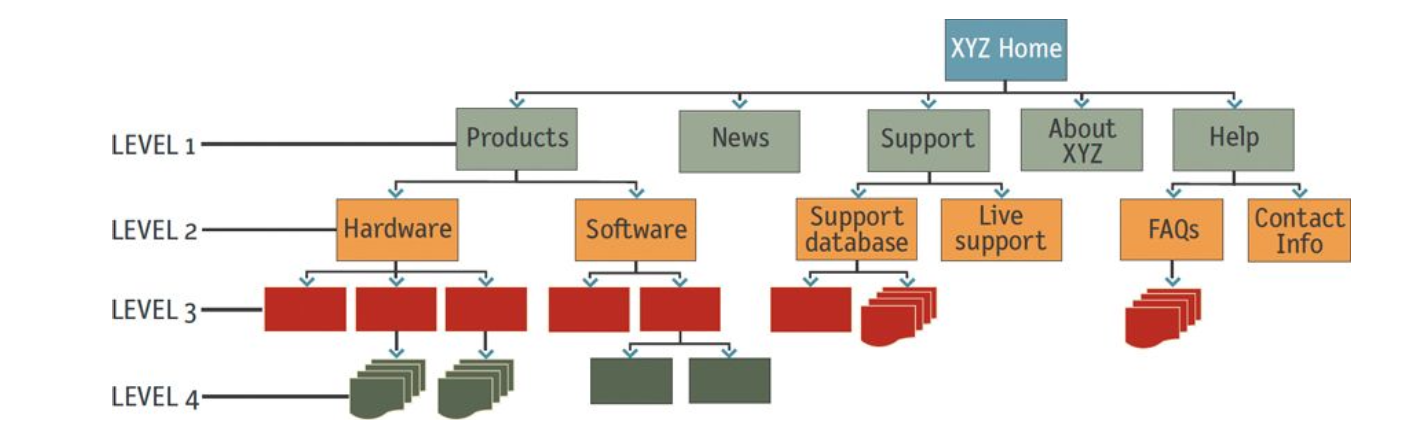
Secondary, tertiary, and whatever comes after tertiary
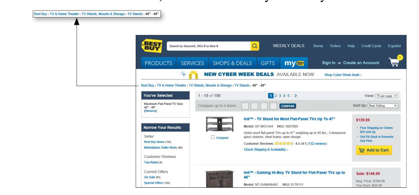
Every page needs a name & The name needs to match what I clicked.
Current location
Bread crumbs
I love tabs
Try the trunk test(to check navigation is well made) - p88
What site is this? (Site ID)
What page am I on? (Page name)
What are the major sections of this site? (Sections)
What are my options at this level? (Local navigation)
Where am I in the scheme of things? (“You are here” indicators) How can I search?
Chapter 7
conveying the big picture
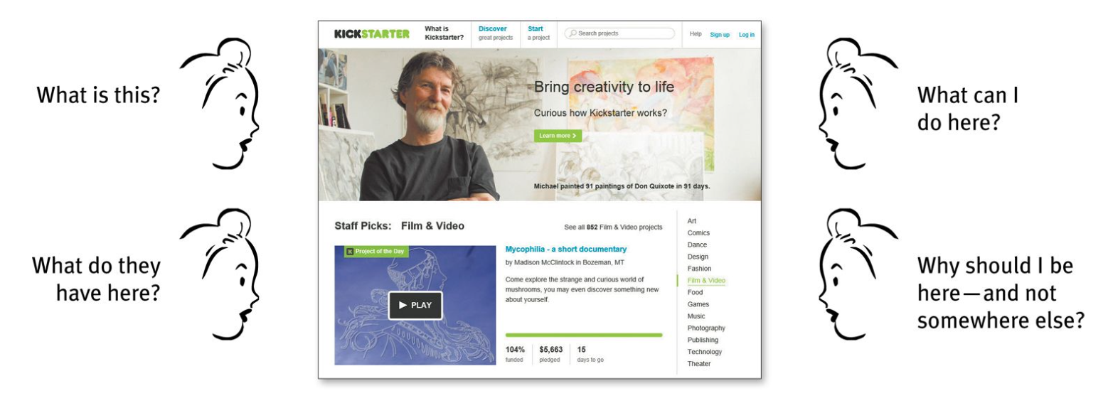
first impression is important
It showed that initial impressions tended to be very similar to the impressions people had after they actually had a chance to spend time on the page
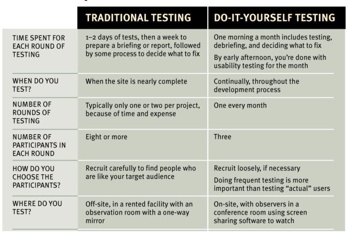
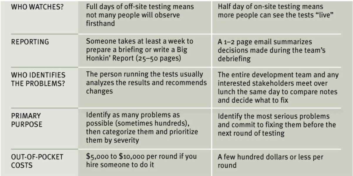
Chapter 9. Usability testing
Chapter 10. Mobile
What’s the difference?
people are moving faster and reading even less on small screens
1. Delightful is the new black
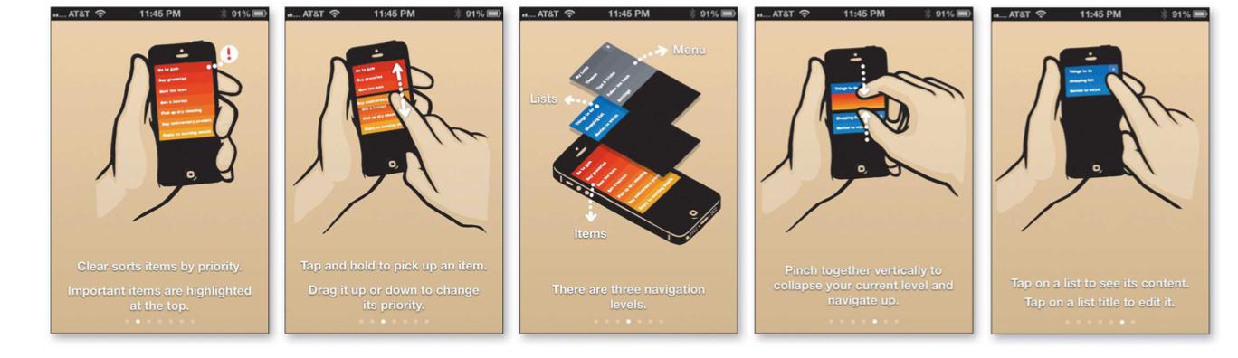
2. Apps need to be learnable
put tutorial and let people find out again easily.
3. Apps need to be memorable, too
Chapter 12. Accessibility and you
1. ___% of the population has a disability.
2. Making things more accessible benefits everyone
- closed captioning
3. It’s the right thing to do.
good design with accessibility
1. Fix the usability problems that confuse everyone
Making sites more usable for “the rest of us” is one of the most effective ways to make them more effective for people with disabilitie
2. Read an article
“Guidelines for Accessible and Usable Web Sites: Observing Users Who Work with Screen Readers.” -Mary Theofanos and Janice (Ginny) Redish
3. Go for the low
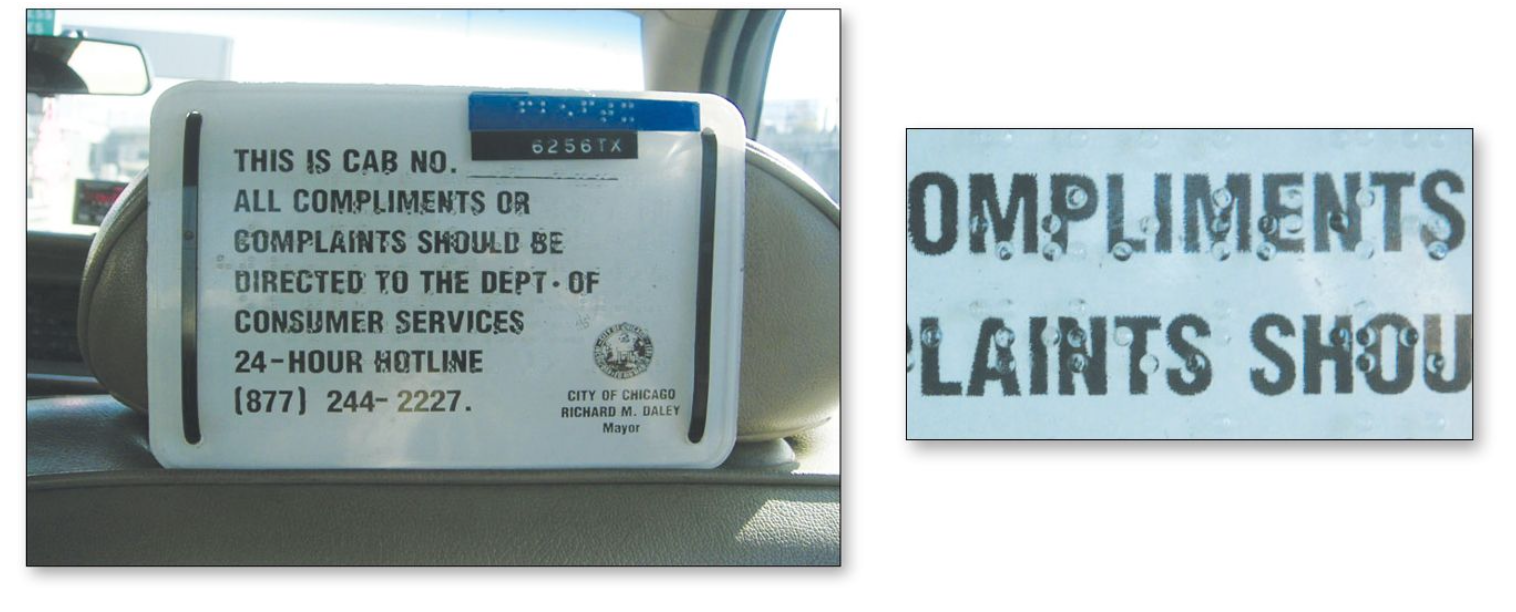
- Add appropriate alt text to every image
- Use headings correctly
: The standard HTML heading elements - Make your forms work with screen readers.
: HTML element - Put a “Skip to Main Content” link at the beginning of each page.
- Make all content accessible by keyboard
- Create significant contrast between your text and background
