다음과 같이 컴포즈에서는 선언형으로 UI를 선언한다.
Text(
	text = "Text",
	color = Color.White,
	fontSize = 28.sp,
	fontWeight = FontWeight.Bold
)
이는 XML을 사용하지 않음으로써 UI 개발을 더 쉽고 빠르게할 수 있게해준다.
기존의 라운드 버튼을 만들 때 Drawable을 선언하고 이를 활용하는 방식을 사용했다.
- drawable/roundedbutton
<?xml version="1.0" encoding="utf-8"?>
<shape xmlns:android="http://schemas.android.com/apk/res/android"
android:shape="rectangle">
    <solid android:color="#eeffffff" />
    <corners android:bottomRightRadius="8dp"
        android:bottomLeftRadius="8dp"
        android:topRightRadius="8dp"
        android:topLeftRadius="8dp"/>
</shape> <Button
android:layout_width="wrap_content"
android:layout_height="wrap_content"
android:text="Button"
android:background="@drawable/roundedbutton"
/>하지만 Radius값에 따라, 색에 따라 각각 다른 Drawable을 만들어서 사용했고 이는 너무 비효율적이라 생각하여
기존의 XML기반의 안드로이드환경에서도 선언형 UI를 사용해 버튼을 만들어보자 한다
버튼 위젯을 빌드하는 ButtonBuilder클래스 및 customButton함수를 만들어 버튼 위젯을 빌드해주자
fun customButton(context:Context, init: ButtonBuilder.()->Unit): Button
  = ButtonBuilder().apply(init).buildButton(context = context)

class ButtonBuilder {
  // Attributes

  fun buildButton(context: Context) = Button(context).apply {
  	// Create Button
  }
}customButton함수에 context 및 ButtonBuilder.() -> Unit 의 함수타입을 파라미터로 가지기 때문에 버튼에 적용하고 싶은 속성들을 람다식으로 다음과 같이 사용해주자.
customButton(context) {
        color = Color.WHITE
        rounded = 80.dp
        text = "Button1"
        onClick = {
        	// TODO
        }
})
해당 color, rounded, text, onClick과 같은 버튼의 속성들은 ButtonBuilder클래스에서 상태로 선언하여 사용하자
class ButtonBuilder {
  lateinit var onClick: () -> Unit
  var text: String = ""
  var strock: Strock = Strock()
  var rounded: Float = 0f
  @ColorInt
  var color: Int = Color.TRANSPARENT
  var width = LinearLayout.LayoutParams.WRAP_CONTENT
  var height = LinearLayout.LayoutParams.WRAP_CONTENT

  fun buildButton(context: Context) = Button(context).apply {
      text = this@ButtonBuilder.text
      val layoutparams = LinearLayout.LayoutParams(
        this@ButtonBuilder.width,
        this@ButtonBuilder.height
      )
      layoutparams.setMargins(0,30,0,0)
      layoutParams = layoutparams
      setOnClickListener { onClick() }
      val shape = GradientDrawable()
      shape.cornerRadius = rounded
      shape.setColor(color)
      shape.setStroke(strock.width,strock.color)
      this.background = shape
    }
}
+) 컴포즈와 비슷한 느낌을 내기위해 몇가지 확장 함수를 구현하였다.
data class Strock(val width: Int = 0, @ColorInt val color: Int = Color.TRANSPARENT)

inline val Int.dp: Float
  get() = (this / Resources.getSystem().displayMetrics.density)
customButton(this@MainActivity) {
color = Color.TRANSPARENT
rounded = 150.dp
text = "Button2"
strock = Strock(10, Color.RED)
onClick = {
Toast.makeText(this@MainActivity, "Button2!", Toast.LENGTH_SHORT).show()
}
}다음과 같이 소스를 작성하면 ButtonBuilder에서는
- ButtonBuilder 내의 속성들이
apply를 통해 초기화 된다. - 초기화된 속성들을 기반으로
buildButton()를 실행하여 각 속성들이 적용된 버튼 위젯을 리턴한다.
binding.columnLayout.apply {
addView(customButton(this@MainActivity) {
color = Color.WHITE
rounded = 80.dp
text = "Button1"
width = 600
height = 150
strock = Strock(10, Color.BLUE)
onClick = {
Toast.makeText(this@MainActivity,"Button1!",Toast.LENGTH_SHORT).show()
}
})
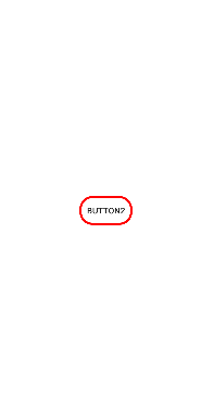
}빨간색 실선을 가진 80.dp RoundedShape 버튼이 잘 생성된다.
하지만 우리는 이 버튼을 레이아웃에 올려야 함으로 레이아웃도 동일하게 레이아웃 빌더를 통해 레이아웃을 만들고 자식으로 뷰를 추가해보자.
class ColumnLayoutBuilder {
var width = LinearLayout.LayoutParams.MATCH_PARENT
var height = LinearLayout.LayoutParams.MATCH_PARENT
val views = mutableListOf<View>()
fun buildColumnLayout(context: Context): LinearLayout = LinearLayout(context).apply {
layoutParams = LinearLayout.LayoutParams(
this@ColumnLayoutBuilder.width,
this@ColumnLayoutBuilder.height
)
gravity = Gravity.CENTER
orientation = LinearLayout.VERTICAL
views.map { view ->
addView(view)
}
}
fun customButton(context: Context, init: ButtonBuilder.() -> Unit): Unit {
views.add(ButtonBuilder().apply(init).buildButton(context = context))
}
}달라진 것은 columnLayoutBuilder내에서 버튼위젯을 생성해야 하기 때문에 customButton함수를 옮겼다.
또한 columnLayout의 자식으로 버튼이 추가되어야 하기 때문에 View를 리스트로 가지는views를 선언하여 빌드할 때 이를 모두 addview()로 추가해주자.
그리고 columnLayoutBuilder를 실행하는 함수를 만들어 가독성있게 표현할 수 있게 만들자
fun columnLayout(context: Context, init: ColumnLayoutBuilder.() -> Unit): LinearLayout =
ColumnLayoutBuilder().apply(init).buildColumnLayout(context = context)binding.root에 추가해주면 끝
binding.root.addView(
columnLayout(this@MainActivity) {
customButton(this@MainActivity) {
color = Color.GRAY
text = "Button3"
strock = Strock(10, Color.DKGRAY)
onClick = {
Toast.makeText(this@MainActivity, "Button3!", Toast.LENGTH_SHORT).show()
}
}
customButton(this@MainActivity) {
  color = Color.TRANSPARENT
  rounded = 150.dp
  text = "Button2"
  strock = Strock(10, Color.RED)
  onClick = {
    Toast.makeText(this@MainActivity, "Button2!", Toast.LENGTH_SHORT).show()
  }
}
customButton(this@MainActivity) {
color = Color.WHITE
rounded = 80.dp
text = "Button1"
width = 600
height = 150
strock = Strock(10, Color.BLUE)
onClick = {
Toast.makeText(this@MainActivity, "Button1!", Toast.LENGTH_SHORT).show()
}
}
}
)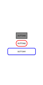
이렇게 보면 제법 Compose스럽게 버튼을 생성한 것을 알 수 있다.
전체 소스
data class Strock(val width: Int = 0, @ColorInt val color: Int = Color.TRANSPARENT)
inline val Int.dp: Float
get() = (this / Resources.getSystem().displayMetrics.density)
fun columnLayout(context: Context, init: ColumnLayoutBuilder.() -> Unit): LinearLayout =
ColumnLayoutBuilder().apply(init).buildColumnLayout(context = context)
class ButtonBuilder {
lateinit var onClick: () -> Unit
var text: String = ""
var strock: Strock = Strock()
var rounded: Float = 0f
@ColorInt
var color: Int = Color.TRANSPARENT
var width = LinearLayout.LayoutParams.WRAP_CONTENT
var height = LinearLayout.LayoutParams.WRAP_CONTENT
fun buildButton(context: Context) = Button(context).apply {
text = this@ButtonBuilder.text
val layoutparams = LinearLayout.LayoutParams(
this@ButtonBuilder.width,
this@ButtonBuilder.height
)
layoutparams.setMargins(0, 30, 0, 0)
layoutParams = layoutparams
setOnClickListener { onClick() }
val shape = GradientDrawable()
shape.cornerRadius = rounded
shape.setColor(color)
shape.setStroke(strock.width, strock.color)
this.background = shape
}
}
class ColumnLayoutBuilder {
  var width = LinearLayout.LayoutParams.MATCH_PARENT
  var height = LinearLayout.LayoutParams.MATCH_PARENT
  val views = mutableListOf<View>()

  fun buildColumnLayout(context: Context): LinearLayout = LinearLayout(context).apply {
    layoutParams = LinearLayout.LayoutParams(
      this@ColumnLayoutBuilder.width,
      this@ColumnLayoutBuilder.height
    )
    gravity = Gravity.CENTER
    orientation = LinearLayout.VERTICAL
    views.map { view ->
      addView(view)
    }
  }

  fun customButton(context: Context, init: ButtonBuilder.() -> Unit): Unit {
    views.add(ButtonBuilder().apply(init).buildButton(context = context))
  }
}