본 포스팅은 💻 유데미 Advanced CSS and Sass강좌 를 공부하면서 정리한 내용입니다.
flex container
1단계
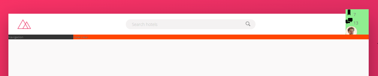
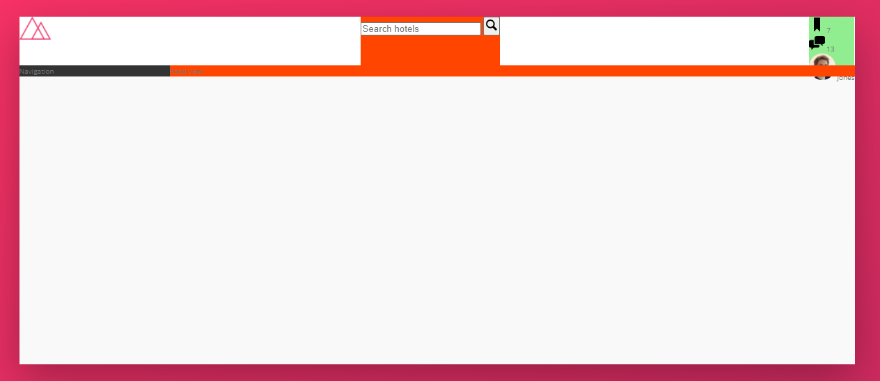
가장 먼저 header의 flex layout을 적용하기 위해 display: flex; 해준다. 이러면 기본적으로 flex-direaction가 row이기 때문에 아래 그림처럼 한줄로 표시될 것이다.
.header {
  (...)
  display: flex;
}
2단계
이제 여기서 주축(main-axis)을 정렬해자. justify-content를 쓰면 된다. 좌우중앙으로 펼쳐주기 위해서 space-between을 써줬다.
.header {
  (...)
  justify-content: space-between;
}
3단계
그 다음에 교차축(cross-axis)을 정렬해보겠다. align-items와 align-content가 있는데 한줄일때는 align-items를 쓰면 된다고 했었다. center로 하니 중앙에 보기 좋게 배치된걸 알 수 있습니다.
.header {
  (...)
  align-items: center;
}
Header form 디자인
1. header form
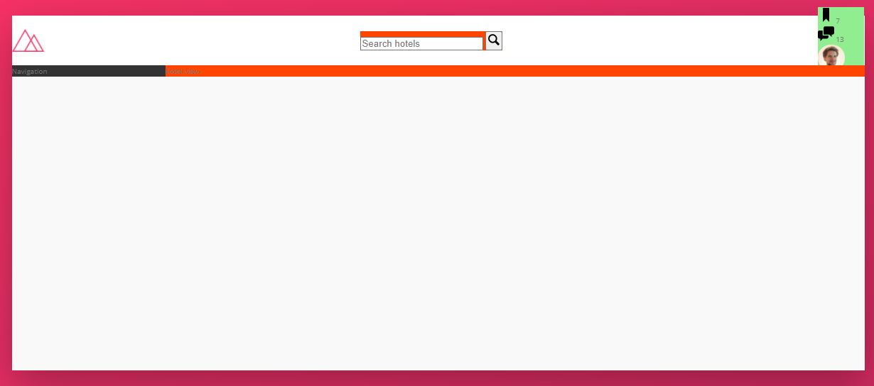
일단, header form(.search) 기본너비를 40%로 맞춰주자.
.search {
  (...)
  flex: 0 0 40%; // 증가 - 감소 - 기본
}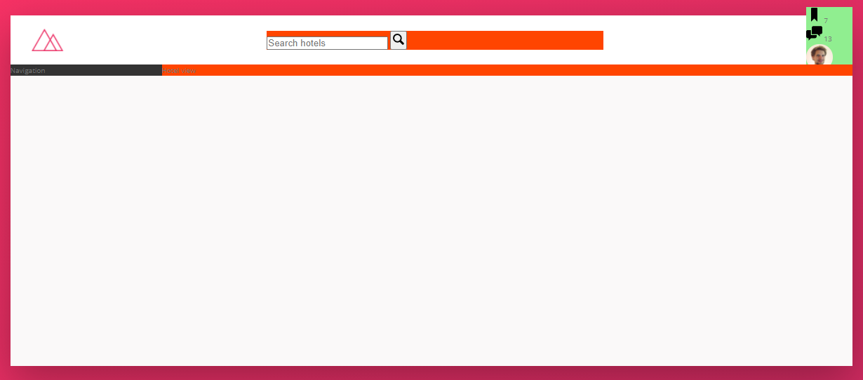
2. input
이제 input(.search__input) 디자인을 해보자.
.search {
  (...)
  &__input {
    font-family: inherit;
    font-size: inherit;
    color: inherit;
    background-color: $color-grey-light-2;
    border: none;
    padding: 0.7rem 2rem;
    border-radius: 100px;
    width: 90%;
    transition: all 0.2s;

    &:focus {
      // outline을 none해주지 않으면 기본적으로 입력박스나 버튼을 클릭하면 검은색 테두리를 보이게 된다.
      // 그런게 보기 싫다면 none 해주자.
      outline: none;
      width: 100%;
      background-color: $color-grey-light-3;
    }
}&:hover,&:active같이&:focus도 가상 클래스라고 불리는 일종이다.(💻 MDN &:focus)transition: all 0.2s는 가상클래스와 정말 붙어서 많이 쓰이다. 가상클래스 처럼 CSS 속성을 변경할 때 애니메이션 속도를 조절해준다. all 대신 특정 속성을 정의할 수 있다.
3. button
button 디자인도 마저 진행하자.
  &__button {
    border: none;
    background-color: $color-grey-light-2;

    &:focus {
      outline: none;
    }

    &:active {
      // 버튼이 눌렸을때 밑으로 2px 만큼 내려가는 효과
      transform: translateY(2px);
    }
  }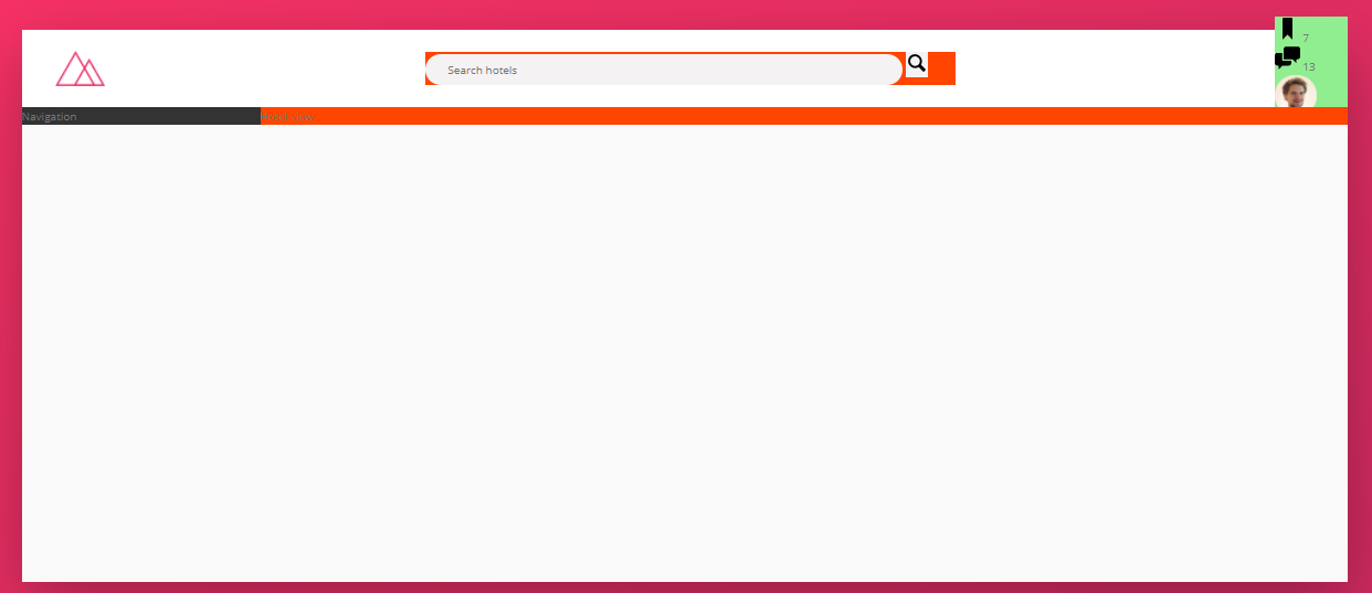
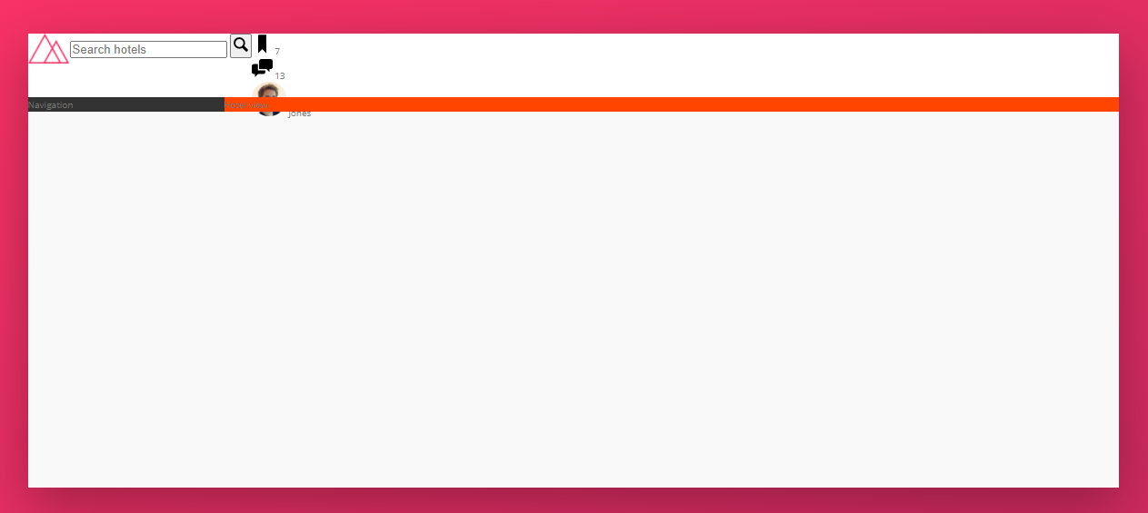
잘 되긴 했는데 나는 저 버튼 아이콘이 input 안으로 들어왔으면 좋겠다. 이럴때 어떻게 해야 할까? 🤔 input 에다가 margin-right: -3.5rem; 를 적용시켜주면 됩니다.
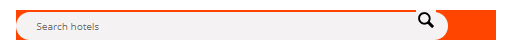
오.. 잘 된것을 볼 수 있다(👍). 근데 이번에는 저 버튼 아이콘이 위로 올라가 있어서 꼴보기 싫다. center로 정렬하고 싶은데 이럴때는? search 에다가 display: flex;를 적용해주고 주축과 교차축 정렬을 수행하면 쉽게 해결된다. flex가 만능!!
.search {
  display: flex;
  align-items: center;
  justify-content: center;
}
4. placeholder 디자인
마지막으로 placeholder를 좀 더 희미하게 해주고 싶다.
  &__input {
    (...)
    &::-webkit-input-placeholder {
      font-weight: 100;
      color: $color-grey-light-4;
    }
  }
폰트사이즈도 조금 크게하고 싶다. 이건 header에서 정해주면 inherit으로 상속받아서 적용된다.
.header {
  font-size: 1.4rem;
  (...)
}