1. CSS Transform
- html
<!DOCTYPE html>
<html lang="en">
<head>
<meta charset="UTF-8">
<meta name="viewport" content="width=device-width, initial-scale=1.0">
<meta http-equiv="X-UA-Compatible" content="ie=edge">
<title>Interactive Web</title>
<style>
.box-container {
display: flex;
}
.box {
width: 100px;
height: 100px;
border: 2px solid black;
background: rgba(255, 255, 0, 0.7);
/* transition 구현 */
/* transition: 1s linear; 가속도 없음 */
/* transition: 1s cubic-bezier(0.81, 0.47, 0.51, 1.78); 크롬 개발자 도구 이용해 수정가능*/
/* transition: 1s 1s; 딜레이 효과*/
transition: 2s;
}
.box:hover {
/*transform: scale(2);*/
width: 200px;
background: RED;
/* 확대 */
transform: scale(2) rotate(15deg);
/* 비틀기 */
/* transform: skewY(-30deg);*/
/* 이동(x, y) 만 */
/* transform: translate(30px, 10px); */
/* transform: scale(1.5); */
/*transform: rotate(30deg);*/
/*기준점 변경*/
/* transform-origin: left top; */
/*transform-origin: 100% 100%;*/
}
</style>
</head>
<body>
<h1>CSS Transform</h1>
<p>Lorem ipsum dolor sit amet, consectetur adipisicing elit, sed do eiusmod tempor incididunt ut labore et dolore
magna aliqua. Ut enim ad minim veniam, quis nostrud exercitation ullamco laboris nisi ut aliquip ex ea commodo
consequat. Duis aute irure dolor in reprehenderit in voluptate velit esse cillum dolore eu fugiat nulla pariatur.
Excepteur sint occaecat cupidatat non proident, sunt in culpa qui officia deserunt mollit anim id est laborum.</p>
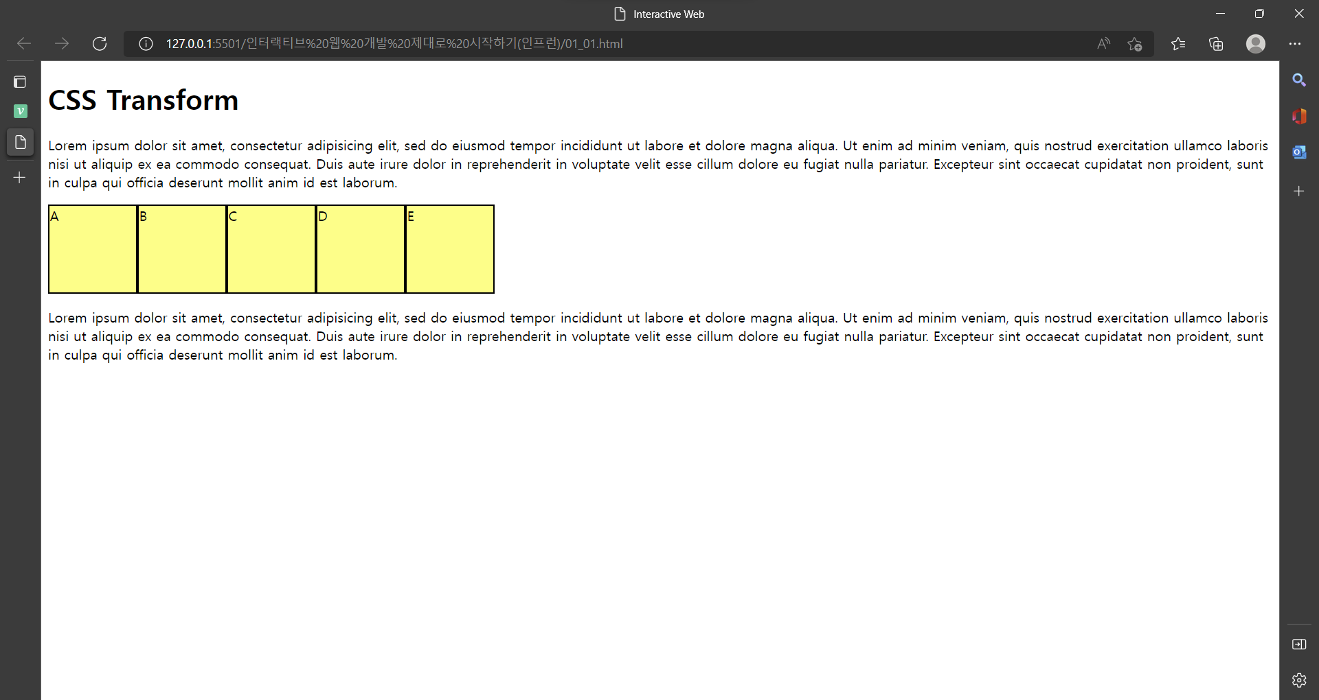
<div class="box-container">
<div class="box">A</div>
<div class="box">B</div>
<div class="box">C</div>
<div class="box">D</div>
<div class="box">E</div>
</div>
<p>Lorem ipsum dolor sit amet, consectetur adipisicing elit, sed do eiusmod tempor incididunt ut labore et dolore
magna aliqua. Ut enim ad minim veniam, quis nostrud exercitation ullamco laboris nisi ut aliquip ex ea commodo
consequat. Duis aute irure dolor in reprehenderit in voluptate velit esse cillum dolore eu fugiat nulla pariatur.
Excepteur sint occaecat cupidatat non proident, sunt in culpa qui officia deserunt mollit anim id est laborum.</p>
</body>
</html>- 기본 화면
> transform ex)
마우스를 박스위에 올리면 css style 태그 안에
.box:hover 작동 -> transform: scale(2) rotate(15deg); 로 변경
<style>
.box {
      width: 100px;
      height: 100px;
      border: 2px solid black;
      background: rgba(255, 255, 0, 0.7);

      /* transition 구현 */
      /* transition: 1s linear; 가속도 없음 */
      /* transition: 1s cubic-bezier(0.81, 0.47, 0.51, 1.78); 크롬 개발자 도구 이용해 수정가능*/
      /* transition: 1s 1s;  딜레이 효과*/
      transition: 2s;
    }
.box:hover {
      background: RED;
      /* 2배 확대, 15deg 회전 */
      transform: scale(2) rotate(15deg);
     }
</style>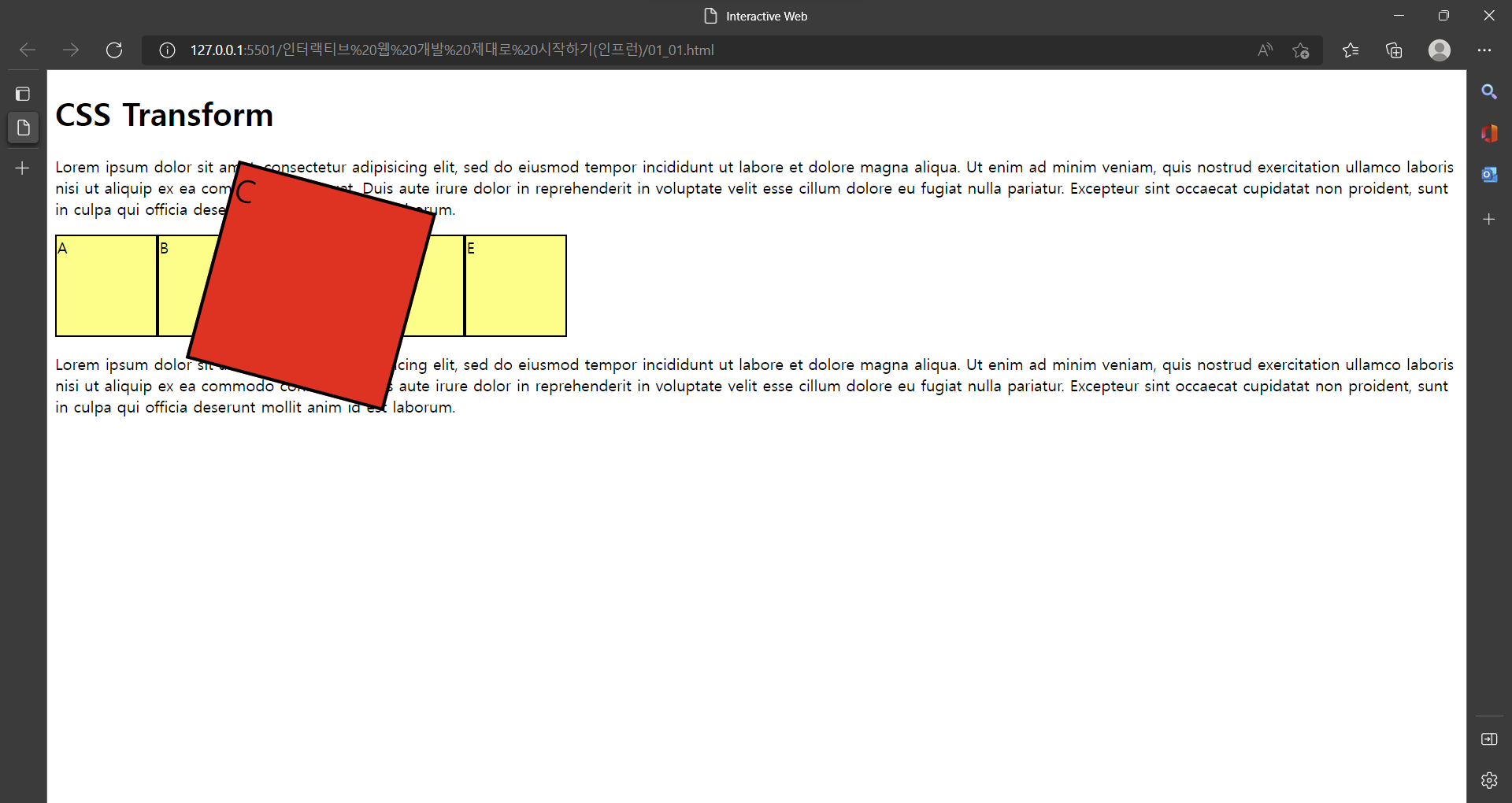
transform 속성 ex)
- transform: scale(2); == 확대
- transform: rotate(15deg); == 회전
- transform: skewY(-30deg); == 비틀기
- transform: translate(30px, 10px); == 이동(x, y)
- transform-origin: left top; == 기준점 변경
- transform-origin: 100% 100%; == 기준점 변경
2. CSS Transition
- transition ex)
마우스를 박스위에 올리면 css style 태그 안에
.box:hover 작동 -> width: 200px & background: RED 로 변경
.box 내 transition: 2s 속성에 의해 2초동안 부드럽게 transform 변경
<style>
.box {
      width: 100px;
      height: 100px;
      border: 2px solid black;
      background: rgba(255, 255, 0, 0.7);
      /* transition 구현 */
      /* transition: 1s linear; 가속도 없음 */
      /* transition: 1s cubic-bezier(0.81, 0.47, 0.51, 1.78); 크롬 개발자 도구 이용해 수정가능*/
      /* transition: 1s 1s;  딜레이 효과*/
      transition: 2s;
    }
.box:hover {
      width: 200px;
      background: RED;

      /* 확대 */
      /*transform: scale(2);*/
      /*transform: scale(2) rotate(15deg);*/
      /* 비틀기 */
      /* transform: skewY(-30deg);*/
      /* 이동(x, y) 만 */
      /* transform: translate(30px, 10px);  */
      /* transform: scale(1.5); */
      /*transform: rotate(30deg);*/
      /*기준점 변경*/
      /* transform-origin: left top;  */
      /*transform-origin: 100% 100%;*/
    }
</style>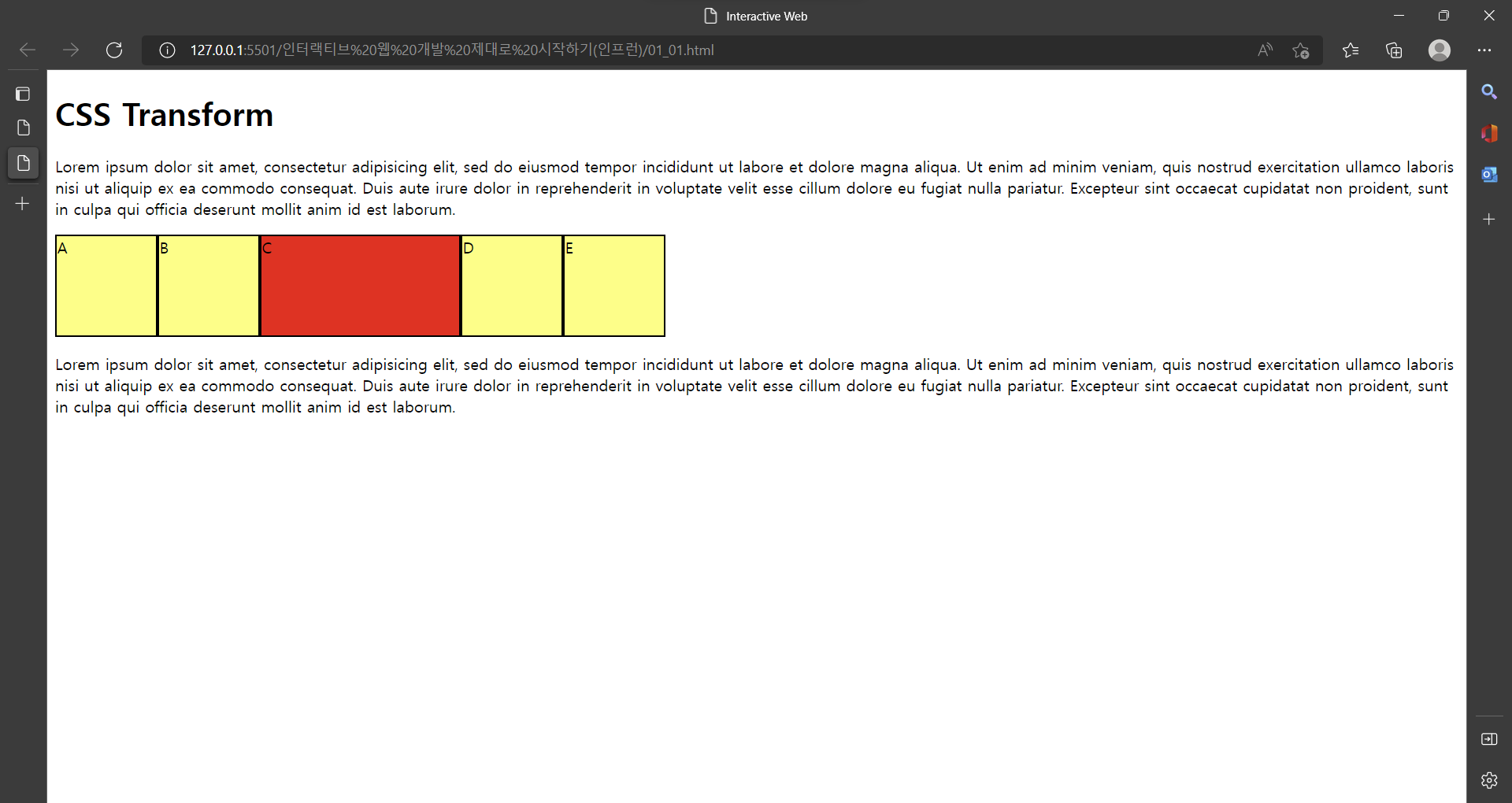
transition 속성 ex)
- transition: 2s;
- transition: 1s linear; == 가속도 없음
- transition: 1s cubic-bezier(0.81, 0.47, 0.51, 1.78);
== 크롬 개발자 도구 이용해 수정가능- transition: 1s 1s; == 딜레이 효과

이창목