Animation
- html
<!DOCTYPE html>
<html lang="en">
<head>
<meta charset="UTF-8">
<meta name="viewport" content="width=device-width, initial-scale=1.0">
<meta http-equiv="X-UA-Compatible" content="ie=edge">
<title>Interactive Web</title>
<style>
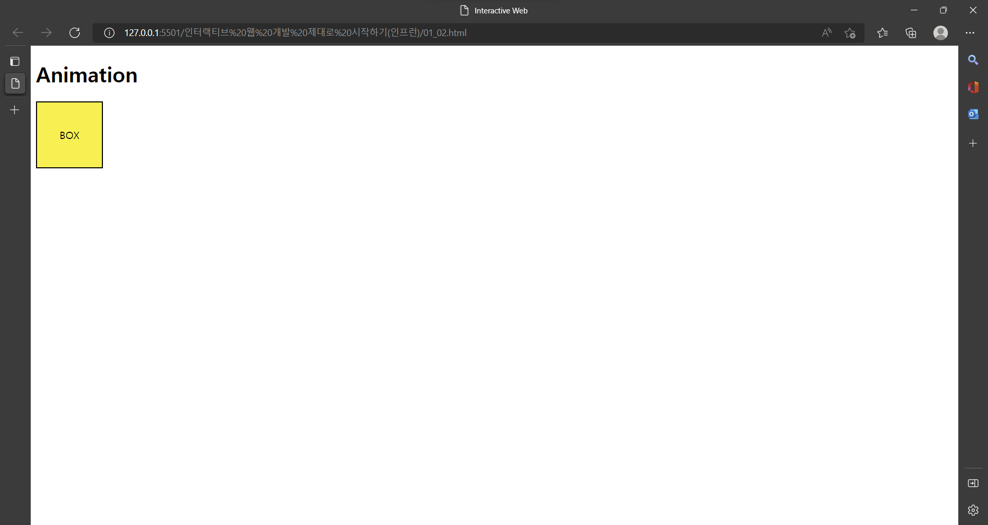
@keyframes sample-ani {
0% {
transform: translate(0, 0);
}
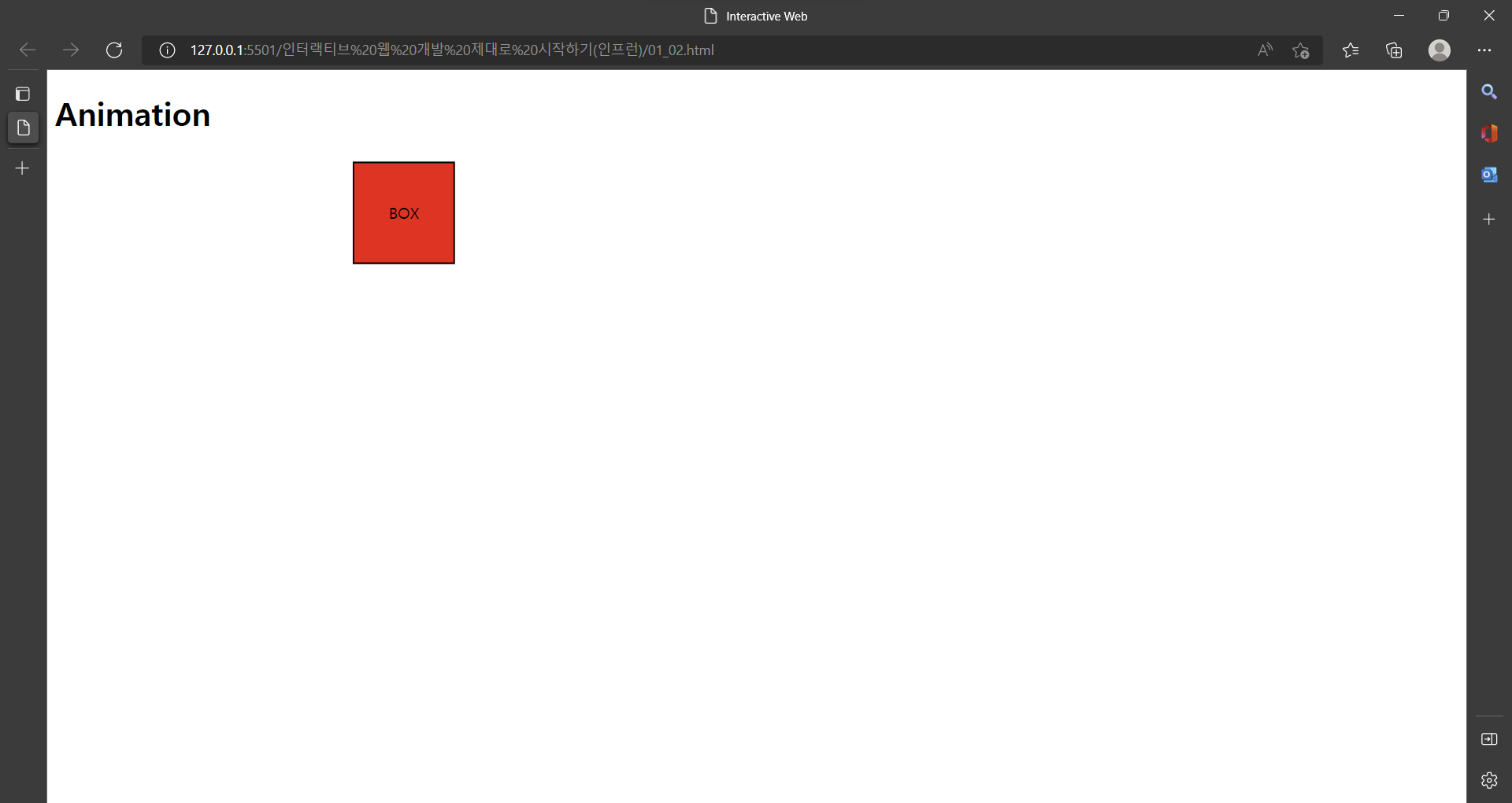
50% {
transform: translate(300px, 0);
background: red;
}
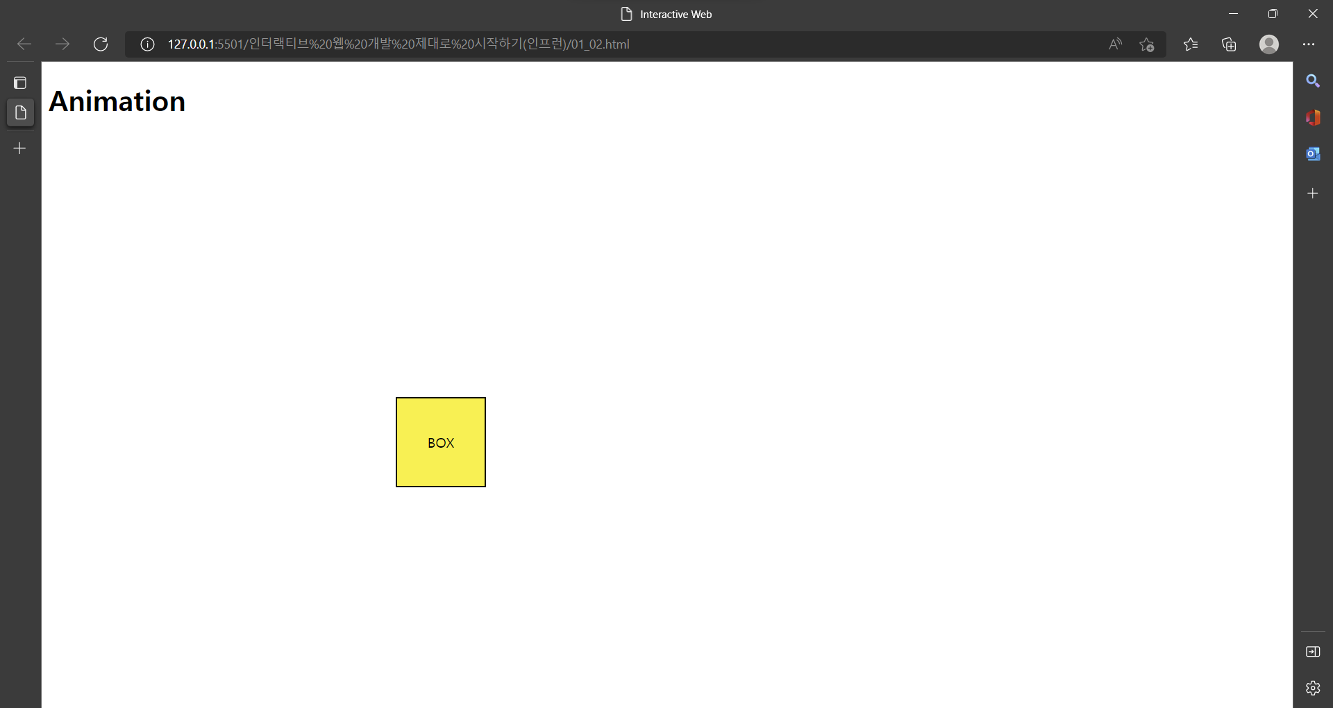
100% {
transform: translate(400px, 300px);
}
}
.box {
display: flex;
align-items: center;
justify-content: center;
width: 100px;
height: 100px;
border: 2px solid #000;
background: #fff000;
animation: sample-ani 3s linear forwards;
/* animation: sample-ani 3s linear infinite alternate; */
/* infinite, reverse, alternate-reverse 도 가능 */
}
.box:hover {
animation-play-state: paused;
}
</style>
</head>
<body>
<h1>Animation</h1>
<div class="box">
BOX
</div>
</body>
</html>- 시작화면(Animation 0%)
- Animation 50%
- Animation 100%
.box:hover { animation-play-state: paused; }
== 박스에 마우스 올리면 Animation 정지
  <style>
    @keyframes sample-ani {
      0% {
        transform: translate(0, 0);
      }

      50% {
        transform: translate(300px, 0);
        background: red;
      }

      100% {
        transform: translate(400px, 300px);
      }
    }

    .box {
      display: flex;
      align-items: center;
      justify-content: center;

      width: 100px;
      height: 100px;
      border: 2px solid #000;
      background: #fff000;

      animation: sample-ani 3s linear forwards;
      /* animation: sample-ani 3s linear infinite alternate; */
      /* infinite, reverse, alternate-reverse 도 가능 */

    }

    .box:hover {
      animation-play-state: paused;
    }
  </style>
Animation ex)
- animation: sample-ani 3s linear forwards;
=>
animation-duration: 3s; == 3초동안 실행
animation-timing-function: linear; == 가속도 없이
animation-fill-mode: forwards; == 동작이 끝난 자리에 그대로 머문다
- animation: sample-ani 3s linear infinite alternate;
=>
(infinite 속성 대신 reverse, alternate-reverse 도 가능)
animation-iteration-count: infinite; == 무한루프
animation-direction: alternate; == 왔다 갔다(왕복)
Animation keyframes
Animation 효과를 사용하려면 keyframes 사용
 <style>
    @keyframes sample-ani {
      0% {
        transform: translate(0, 0);
      }

      50% {
        transform: translate(300px, 0);
        background: red;
      }

      100% {
        transform: translate(400px, 300px);
      }
    }
  </style>
Animation의 실행 퍼센트 마다 효과를 입힐 수 있다.

이창목