Styled Components는 CSS in JS개념이 대두되면서 나온 라이브러리로 React환경에서 CSS를 컴포넌트화 시켜 사용할 수 있는 라이브러리다.
터미널에 아래의 명령어를 입력 후 설치되면 Styled Components를 사용할 파일 가장 상단에 import 해준다.
# npm
$ npm install --save styled-components

# yarn
$ yarn add styled-components
import styled from "styled-components"Styled Components 사용법
1. 컴포넌트 만들기
const 컴포넌트이름 = stled.태그종류 `
	css속성1 : 속성값;
	css속성2 : 속성값;
`
Styled Components은 Templete Literals 문법을 사용하기 때문에 백틱을 사용한다.
컴포넌트를 선언한 후 styled.태그종류를 할당하고 백틱 안에 기존 CSS문법을 작성한다. 이렇게 만든 컴포넌트를 React 컴포넌트를 사용하듯 리턴문 안에 작성해 주면 스타일이 적용된 컴포넌트가 렌더 된다.
import styled from "styled-components";
//Styled Components로 컴포넌트를 만들고
const BlueButton = styled.button`
background-color: blue;
color: white;
`;
export default function App() {
// React 컴포넌트를 사용하듯이 사용하면 됩니다.
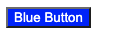
return <BlueButton>Blue Button</BlueButton>;
}
2. 컴포넌트를 재활용해서 새로운 컴포넌트 만들기
const 컴포넌트이름 = stled(재활용할 컴포넌트) `
	추가할 css속성1 : 속성값;
	추가할 css속성2 : 속성값;
`
이미 만들어진 컴포넌트을 재활용해 새로운 컴포넌트를 만들 수 있다. 컴포넌트를 선언하고 styled()에 재활용할 컴포넌트를 전달해 준 뒤, 추가하고싶은 속성들을 넣어준다.
import styled from "styled-components";
const BlueButton = styled.button`
background-color: blue;
color: white;
`;
//만들어진 컴포넌트를 재활용해 컴포넌트를 만들 수 있습니다.
const BigBlueButton = styled(BlueButton)`
padding: 10px;
margin-top: 10px;
`;
//재활용한 컴포넌트를 재활용할 수도 있습니다.
const BigRedButton = styled(BigBlueButton)`
background-color: red;
`;
export default function App() {
return (
<>
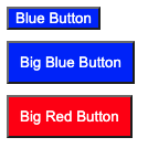
<BlueButton>Blue Button</BlueButton>
<br />
<BigBlueButton>Big Blue Button</BigBlueButton>
<br />
<BigRedButton>Big Red Button</BigRedButton>
</>
);
}
3. Props 활용하기
Styled Component로 만든 컴포넌트도 React 컴포넌트처럼 props를 내려줄 수 있다. 내려준 props 값에 따라서 컴포넌트를 렌더링 하는 것도 가능하다.
const 컴포넌트이름 = styled.태그종류`
	css속성 : ${(props)=>함수 코드}
`
템플릿 리터럴 문법을 사용해 JavaScript코드를 사용할 수 있다.
1) Props로 조건부 렌더링하기
const Button = styled.button`
	background: ${(props) => props.skyblue ? "skyblue" : "white"}
`
삼항 연산자를 이용해 <Button>컴포넌트에 skyblue라는 props가 있을 경우 배경색을 skyblue로, 아닐 시 배경색을 white로 지정 해주는 코드다.
import styled from "styled-components";
import GlobalStyle from "./GlobalStyle";
//받아온 prop에 따라 조건부 렌더링이 가능합니다.
const Button1 = styled.button`
background: ${(props) => (props.skyblue ? "skyblue" : "white")};
`;
export default function App() {
return (
<>
<GlobalStyle />
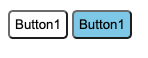
<Button1>Button1</Button1>
<Button1 skyblue>Button1</Button1>
</>
);
}
2) Props 값으로 렌더링하기
props의 값을 통째로 활용해서 컴포넌트 렌더링에 활용할 수 있다.
const Button = styled.button`
	backgroung: ${(props) => props.color ? props.color : "white"}
`props.color가 있으면 그대로 props.color를 사용하고 없다면 white로 배경색을 지정 한다.
꼭 삼항연산자만 사용해야되는것은 아니고 JavaScript코드라면 무엇이든 사용할 수 있다.
import styled from "styled-components";
import GlobalStyle from "./GlobalStyle";
//받아온 prop 값을 그대로 이용해 렌더링할 수도 있습니다
const Button1 = styled.button`
background: ${(props) => (props.color ? props.color : "white")};
`;
//다음과 같은 형식으로도 활용할 수 있습니다.
const Button2 = styled.button`
background: ${(props) => props.color || "white"};
`;
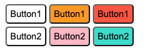
export default function App() {
return (
<>
<GlobalStyle />
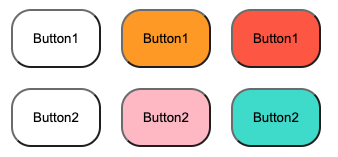
<Button1>Button1</Button1>
<Button1 color="orange">Button1</Button1>
<Button1 color="tomato">Button1</Button1>
<br />
<Button2>Button2</Button2>
<Button2 color="pink">Button2</Button2>
<Button2 color="turquoise">Button2</Button2>
</>
);
}
4. 전역 스타일 설정하기
전역 스타일을 설정하기 위해 Styled Components에서 createGlobalStyle 함수를 불러 온다.
import { createGlobalStyle } from "styled-components";그 후 createGlobalStyle함수를 이용해 전역 스타일을 주고싶은 속성값을 넣어준다.
const GlobalStyle = createGlobalStyle`
	button {
		padding : 20px;
    margin : 10px;
    border-radius : 20px;
	}
`
그 후 <GlobalStyle>컴포넌트를 최상위 컴포넌트로 위치시켜주면 적용 된다.
import styled from "styled-components";
// createGlobalStyle함수 불러오기
import { createGlobalStyle } from "styled-components";

// 설정하고 싶은 전역 스타일 지정
const GlobalStyle = createGlobalStyle`
	button {
		padding : 20px;
    margin : 10px;
    border-radius : 20px;
	}
`


const Button1 = styled.button`
  background: ${(props) => (props.color ? props.color : "white")};
`;

const Button2 = styled.button`
  background: ${(props) => props.color || "white"};
`;

export default function App() {
  return (
    <>
    // 전역 스타일을 적용시키고 싶은 컴포넌트들 제일 위에 위치
      <GlobalStyle />
      <Button1>Button1</Button1>
      <Button1 color="orange">Button1</Button1>
      <Button1 color="tomato">Button1</Button1>
      <br />
      <Button2>Button2</Button2>
      <Button2 color="pink">Button2</Button2>
      <Button2 color="turquoise">Button2</Button2>
    </>
  );
}