파이썬 환경 설정
- Vcode와 jupyter
(https://danbi-ncsoft.github.io/etc/2019/11/07/viva-vsc.html)
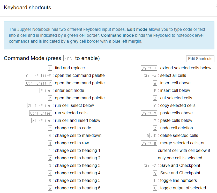
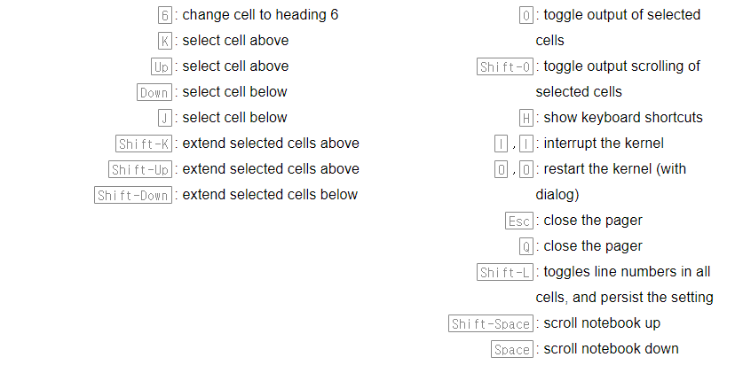
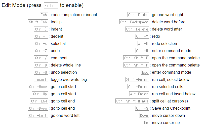
- jupyter 단축키
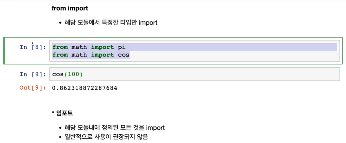
파이썬 모듈
아나콘다
- 파이썬 2.0과 3.0을 같은 컴퓨터에서 돌리고 싶을 때, 여러개의 실험실을 만들 수 있게 해주는 역할
consda create -n test python=3.6 anaconda //실험실 생성
conda activate test //실험실 입장
pip install selenium
pip list // pip로 설치한 모든게 다 뜸
- konlpy 설치
(https://konlpy-ko.readthedocs.io/ko/v0.4.3/install/)
- mecab 설치
(https://cleancode-ws.tistory.com/97)
데이터 시각화
시각화 라이브러리
-
시각화의 필요성
-
대량의 데이터 파악 가능
-
데이터의 패턴 파악 가능
-
-
matplotlib
-
pandas의 데이터 프레임, 시리즈 자료구조와 함께 사용 가능
-
따라서 데이터 처리와 동시에 시각화도 함께 진행 가능
-
아나콘다를 설치했다면 별도의 설치 과정 필요 x
-
-
사용법
-
import matplotlib.pyplot as plt -
from pandas import DataFrame -
from pandas import Series
-
# matplotlib 한글 폰트 출력코드
# 출처 : 데이터공방( https://kiddwannabe.blog.me)

import matplotlib
from matplotlib import font_manager, rc
import platform

try :
    if platform.system() == 'Windows':
    # 윈도우인 경우
        font_name = font_manager.FontProperties(fname="c:/Windows/Fonts/malgun.ttf").get_name()
        rc('font', family=font_name)
    else:
    # Mac 인 경우
        rc('font', family='AppleGothic')
except :
    pass
matplotlib.rcParams['axes.unicode_minus'] = False
데이터프레임 시각화
- 딕셔너리 부터 만들기
#데이터프레임 변수 생성
dict_data={"철수":[1,2,3,4],"영희":[2,3,4,5],"민수":[3,4,5,6],"수진":[4,5,6,7]}
df=DataFrame(dict_data)
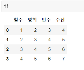
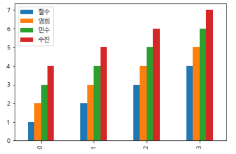
차트 그리기
- 선 그래프
df.plot()
plt.show()
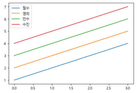
- 값은 y축 인덱스는 x축
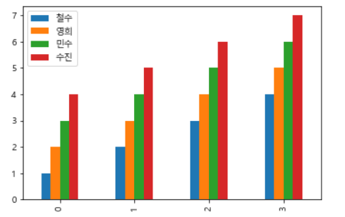
- 막대 그래프
df.plot.bar()
plt.show()
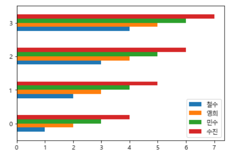
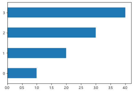
- 가로 막대 그래프
df.plot.barh()
plt.show()
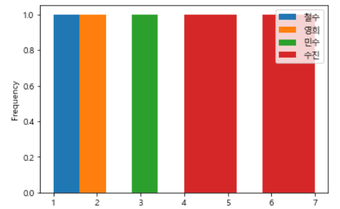
- 히스토그램
df.plot.hist()
plt.show()
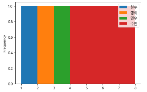
- 히스토그램 구간 설정
df.plot.hist(bins=range(1,9,1)) #1~8까지 하나씩
plt.show()
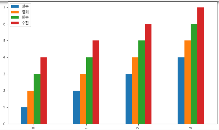
차트에 옵션 설정하기
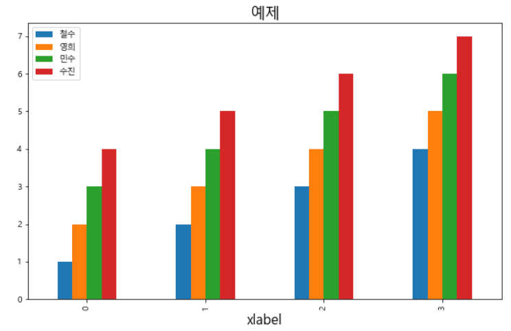
- 기본 막대 그래프
df.plot.bar()
plt.show()
- 그래프 크기 설정
df.plot.bar(figsize=[10,6]) #[x축, y축]
plt.show()
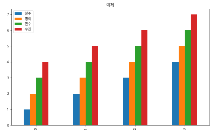
- 제목설정 & 제목 폰트 크기 설정
df.plot.bar(figsize=[10,6]) #[x축, y축]
plt.title('예제', fontsize = 18)
plt.show()
- x축 이름 및 폰트크기 설정
# x축 이름 및 폰트크기 설정

df.plot.bar(figsize=[10,6]) #[x축, y축]
plt.title('예제', fontsize = 18)
plt.xlabel('xlabel', fontsize = 16)
plt.show()
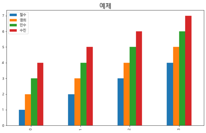
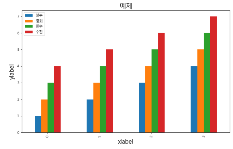
- y축 이름 및 폰트 크기 설정
df.plot.bar(figsize=[10,6]) #[x축, y축]
plt.title('예제', fontsize = 18)
plt.xlabel('xlabel', fontsize = 16)
plt.ylabel('ylabel', fontsize = 16)
plt.show()
-
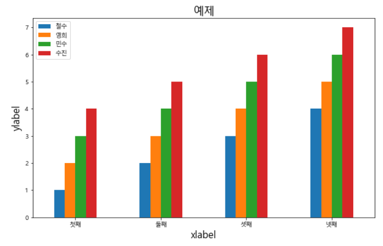
x축 눈금설정
- 설정할 눈금의 위치, 눈금의 이름, 폰트사이즈, 각도
df.plot.bar(figsize=[10,6]) #[x축, y축]
plt.title('예제', fontsize = 18)
plt.xlabel('xlabel', fontsize = 16)
plt.ylabel('ylabel', fontsize = 16)
plt.xticks([0,1,2,3], ['첫째','둘째','셋째','넷째'], fontsize=10, rotation=0)
plt.show()
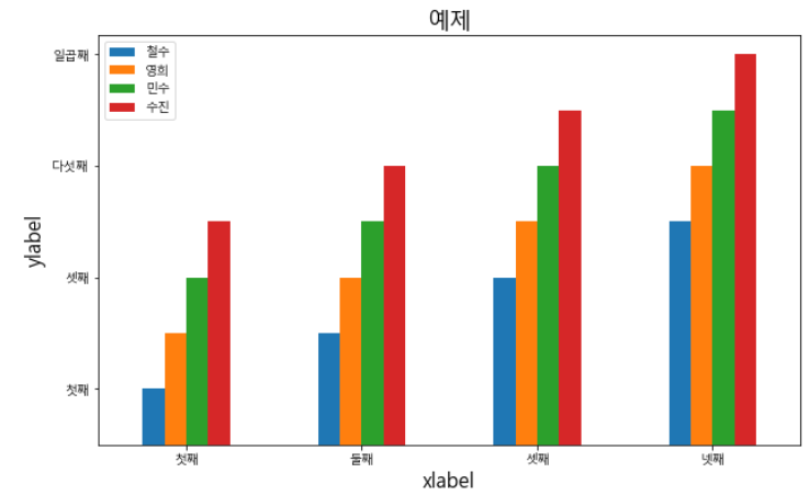
- y축 눈금설정
df.plot.bar(figsize=[10,6]) #[x축, y축]
plt.title('예제', fontsize = 18)
plt.xlabel('xlabel', fontsize = 16)
plt.ylabel('ylabel', fontsize = 16)
plt.xticks([0,1,2,3], ['첫째','둘째','셋째','넷째'], fontsize=10, rotation=0)
plt.yticks([1,3,5,7], ['첫째','셋째','다섯째', '일곱째'], fontsize=10, rotation=0)
plt.show()
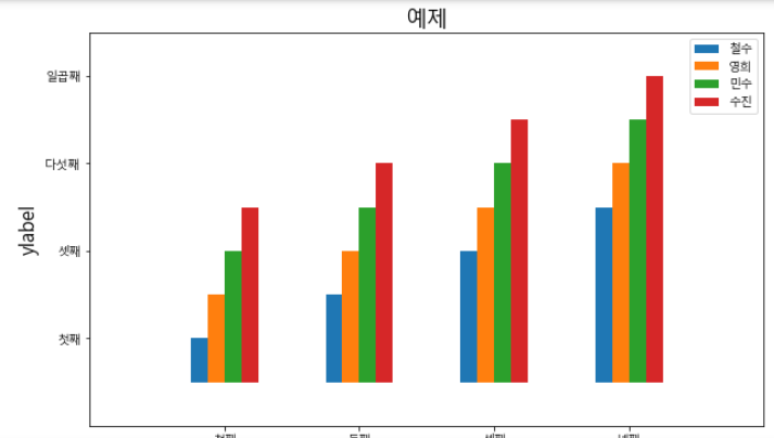
- x축 범위설정
df.plot.bar(figsize=[10,6]) #[x축, y축]
plt.title('예제', fontsize = 18)
plt.xlabel('xlabel', fontsize = 16)
plt.ylabel('ylabel', fontsize = 16)
plt.xticks([0,1,2,3], ['첫째','둘째','셋째','넷째'], fontsize=10, rotation=0)
plt.yticks([1,3,5,7], ['첫째','셋째','다섯째', '일곱째'], fontsize=10, rotation=0)
plt.xlim([-1,4]) #맨 처음과 마지막에 공간이 생김
plt.show()
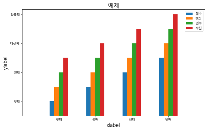
- y축 범위설정
df.plot.bar(figsize=[10,6]) #[x축, y축]
plt.title('예제', fontsize = 18)
plt.xlabel('xlabel', fontsize = 16)
plt.ylabel('ylabel', fontsize = 16)
plt.xticks([0,1,2,3], ['첫째','둘째','셋째','넷째'], fontsize=10, rotation=0)
plt.yticks([1,3,5,7], ['첫째','셋째','다섯째', '일곱째'], fontsize=10, rotation=0)
plt.xlim([-1,4]) #맨 처음과 마지막에 공간이 생김
plt.ylim([-1,8])
plt.show()
시리즈 시각화
- 차트 옵션 추가하는 것은 위와 동일
# 데이터프레임 열 = 시리즈
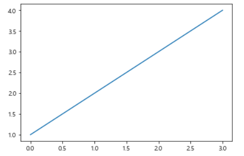
df['철수']
- 선그래프
df['철수'].plot()
plt.show()
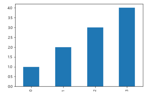
- 막대 그래프
df['철수'].plot.bar()
plt.show()
- 가로 막대 그래프
df['철수'].plot.barh()
plt.show()
- 히스토그램 (구간 설정)
df['철수'].plot.hist(1,6,1) #철수 한명이기에 꽉차게 나옴
plt.show()
For the sake of someone who studies computer science