4장 스타일링 소개
1. 리액트 네이티브에서 스타일 적용하고 관리하기
앱에서 스타일 적용하기
-
세계에서 가장 멋진 앱을 만들 필요는 없지만, 스타일이 잘 다듬어진 앱을 만들도록 해야 합니다.
-
스타일이 잘 다듬어진 앱은 사용자의 앱의 품질에 대한 인식에 지대한 영향을 미칩니다.
인라인 스타일
import React from 'react';
import { StyleSheet, Text, View } from 'react-native';

export default function App() {
  return (
    <View style={{marginLeft: 20, marginTop: 20}}>
      <Text> SomeText </Text>
    </View>
  );
}
StyleSheet에 정의된 스타일
import React from 'react';
import { StyleSheet, Text, View } from 'react-native';

export default function App() {
  return (
    <View style={styles.container}>
      <Text>Open up App.js to start working on your app!</Text>
      <StatusBar style="auto" />
    </View>
  );
}

const styles = StyleSheet.create({
  container: {
    flex: 1,
    backgroundColor: '#fff',
    alignItems: 'center',
    justifyContent: 'center',
  },
});-
StyleSheet에서는 style 객체를 생성해서 각 스타일을 개별적으로 참조합니다.
-
render 메서드에서 스타일을 별도로 분리하는 것이 코드를 더 이해하기 쉽고 다른 컴포넌트에서 재사용할 수도 있습니다.
-
인라인 스타일을 사용하는 것보다 스타일시트로 한 곳에서 스타일을 관리하는 것이 전체 앱의 스타일을 관리하는 데 쉽습니다.
-
style 속성 배열로 다양한 스타일을 지정할 때, 중복된 property가 있을 때, 마지막으로 전달된 스타일이 이전 스타일을 재정의 한다.
-
인라인, 스타일시트를 동시에 사용하도록 배열로 지정하는 것도 가능하다.
style={[{color: 'black'}, styles.message]}
스타일 시트로 스타일을 관리했을 때 장점
-
코드베이스(codevase)만 분리해서 관리
-
다른 컴포넌트에서 스타일 재사용
-
개발 할 때 스타일 변경이 쉬움
스타일 구성하기
-
웹에서는 스타일은 본질적으로 모든 페이지에 적용될 수 있지만, 리액트 네이티브는 그렇지 않다.
-
리액트 네이티브는 컴포넌트가 중심이 된다.
-
컴포넌트를 가능한 한 재사용가능하고 독립적으로 만드는 것을 목표로 한다.
-
컴포넌트를 앱의 스타일시트에 의존적으로 만드는 것은 컴포넌트를 이용하는 모듈화에 반하는 것이 된다.
-
리액트 네이티브의 스타일 범위는 전체 앱이 아니라 컴포넌트이다.
-
-
리액트 네이티브 커뮤니티에서 사용하는 두가지 일반적인 방법
- 컴포넌트 내에 스타일시트 선언하기
- 컴포넌트 파일과는 별도의 스타일 시트 선언하기
- 컴포넌트 내에 스타일시트 선언하기
컴포넌트 내에 스타일시트 선언하기
- 스타일시트를 컴포넌트 내에 선언해서 사용
- 하나의 파일에 컴포넌트와 컴포넌트가 사용할 스타일을 완전히 캡슐화 할 수 있다는 장점
- 컴포넌트 내에 스타일시트를 선언할 때 전형적인 방법은 스타일을 컴포넌트 이후에 지정하는 것
컴포넌트 파일과는 별도의 스타일 시트 선언하기
-
전형적인 이름은 styles.js
- 여기서 명심할 점은 확장자는 .js 여야 한다는 점이다.
-
스타일시트와 컴포넌트 파일을 같은 폴더 내에 저장
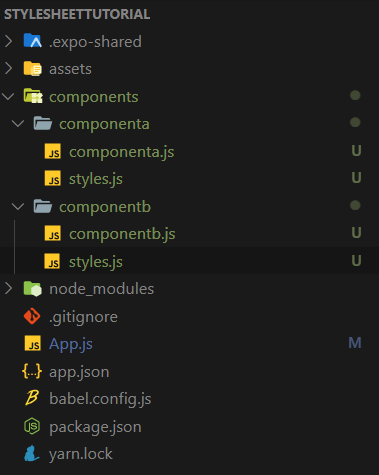
<컴포넌트의 스타일시트를 외부로 분리(component 폴더 내의 styles.js)>
import {StyleSheet} from 'react-native';

    //styles 상수에 스타일 생성
const styles = StyleSheet.create({

    //container스타일을 생성하고, 컴포넌트에서는 styles.container로 참조
    container:{
        marginTop: 150,
        backgroundColor: '#ededed',
        flexWrap: 'wrap'
    }
});

const buttons = StyleSheet.create({
    primary:{
        flex: 1,
        height: 70,
        backgroundColor: 'red',
        justifyContent: 'center',
        alignItems: 'center',
        marginLeft: 20,
        marginRight: 20
    }
});

//styles와 buttons 모두 export 해서 외부에서 사용할 수있도록 한다.
export {styles, buttons}
<외부 스타일시트 가져오기>
...
import {styles, buttons} from './component/styles'

export default function App() {
  return (
    <View style={styles.container}>
      <TouchableHighlight style={buttons.primary}>
        <Text> SomeText </Text>
      </TouchableHighlight>
    </View>
  );
}
스타일과 코드
-
지금까지의 스타일은 정적(static)이었다. 하지만, 반드시 그럴 필요는 없다.
-
웹 개발자는 CSS와 계속 씨름해 왓고, 캐스케이딩(Cascading) 스타일시트의 많은 문제점을 해결하려고 Sass, Less, PostCSS와 같은 새로운 기술이 만들어졌다.
-
CSS 전처리기 없이는 웹 사이트 주 색상을 변수에 정의하는 것과 같은 단순한 일도 할 수 없었다.
-
2015.12 사용자 정의 속성 개념이 도입되었다.
-
사용자 정의 속성은 변수와 유사하다.
-
80% 정도의 브라우저에서 이 기능을 지원한다.
-
흰색과 검은색 두 개의 테마를 지원하는 간단한 앱 만들기
<컴포넌트 파일에서 사용하게 될 외부로 분리한 스타일 (styles.js)>
import {StyleSheet} from 'react-native';

export const Colors = {
    dark: 'black',
    light: 'white'
};

const baseContainerStyles = {
    flex: 1,
    justifyContent: 'center',
    alignItems: 'center'

};

const baseBoxStyles = {
    justifyContent: 'center',
    alignItems: 'center',
    borderWidth: 2,
    height: 150,
    width: 150
};

const lightStyleSheet = StyleSheet.create({
    container:{
        ...baseContainerStyles,
        backgroundColor: Colors.light
    },
    box:{
        ...baseBoxStyles,
        borderColor: Colors.dark
    }
});

const darkStyleSheet = StyleSheet.create({
    container:{
        ...baseContainerStyles,
        backgroundColor: Colors.dark
    },
    box:{
        ...baseBoxStyles,
        borderColor: Color.light

    }
});

//Boolean 값에 따라 해당하는 테마를 반환하는 함수
export default function getStyleSheet(useDarkTheme){
    return useDarkTheme ? darkStyleSheet : lightStyleSheet;
}
<밝은색과 어두운색 테마를 토글하는 앱>
import { StatusBar } from 'expo-status-bar';
import React,{Component} from 'react';
import { Button, StyleSheet, Text, View } from 'react-native';

import getStyleSheet from './styles';

export default class App extends Component {
  constructor(props){
    super(props);

    this.state = {
      darkTheme:false
    }

    //예외가 발생하지 않도록 toggleTheme 함수를 컴포넌트에 bind
    this.toggleTheme = this.toggleTheme.bind(this);

  };

  toggleTheme(){
    this.setState({darkTheme: !this.state.darkTheme});
  }

  render(){

    //표시할 테마에 적합한 스타일시트를 가져오기 위해 getStyleSheet 함수 사용
    const styles = getStyleSheet(this.state.darkTheme);
    const backgroundColor = StyleSheet.flatten(styles.container).backgroundColor;

    return(
      <View style={styles.container}>
        <View style={styles.box}>
          <Button title={backgroundColor} onPress={this.toggleTheme}/>
        </View>
      </View>

    );
  }
}

2. View 컴포넌트에 스타일 적용하기
View 컴포넌트는 UI의 주요 조립 블록이며 스타일을 올바로 사용하기 위해서 알아야 할 가장 중요한 컴포넌트 중 하나입니다.
- View 컴포넌트는 다른 요소를 감싸고 View 컴포넌트 내에 UI 코드블록을 만들 수 있다는 점에서 HTML의 div 태그와 유사합니다.
<프로필 카드 컴포넌트를 만들면서 배우는 내용>
-
borderWidth를 이용해 profile 컨테이너에 테두리(border) 만들기
-
borderRadius를 이용해 테두리의 모서리(corner of border) 둥글게 하기(round)
-
컴포넌트 폭의 반 크기인 borderRadius 값을 이요해서 원처럼 보이는 테두리 만들기
-
margin 과 padding 속성을 이용해 위치 지정(position) 하기
배경색 설정하기
-
backgroundColor 속성
-
지원되는 컬러의 지정 형식
-
#rgb - '#06f'
-
#rgba - '#06fc'
-
#rrggbb - '#0066ff'
-
#rrggbbaa - '#ff00ff00'
-
rgb(숫자, 숫자, 숫자) - 'rgb(0, 102, 255)'
-
rgb(숫자, 숫자, 숫자, 알파 값) - 'rgba(0, 102, 255, 5)'
-
hsl(색상, 채도, 명도) - 'hsl(216, 100%, 50%)'
-
hsla(색상, 채도, 명도, 알파 값) - 'hsla(216, 100%, 50%, .5)'
-
투명 배경 - 'transparent'
-
CSS3 지정 색 이름(black, red, blue 외) - 'dodgerblue'
-
-
rgb는 빨간색, 녹색, 파란색을 의미하며, 0-255(00-FF, 16진수)까지의 숫자를 이용해서 각 색의 값을 지정할 수 있으며 더 높은 숫자가 짙은 농도를 의미합니다.
-
alpha는 투명도와 유사합니다. (0은 투명 1은 선명)
-
hue은 360도로 구성된 색상환(color wheel)의 1도를 의미합니다.
- 0은 빨간색, 120은 녹색, 240은 파란색입니다.
-
saturation은 색상의 강도이며, 회색 음영인 0%부터 선명한 색상인 100%까지 사용할 수 있습니다.
-
lightness는 0%에서 100%까지의 값으로 0%는 검은색에 가까운 어두운색이고, 100%는 흰색에 가까운 밝은 색입니다.
<Profile Card 컴포넌트를 위한 초기 형태>
import { StatusBar } from 'expo-status-bar';
import React from 'react';
import { StyleSheet, Text, View } from 'react-native';

export default class App extends Component{

  render(){
    return(
      <View style={StyleSheet.container}>
        <View style={StyleSheet.cardContainer}/>
      </View>
    );
  }
}

const profileCardColor = 'dodgerblue';

const styles = StyleSheet.create({
  container:{
    flex:1,
    justifyContent: 'center',
    alignItems:'center'
  },
  cardContainer:{
    //상수로 정의된 값을 이용해서 스타일 속성값을 쉽게 사용
    backgroundColor: profileCardColor,
    width:300,
    height: 400

  }
});
-
첫 번째 View 컴포넌트는 가장 바깥쪽을 구성하는 요소이다.
-
이 View 컴포넌트는 다른 모든 컴포넌트의 컨테이너 역할을 하며 디바이스의 화면에서 자식 컴포넌트를 중앙 정렬하기 위해 사용합니다.
-
지금은 300 * 400 크기의 색상이 있는 직사각형일 뿐이지만, 두 번째 View 컴포넌트는 프로필 카드의 컨테이너입니다.
-
border 속성 지정하기
컴포넌트 사이의 명확한 윤곽이 있어야 사용자가 모바일 앱을 어떻게 이용할 수 있는지 알 수 있게 됩니다.
컴포넌트 주위에 테두리를 더하는 것이 화면의 요소들을 구체적이며 실제로 느낄 수 있는 가장 확실한 방법입니다.
border 속성의 종류
-
borderColor
- borderTopColor
- borderRightColor
- borderBottomColor
- borderLeftColor
-
borderRadius
- borderTopRightRadius
- borderBottomRightRadius
- borderBottomLeftRadius
- borderTopLeftRadius
-
borderStyle
- 모든 모서리에 공통으로 하나만 적용된다.
-
borderWidth
- borderTopWidth
- borderRightWidth
- borderBottomWidth
- borderLeftWidth
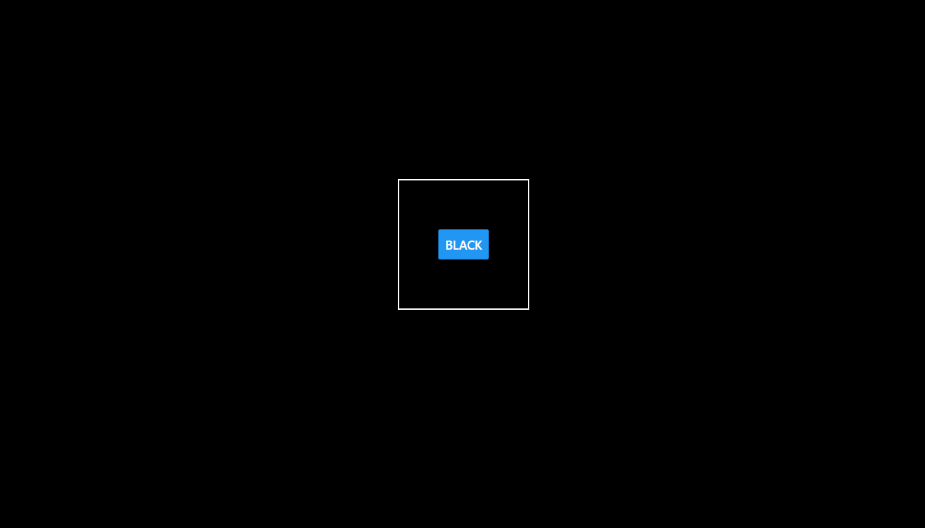
color, width, style 속성으로 테두리 만들기
import { StatusBar } from 'expo-status-bar';
import React, {Component} from 'react';
import { StyleSheet, Text, View } from 'react-native';

export default class App extends Component{

  render(){
    <View style={styles.container}>
      <Example style={{borderWidth:1}}>
        <Text>borderWidth: 1</Text>
      </Example>
      <Example style={{borderWidth:3, borderLeftWidth: 0}}>
        <Text>borderWidth: 3, borderLeftWidth: 0 </Text>
      </Example>
      <Example style={{borderWidth:3, borderLeftColor:'red'}}>
        <Text>borderWidth:3, borderLeftColor:'red'</Text>
      </Example>

      <Example style={{borderLeftWidth: 3}}>
        <Text>borderLeftWidth: 3</Text>
      </Example>

      <Example style={{borderWidth:1, borderStyle:'dashed'}}>
        <Text>borderWidth:1, borderStyle:'dashed'</Text>
      </Example>
    </View>
  }
}

//재사용할 수 있는 Example 컴포넌트, 기본 스타일 속성을 전달된 스타일 속성으로 쉽게 오버라이드 할 수 있음
const Example = (props) => (
  <View style={[styles.example, props.style]}>
    {props.children}
  </View>
);


const styles = StyleSheet.create({
  container:{
    flex:1,
    justifyContent: 'center',
    alignItems:'center'
  },
  example:{
    marginBottom: 15
  },
});
테두리를 지정하려면 먼저 borderWidth를 지정해야 합니다.
-
borderWidth 속성만 지정하면, 기본적으로borderColor 속성은 'black;으로 borderStyle은 'solid'로 지정됩니다.
- borderStyle 속성은 'dotted' 또는 'dashed'로 지정하고 각 측면의 테두리 폭을 변경하려면 오류가 발생한다.
-
스타일에서는 세부적인 속성이 일반적인 속성보다 우선순위가 높습니다.
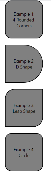
borderRadius를 이용해서 모양 만들기
-
borderRadius 속성을 이용해서 요소의 테두리를 얼마나 둥글게 만들지 정의할 수 있습니다.
-
borderRadius 속성은 전체 모서리에 적용됩니다.
-
세부적인 속성 지정하지 않고 borderRadius 속성을 지정하면 네 곳의 모서리가 모두 둥글게 됩니다.
-
가장 신경 써야 할 부분은 도형에 나타나는 글자를 너무 크거나 길게 하지 않는 것입니다.
import { StatusBar } from 'expo-status-bar';
import React, {Component} from 'react';
import { StyleSheet, Text, View } from 'react-native';

export default class App extends Component{

  render(){
    return(
      <View style={styles.container}>
        <Example style={{borderRadius: 20}}>
          <CenteredText>
             Example 1:{"\n"}4 Rounded Corners
          </CenteredText>
        </Example>

        <Example style={{borderTopRightRadius: 60, borderBottomRightRadius: 60}}>
          <CenteredText>
             Example 2:{"\n"}D Shape
          </CenteredText>
        </Example>

        <Example style={{borderTopLeftRadius: 30, borderBottomRightRadius: 30}}>
          <CenteredText>
             Example 3:{"\n"}Leap Shape
          </CenteredText>
        </Example>

        <Example style={{borderRadius: 20}}>
          <CenteredText>
             Example 4:{"\n"}Circle
          </CenteredText>
        </Example>

      </View>
    );
  }
}

//재사용할 수 있는 Example 컴포넌트, 기본 스타일 속성을 전달된 스타일 속성으로 쉽게 오버라이드 할 수 있음
const Example = (props) => (
  <View style={[styles.example, props.style]}>
    {props.children}
  </View>
);

const CenteredText = (props) =>(
  <Text style={[styles.centeredText, props.style]}>
    {props.children}
  </Text>
)

const styles = StyleSheet.create({
  container:{
    flex:1,
    flexDirection: 'row',
    flexWrap: 'wrap',
    marginTop: 75
  },
  example:{
    width: 120,
    height: 120,
    marginLeft: 20,
    marginBottom: 20,
    backgroundColor:'grey',
    borderWidth: 2,
    justifyContent: 'center'
  },
  centeredText:{
    textAlign: 'center',
    margin: 10
  }
});
-
기본적으로 Text 컴포넌트는 부모 컴포넌트의 배경색을 상속합니다.
Text 컴포넌트의 bounding box(기본적인 영역)는 사각형이기 때문에 배경이 둥근 테두리와 겹치게 됩니다.- centeredTex 스타일에 margin:10 대신 padding: 10을 이용한 결과 원은 Text 컴포넌트의 bounding box가 View 컴포넌트의 테두리와 겹치는 위치를 표시한다.
margin 속성을 이용해서 이 문제를 해결할 수도 있지만 다른 방법으로 이 문제를 해결할 수 있다.
centeredText 스타일에 backgroundColor: 'transparent' 를 추가해도 이 문제를 해결할 수 있습니다.
프로필 카드 컴포넌트에 테두리 추가하기
<프로필 카드에 border 속성 적용하기>
import { StatusBar } from 'expo-status-bar';
import React, {Component} from 'react';
import { StyleSheet, Text, View, Image } from 'react-native';

export default class App extends Component{

  render(){
    return(
      <View style={styles.container}>
        <View style={styles.cardContainer}>
          <View style={styles.cardImageContainer}>
          <Image style={styles.cardImage} source={require('./user.jpg')}/>
          </View>
        </View>
      </View>
    );
  }
}

const profileCardColor = 'dodgerblue';

const styles = StyleSheet.create({
  container:{
    flex:1,
    justifyContent: 'center',
    alignItems:'center'
  },
  cardContainer:{
    //상수로 정의된 값을 이용해서 스타일 속성값을 쉽게 사용
    backgroundColor: profileCardColor,
    borderColor: 'black',
    borderWidth: 3,
    borderStyle: 'solid',
    borderRadius: 20,
    width:300,
    height: 400,


  },
  cardImageContainer:{
    backgroundColor:'white',
    borderWidth: 3,
    borderColor: 'black',
    width: 120,
    height: 120,
    borderRadius: 60,
  },
  cardImage: {
    width: 80,
    height: 80
  }
});
마진(margin)과 패딩(padding) 지정하기
화면의 모든 컴포넌트의 위치를 여러분이 원하는 곳에 놓을 수 있도록 명시적으로 지정할 수도 있지만, 이런 방법은 반응형으로 동작하는 레이아웃이 필요할 때는 아주 복잡하고 지루한 일이 될 것입니다.
이럴 때는 각 컴포넌트의 위치를 다른 컴포넌트의 위치에 상대적으로 지정해서 한 컴포넌트를 이동하면 각 컴포넌트의 상태 위치에 따라 다른 컴포넌트가 움직이는 것이 좀 더 합리적입니다.
마진(margin)
-
마진을 이용해서 각 컴포넌트 사이의 위치를 상대적으로 정의할 수 있다.
-
margin 속성으로 컴포넌트의 주변 둘레를 정의할 수 있으며, 이를 통해 한 컴포넌트의 이전 컴포넌트 또는 부모 컴포넌트로부터의 간격을 결정한다.
-
이런 방법으로 컴포넌트를 연결하면 컴포넌트와 다른 컴포넌트들이 서로 어디에 위치해야 하는지 상대적으로 배치할 수 있어서 개별적으로 컴포넌트의 위치를 계산하는 방식보다 위치를 파악하기 쉽다.
-
세부 속성
-
margin
-
marginTop
-
marginRight
-
marginBottom
-
marginLeft
-
-
margin 속성과 세밀한 속성이 둘 다 지정된 경우에는 세밀한 속성이 우선적으로 적용된다.
-
margin은 모든 컴포넌트를 예상대로 위치시키지만, 안드로이드 디바이스에서 음수 마진(negative margin)이 적용될 때 리액트 네이티브의 버전이 낮은 경우에는 컴포넌트가 클립핑(clipping)되는 경우가 발생한다.
- 따라서, iOS와 안드로이드 모두 지원할 계획인 경우에는 프로젝트의 처음부터 각 디바이스에서 테스트를 해보아야 한다.
padding 속성 이용하기
-
패딩은 하나의 요소 내에서 테두리로부터 요소 안이 내용물까지의 간격을 의미한다.
-
패딩을 지정하면, 컴포넌트 내용이 해당 컴포선의 경계선에 제한되지 않도록 할 수 있다.
-
세부 속성
-
padding
-
paddingLeft
-
paddingRight
-
paddingTop
-
paddingBottom
-
- 컴포넌트와 부모 컴포넌트 사이의 공간을 지정하는 마진과 달리, 패딩은 컴포넌트의 테두리로부터 자식 엘리먼트에 적용됩니다.
position을 이용해서 컴포넌트 배치하기
기본적으로 리액트 네이티브에서 모든 요소는 다른 요소들에 상대적으로 배치됩니다.
-
relative(기본 값)
-
absolute
- 부모 요소의 위치를 기준으로 배치됩니다.
- top, right, bottom, left 속성을 사용할 수 있습니다.
프로필 카드의 위치 지정하기
<프로필 카드의 스타일을 수정해서 레이아웃을 변경함>
...

 cardContainer:{
    //상수로 정의된 값을 이용해서 스타일 속성값을 쉽게 사용
    backgroundColor: profileCardColor,
    borderColor: 'black',
    borderWidth: 3,
    borderStyle: 'solid',
    borderRadius: 20,
    alignItems:'center',
    width:300,
    height: 400,


  },
  cardImageContainer:{
    backgroundColor:'white',
    borderWidth: 3,
    borderColor: 'black',
    alignItems:'center',
    width: 120,
    height: 120,
    borderRadius: 60,
    marginTop:30,
    paddingTop: 15
  },

  ...
3. Text 컴포넌트에 스타일 적용하기
Text 컴포넌트 vs View 컴포넌트
View에서 사용되는 대부분의 스타일은 Text에서도 사용할 수 있지만, Text에서 지원하는 스타일은 대부분 View에서 사용할 수 없습니다.
Text에 색상 적용하기
- Text 컴포넌트의 color 속성은 View 컴포넌트와 동일하게 동작합니다.
<프로필 카드에 텍스트 추가하기>
import { StatusBar } from 'expo-status-bar';
import React, {Component} from 'react';
import { StyleSheet, Text, View, Image } from 'react-native';

export default class App extends Component{

  render(){
    return(
      <View style={styles.container}>
        <View style={styles.cardContainer}>
          <View style={styles.cardImageContainer}>
          <Image style={styles.cardImage} source={require('./user.jpg')}/>
          </View>

          <View>
          //인물 이름 보여주는 Text컴포넌트
            <Text style={styles.cardName}>
              Ahhyun Kim
            </Text>
          </View>
          <View style={styles.cardOccupationContainer}>
            //직업 표시
            <Text style={styles.cardOccupation}>
              Student
            </Text>
          </View>

          <View>
            //프로필 설정
            <Text style={styles.cardDescription}>
              Ahhyun is a College student. She likes Javascript and React.
              Therefore, She studying using JS and React.
            </Text>
          </View>
        </View>
      </View>
    );
  }
}

const profileCardColor = 'dodgerblue';

const styles = StyleSheet.create({
  container:{
    flex:1,
    justifyContent: 'center',
    alignItems:'center'
  },
  cardContainer:{
    //상수로 정의된 값을 이용해서 스타일 속성값을 쉽게 사용
    backgroundColor: profileCardColor,
    borderColor: 'black',
    borderWidth: 3,
    borderStyle: 'solid',
    borderRadius: 20,
    alignItems:'center',
    width:300,
    height: 400,


  },
  cardImageContainer:{
    backgroundColor:'white',
    borderWidth: 3,
    borderColor: 'black',
    alignItems:'center',
    width: 120,
    height: 120,
    borderRadius: 60,
    marginTop:30,
    paddingTop: 15
  },
  cardImage: {
    width: 80,
    height: 80
  },
  cardName: {
    color: 'white',
    marginTop: 30
  },
  cardOccupationContainer:{
    borderColor: 'black',
    borderWidth: 3,
    borderTopWidth: 0,
    borderRightWidth: 0,
    borderLeftWidth: 0,
  },
  cardOccupation:{
    marginTop: 10,
    marginBottom: 10,
  },
  cardDescription:{
    marginTop: 10,
    marginRight: 40,
    marginLeft: 40,
    marginBottom: 10
  }
});
폰트 스타일
font family 지정하기
iOS와 안드로이드 모두 기본 폰트 세트를 제공한다.
iOS는 바로 사용할 수 있는 다수의 폰트를 제공하며 안드로이드는 Roboto, 모노스페이스 폰트, 세리프와 산 세리프의 변형 폰트를 제공한다.
리액트 네이티브에서 둘 다 지원하는 폰트 전체 목록은 이 사이트를 참조
click
-
fontFamily
-
'monospace'
-
iOS에서는 이 옵션을 사용할 수 없으며, iOS에서 사용할 경우 "Unrecognized font family 'monospace'" 오류가 발생한다.
-
반면 , 안드로이드에서는 문제없이 잘 렌더링 되며, fontFamily 속성에 여러 개의 폰트를 지정할 수 없다.
-
-
'American Typewriter, monospace'
-
iOS에서는 "Unrecognized font family 'American Typewriter, monospace'" 오류가 발생한다.
-
반면, 안드로이드에서는 지원하지 않는 폰트가 지원되면 기본 폰트를 사용한다.
-
-
기본 폰트 외에 다른 폰트를 사용하려면, 리액트 네이티브의 Platform 컴포넌트를 이용해야 한다.
<iOS와 안드로이드에서 모노스페이스 폰트 표시하기>
import { StatusBar } from 'expo-status-bar';
import React, {Component} from 'react';
import { StyleSheet, Text, View, Image, Platform } from 'react-native';


export default class App extends Component{

    render(){
      return(
        <View style={styles.container}>
           <View style={styles.row}>
                <CenteredText>
                    I am a monospaced font on both platforms
                </CenteredText>

                <BottomText>
                    {Platform.OS}
                </BottomText>
           </View>
        </View>

      );
    }
}

const CenteredText = (props) => (
    <Text style={[styles.centeredText, props.style]}>
        {props.children}
    </Text>
);

const BottomText = (props) => (
    <CenteredText style={[{position: 'absolute', bottom: 0}, props.style]}>
        {props.children}
    </CenteredText>
);

const styles = StyleSheet.create({
    container:{
        width: 300,
        height: 300,
        margin: 40,
        marginTop: 100,
        borderWidth: 1
    },
    row:{
        alignItems: 'center',
        flex: 1,
        flexDirection: 'row',
        justifyContent: 'center'
    },
    centeredText:{
        textAlign: 'center',
        margin: 10,
        fontSize: 24,
        //Platform.select를 통해 운영체제에 맞는 폰트 선택
        ...Platform.select({
            ios: {
                fontFamily: 'American Typewriter'
            },
            android:{
                fontFamily: 'monospace'
            }
        })
    }
});
- Platform.OS를 통해서 현재 운영체제를 알아낼 수 있다.
- Platform.select를 통해 운영체제에 맞는 폰트 선택
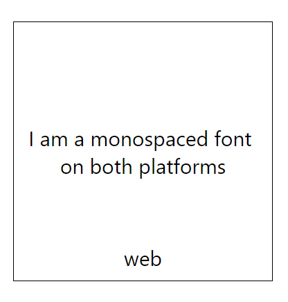

-
이 예제는 운영체제에 따라 별도의 폰트를 적용할 수 있는 방법을 보여주지만 사용할 수 있는 폰트는 리액트 네이티브가 기본 제공하는 폰트에 한정된다는 제한이 있다.
-
TTF, OTF 등의 폰트 파일을 이용해서 사용자 정의 폰트를 프로젝트에 추가하고 이 폰트를 앱의 애셋으로 처리해서 원하는 폰트를 이용할 수도 있다.
-
이론적으로는 가능하지만 성공 여부는 운영체제나 사용하려는 폰트에 따라 달라진다.
-
이 방법을 테스트 해보려면, react-native link로 검색해보자
-
fontSize
- fontSIze 속성은 Text 요소의 텍스트 크기를 조정한다.
fontStyle
-
fontStyle 속성을 이용해서 폰트의 스타일을 기울임 꼴로 변경할 수 있다.
- 'normal'
- 'italic'
fontWeight
-
fontWeight 속성은 폰트의 두께를 의미한다.
-
기본값: 'normal'
-
'bold'
-
'100 ~ '900'
-
<프로필 카드의 Text에 폰트 스타일 적용하기>
...

cardName: {
    color: 'white',
    fontWeight: 'bold',
    fontSize: 24,
    marginTop: 30
  },
  cardOccupationContainer:{
    borderColor: 'black',
    borderWidth: 3,
    borderTopWidth: 0,
    borderRightWidth: 0,
    borderLeftWidth: 0,
  },
  cardOccupation:{
    fontWeight:'bold',
    marginTop: 10,
    marginBottom: 10,
  },
  cardDescription:{
    fontStyle:'italic',
    marginTop: 10,
    marginRight: 40,
    marginLeft: 40,
    marginBottom: 10
  }

    ...
텍스트 장식하기
-
iOS와 안드로이드
-
lineHeight
-
textAlign
-
textDecorationLine
-
textShadowcolor
-
textShadowOffset
-
textShadowRadius
-
-
안드로이드
- textAlignVertical
-
iOS
-
letterSpacing
-
textDecorationColor
-
textDecorationStyle
-
writingDirection
-
lineHeight
- lineHeight 속성은 Text의 높이를 지정합니다.
textAlign
-
textAlign 속성은 요소 내 텍스트를 수평으로 어떻게 정렬될지를 지정합니다.
-
옵션
-
'auto'
-
'center'
-
'right'
-
'left'
-
'justify' (iOS 에서만 사용가능)
-
textDecorationLine
-
textDecorationLine 속성을 이용해서 텍스트에 밑줄이나 취소선을 추가할 수 있다.
-
'none'
-
'underline'
-
'linethrough'
-
'underline line-through'
-
-
옵션 값을 사용할 때는 ' '내에 중간에 공백 문자를 이용해서 속성을 중첩으로 적용합니다.
텍스트 장식 스타일 (iOS만 적용)
-
iOS는 안드로이드가 지원하지 않는 몇 가지 텍스트 장식 스타일을 지원합니다.
-
textDecorationColor 속성은 textDecorationLine의 색상을 지정합니다.
-
iOS는 선 자체의 스타일링도 지원한다.
- 안드로이드에서의 선은 항상 실선이다.
-
iOS 에서는 textDecorationStyle 속성을 이용해서 선의 스타일을 변경 할 수 있다.
- 옵션
- 'solid'
- 'double'
- 'dotted'
- 'dashed'
안드로이드에서는 이 스타일 값들을 무시한다.
- 옵션
{
 textDecorationLine: 'underline',
 textDecorationColor: 'red',
 textDecorationStyle: 'double'
}- textDecorationLine 속성과 연결해서 이들 스타일을 사용하면 됩니다.
텍스트에 음영(그림자) 넣기
텍스트에 음영을 넣기 위해서는 다음 세가지를 지정하면 된다.
-
색상
-
오프셋(offset)
- 음영 효과를 갖는 컴포넌트에서 음영의 위치를 지정한다.
-
반경(radius)
- 기본적으로 음영을 얼마나 흐릿하게 표시할지를 지정한다.
{
 textShadowColor: 'red',
 textShadowOffset: {width: -2, height: -2},
 textShadowRadius: 4
}
letterspacing(과거에는 iOS만 적용)
- letterspacing 속성은 텍스트 글자 사이의 간격을 지정한다.
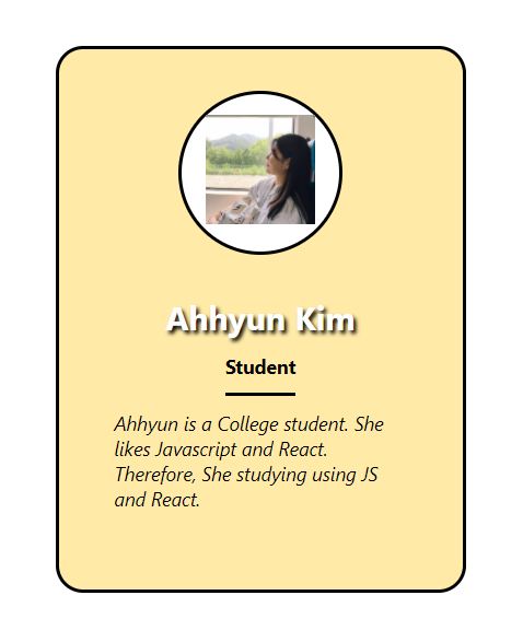
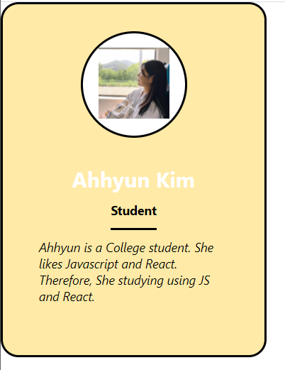
<완성한 프로필 카드 예제>
import { StatusBar } from 'expo-status-bar';
import React, {Component} from 'react';
import { StyleSheet, Text, View, Image } from 'react-native';

export default class App extends Component{

  render(){
    return(
      <View style={styles.container}>
        <View style={styles.cardContainer}>
          <View style={styles.cardImageContainer}>
          <Image style={styles.cardImage} source={require('./user.jpg')}/>
          </View>

          <View>

            <Text style={styles.cardName}>
              Ahhyun Kim
            </Text>
          </View>
          <View style={styles.cardOccupationContainer}>

            <Text style={styles.cardOccupation}>
              Student
            </Text>
          </View>

          <View>

            <Text style={styles.cardDescription}>
              Ahhyun is a College student. She likes Javascript and React.
              Therefore, She studying using JS and React.
            </Text>
          </View>
        </View>
      </View>
    );
  }
}

const profileCardColor = '#ffeaa7';

const styles = StyleSheet.create({
  container:{
    flex:1,
    justifyContent: 'center',
    alignItems:'center'
  },
  cardContainer:{
    //상수로 정의된 값을 이용해서 스타일 속성값을 쉽게 사용
    backgroundColor: profileCardColor,
    borderColor: 'black',
    borderWidth: 3,
    borderStyle: 'solid',
    borderRadius: 20,
    alignItems:'center',
    width:300,
    height: 400,


  },
  cardImageContainer:{
    backgroundColor:'white',
    borderWidth: 3,
    borderColor: 'black',
    alignItems:'center',
    width: 120,
    height: 120,
    borderRadius: 60,
    marginTop:30,
    paddingTop: 15
  },
  cardImage: {
    width: 80,
    height: 80
  },
  cardName: {
    color: 'white',
    fontWeight: 'bold',
    fontSize: 24,
    marginTop: 30,
    textShadowColor: 'black',
    textShadowOffset:{
      width:2,
      height: 2
    },
    textShadowRadius: 3
  },
  cardOccupationContainer:{
    borderColor: 'black',
    borderWidth: 3,
    borderTopWidth: 0,
    borderRightWidth: 0,
    borderLeftWidth: 0,
  },
  cardOccupation:{
    fontWeight:'bold',
    marginTop: 10,
    marginBottom: 10,
  },
  cardDescription:{
    fontStyle:'italic',
    marginTop: 10,
    marginRight: 40,
    marginLeft: 40,
    marginBottom: 10
  }
});