5장 고급 스타일링 기법
1. 플랫폼별 크기와 스타일
여러분은 두 개의 다른 플랫폼에서 동작하는 앱을 개발하고 있다는 점을 염두에 두고 있어야 합니다.
컴포넌트에 적용한 스타일이 플랫폼별로 다르게 보이거나 동작할 수 있습니다.
심지어 iOS나 안드로이드의 각 버전 별로도 스타일이 다르게 적용될 수 있습니다.
-
리액트 네이티브의 문서를 검토하다 보면, ProgressBarAndroid, ProgressViewIOS, ToolbarAndroid와 같이 iOS나 Android와 같은 접미사가 붙어있는 다수의 컴포넌트를 발견할 수 있습니다.
-
스타일이 플랫폼별로 다르게 적용된다는 것은 이제 새삼스러운 것은 아닙니다.
- width: 300, height: '300px'과 같이 픽셀 단위로 크기를 지정한 적이 없었습니다.
이것은 크기의 개념이 iOS와 안드로이드 운영 체제에서 다르기 때문입니다.
- width: 300, height: '300px'과 같이 픽셀 단위로 크기를 지정한 적이 없었습니다.
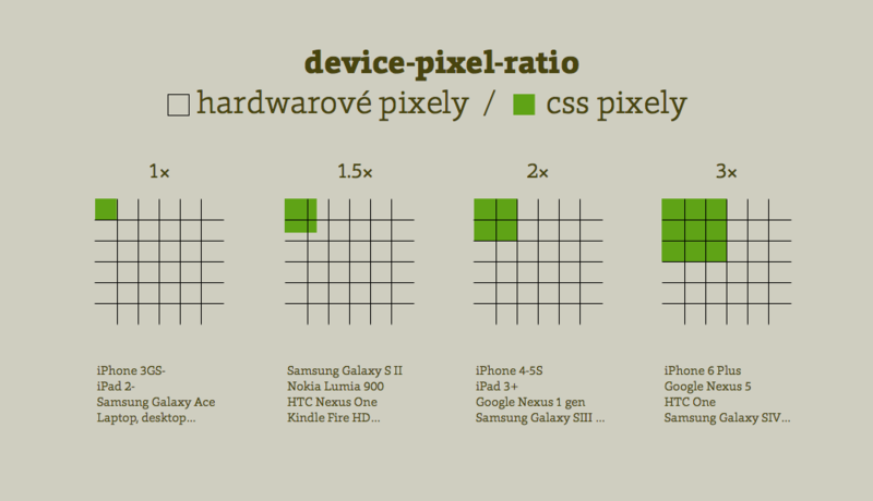
픽셀, 포인트, DP(DPs)
'크기'라는 주제는 혼동을 줄 수 있기는 해도 화면에 컴포넌트를 배치할 때 크기에 대한 개념을 정확히 이해하고 있어야 합니다.
디바이스별 레이아웃에 차이가 발생하는 것을 대비해서 크기에 대한 개념을 이해하고 있는 것이 좋습니다.
픽셀
-
픽셀은 디스플레이에 표현되는 프로그래밍이 할 수 잇는 가장 작은 단위의 색상입니다.
-
픽셀은 빨간색, 녹색, 파란색 (RGB)의 색 요소로 구성됩니다.
- 각 RGB 값의 농도를 조절해서 픽셀은 여러분이 보는 색상을 만들어 냅니다.
-
픽셀이라는 단위는 화면의 크기나 1인치당 도트의 수와 같이 물리적인 단위로 수치가 정해지지 않는다면 아무 의미를 가지지 못합니다.
화면 크기
-
한 모서리부터 대각선 모서리까지의 대각선 길이
- 예: 초창기 아이폰의 화면 크기는 3.5인치였지만, 아이폰 X의 화면 크기는 5.8인치이다.
해상도 (Resolution)
-
디스플레이에 표시되는 픽셀 수이며, 보통 디바이스의 높이와 폭에 표현되는 픽셀 수를 의미한다.
- 예: 초기 아이폰의 해상도는 320 x 480 이엇으며, 아이폰 X의 해상도는 1125 x 2436 이다.
픽셀 수 (PPI)
-
화면 크기와 해상도를 알아야 픽셀 밀도인 1인치 당 픽셀 수를 계산할 수 있다.
-
도트의 수(DPI)로 표현되는 경우도 종종 있으나, 이는 인쇄에서 사용되는 용어이다.
- 하지만, 자주 혼용되어 사용되니, 화면에 대해 언급할 때 DPI를 보게 된다면 실제로는 PPI를 의미했다고 이해하면 된다.
-
PPI로 이미지의 선명도를 측정할 수 있다.
-
두 개의 화면이 320 x 480의 똑같은 해상도(VGA 기반)를 가졌다고 가정했을 때, 3.5인치인 아이폰과 17인치의 HVGA 모니터에서 같은 이미지가 어떻게 보일까?
VGA : 비디오 카드 또는 그래픽 카드는 이미지를 디스플레이 장치로 출력하는 컴퓨터 하드웨어의 부품이자 확장 카드이다.
-
아이폰에서 이미지가 훨씬 선명하게 보인다.
아이폰의 PPI는 163이고, 17인치 CRT 모니터의 PPI는 34이기 때문이다.
즉, 3.5인치의 초기 아이폰에 거의 다섯배나 많은 정보를 넣을 수 있는 셈이다.
HVGA 모니터 초기 아이폰 대각선 길이 17인치 3.5인치 해상도 320 x 480 320 x 480 PPI 34 163
-
iOS vs 안드로이드
iOS나 안드로이드는 디바이스의 화면에 내용물들을 렌더링할 때 실제 물리 단위를 이용하지 않는다.
- iOS는 '포인트(Point)'라는 추상적인 단위를 이용
- 안드로이드는 이와 유사한 추상적인 단위인 'DP(density-independent pixel, 밀도 독립 화소)' 를 이용
iOS
아이폰 4는 전작과 동일한 화면 크기로 출시됐지만, 640 x 960 해상도의 멋진 레티나 스크린을 탑재했으며 해상도가 전작의 4배로 커졌다.
기존의 앱을 1:1 비율로 새로운 레티나 디스플레이에 렌더링한다면, 크기가 1/4로 축소돼 보였을 것이다.
-
대신 애플은 '포인트(Point-PT)' 라는 논리적인 개념을 도입했다.
-
'포인트'는 디바이스의 해상도와 상관없이 확대나 축소될 수 있는 거리의 단위이다.
<여러 아이폰 모델별 픽셀 밀도 시각화>
-
초기의 아이폰의 163 PPI는 iOS 포인트의 기준이다.
-
1 iOS point는 1인치의 1/163이다.
- 안드로이드는 디바이스 독립 픽셀 (DPI, DP)이라는 유사한 단위를 이용한다
- 1 안드로이드 DP는 1인치의 1/160이다.
-
리액트 네이티브에서 스타일을 정의할 때, 픽셀의 논리적인 개념을 이용한다.
- 즉, iOS에서는 PT를 안드로이드에서는 DP를 사용한다.
- 네이티브 언어로 앱을 개발할 때에는 간혹 논리적인 픽셀 단위에 화면 크기(scale)을 곱해서 디바이스 픽셀로 작업할 필요도 있다.
- 예: 2X, 3X
shadowPropTypesIOS와 elevation 속성으로 음영 넣기
iOS와 안드로이드 모두 Text 컴포넌트에 음영을 넣는 기능을 지원합니다.
안타깝게도 View 컴포넌트에서는 iOS와 안드로이드에서 공통으로 사용할 수 있는 스타일 속성이 없습니다.
iOS - shadowPropTypesIOS
-
iOS 디바이스에 View 컴포넌트에 음영을 넣을 수 있다.
-
z-order(z-index 순서)에는 영향을 주지 않는다.
-
ShdowPropTypesIOS 스타일 속성은 안드로이드에서 무시된다.
-
주요 속성
-
shadowOpacity : 속성값을 지정하지 않으면 음영이 나타나지 않는다.
-
음영의 오프셋 값(offset)은 폭과 높이로 표시하지만, 음영을 x와 y 방향으로 이동한다고 생각해도 무방하다.
- 폭과 높이에 음수값을 지정할 수도 있다.
-
shadowOpacity 속성 값이 1이면 완전히 불투명하고, 0.2면 좀 더 투명하게 보인다.
-
shdowRadius : 음영의 모서리를 흐리게(blur) 표현해서 음영이 좀 더 분산되어 보이게 한다.
shadowOffset
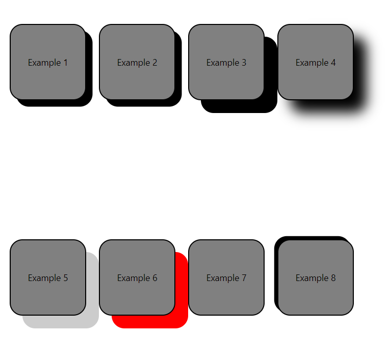
예 shadowColor width(x) height(y) shadowOpacity shadowRadius 1 Black 10 10 2 Black 10 10 1 3 Black 20 20 1 4 Black 20 20 1 20 5 Black 20 20 0.2 6 Red 20 20 1 7 Black 20 1 8 Black -5 -5 1
-
import React, { Component } from 'react';
import { StyleSheet, Text, View} from 'react-native';

export default class App extends Component{
    render() {
        return (
            <View style={styles.container}>
                <Example style={{shadowColor: 'black',
                                 shadowOffset: {width: 10, height: 10}
                }}>
                    <CenteredText>Example 1</CenteredText>
                </Example>
                <Example style={{shadowColor: 'black',
                                 shadowOffset: {width: 10, height: 10},
                                 shadowOpacity: 1
                }}>
                    <CenteredText>Example 2</CenteredText>
                </Example>
                <Example style={{shadowColor: 'black',
                                 shadowOffset: {width: 20, height: 20},
                                 shadowOpacity: 1
                }}>
                    <CenteredText>Example 3</CenteredText>
                </Example>
                <Example style={{shadowColor: 'black',
                                 shadowOffset: {width: 20, height: 20},
                                 shadowOpacity: 1,
                                 shadowRadius: 20
                }}>
                    <CenteredText>Example 4</CenteredText>
                </Example>
                <Example style={{shadowColor: 'black',
                                 shadowOffset: {width: 20, height: 20},
                                 shadowOpacity: 0.2
                }}>
                    <CenteredText>Example 5</CenteredText>
                </Example>
                <Example style={{shadowColor: 'red',
                                 shadowOffset: {width: 20, height: 20},
                                 shadowOpacity: 1
                }}>
                    <CenteredText>Example 6</CenteredText>
                </Example>
                <Example style={{shadowColor: 'black',
                    shadowOffset: {height: 20},
                    shadowOpacity: 1
                }}>
                    <CenteredText>Example 7</CenteredText>
                </Example>
                <Example style={{shadowColor: 'black',
                    shadowOffset: {width: -5, height: -5},
                    shadowOpacity: 1
                }}>
                    <CenteredText>Example 8</CenteredText>
                </Example>
            </View>
        );
    }
}

const Example = (props) => (
    <View style={[styles.example,props.style]}>
        {props.children}
    </View>
);

const CenteredText = (props) => (
    <Text style={[styles.centeredText, props.style]}>
        {props.children}
    </Text>
);

const styles = StyleSheet.create({
    container: {
        flex: 1,
        flexDirection: 'row',
        flexWrap: 'wrap',
        marginTop: 75
    },
    example: {
        width: 120,
        height: 120,
        marginLeft: 20,
        marginBottom: 20,
        backgroundColor: 'grey',
        borderRadius: 20,
        borderWidth: 2,
        justifyContent: 'center'
    },
    centeredText: {
        textAlign: 'center',
        margin: 10
    }
});
Android - elevation
-
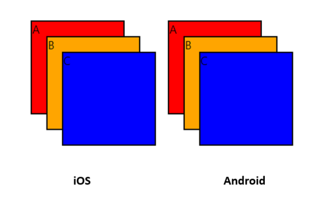
안드로이드에서 elevation 스타일 속성으 ㄹ이용해서 컴포넌트 z-order에 영향을 줄 수 있다.
-
전면에 나올 컴포넌트에 더 높은 elevation 값( 더 높은 z-index 값)을 지정해서 약간의 음영 효과를 낼 수 있다.
-
iOS는 elevation 스타일 속성은 지원하지 않고 혹시라도 지정되면 이 속성을 무시한다.
-
iOS에서는 elevation 속성을 무시하고 모든 컴포넌트는 같은 z-order 값을 유지하기 때문에 레이아웃에서 마지막에 나오는 컴포넌트가 위에 위치한다.
-
안드로이드에서 elevation 속성이 사용되면, z-order가 변경됨,
두 번째 예에서 elevation 속성 값을 반대로 적용해서 A가 위에 위치한다.
elevation 설정 값
| Example | color | top | left | elevation |
|---|---|---|---|---|
| A | Red | 0 | 0 | 1 |
| B | Orange | 20 | 20 | 2 |
| C | Blue | 40 | 40 | 3 |
| ------ | ------ | ------ | ------ | ------ |
| A | Red | 0 | 0 | 3 |
| B | Orange | 20 | 20 | 2 |
| C | Blue | 40 | 40 | 1 |
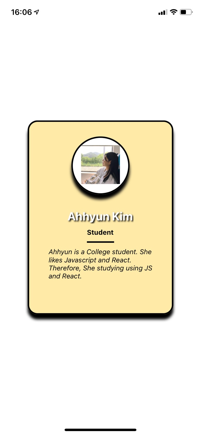
프로필 카드 예제에 음영 넣기
ProfileCard 컴포넌트 예제에 음영을 넣어보자
iOS에서는 음영 효과가 제대로 표현되겠지만, 안드로이드에서는 효과가 기대에 미치지 못한다.
안드로이드에서 elevation이 적용되었음에도 그다지 음영 효과가 두드러지지 않는다. 리액트 네이티브가 기본 제공하는 음영 효과를 가지고는 안드로이드에서 iOS에 표현되는 음영 효과 정도까지는 표현할 수 없다.
-
다만, npm 이나 yarn에서 적절한 음영 효과를 내는 데 필요한 컴포넌트를 찾아보길 바란다.
-
딱히 추천할 만한 컴포넌트가 없으므로, 음영효과를 포기하거나 두 OS에서 다르게 표현되는 것을 인정하고 그대로 사용할 수 밖에 없다.
import { StatusBar } from 'expo-status-bar';
import React, {Component} from 'react';
import { StyleSheet, Text, View, Image, Platform } from 'react-native';

export default class App extends Component{

  render(){
    return(
      <View style={styles.container}>
        <View style={styles.cardContainer}>
          <View style={styles.cardImageContainer}>
          <Image style={styles.cardImage} source={require('./user.jpg')}/>
          </View>

          <View>

            <Text style={styles.cardName}>
              Ahhyun Kim
            </Text>
          </View>
          <View style={styles.cardOccupationContainer}>

            <Text style={styles.cardOccupation}>
              Student
            </Text>
          </View>

          <View>

            <Text style={styles.cardDescription}>
              Ahhyun is a College student. She likes Javascript and React.
              Therefore, She studying using JS and React.
            </Text>
          </View>
        </View>
      </View>
    );
  }
}

const profileCardColor = '#ffeaa7';

const styles = StyleSheet.create({
  container:{
    flex:1,
    justifyContent: 'center',
    alignItems:'center',
  },
  cardContainer:{
    //상수로 정의된 값을 이용해서 스타일 속성값을 쉽게 사용
    backgroundColor: profileCardColor,
    borderColor: 'black',
    borderWidth: 3,
    borderStyle: 'solid',
    borderRadius: 20,
    alignItems:'center',
    width:300,
    height: 400,
    ...Platform.select({
      ios:{
        shadowColor: 'black',
        shadowOffset:{
          height: 10
        },
        shadowOpacity: 1
      },
      android:{
        elevation: 15
      }
    })


  },
  cardImageContainer:{
    backgroundColor:'white',
    borderWidth: 3,
    borderColor: 'black',
    alignItems:'center',
    width: 120,
    height: 120,
    borderRadius: 60,
    marginTop:30,
    paddingTop: 15,
    ...Platform.select({
      ios:{
        shadowColor: 'black',
        shadowOffset:{
          height: 10
        },
        shadowOpacity: 1
      },
      android:{
        borderWidth:3,
        borderColor:'black',
        elevation: 15
      }
    })
  },
  cardImage: {
    width: 80,
    height: 80
  },
  cardName: {
    color: 'white',
    fontWeight: 'bold',
    fontSize: 24,
    marginTop: 30,
    textShadowColor: 'black',
    textShadowOffset:{
      width:2,
      height: 2
    },
    textShadowRadius: 3
  },
  cardOccupationContainer:{
    borderColor: 'black',
    borderWidth: 3,
    borderTopWidth: 0,
    borderRightWidth: 0,
    borderLeftWidth: 0,
  },
  cardOccupation:{
    fontWeight:'bold',
    marginTop: 10,
    marginBottom: 10,
  },
  cardDescription:{
    fontStyle:'italic',
    marginTop: 10,
    marginRight: 40,
    marginLeft: 40,
    marginBottom: 10
  }
});
2. 컴포넌트를 이동, 회전, 크기변경, 기울이기
컴포넌트를 이동하거나 회전시킬 수 있는 방법은 무엇일까요?
바로 변형입니다.
리액트 네이티브는 3차원에서 컴포넌트의 모양이나 위치를 변경할 수 있는 다수의 유용한 변형 스타일들을 제공합니다.
컴포넌트를 한 곳에서 다른 곳으로 이동하거나 3개의 축( x, y, z)을 기준으로 회전하거나 크기를 변경하거나 x나 y 방향으로 기울일 수 있습니다.
단순하게는 변형이라는 것이 재미있는 효과를 만들어 낼 수 있지만, 변형의 진정한 위력은 연속적인 일련의 변형을 이용해 애니메이션 효과를 만드는 것입니다.
transform 스타일
-
컴포넌트에 어떠한 변형 효과들을 적용될 것인지를 정의하는 transform 속성들의 배열을 인수로 갖습니다.
-
예: 컴포넌트를 90도로 회전하고 그 크기를 50%로 축소
transform: [{rotate: '90deg', scale: .5}]
-
-
transform 스타일이 지원하는 속성들
-
perspective
-
translateX, translate
-
rotateX, rotateY, rotateZ (rotate)
-
scale, scaleX, scaleY
-
skewX, skewY
-
3D 효과를 내기위한 perspective 속성
-
perspective 속성은 사용자와 평면(화면) 사이의 거리를 조정해서 화면 내 요소들에 3차원 공간을 만듭니다.
- 모바일 기기와 눈 사이의 거리를 생각하면 된다.
거리가 가까우면 입체감이 더 크게 느껴지고, 멀어질수록 2D와 유사해진다.
- 모바일 기기와 눈 사이의 거리를 생각하면 된다.
-
3차원 효과 (3D effect)를 내기 위해서 이 속성에 다른 속성들을 같이 사용하게 된다.
-
perspective 속성값이 커질수록 컴포넌트의 z-index 값도 커지며, 컴포넌트가 사용자에게 좀 더 가깝게 보이도록 한다.
- z-index 값이 음수면, 컴포넌트는 멀리 떨어진 것처럼 보이게 된다.
translateX와 translateY 속성으로 이동하기
-
translation 속성들은 하나의 요소를 현 위치에서 x축 또는 y푹을 따라 이동시킨다 (trnaslateX, translateY)
-
컴포넌트를 화면의 한 곳에서 다른 곳으로 이동시키는 애니메이션 효과를 낼 때는 유용하게 사용할 수 있다.
<translateX와 translateY 스타일 속성을 이용해서 정사각형을 이동하는 방법>
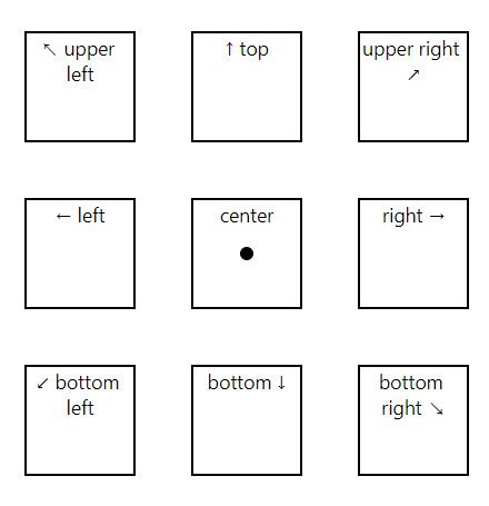
-
정사각형은 화면(display)의 중앙에서 NW(왼쪽 위, upper left), N(위, Top), NE(오른쪽 위, upper right), W(왼쪽, left), E(오른쪽, right), SW(왼쪽 아래, bottom left), S(아래, bottom), SE(오른쪽 아래, bottom right)의 8방위로 이동한다.
-
정사각형은 x또는 y 방향이나 동시에 양방향으로 그 크기의 1.5배 만큼의 거리를 이동한다.
-
Z 평면으로는 컴포넌트를 이동시킬 수 없다.
-
Z 축 여러분이 바라보고 있는 디바이스의 화면과 수직이므로 컴포넌트의 크기 변화 없이는 컴포넌트를 앞이나 뒤로 움직여도 그 변화를 인지할 수 없다.
-
Z축을 통한 시간 효과를 내려면 perspective 속성을 이용하면 된다.
-
import React, { Component } from 'react';
import { Dimensions, StyleSheet, Text, View} from 'react-native';
export default class App extends Component {
render() {
return (
<View style={styles.container}>
<Point/>
<Square style={{transform: [{translateX: -1.5 * squareSize},
{translateY: -1.5 * squareSize}]
}}>
<SquareText>↖ upper left</SquareText>
</Square>
<Square style={{transform: [{translateY: -1.5 * squareSize}]}}>
<SquareText>↑ top</SquareText>
</Square>
<Square style={{transform: [{translateX: 1.5 * squareSize},
{translateY: -1.5 * squareSize}]
}}>
<SquareText>upper right ↗</SquareText>
</Square>
<Square style={{transform: [{translateX: -1.5 * squareSize}]}}>
<SquareText>← left</SquareText>
</Square>
<Square>
<SquareText>center</SquareText>
</Square>
<Square style={{transform: [{translateX: 1.5 * squareSize}]}}>
<SquareText>right →</SquareText>
</Square>
<Square style={{transform: [{translateX: -1.5 * squareSize},
{translateY: 1.5 * squareSize}]
}}>
<SquareText>↙ bottom left</SquareText>
</Square>
<Square style={{transform: [{translateY: 1.5 * squareSize}]}}>
<SquareText>bottom ↓</SquareText>
</Square>
<Square style={{transform: [{translateX: 1.5 * squareSize},
{translateY: 1.5 * squareSize}]
}}>
<SquareText>bottom right ↘</SquareText>
</Square>
</View>
);
}
}
const Point = (props) => (
<View style={[styles.point, props.style]}>
{props.children}
</View>
);
const Square = (props) => (
<View style={[styles.square, props.style]}>
{props.children}
</View>
);
const SquareText = (props) => (
<Text style={[{textAlign: 'center'}, props.style]}>
{props.children}
</Text>
);
const centerY = (Dimensions.get('window').height / 2);
const centerX = (Dimensions.get('window').width / 2);
const squareSize = 80;
const pointSize = 10;
const styles = StyleSheet.create({
container: {
flex: 1,
},
point: {
width: pointSize,
height: pointSize,
position: 'absolute',
top: centerY - (pointSize / 2),
left: centerX - (pointSize / 2),
borderWidth: 1,
borderRadius: pointSize / 2,
backgroundColor: 'black'
},
square: {
width: squareSize,
height: squareSize,
alignItems: 'center',
position: 'absolute',
top: centerY - (squareSize / 2),
left: centerX - (squareSize / 2),
borderWidth: 2,
backgroundColor: 'transparent'
}
});
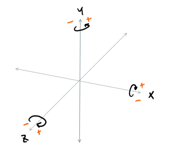
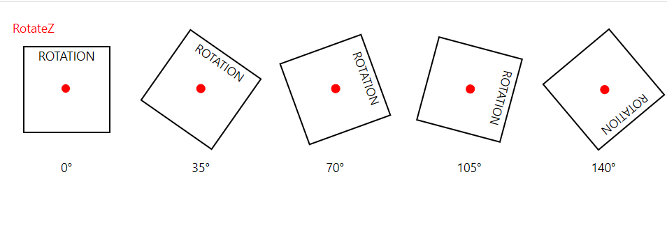
rotateX, rotateY, rotateZ 속성으로 엘리먼트 회전하기
-
rotation 속성들은 이름 그대로 엘리먼트를 회전시킵니다.
-
회전은 x, y, z 축을 따라 일어나며 회전의 기준점(origin)은 어떠한 변형도 적용되기 전, 중앙입니다.
- translateX와 translateY 속성을 이용할 때는 컴포넌트의 원래 위치의 축을 기준으로 회전한다는 점을 명심해야 합니다.
-
회전의 정도는 도(deg)나 라디안(rad)로 지정합니다.
transform: [{rotate: '45deg'}]
transform: [{rotate: '0.785398rad'}]
-
rotate 속성만을 이용하는 경우는 rotateZ 속성을 이용한 변형과 동일한 효과를 낸다.
-
X 축의 양의 방향으로 회전하는 것을 정사각형의 위쪽이 뒤로 넘어가는 모습을 상상해보면, 정사각형의 위쪽이 멀어질수록 정사각형의 아래쪽은 여러분에게 다가오게 된다.
-
책을 폈다 덮는 것으로 Y축을 기준으로 회전하는 것을 상상해보면 좋다.
책을 펴면, 책의 앞면은 음의 방향으로 회전하고 책을 덮으면, 책의 앞면이 양의 방향으로 회전한다. -
Z 축을 기준으로 양의 방향으로 회전하면 물체를 시계방향으로 회전시키고 음의 방향으로 회전하면 물체를 시계 반대 방향으로 회전시킨다.
-
전축(axis of rotation)은 정사각형의 중앙에 있는 점으로 표시되어 있습니다.
-
Z축은 여러분의 시선이므로 화면에서 바로 이어진다.
-
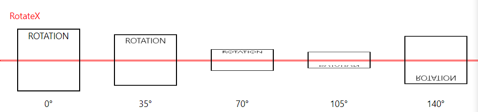
RotateX
import React, { Component } from 'react';
import { StyleSheet, Text, View} from 'react-native';

export default class App extends Component{
    render() {
        return (
          <View style={styles.container}>
            <Text style={styles.titleText}>RotateX</Text>
            <CenterLine/>
            <View style={styles.squareContainer}>
                <Square label='0°'/>
                <Square label={rotationIncrement + '°'}
                        style={{transform: [{rotateX: rotationIncrement + 'deg'}]}}/>
                <Square label={2*rotationIncrement + '°'}
                        style={{transform: [{rotateX: 2*rotationIncrement + 'deg'}]}}/>
                <Square label={3*rotationIncrement + '°'}
                        style={{transform: [{rotateX: 3*rotationIncrement + 'deg'}]}}/>
                <Square label={4*rotationIncrement + '°'}
                        style={{transform: [{rotateX: 4*rotationIncrement + 'deg'}]}}/>
            </View>
          </View>
        );
    }
}

const CenterLine = () => (
    <View style={[styles.centerLine]}/>
);

const Square = (props) => (
    <View>
        <View style={[styles.square, props.style]}>
            <Text style={[styles.squareText]}>
              ROTATION
            </Text>
        </View>
        <Text style={styles.labelText}>{props.label}</Text>
    </View>
);

const squareSize = 100;
const rotationIncrement = 35;

const styles = StyleSheet.create({
    container: {
        flex: 1,
        marginTop: 50
    },
    titleText: {
        color: 'red',
        position: 'absolute',
        marginLeft: 15,
        top: -30
    },
    centerLine: {
        borderColor: 'red',
        borderWidth: 1,
        height: 1,
        position: 'absolute',
        top: squareSize / 2,
        width: '100%'
    },
    squareContainer: {
        flexDirection: 'row',
        justifyContent: 'space-around'
    },
    square: {
        borderWidth: 2,
        backgroundColor: 'transparent',
        display: 'flex',
        flexDirection: 'column',
        height: squareSize,
        width: squareSize,
    },
    squareText: {
        alignSelf: 'center',
    },
    labelText: {
        alignSelf: 'center',
        marginTop: 10
    }

});
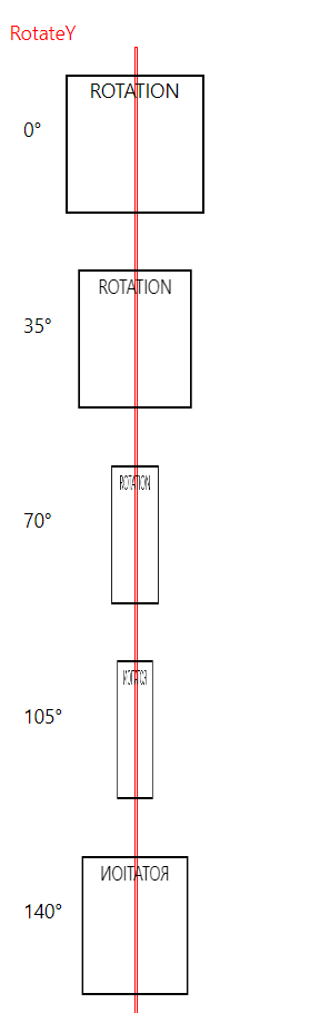
RotateY
import React, { Component } from 'react';
import { StyleSheet, Text, View} from 'react-native';

export default class App extends Component{
  render() {
    return (
      <View style={styles.container}>
        <Text style={styles.titleText}>RotateY</Text>
        <CenterLine/>
        <View style={styles.squareContainer}>
          <Square label='0°'/>
          <Square label={rotationIncrement + '°'}
                  style={{transform: [{rotateY: rotationIncrement + 'deg'}]}}/>
          <Square label={2*rotationIncrement + '°'}
                  style={{transform: [{rotateY: 2*rotationIncrement + 'deg'}]}}/>
          <Square label={3*rotationIncrement + '°'}
                  style={{transform: [{rotateY: 3*rotationIncrement + 'deg'}]}}/>
          <Square label={4*rotationIncrement + '°'}
                  style={{transform: [{rotateY: 4*rotationIncrement + 'deg'}]}}/>
        </View>
      </View>
    );
  }
}

const CenterLine = () => (
  <View style={[styles.centerLine]}/>
);

const Square = (props) => (
  <View>
    <View style={styles.labelContainer}>
      <Text style={styles.labelText}>{props.label}</Text>
    </View>
    <View style={[styles.square, props.style]}>
      <Text style={[styles.squareText]}>
        ROTATION
      </Text>
    </View>
  </View>
);

const squareSize = 100;
const rotationIncrement = 35;

const styles = StyleSheet.create({
  container: {
    flex: 1,
    marginLeft: 50,
    marginTop: 50
  },
  titleText: {
    color: 'red',
    position: 'absolute',
    marginLeft: -40,
    top: -20
  },
  centerLine: {
    borderColor: 'red',
    borderWidth: 1,
    height: '100%',
    position: 'absolute',
    left: squareSize / 2,
    width: 1
  },
  squareContainer: {
    height: '100%',
    flexDirection: 'column',
    justifyContent: 'space-around'
  },
  square: {
    borderWidth: 2,
    backgroundColor: 'transparent',
    display: 'flex',
    flexDirection: 'column',
    height: squareSize,
    width: squareSize,
  },
  squareText: {
    alignSelf: 'center',
  },
  labelContainer: {
    position: 'absolute',
    top: 30,
    left: -30
  },
  labelText: {
    backgroundColor: 'transparent',
  }

});
RotateZ
import React, { Component } from 'react';
import { StyleSheet, Text, View} from 'react-native';

export default class App extends Component{
    render() {
        return (
          <View style={styles.container}>
            <Text style={styles.titleText}>RotateZ</Text>
            <View style={styles.squareContainer}>
                <Square label='0°'/>
                <Square label={rotationIncrement + '°'}
                        style={{transform: [{rotateZ: rotationIncrement + 'deg'}]}}/>
                <Square label={2*rotationIncrement + '°'}
                        style={{transform: [{rotateZ: 2*rotationIncrement + 'deg'}]}}/>
                <Square label={3*rotationIncrement + '°'}
                        style={{transform: [{rotateZ: 3*rotationIncrement + 'deg'}]}}/>
                <Square label={4*rotationIncrement + '°'}
                        style={{transform: [{rotateZ: 4*rotationIncrement + 'deg'}]}}/>
            </View>
          </View>
        );
    }
}

const Point = (props) => (
    <View style={[styles.point, props.style]}>
        {props.children}
    </View>
);


const Square = (props) => (
    <View>
        <View style={[styles.square, props.style]}>
            <Text style={[styles.squareText]}>
              ROTATION
            </Text>
            <Point/>
        </View>
        <Text style={styles.labelText}>{props.label}</Text>
    </View>
);

const pointSize = 10;
const squareSize = 100;
const rotationIncrement = 35;

const styles = StyleSheet.create({
    container: {
        flex: 1,
        marginTop: 50,
    },
    titleText: {
        color: 'red',
        position: 'absolute',
        marginLeft: 15,
        top: -30
    },
    squareContainer: {
        flexDirection: 'row',
        justifyContent: 'space-around'
    },
    square: {
        borderWidth: 2,
        backgroundColor: 'transparent',
        display: 'flex',
        flexDirection: 'column',
        height: squareSize,
        width: squareSize,
    },
    squareText: {
        alignSelf: 'center',
    },
    labelText: {
        alignSelf: 'center',
        marginTop: 30
    },
    point: {
        width: pointSize,
        height: pointSize,
        position: 'absolute',
        top: ((squareSize - pointSize) / 2) - 3,  // halfway - half border widths of square and point
        left: (( squareSize - pointSize) / 2) - 3,
        borderColor: 'red',
        borderWidth: 1,
        borderRadius: pointSize / 2,
        backgroundColor: 'red'
    },
});
-
transform 속성은 변형의 배열이며, 이를 이용해서 복수의 변형을 한 번에 적용할 수 있습니다.
-
적용되는 순서가 중요한데, 변형의 속성값 배열에서 변형 효과들의 순서를 바꾸면 전혀 다른 결과를 만들어 낸다.
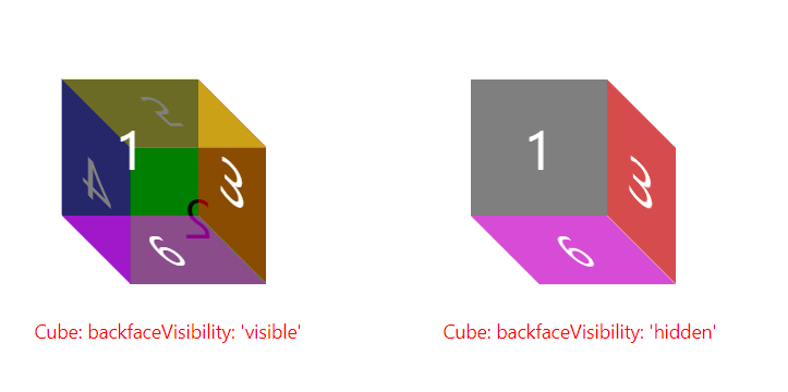
90도 이상 회전할 때 visibility 속성 지정하기
-
backfaceVisibility 속성은 요소가 90도 이상 회전할 때 해당 요소를 표시할지를 지정한다.
- 이 속성의 값은 'visible'(기본값) 또는 'hidden'으로 지정할 수 있다.
- 'hidden'으로 바꾸면 컴포넌트를 X축 또는 Y축 방향으로 90도 이상 회전할 때 요소를 볼 수 없게 된다.
 import React, { Component } from 'react';
import { StyleSheet, Text, View} from 'react-native';

export default class App extends Component {
  render() {
    return (
      <View style={styles.container}>
        <View style={styles.exampleContainer}>
          <BackFace style={styles.back} label='2'/>
          <Face style={styles.left} label='4'/>
          <Face style={styles.right} label='3'/>
          <AltFace style={styles.bottom} label='6'/>
          <AltFace style={styles.top} label='5'/>
          <Face style={styles.front} label='1'/>
          <Text style={styles.label}>Cube: backfaceVisibility: 'visible'</Text>
        </View>
        <View style={[styles.exampleContainer]}>
          <BackFace style={[styles.back,styles.hidden]} label='2'/>
          <Face style={[styles.left,styles.hidden]} label='4'/>
          <Face style={[styles.right,styles.hidden]} label='3'/>
          <AltFace style={[styles.bottom,styles.hidden]} label='6'/>
          <AltFace style={[styles.top,styles.hidden]} label='5'/>
          <Face style={[styles.front,styles.hidden]} label='1'/>
          <Text style={styles.label}>Cube: backfaceVisibility: 'hidden'</Text>
        </View>
      </View>
    );
  }
}

const BackFace = (props) => (
  <View style={[styles.face, props.style]}>
    <Text style={[styles.text,{color: 'black'}]}>{props.label}</Text>
  </View>
);

const Face = (props) => (
  <View style={[styles.face, props.style]}>
    <Text style={styles.text}>{props.label}</Text>
  </View>
);

const AltFace = (props) => (
  <View style={[styles.face, props.style]}>
    <Text style={[styles.altText]}>{props.label}</Text>
  </View>
);

const styles = StyleSheet.create({
  container: {
    display: 'flex',
    flexDirection: 'row',
    height: 300,
    marginLeft: 10,
    marginTop: 20
  },
  exampleContainer: {
    width: 300
  },
  face: {
    width: 100,
    height: 100,
  },
  hidden: {
    backfaceVisibility: 'hidden'
  },
  text: {
    lineHeight: 100,
    fontSize: 40,
    color: 'white',
    textAlign: 'center'
  },
  altText: {
    lineHeight: 50,
    fontSize: 30,
    color: 'white',
    textAlign: 'center'
  },
  front: {
    backgroundColor: 'rgba(0,0,0,0.5)',
    position: 'absolute',
    top: 100,
    left: 100,
  },
  back: {
    backgroundColor: 'rgba(0,255,0,1)',
    position: 'absolute',
    top: 150,
    left: 150,
    transform: [{rotateY: '180deg'}]
  },
  left: {
    backgroundColor: 'rgba(0,0,196,0.7)',
    transform: [{rotateY: '-180deg'},{skewY: '-45deg'}],
    width: 50,
    position: 'absolute',
    top: 125,
    left: 100
  },
  right: {
    backgroundColor: 'rgba(196,0,0,0.7)',
    transform: [{skewY: '45deg'}],
    width: 50,
    position: 'absolute',
    top: 125,
    left: 200
  },
  bottom: {
    backgroundColor: 'rgba(196,0,196,0.7)',
    transform: [{skewX: '45deg'}],
    height: 50,
    width: 100,
    position: 'absolute',
    top: 200,
    left: 125
  },
  top: {
    backgroundColor: 'rgba(196,196,0,0.7)',
    transform: [{rotateX: '-180deg'},{skewX: '-45deg'}],
    height: 50,
    width: 100,
    position: 'absolute',
    top: 100,
    left: 125
  },
  label: {
    color: 'red',
    position: 'absolute',
    top: 275,
    left: 80
  }
});
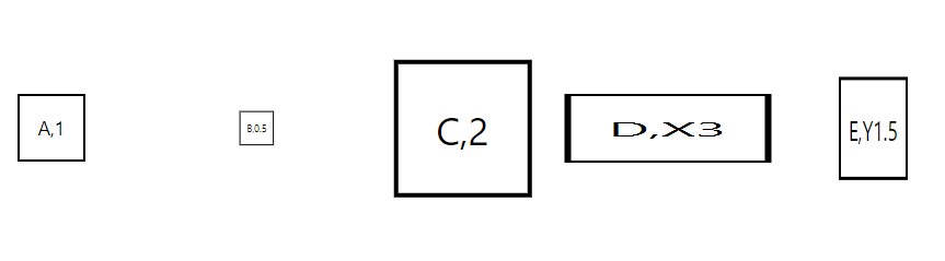
scale, scaleX, scaleY 속성으로 화면에서 크기 변경하기
-
scale 속성은 요소의 크기를 자신에 지정된 값만큼 확대/축소하는데 기본값은 1입니다.
- 요소의 크기를 키우려면 1보다 큰 값으로 지정하면 되고, 작게 축소하려면 1보다 작은 값을 지정하면 됩니다.
-
scaleX 또는 scaleY 속성을 이용하면 요소를 특정한 축을 기준으로 크기를 변경할 수 잇습니다.
-
scaleX 속성은 X축을 기준으로 수평을 엘리먼트의 크기를 변경
-
scaleY 속성은 Y축을 기준으로 수직으로 요소의 크기를 변경
-
-
모든 정사각형은 기본 scale 속성값이 1이 적용된 A 정사각형의 크기와 모양에서 변형되었다.
-
B 정사각형은 0.5배만큼 축소됨
-
C 정사각형은 2배만큼 확대됨
-
D 정사각형은 scaleX 속성을 이용해서 X축 방향으로 3배 확대됨
-
E 정사각형은 scaleY 속성을 이용해서 Y축 방향으로 1.5배 확대됨
import React, { Component } from 'react';
import { StyleSheet, Text, View} from 'react-native';

export default class App extends Component{
    render() {
        return (
            <View style={styles.container}>
                <Example style={{}}>A,1</Example>
                <Example style={{transform: [{scale: 0.5}]}}>B,0.5</Example>
                <Example style={{transform: [{scale: 2}]}}>C,2</Example>
                <Example style={{transform: [{scaleX: 3}]}}>D,X3</Example>
                <Example style={{transform: [{scaleY: 1.5}]}}>E,Y1.5</Example>
            </View>
        );
    }
}

const Example = (props) => (
    <View style={[styles.example,props.style]}>
        <Text>
            {props.children}
        </Text>
    </View>
);

const styles = StyleSheet.create({
    container: {
        marginTop: 75,
        alignItems: 'center',
        flex: 1,
        flexDirection: 'row',
    },
    example: {
        width: 50,
        height: 50,
        borderWidth: 2,
        margin: 50,
        alignItems: 'center',
        justifyContent: 'center'
    },
});
scale을 이용해 프로필 카드 섬네일 만들기
-
축소된 ProfileCard 컴포넌트, 즉 섬네일을 보여주고, 섬네일을 누르면 ProfileCard 컴포넌트의 원래의 크기로 표시된다.
-
원래 크기의 ProfileCard 컴포넌트를 누르면 다시 섬네일 크기로 축소되어 표시된다.
-
immutability-helper 패키지를 추가
npm install immutability-helper --save- immutability helper의 update함수는 특정 컴포넌트의 state를 갱신한다.
<ProfileCard 컴포넌트를 원래 크기에서 섬네일 크기로 축소>
import { StatusBar } from 'expo-status-bar';
import React, {Component} from 'react';
import update from 'immutability-helper'
import { StyleSheet, Text, View, Image, Platform, TouchableHighlight } from 'react-native';

const userImage = require('./user.jpg');

//컴포넌트를 만들기 위한 데이터
const data = [{
  image: userImage,
  name: 'Ahhyun Kim',
  occupation: 'Student',
  description: 'Ahhyun is a College student. She likes Javascript and React. Therefore, She is studying using JS and React.',
  showThumbnail:true
}];


//ProfileCard 컴포넌트를 App코드에서 분리
const ProfileCard = (props) => {
  const {image, name, occupation, description, onPress, showThumbnail} = props;
  let containerStyles = [styles.cardContainer];

  if(showThumbnail){
    containerStyles.push(styles.cardThumbnail);
  }

  return(
    <TouchableHighlight onPress={onPress}>
      <View style={[containerStyles]}>
        <View style={styles.cardImageContainer}>
          <Image style={styles.cardImage} source={image} />
        </View>

        <View>
          <Text style={styles.cardName}>
            {name}
          </Text>
        </View>

        <View style={styles.cardOccupationContainer}>
          <Text style={styles.cardOccupation}>
            {occupation}
          </Text>
        </View>

        <View>
          <Text style={styles.cardDescription}>
            {description}
          </Text>
        </View>
      </View>
    </TouchableHighlight>
  );
};

Profile.propTypes = {
  image: PropTypes.number.isRequired,
  name: PropTypes.string.isRequired,
  occupation: PropTypes.string.isRequired,
  description:PropTypes.string.isRequired,
  showThumbnail: PropTypes.bool.isRequired,
  onPress: PropTypes.func.isRequired,
};

export default class App extends Component{

  constructor(props, context){
    //ProfileCard 컴포넌트의 상태는 상위 컴포넌트인 App에서 관리
    super(props, context);
    this.state={
      data: data
    }
  }

  //onPress 이벤트 처리하는 함수
  handleProfileCardPress = (index) =>{
    const showThumbnail = !this.state.data[index].showThumbnail;

    this.setState({
      data: update(this.state.data, {[index]: {showThumbnail: {$set: showThumbnail}}})
    });
  }

  render(){

    const list = this.state.data.map(function(item, index){
      const{image, name, occupation, description, showThumbnail} = item;
      return <ProfileCard key={'card-'+index}
                          image={image}
                          name={name}
                          occupation={occupation}
                          description={description}
                          onPress={this.handleProfileCardPress.bind(this, index)}
                          showThumbnail={showThumbnail} />
    })
    return(
      <View style={styles.container}>
        {list}
      </View>
    );
  }
}

const profileCardColor = '#ffeaa7';

const styles = StyleSheet.create({
  cardThumbnail:{
    transform:[{scale: 0.2}]
  },
  container:{
    flex:1,
    justifyContent: 'center',
    alignItems:'center',
  },
  cardContainer:{
    //상수로 정의된 값을 이용해서 스타일 속성값을 쉽게 사용
    backgroundColor: profileCardColor,
    borderColor: 'black',
    borderWidth: 3,
    borderStyle: 'solid',
    borderRadius: 20,
    alignItems:'center',
    width:300,
    height: 400,
    ...Platform.select({
      ios:{
        shadowColor: 'black',
        shadowOffset:{
          height: 10
        },
        shadowOpacity: 1
      },
      android:{
        elevation: 15
      }
    })


  },
  cardImageContainer:{
    backgroundColor:'white',
    borderWidth: 3,
    borderColor: 'black',
    alignItems:'center',
    width: 120,
    height: 120,
    borderRadius: 60,
    marginTop:30,
    paddingTop: 15,
    ...Platform.select({
      ios:{
        shadowColor: 'black',
        shadowOffset:{
          height: 10
        },
        shadowOpacity: 1
      },
      android:{
        borderWidth:3,
        borderColor:'black',
        elevation: 15
      }
    })
  },
  cardImage: {
    width: 80,
    height: 80
  },
  cardName: {
    color: 'white',
    fontWeight: 'bold',
    fontSize: 24,
    marginTop: 30,
    textShadowColor: 'black',
    textShadowOffset:{
      width:2,
      height: 2
    },
    textShadowRadius: 3
  },
  cardOccupationContainer:{
    borderColor: 'black',
    borderWidth: 3,
    borderTopWidth: 0,
    borderRightWidth: 0,
    borderLeftWidth: 0,
  },
  cardOccupation:{
    fontWeight:'bold',
    marginTop: 10,
    marginBottom: 10,
  },
  cardDescription:{
    fontStyle:'italic',
    marginTop: 10,
    marginRight: 40,
    marginLeft: 40,
    marginBottom: 10
  }
});
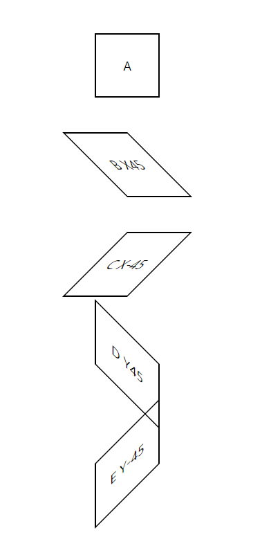
skewX와 skewY 속성을 이용해 X축과 Y축을 따라 기울이기
-
skewX 속성은 엘리먼트를 X축을 따라 기울이고 skewY 속성은 엘리먼트를 Y축을 따라 기울인다.
- 현재 skewX 속성을 이용한 변형(skewX transform)은 안드로이드에서 제대로 동작하지 않는다.
-
정사각형 A: skew 변형이 적용됮 않는다.
-
정사각형 B: X축을 따라 45도 기울임
-
정사각형 C: X축을 따라 -45도 기울임
-
정사각형 D: Y축을 따라 45도 기울임
-
정사각형 E: Y축을 따라 -45도 기울임
import React, { Component } from 'react';
import { StyleSheet, Text, View} from 'react-native';

export default class App extends Component{
    render() {
        return (
            <View style={styles.container}>
                <Example style={{}}>A</Example>
                <Example style={{transform: [{skewX: '45deg'}]}}>B X45</Example>
                <Example style={{transform: [{skewX: '-45deg'}]}}>C X-45</Example>
                <Example style={{transform: [{skewY: '45deg'}]}}>D Y45</Example>
                <Example style={{transform: [{skewY: '-45deg'}]}}>E Y-45</Example>
            </View>
        );
    }
}

const Example = (props) => (
    <View style={[styles.example,props.style]}>
        <Text>
            {props.children}
        </Text>
    </View>
);

const styles = StyleSheet.create({
    container: {
        marginTop: 50,
        alignItems: 'center',
        flex: 1
    },
    example: {
        width: 75,
        height: 75,
        borderWidth: 2,
        margin: 20,
        alignItems: 'center',
        justifyContent: 'center'
    },
});
변형 효과의 핵심 포인트
-
X축과 Y축의 기준점은 왼쪽 위, 따라서 Y축의 양의 방향은 화면의 아래쪽이다.
이전 장의 절대 위치부분에서 다루며 기하학에서 익숙한 것과 반대이기 때문에 변형의 결과를 추측하기 어렵게 할 수 있다. -
회전과 이동의 기준점은 항상 요소의 원래 위치, X 또는 Y 방향으로 이동한 후에 새로운 중심점(center point)에서 회전할 수 없다.
3. flexbox를 이용해서 컴포넌트 배치하기
-
flexbox는 사용자가 UI를 만들고 위치 조정을 효율적으로 할 수 있도록 리액트 네이티브가 사용하는 레이아웃 구현체이다.
-
리액트 네이티브가 구현한 flexbox는 W3C의 flexbox 웹 스펙(flexbox web specification)을 기반으로 만들었지만 100% 동일한 API를 지원하는 것은 아닙니다.
-
컴포넌트의 크기를 모르거나, 동적으로 변경될지라도 레이아웃에서 컴포넌트들을 정렬하고 여백을 조정하는 것을 쉽게 할 수 있도록 만들어졌습니다.
-
flexbox 레이아웃을 조정하는 정렬 속성들
-
flex
-
flexDirection
-
justifyContent
-
alignItems
-
alignSelf
-
flexWrap
-
flex 속성으로 컴포넌트의 면적 변경하기
-
flex 속성은 컴포넌트가 속한 컨테이너에서 컴포넌트가 차지하는 면적을 변경할 수 있게 해준다.
-
이 속성값은 같은 컨테이너에 속한 다른 컴포넌트에 지정한 flex 속성 값에 상대적으로 지정한다.
-
300 x 300 크기의 View 컴포넌트가 있고, 그 컴포넌트의 자식 View 컴포넌트의 flex 속성값이 1이라면, 자식 View 컴포넌트는 부모 View 컴포넌트의 전체를 채우게 된다.
-
이 부모 View 컴포넌트는 부모 컨테이너에서 똑같은 공간을 차지한다.
-
-
flex 속성값은 퍼센트처럼 생각해서 지정할 수도 있다.
-
예: 두 개의 자식 컴포넌트에 각각 66.6% 와 33.3%의 공간으로 분리하려면
-
각 자식 컴포넌트에 flex: 66과 flex: 33으로 지정할 수 있다.
-
flex:2와 flex:1로 지정해도 같은 결과를 얻을 수 있다.
-
-
-
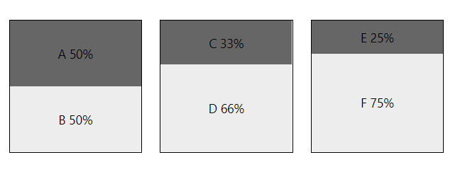
첫 번째 예: A와 B는 1:1 비율로 배치돼서 각각 50%씩 공간을 차지한다.
- A = {flex: 1}, B = {flex:1}
-
중간 예: C와 D는 1:2 비율로 배치돼서 C는 33%, D는 66%의 공간을 차지한다.
- C = {flex: 1}, D = {flex: 2}
-
마지막 예: E와 F는 1:3 비율로 배치돼서 E는 25%, F는 75%의 공간을 차지한다.
- E = {flex: 1}, F = {flex: 3}
import React, { Component } from 'react';
import { StyleSheet, Text, View} from 'react-native';

export default class App extends Component{
    render() {
        return (
            <View style={styles.container}>
                <View style={[styles.flexContainer]}>
                    <Example style={[styles.darkgrey]}>A 50%</Example>
                    <Example>B 50%</Example>
                </View>
                <View style={[styles.flexContainer]}>
                    <Example style={[styles.darkgrey]}>C 33%</Example>
                    <Example style={{flex: 2}}>D 66%</Example>
                </View>
                <View style={[styles.flexContainer]}>
                    <Example style={[styles.darkgrey]}>E 25%</Example>
                    <Example style={{flex: 3}}>F 75%</Example>
                </View>
            </View>
        );
    }
}

const Example = (props) => (
    <View style={[styles.example,styles.lightgrey,props.style]}>
        <Text>
            {props.children}
        </Text>
    </View>
);

const styles = StyleSheet.create({
    container: {
        marginTop: 50,
        alignItems: 'center',
        flex: 1,
        flexDirection: 'row'

    },
    flexContainer: {
        width: 150,
        height: 150,
        borderWidth: 1,
        margin: 10
    },
    darkgrey: {
        backgroundColor: '#666666'
    },
    lightgrey: {
        backgroundColor: '#ededed'
    },
    example: {
        flex: 1,
        alignItems: 'center',
        justifyContent: 'center'
    },
});
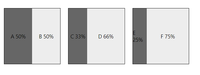
flexDirection 속성으로 flex 진행 방향 지정하기
-
flexDirection 속성을 이용해서 레이아웃의 진행 축(axis)을 변경해서 레이아웃의 방향을 바꿀 수 있습니다.
-
flexDirection 속성은 부모 View 컨테이너에 지정합니다.
- 모든 flex가 적용되는 하위 컴포넌트들의 레이아웃에 영향을 줍니다.
-
flexDirection의 속성
-
'row' : 수평으로 배치
-
'column' (기본 값) : 수직으로 배치
-
<부모 컨테이너에 flexDirection:'row' 추가>
...

    flexContainer: {
        width: 150,
        height: 150,
        borderWidth: 1,
        margin: 10,
        flexDirection: 'row'
    },

...
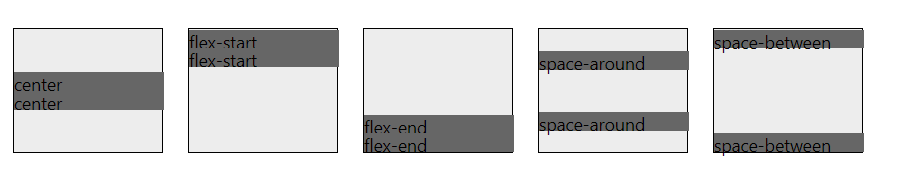
justifyContent 속성으로 컴포넌트 주위 여백 정하기
- justifyContent 속성은 컨테이너의 flex direction의 방향에 따라 배치되는 flex 적용 대상들의 사이 간격과 주변의 여백을 지정한다.
-
justifyContent 속성은 부모 컨테이너에 적용한다.
-
옵션
-
center
: 부모 컨테이너 내의 자식 엘리먼트를 중앙에 배치, 남은 여백(space)은 모여 있는 자식 요소들의 양 측면에 배치 -
flex-start
: flexDirection 속성에 지정된 값을 기준으로 행(row)이나 열(column)의 시작점부터 자식 요소들을 배치 -
flex-end
: flex-start와는 반대로 동작, 자식 요소들을 부모 컨테이너의 끝에 배치 -
space-around
: 각 요소 주변으로 공간을 고르게 배치한다.-
부모 컨테이너에 요소들을 같은 간격으로 배치하는 것과 혼동하면 안되며, 여백을 자식 요소들 주변으로 배치한다.
-
내용이 되는 요소들을 기준으로 생각해 보면 '여백-요소-여백-요소-여백'과 같이 배치될 것으로 생각할 수 있지만,
실제로는 요소들 주변에 동일한 크기의 여백을 붙여서 '여백-요소-여백-여백-요소-여백'과 같은 배치 결과를 만들어 낸다. -
두 경우 모두 여백의 크기는 동일하기 때문에 후자의 경우에 두 요소의 사이가 더 크게 된다.
-
-
space-between
: 컨테이너의 시작과 끝에 여백을 주지 않는다.- 연속된 요소들 사이의 여백은 동일하게 배치한다.
-
import React, { Component } from 'react';
import { StyleSheet, Text, View} from 'react-native';

export default class App extends Component {
    render() {
        return (
            <View style={styles.container}>
                <FlexContainer style={[{justifyContent: 'center'}]}>
                    <Example>center</Example>
                    <Example>center</Example>
                </FlexContainer>
                <FlexContainer style={[{justifyContent: 'flex-start'}]}>
                    <Example>flex-start</Example>
                    <Example>flex-start</Example>
                </FlexContainer>
                <FlexContainer style={[{justifyContent: 'flex-end'}]}>
                    <Example>flex-end</Example>
                    <Example>flex-end</Example>
                </FlexContainer>
                <FlexContainer style={[{justifyContent: 'space-around'}]}>
                    <Example>space-around</Example>
                    <Example>space-around</Example>
                </FlexContainer>
                <FlexContainer style={[{justifyContent: 'space-between'}]}>
                    <Example>space-between</Example>
                    <Example>space-between</Example>
                </FlexContainer>
            </View>
        );
    }
}

const FlexContainer = (props) => (
    <View style={[styles.flexContainer,props.style]}>
        {props.children}
    </View>
);

const Example = (props) => (
    <View style={[styles.example,props.style]}>
        <Text>
            {props.children}
        </Text>
    </View>
);

const styles = StyleSheet.create({
    container: {
        marginTop: 50,
        alignItems: 'center',
        flex: 1,
        flexDirection:'row'
    },
    flexContainer: {
        alignItems: 'stretch',
        backgroundColor: '#ededed',
        width: 120,
        height: 100,
        borderWidth: 1,
        margin: 10
    },
    example: {
        width: 120,
        height: 15,
        backgroundColor: '#666666'
    },
});
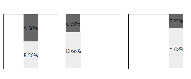
alignItems 속성으로 하위 요소들 정렬하기
-
alignitems 속성은 부모 컨테이너의 보조 축을 따라 자식 요소들을 어떻게 정렬할지를 지정한다.
-
부모 View 컴포넌트에 선언하며, flex가 적용가능한 자식 요소들에 영향을 미친다.
-
옵션
-
stretch(기본값)
: 부모 컨테이너를 채울 수 있도록 늘어난다. -
center
-
flex-start
-
flex-end
import React, { Component } from 'react';
import { StyleSheet, Text, View} from 'react-native';

export default class App extends Component{
    render() {
        return (
            <View style={styles.container}>
                <View style={[styles.flexContainer,{alignItems: 'center'}]}>
                    <Example style={[styles.darkgrey]}>A 50%</Example>
                    <Example>B 50%</Example>
                </View>
                <View style={[styles.flexContainer,{alignItems: 'flex-start'}]}>
                    <Example style={[styles.darkgrey]}>C 33%</Example>
                    <Example style={{flex: 2}}>D 66%</Example>
                </View>
                <View style={[styles.flexContainer,{alignItems: 'flex-end'}]}>
                    <Example style={[styles.darkgrey]}>E 25%</Example>
                    <Example style={{flex: 3}}>F 75%</Example>
                </View>
            </View>
        );
    }
}

const Example = (props) => (
    <View style={[styles.example,styles.lightgrey,props.style]}>
        <Text>
            {props.children}
        </Text>
    </View>
);

const styles = StyleSheet.create({
    container: {
        marginTop: 50,
        alignItems: 'center',
        flex: 1,
        flexDirection: 'row'
    },
    flexContainer: {
        width: 150,
        height: 150,
        borderWidth: 1,
        margin: 10
    },
    darkgrey: {
        backgroundColor: '#666666'
    },
    lightgrey: {
        backgroundColor: '#ededed'
    },
    example: {
        flex: 1,
        alignItems: 'center',
        justifyContent: 'center'
    },
});
alignSelf 속성으로 부모에 지정된 정렬 기준 재정의 하기
-
지금까지 배운 모든 flex 속성을 부모 컨테이너에 적용한 반면, alignSelf 속성은 자식 요소에 직접 적용합니다.
-
alignSelf 속성으로 부모 컨테이너 내의 자식요소에서 alignItems 속성을 조정할 수 있습니다.
-
alignSelf 속성은 부모 컨테이너에 지정된 정렬 기준을 재정의해서 특정한 자식 요소가 다른 자식요소들과는 별개로 정렬할 수 있습니다.
-
옵션
- auto (기본 값)
: 부모 컨테이너의 alignItems 속성값을 그대로 사용 - stretch
- center
- flex-start
- flex-end
- auto (기본 값)
<alignSelf 속성을 이용해서 부모 컨테이너의 alignItems 속성값 오버라이드하기>
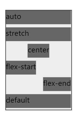
- 부모 컨테이너에 alignItems 속성값이 지정되지 않았기 때문에 기본값이 stretch를 사용합니다. 따라서, auto 속성 값은 부모 컨테이너의 stretch를 상속해서 사용합니다.
import React, { Component } from 'react';
import { StyleSheet, Text, View} from 'react-native';
export default class App extends Component{
render() {
return (
<View style={styles.container}>
<FlexContainer style={[]}>
<Example align='auto'>auto</Example>
<Example align='stretch'>stretch</Example>
<Example align='center'>center</Example>
<Example align='flex-start'>flex-start</Example>
<Example align='flex-end'>flex-end</Example>
<Example>default</Example>
</FlexContainer>
</View>
);
}
}
const FlexContainer = (props) => (
<View style={[styles.flexContainer,props.style]}>
{props.children}
</View>
);
const Example = (props) => (
<View style={[styles.example,
styles.lightgrey,
{alignSelf: props.align || 'auto'},
props.style
]}>
<Text>
{props.children}
</Text>
</View>
);
const styles = StyleSheet.create({
container: {
marginTop: 50,
alignItems: 'center',
flex: 1,
flexDirection:'row'
},
flexContainer: {
backgroundColor: '#ededed',
width: 120,
height: 180,
borderWidth: 1,
margin: 10
},
example: {
height: 25,
marginBottom: 5,
backgroundColor: '#666666'
},
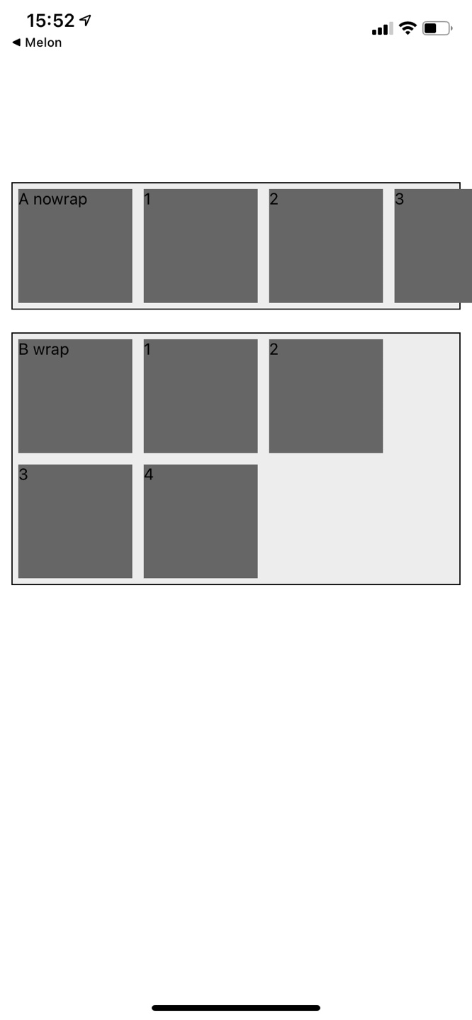
});flexWrap 속성으로 잘려나가지 않도록 하기
-
flexWrap 속성은 nowrap와 wrap의 두 가지의 속성 값을 사용한다.
-
옵션
-
nowrap (기본값)
: 항목들이 많아서 화면에 공간이 모자라게 되면 어떤 항목들은 화면 밖으로 벗어나게 된다.사용자는 잘려나간 항목이 무엇인지 제대로 볼 수 없다.
-
wrap
: 원래 형태를 잘 유지하면서 공간이 모자라게 될 경우 새로운 열로 넘긴다.
-
import React, { Component } from 'react';
import { StyleSheet, Text, View} from 'react-native';

export default class App extends Component{
    render() {
        return (
            <View style={styles.container}>
                <NoWrapContainer>
                    <Example>A nowrap</Example>
                    <Example>1</Example>
                    <Example>2</Example>
                    <Example>3</Example>
                    <Example>4</Example>
                </NoWrapContainer>
                <WrapContainer>
                    <Example>B wrap</Example>
                    <Example>1</Example>
                    <Example>2</Example>
                    <Example>3</Example>
                    <Example>4</Example>
                </WrapContainer>
            </View>
        );
    }
}

const NoWrapContainer = (props) => (
    <View style={[styles.noWrapContainer,props.style]}>
        {props.children}
    </View>
);

const WrapContainer = (props) => (
    <View style={[styles.wrapContainer,props.style]}>
        {props.children}
    </View>
);

const Example = (props) => (
    <View style={[styles.example,props.style]}>
        <Text>
            {props.children}
        </Text>
    </View>
);

const styles = StyleSheet.create({
    container: {
        marginTop: 150,
        flex: 1
    },
    noWrapContainer: {
        backgroundColor: '#ededed',
        flexDirection: 'row',
        flexWrap: 'nowrap',
        borderWidth: 1,
        margin: 10
    },
    wrapContainer: {
        backgroundColor: '#ededed',
        flexDirection: 'row',
        flexWrap: 'wrap',
        borderWidth: 1,
        margin: 10
    },
    example: {
        width: 100,
        height: 100,
        margin: 5,
        backgroundColor: '#666666'
    },
});