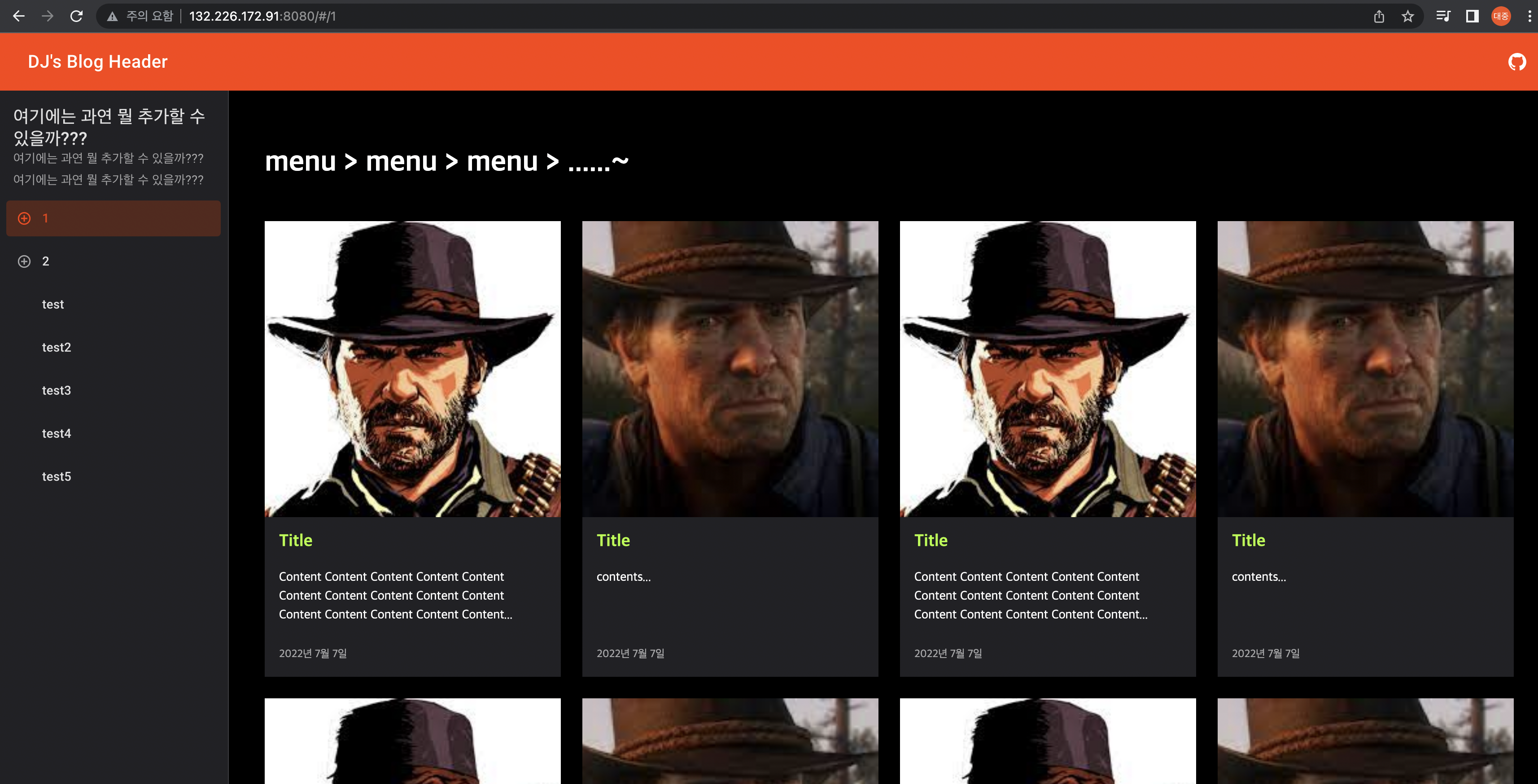
위와 같은 구조의 Article List 화면 UI template 를 만들자.
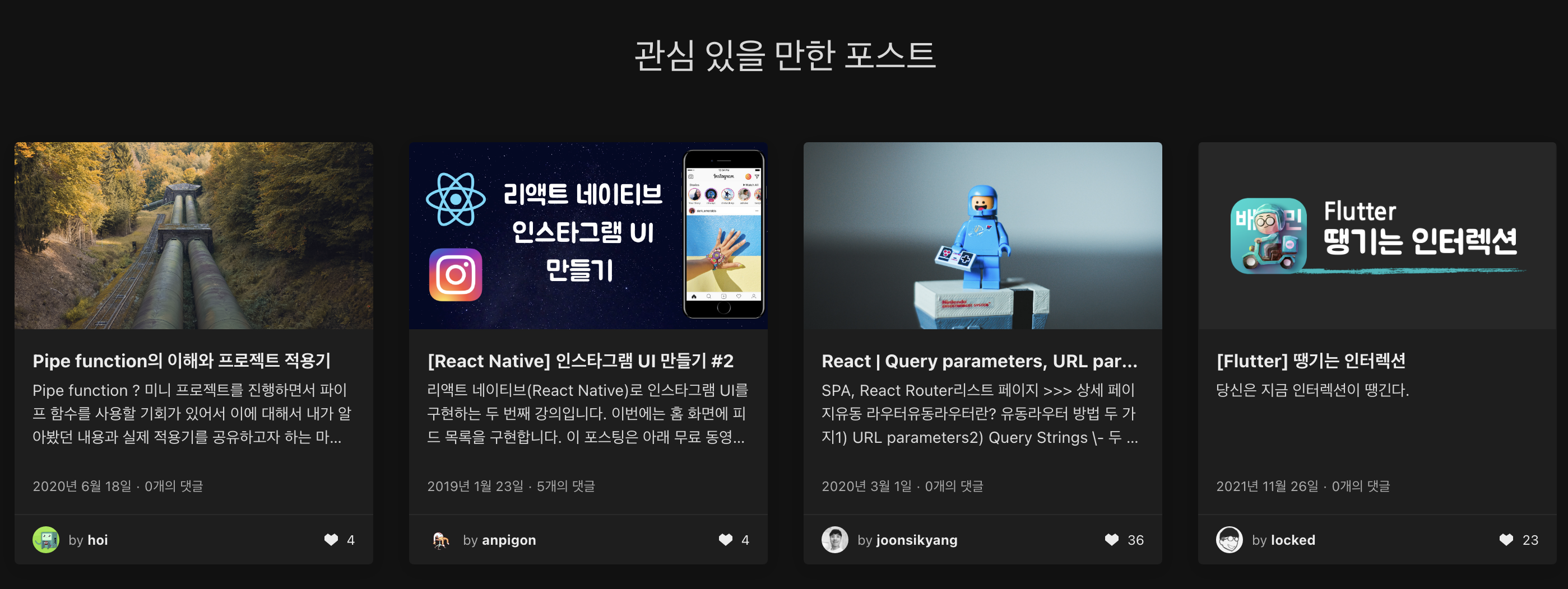
먼저 밝혀두어야 할 것은 내가 디자인의 재능이 없기 때문에 velog 의 "관심 있을 만한 포스트" 화면을 모티브로 삼았다.
velog 님 감사드립니다. 🙇
- velog 의 "관심 있을 만한 포스트" 화면
html 구조 자체는 Svelte Material UI 의 Layout Grid 를 쓰고 (https://sveltematerialui.com/demo/layout-grid/)
세부적인 css 는 velog 의 "관심 있을 만한 포스트" 에서 사용하는 걸 많이 가져다 썼다.
velog 님 다시 한번 감사드립니다. 🙇
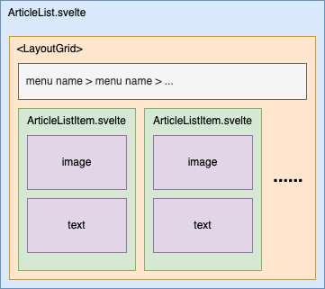
ArticleList.svelte
일단 컨테이너가 되는 ArticleList.svelte 는 아래와 같다.
-
ArticleList.svelte<LayoutGrid> <Cell spanDevices={{ desktop: 12, tablet: 8, phone: 4 }}> <div><h1>menu > menu > menu > ......~</h1></div> </Cell> {#each Array(39) as _unused, i} <Cell spanDevices={{ desktop: 3, tablet: 4, phone: 4 }}> <ArticleListItem i={i}></ArticleListItem> </Cell> {/each} </LayoutGrid> <script> import LayoutGrid, { Cell } from '@smui/layout-grid'; import ArticleListItem from '../child/ArticleListItem.svelte'; </script>
기본적으로 Material UI 의 Layout Grid 는 width 에 따라 colomn 의 개수를 달리 가져가는 듯 하다.
https://material.io/design/layout/responsive-layout-grid.html#columns-gutters-and-margins
뭐 width 로 구분하겠지만, 간단히 mobile 에서는 4개, tablet 에서는 8개, 위 링크에는 없지만 pc 에는 12 구획으로 나누는 듯...
<Cell> 의 spanDevices 항목은 하나의 <Cell> 이 몇 colomn 을 차지하느냐를 정의하는 옵션이다.
<Cell spanDevices={{ desktop: 3, }}> 의 경우 desktop 에서 colomn 의 총 개수는 12개이고 1개의 <Cell> 당 colomn 3개를 차지하므로, 1행당 총 4개의 <Cell> 이 노출된다.
위 코드의 <Cell spanDevices={{ desktop: 3, tablet: 4, phone: 4 }}> 의 경우 아래와 같은 의미를 지닌다.
desktop: 3- 하나의
<Cell>은 colomn 3개를 차지함 - desktop 에서는 총 12개의 colomn 이 존재하므로, row 에는 12 / 3 = 4개의
<Cell>존재
- 하나의
tablet: 4- 하나의
<Cell>은 colomn 4개를 차지함 - tablet 에서는 총 8개의 colomn 이 존재하므로, row 에는 8 / 4 = 2개의
<Cell>존재
- 하나의
phone: 4- 하나의
<Cell>은 colomn 3개를 차지함 - phone 에서는 총 4개의 colomn 이 존재하므로, row 에는 4 / 4 = 1개의
<Cell>존재
- 하나의
ArticleListItem.svelte
이제 리스트의 아이템이 되는 ArticleListItem.svelte 를 작성해보자.
-
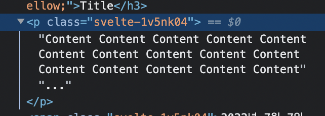
ArticleListItem.svelte<div class="article-list-item-cell-container"> <div class="article-list-item-cell-image-box"> <img alt="..." src={images[i % 2]} /> </div> <div class="article-list-item-cell-text-box"> <div> <h3 style="color: greenyellow;">Title</h3> <p>{title}{@html '...'}</p> <span>2022년 7월 7일</span> </div> </div> </div> <script> export let i; const images = [ '...', '...' ]; const title = i % 2 === 0 ? "Content Content Content Content Content Content Content Content Content Content Content Content Content Content Content" : "contents"; </script> <style> .article-list-item-cell-container { display: flex; flex-direction: column; justify-content: center; align-items: center; background-color: var(--mdc-theme-surface, #212125); color: var(--mdc-theme-on-surface, #fff); } .article-list-item-cell-image-box { width: 100%; padding-top: 100%; position: relative; } .article-list-item-cell-image-box img{ position: absolute; top: 0px; left: 0px; width: 100%; height: 100%; display: block; object-fit: cover; } .article-list-item-cell-text-box { width: 100%; } .article-list-item-cell-text-box > div{ padding: 1rem; display: flex; flex: 1 1 0%; flex-direction: column; } .article-list-item-cell-text-box h3 { color: greenyellow; margin-top: 0; } .article-list-item-cell-text-box p { margin: 0px 0px 1.5rem; word-break: break-word; overflow-wrap: break-word; font-size: 0.875rem; line-height: 1.5; height: 3.9375rem; display: -webkit-box; -webkit-line-clamp: 3; -webkit-box-orient: vertical; overflow: hidden; text-overflow: ellipsis; } .article-list-item-cell-text-box span { font-size: 0.75rem; line-height: 1.5; color: rgba(255, 255, 255, 0.6); } </style>
거의 대부분의 css 를 velog 의 "관심 있을 만한 포스트" 에서 사용하는 걸 많이 가져다 썼다.
다시 한번 velog 님 감사드립니다. 🙇
아 참고로 {@html ...} 은 svelte 문법으로 전달되는 text 를 그대로 html 에 추가하는 문법이다. (https://svelte.dev/docs#template-syntax-html)
<p>{text}{@html '...'}</p>위 코드의 의미는 결국 text node 2개가 생성되어서 <p> 의 자식으로 들어가게 된다는 의미이다.
만약 {@html ...} 없이, 예를 들면 <p>{title}{'...'}</p> 처럼 그냥 ... 을 추가한다면 svelte 에서는 <p> 안의 모든 contents 를 합친 후 escape 처리 후 들어가기 때문에 하나의 text node 만 생성됨.
물론 velog 의 "관심 있을 만한 포스트" 에서 참조한 부분이고, 왜 이렇게 했느냐 하면 ... 처리를 좀 더 자연스럽게 하려고 한듯...
어쨌든 최종 화면은 아래와 같다.