.png)
외주로 iOS 앱 개발을 하고 있는데, 키워드 버블을 구현해달라고 한다.

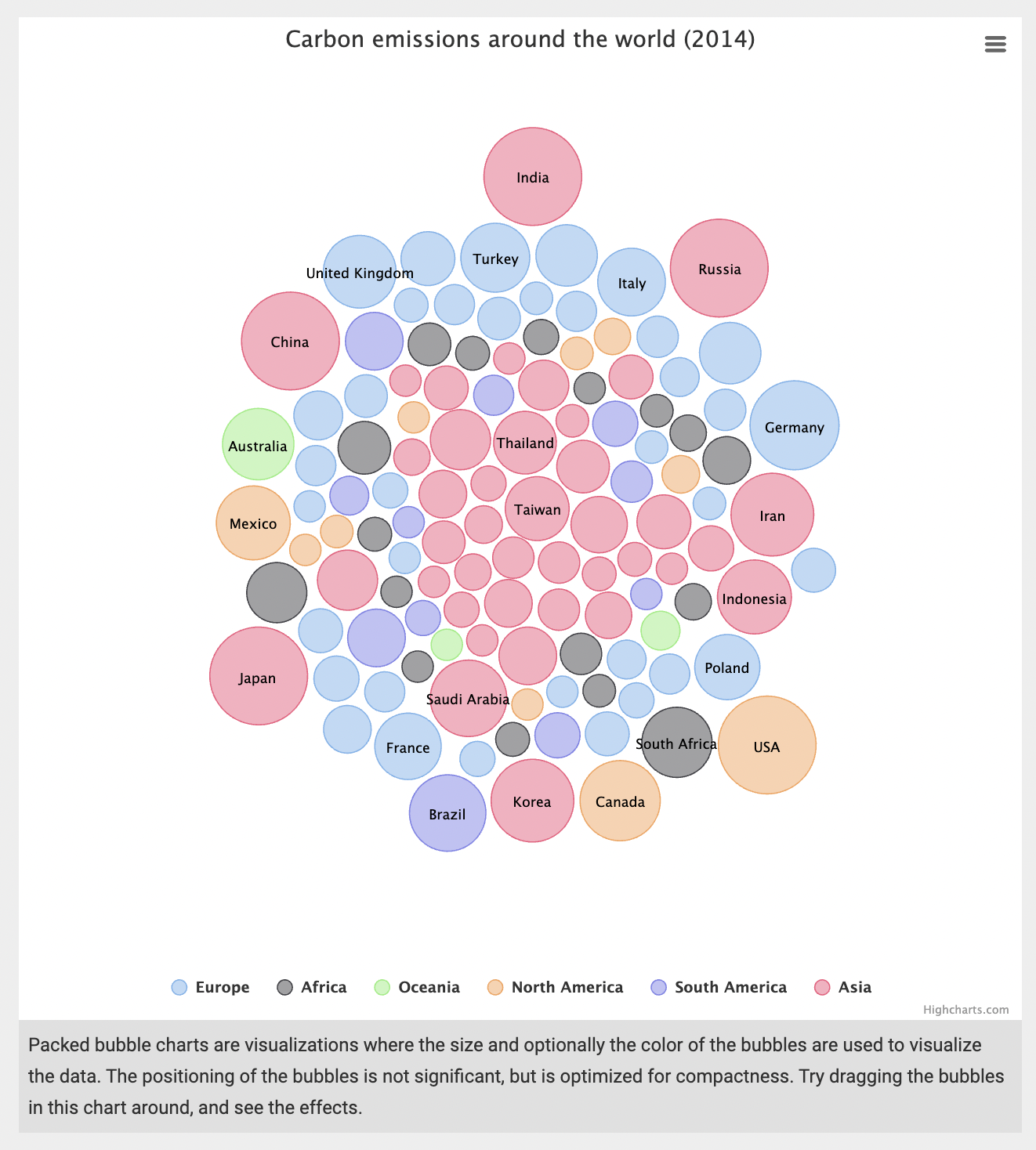
대충 이렇게 생긴 ..
당연히 레퍼런스는 없었다.
어딘가 한 번쯤 보게 생겼는데, 했을 때쯤에는 웹에서는 많이 봤지만 앱에서는 한 번도 본 적이 없다는 것을 깨달은 후였다.
막막했다.
막막하게 한 3일 정도 라이브러리 서치와 어떻게 구현할 수 있을지, javascript로 구현해서 web뷰 이식을 하는 방법이 나을지 별의 별 궁리를 다 했다.
그러다가 기적처럼 라이브러리 딱 하나를 발견했다.
https://www.highcharts.com/
Highcharts라는 다양한 차트 라이브러리였다. 이미 웹 프론트엔드, 안드로이드, iOS 환경 모두를 지원하고 있었다. 깃허브를 잠시 살펴 보니 마지막 업데이트를 한지 1달도 채 되지 않을 만큼 꾸준히 업데이트가 일어나고 있었고, 차트 분야에서는 사용자도 꽤 많은 것 같았다. API docs도 꽤 논리적이고 꼼꼼하게 구성되어 있었다.
그 중에서도 내가 키워드 버블을 구현하기 위해 사용했던 라이브러리 모듈은 Packed bubble chart이다.
https://www.highcharts.com/demo/ios/packed-bubble
코드도 예시가 나와 있어서 사실 docs 없이도 눈치껏 할 수 있을 것 같았다.
import Highcharts
import UIKit

class ViewController: UIViewController {

  override func viewDidLoad() {
    super.viewDidLoad()

    let chartView = HIChartView(frame: view.bounds)

    let options = HIOptions()

    let chart = HIChart()
    chart.type = "packedbubble"
    chart.height = "100%"
    options.chart = chart

    let title = HITitle()
    title.text = "Carbon emissions around the world (2014)"
    options.title = title

    let tooltip = HITooltip()
    tooltip.useHTML = true
    tooltip.pointFormat = "<b>{point.name}:</b> {point.value}m CO<sub>2</sub>"
    options.tooltip = tooltip

    let plotOptions = HIPlotOptions()
    plotOptions.packedbubble = HIPackedbubble()
    plotOptions.packedbubble.minSize = "30%"
    plotOptions.packedbubble.maxSize = "120%"
    // plotOptions.packedbubble.zMin = 0
    // plotOptions.packedbubble.zMax = 1000
    plotOptions.packedbubble.layoutAlgorithm = HILayoutAlgorithm()
    plotOptions.packedbubble.layoutAlgorithm.splitSeries = "false"
    plotOptions.packedbubble.layoutAlgorithm.gravitationalConstant = 0.02

    let dataLabels = HIDataLabels()
    dataLabels.enabled = true
    dataLabels.format = "{point.name}"
    dataLabels.filter = HIFilter()
    dataLabels.filter.property = "y"
    dataLabels.filter.operator = ">"
    dataLabels.filter.value = 250
    dataLabels.style = HIStyle()
    dataLabels.style.color = "black"
    dataLabels.style.textOutline = "none"
    dataLabels.style.fontWeight = "normal"

    plotOptions.packedbubble.dataLabels = [dataLabels]

    options.plotOptions = plotOptions

    let europe = HIPackedbubble()
    europe.name = "Europe"

    let germany = HIData()
    germany.name = "Germany"
    germany.value = 767.1

    let belgium = HIData()
    belgium.name = "Belgium"
    belgium.value = 97.2

    // 중략 (버블 선언부)

    let korea = HIData()
    korea.name = "Korea"
    korea.value = 610.1

    asia.data = [nepal, georgia, bruneiDarussalam, kyrgyzstan, afghanistan, myanmar, mongolia, sriLanka, bahrain, yemen, jordan, lebanon, azerbaijan, singapore, hongKong, syria, dPRKorea, israel, turkmenistan, oman, qatar, philippines, kuwait, uzbekistan, iraq, pakistan, vietnam, unitedArabEmirates, malaysia, kazakhstan, thailand, taiwan, indonesia, saudiArabia, japan, china, india, russia, iran, korea]

    options.series = [europe, africa, oceania, northAmerica, southAmerica, asia]

    chartView.options = options

    self.view.addSubview(chartView)
사이트에 공개돼있는 해당 사진을 만들기 위한 swift 코드다.
기본적으로 JS 베이스로 되어있는 코드고, swift로 접근할 수 있게 만들어진 프레임워크로 코드를 짜면 그게 js로 변환되어 웹뷰로 띄우는 구조로 되어 있는 것 같았다.
하이차트로 swift 개발을 한 선례는 많이 없었지만, 곧 쉽게 커스텀 할 수 있게 되었는데, Js로 나와있는 예시를 swift로 다 변환할 수 있는 이 구조를 알면 쉬웠다.
예시를 하나 들자면, 만약 버블의 투명도를 조절하는 Js 코드 예시가 아래처럼 나와있다면,
Highcharts.chart('container', {
    plotOptions: {
        series: {
            marker: {
                fillOpacity: '#FFFFFF', // 투명도 조절하는 부분
            }
        }
    },
});
swift에서 쓸 때는 HIMarker 클래스를 marker 변수에 상속해준 후, 내가 기존에 선언해놓은 plotOptions.packedbubble에 해당 marker를 계속해서 이어주면 된다.
js의 계층은 그대로 따르되, 클래스 변수를 선언하는 과정이 한 번 더 있어야 하는 것이다.
/// 동그라미 투명도 조절하기
let marker = HIMarker()
plotOptions.packedbubble.marker = marker
plotOptions.packedbubble.marker.fillOpacity = 1
이걸 알기 전에는 계속 프로퍼티가 nil이 떠서 고생했었는데, let marker = HIMarker() 한 줄에 모든 것이 해결되었다. 신기하다.
그래서 나는 햄버거바 숨기기, 크레딧 text 수정, 버블 투명도 조절, 타이틀 디자인, 카테고리 숨기기, 클릭 이벤트 넣기 등의 커스텀을 했다.
/// 햄버거바 숨기기
let exporting = HIExporting()
exporting.enabled = false
options.exporting = exporting

/// 크레딧 자리에 기준날짜 띄우기
let credits = HICredits()
credits.text = "\(getDateToday()) 기준"
options.credits = credits

/// 동그라미 투명도 조절하기
let marker = HIMarker()
plotOptions.packedbubble.marker = marker
plotOptions.packedbubble.marker.fillOpacity = 1

/// 타이틀 디자인
let style = HICSSObject()
title.style = style
title.style.fontSize = "15"
title.style.fontWeight = "bold"

/// 카테고리 숨기기
let legend = HILegend()
legend.enabled = false
options.legend = legend

/// 클릭 이벤트
let chartSeries = HISeries()
plotOptions.series = chartSeries

let chartPoint = HIPoint()
plotOptions.series.point = chartPoint

let chartEvents = HIEvents()
plotOptions.series.point.events = chartEvents

let chartFunction = HIFunction(closure: { context in
  guard let context = context else { return }
  let bubbleIndex: Int = context.getProperty("this.index") as! Int
  // 클릭이벤트 처리 로직
}, properties: ["this.index"])

plotOptions.series.point.events.click = chartFunction
이렇게 커스텀을 해서 결국
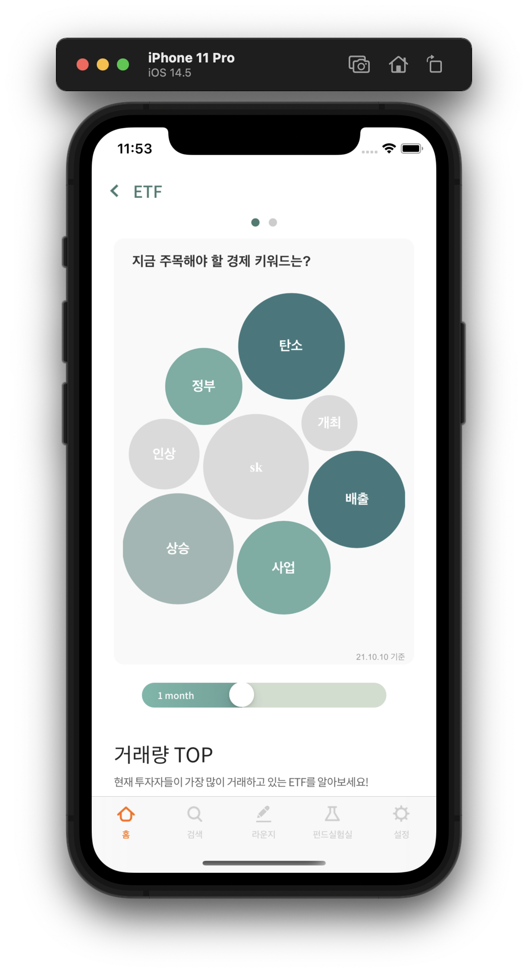
이런 식으로 서버에서 넘어오는 데이터를 버블차트에 띄울 수 있게 되었다!!
아쉬웠던 건,
1. 회색인 버블은 약간 진한 색의 데이터라벨을 띄우고 싶었고, 색이 있는 버블은 흰색의 데이터 라벨을 띄우고 싶었는데, 그 부분을 커스텀하는 법을 모르겠다는 것
2. 데이터 라벨의 글자 크기를 버블 크기에 따라 바꾸고 싶은데, 거기까지는 커스텀을 하지 못했다는 것
커스텀 할 수는 있을 것 같은데 서버 데이터도 받아오고 해야 해서 너무 하드코딩이 될 것 같아서 하지 않았는데 ..
나중에 시간이 더 많다면 이 부분 커스텀을 더 해보고 싶다.