프론트엔드스쿨 layout - grid 10/5
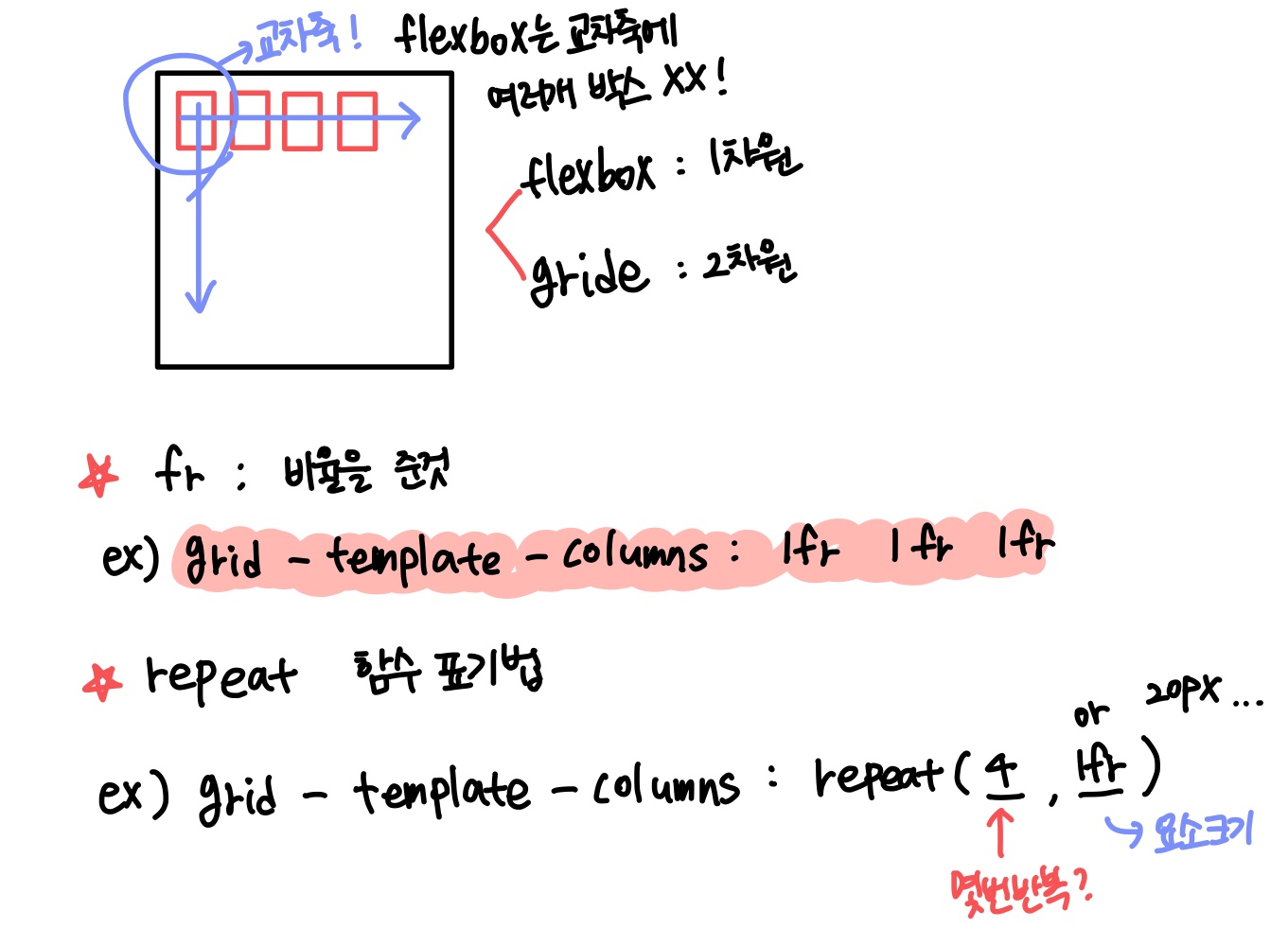
✅grid layoyt
▲ flexbox에는 교차축에 여러개의 item들이 있으면 안돼
▲ row - 행
▲ column - 열
▲ gutters - 각 행과 열 사이의 공백
▲ 이 레이아웃은 상품 나열 또는 사진 나열하는 곳에 잘 쓰여
▲ table은 레이아웃에 사용하면 안돼
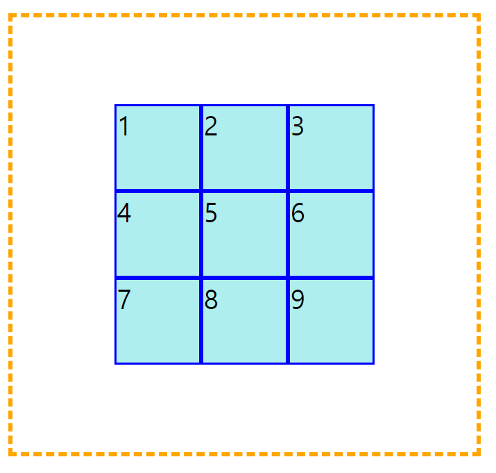
▲ grid layout은 바깥쪽에 container틀을 만들고 내부에 형제 item들을 차례로 넣는 형태로 이루어진다.✨html code
    <div class="container">
      <div class="item">1</div>
      <div class="item">2</div>
      <div class="item">3</div>
      <div class="item">4</div>
      <div class="item">5</div>
    </div>
✨css code
.container{
  margin: 50px 0px;
  border: 5px dashed orange;
  display: inline-grid;
  grid-template-columns: 1fr 1fr 1fr;
  width: 70%;
}
.item{
  background-color: paleturquoise;
  border: 3px solid blue;
  font-size: 30px;
}
✅부모(container)에 쓸 수 있는 속성
▲ gird-template-rows : 몇개의 행을 갖는지
▲ gird-template-columns : 몇개의 열을 갖는지
3개의 열로 만들고 싶다
.container{
  	border: 5px dashed orange;
  	display: inline-grid;
  	grid-template-columns: 100px 150px 100px;
  	width: 70%;
}
.item{
  background-color: paleturquoise;
  border: 3px solid blue;
  font-size: 30px;
}
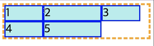
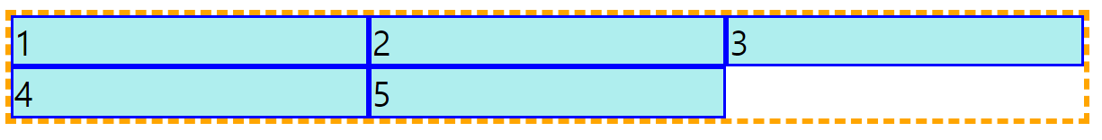
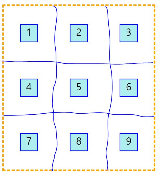
▲ item들이 하나의 행 하나의 열에만 차지하는 것이 아니라, 여러개의 행과 열을 차지 할 수 있어
▲ 무조건 item들은 네모 모양이여야 돼!!!!!!!!!!
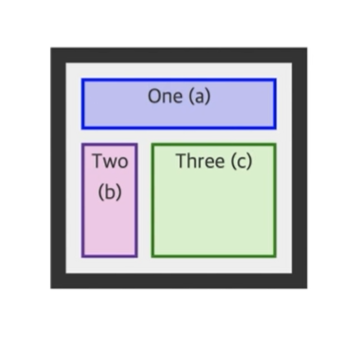
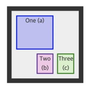
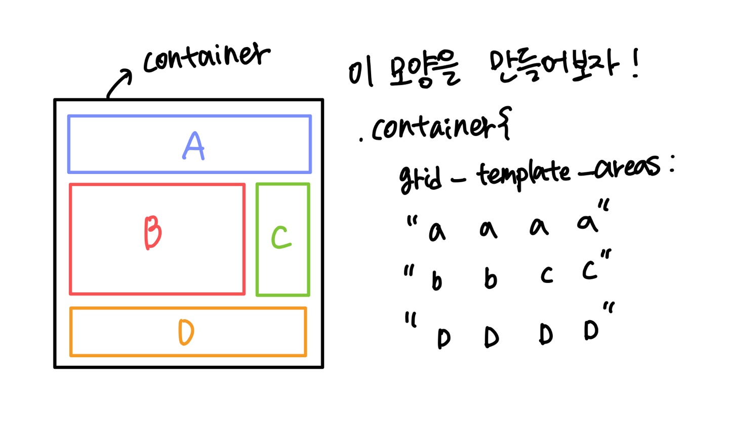
▲ gird-template-areas를 사용하면 돼gird-template-areas : "a a a" "b c c" "b c c";
 gird-template-areas :
         "b b a"
         "b b c"
         "b b c";
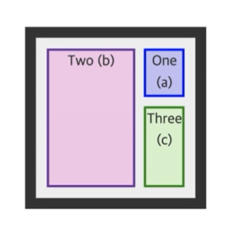
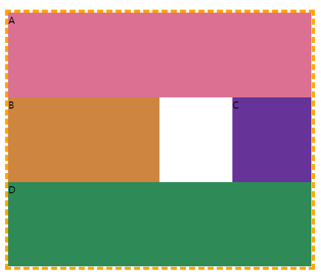
gird-template-areas :
         "a a ."
         "a a ."
         ". b c";
💥grid로 레이아웃 짤 때, class명을 사용하는 것이 아니라 grid-area로 이름 정해서 사용
 .container{
  margin: 50px 20px;
  border: 5px dashed orange;
  width: 70%;
  height: 400px;
  display: grid;
  grid-template-areas:
    "a a a a"
    "b b . c"
    "d d d d";
}
.a{
  grid-area: a;
  background-color: palevioletred;
}
.b{
  grid-area: b;
  background-color: peru;
}
.c{
  grid-area: c;
  background-color: rebeccapurple;
}
.d{
  grid-area: d;
  background-color: seagreen;
}
✅justify-content, align-content vs justify-items, align-items
▲ justify : main축
▲ align : 교차축
▲ content : 안에 있는 요소들
▲ items : 하나의 틀안에서 하나의 요소에 대해서만
▲ justify-items : 그 하나하나 요소들의 전체
▲ justify-self : 여러개중 딱 하나를 정해 그것만 효과줄때
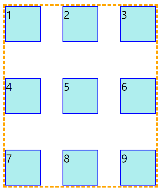
✅ container 안에서 가운데 정렬
html code
<div class="container">
      <div class="item">1</div>
      <div class="item">2</div>
      <div class="item">3</div>
      <div class="item">4</div>
      <div class="item">5</div>
      <div class="item">6</div>
      <div class="item">7</div>
      <div class="item">8</div>
      <div class="item">9</div>
</div>
css code
.container{
  margin: 50px 20px;
  border: 5px dashed orange;
  width: 100%;
  height: 500px;
  display: grid;
  grid-template-rows: repeat(3,100px);
  grid-template-columns: repeat(3,100px);
  **justify-content: center;**
  **align-content: center;**
}
.item{
  background-color: paleturquoise;
  border: 3px solid blue;
  font-size: 30px;
}
✅item들이 container 끝으로 퍼지는
justify-content: space-between과 align-content: space-between이용!
css code
.container{
  margin: 50px 20px;
  border: 5px dashed orange;
  width: 100%;
  height: 500px;
  display: grid;
  grid-template-rows: repeat(3,100px);
  grid-template-columns: repeat(3,100px);
  **justify-content: space-between;**
  **align-content: space-between;**
}
.item{
  background-color: paleturquoise;
  border: 3px solid blue;
  font-size: 30px;
}
✅ item들이 자기가 차지할 수 있는 틀안에서 가운데 정렬
justify-content: cernter과 align-content: center이용!
css code
 .container{
  margin: 50px 20px;
  border: 5px dashed orange;
  width: 50%;
  height: 500px;
  display: grid;
  grid-template-rows: repeat(3,1fr);
  grid-template-columns: repeat(3,1fr);
  justify-items: center;
  align-items: center;
 }
 .item{
  background-color: paleturquoise;
  border: 3px solid blue;
  font-size: 30px;
  width: 50px;
  height: 50px;
  text-align: center;
 }
✅ grid 단위 - fr, min-content, max-content```
만약
gird-template-rows : 100px 1fr 1fr;이렇게 사용한다면, 맨 앞 요소는 100px로 잡아 놓고 남은 크기에서 비율로 크기를 가져간다.
📌min-content : 최소로 줄일 수 있을 만큼 사이즈로 줄어드는데, 요소의 원래 크기까지
📌max-content : 최대로 늘릴 수 있을 만큼
✅ auto-fill, auto-fit
📌auto-fill : column의 개수를 유연하게 조절, 만약 브라우저 사이즈를 조절할 때, 남는 공간에 요소가 채워짐(그 반대도 마찬가지)
📌auto-fill과 minmax()를 같이 사용하면 남는 공간 없이 꽉 채워서 사용가능