오늘은 팀 프로젝트에서 다양한 일들을 진행하면서 많은 것을 배울 수 있었다. 같이 의견도 조율하고 스탠다드반 수업도 들었었다...
탑버튼, 바텀버튼 구현
import styled from 'styled-components';
const UpDown = () => {
const scrollTop = () => {
window.scrollTo({
top: 0,
behavior: 'smooth',
});
};
const scrollDown = () => {
window.scrollTo({
top: document.body.scrollHeight,
behavior: 'smooth',
});
};
return (
<div>
<UpButton onClick={scrollTop}>↑</UpButton>
<DownButton onClick={scrollDown}>↓ </DownButton>
</div>
);
};
export default UpDown;
const UpButton = styled.button`
padding: 10px;
position: fixed;
bottom: 90px;
right: 25px;
border: none;
background-color: #f4eba5;
z-index: 99;
font-size: 30px;
border-radius: 10px;
width: 60px;
box-shadow: 2px 2px 2px #aaa;
font-weight: bold;
&:hover {
background-color: #ccc;
}
`;
const DownButton = styled.button`
padding: 10px;
position: fixed;
font-weight: bold;
bottom: 20px;
border: none;
box-shadow: 2px 2px 2px #aaa;
border-radius: 10px;
right: 25px;
font-size: 30px;
background-color: #a5c7bb;
width: 60px;
z-index: 99;
&:hover {
background-color: #ccc;
}
`;
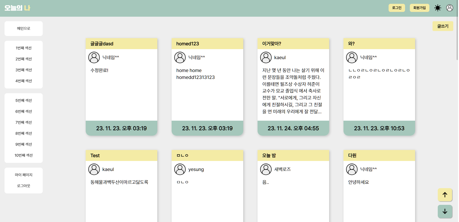
☞ 탑 버튼은 페이지 상단으로 스크롤하도록 하고, 바텀 버튼은 페이지의 맨 아래로 스크롤하도록 설정했음
☞ Top은 쉬웠는데 Bottom에서 조금 헤맸음
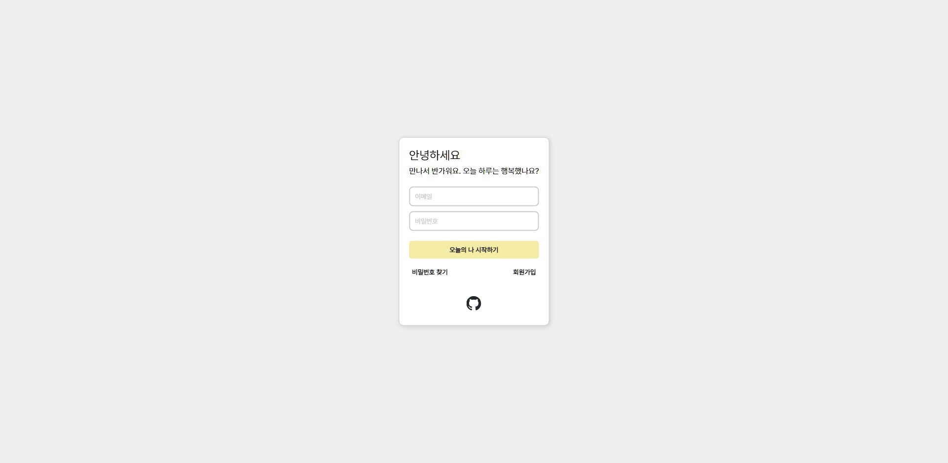
로그인 화면 Styled Components로 Styling구현
import styled from 'styled-components';

export const LoginBox = styled.div`
  background-color: #fff;
  position: absolute;
  left: 50%;
  top: 50%;

  transform: translate(-50%, -50%);
  padding: 20px;
  line-height: 2rem;
  border-radius: 10px;
  border: 1px solid #ccc;
  box-shadow: 2px 2px 8px #ccc;
  //rem <body> 16px 설정되어있는 폰트사이즈 기준으로
  // 1rem 100% 2rem 200%  em은 부모 태그 기준

  h2 {
    font-size: 1.5rem;
  }
`;
//가로 34% 대략
export const SignUpBtn = styled.button`
  background-color: transparent;
  border: none;
  font-weight: bold;
  cursor: pointer;
`;
export const LoginBtn = styled.button`
  width: 100%;
  padding: 10px;
  background-color: #f4eba5 !important;
  border-radius: 5px;
  border: none;
  cursor: pointer;
  font-weight: bold;
  margin-bottom: 10px;
  &:hover {
    background-color: #a5c7bb !important;
  }
`;
export const FindPwBtn = styled.button`
  background-color: transparent;
  border: none;
  font-weight: bold;
  cursor: pointer;
`;
export const PwInput = styled.input`
  padding: 10px;
  border-radius: 8px;
  width: 100%;
  outline: none;
  &::placeholder {
    color: #ccc;
  }
  border: 2px solid #ccc;
  margin-bottom: 20px;
`;
export const EmailInput = styled.input`
  padding: 10px;
  width: 100%;
  outline: none;
  border: 2px solid #ccc;
  border-radius: 8px;
  margin-bottom: 10px;
  margin-top: 15px;
  &::placeholder {
    color: #ccc;
  }
`;

export const BtnBundle = styled.div`
  display: flex;
  margin-top: 8px;
  justify-content: space-between;
`;

export const GithubButton = styled.img`
  width: 30px;
  cursor: pointer;
`;

export const SocialLogin = styled.div`
  display: flex;
  width: 70%;

  justify-content: space-evenly;
  margin: 40px auto 10px;
  // 위 양쪽 아래 // 2개 : 위아래 양쪽
`;
비밀번호 찾기 모달 구현
const Bg = styled.div`
  background-color: rgba(0, 0, 0, 0.5);
  width: 100%;
  height: 100%;
  position: absolute;
  h2 {
    font-size: 24px;
    font-weight: bold;
  }
`;

const Modal = styled.div`
  background-color: #fff;
  padding: 30px 20px;
  width: 400px;
  position: absolute;
  left: 50%;
  border-radius: 15px;
  top: 50%;
  transform: translate(-50%, -50%);
  box-shadow: 3px 3px 10px #555;
`;

const CloseBtn = styled.button`
  font-size: 29px;
  font-weight: bold;
  border: none;
  background-color: transparent;
  transform: translate(0px, -2px);
`;
const Email = styled.input`
  padding: 10px;
  width: 100%;
  outline: none;
  border: 2px solid #ccc;
  border-radius: 8px;
  margin-bottom: 30px;
  margin-top: 30px;
  &::placeholder {
    color: #ccc;
  }
`;

export const ResetPwBtn = styled.button`
  width: 100%;
  padding: 10px;
  background-color: #f4eba5 !important;
  border-radius: 5px;
  border: none;
  cursor: pointer;
  font-weight: bold;
  margin-bottom: 10px;
  &:hover {
    background-color: #a5c7bb !important;
  }
`;

const ModalBasic = ({ setModalOpen }) => {
  const [email, setEmail] = useState('');
  const closeModal = () => {
    setModalOpen(false);
  };

  const NameClose = styled.div`
    display: flex;
    align-items: center;
    justify-content: space-between;
  `;
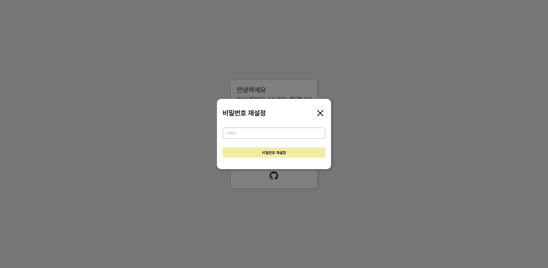
☞ 모달창 띄우고 뒤에 반투명하게 하는 것이 컴포넌트가 내부에 있어서 구현이 어려워서 외부로 빼내니까 수월했음
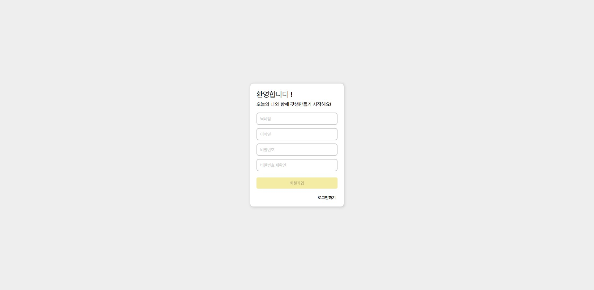
회원가입 Styled Components로 Styling 구현
import styled from 'styled-components';

export const SignUpBox = styled.form`
  background-color: #fff;
  position: absolute;
  left: 50%;
  top: 50%;
  width: 304px;
  transform: translate(-50%, -50%);
  padding: 20px;
  line-height: 2rem;
  border-radius: 10px;
  border: 1px solid #ccc;
  box-shadow: 2px 2px 8px #ccc;
  h2 {
    font-size: 1.5rem;
  }
  p {
    margin-bottom: 10px;
  }
`;

export const NameInput = styled.input`
  padding: 10px;
  border-radius: 8px;
  width: 100%;
  outline: none;
  &::placeholder {
    color: #ccc;
  }
  border: 2px solid #ccc;
  margin-bottom: 10px;
`;
export const EmailInput = styled.input`
  padding: 10px;
  border-radius: 8px;
  width: 100%;
  outline: none;
  &::placeholder {
    color: #ccc;
  }
  border: 2px solid #ccc;
  margin-bottom: 10px;
`;
export const PasswordInput = styled.input`
  padding: 10px;
  border-radius: 8px;
  width: 100%;
  outline: none;
  &::placeholder {
    color: #ccc;
  }
  border: 2px solid #ccc;
  margin-bottom: 10px;
`;
export const TwicePwInput = styled.input`
  padding: 10px;
  border-radius: 8px;
  width: 100%;
  outline: none;
  &::placeholder {
    color: #ccc;
  }
  border: 2px solid #ccc;
  margin-bottom: 10px;
`;

export const SignUpBtn = styled.button`
  width: 100%;
  padding: 10px;
  background-color: #f4eba5 !important;
  border-radius: 5px;
  border: none;
  cursor: pointer;
  font-weight: bold;
  margin-top: 10px;
  margin-bottom: 10px;
`;

export const LoginBtn = styled.button`
  border: none;
  background-color: transparent;
  float: right;
  font-weight: bold;
  margin-top: 10px;
`;
헤더 조정
const UserIcon = styled.img`
  width: 30px;
`;
const DarkMode = styled.img`
  margin-right: 20px;
  width: 30px;
`;

const MenuIcon = styled.img`
  width: 30px;
  display: none;
  margin-left: 20px;
  @media ${props => props.theme.mobile} {
    display: flex;
  }
`;

const SignUpBtn = styled.button`
  background-color: #f4eba5;
  border: none;
  padding: 8px 15px;
  font-size: 15px;
  font-weight: bold;
  margin: 0 20px;
  font-family: 'Pretendard-Regular';
  border-radius: 8px;
  cursor: pointer;

  &:hover {
    background-color: #eee;
  }
`;

const LoginBtn = styled.button`
  background-color: #f4eba5;
  border: none;
  font-size: 15px;
  font-weight: bold;
  padding: 8px 15px;
  font-family: 'Pretendard-Regular';
  cursor: pointer;
  border-radius: 8px;
  &:hover {
    background-color: #eee;
  }
`;

const LogOutBtn = styled.button`
  background-color: #f4eba5;
  border: none;
  font-size: 15px;
  font-weight: bold;
  padding: 8px 15px;
  margin-right: 20px;
  font-family: 'Pretendard-Regular';
  cursor: pointer;
  border-radius: 8px;
  &:hover {
    background-color: #eee;
  }
`;

const Buttons = styled.div`
  display: flex;
  align-items: center;
`;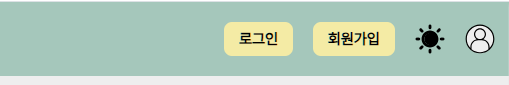
☞ 헤더에 오른쪽 아이콘들이 각각 위아래로 안맞게 되어 있어서 위치 조정을 했다.
오늘의 한줄평 : 와 9시 시작해서 12시 넘어서 끝나는거 실화냐... 진짜 열심히 너무.. 고단함 ㅠㅠ 뿌듯하면서도 와... 다 팀원덕분인것 같다.
귀여운 걸 좋아하고 흥미가 있으면 불타오릅니다💙 최근엔 코딩이 흥미가 많아요🥰