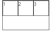
Flex
보통 1줄 정렬할 때 사용
display
border는 따로 설정
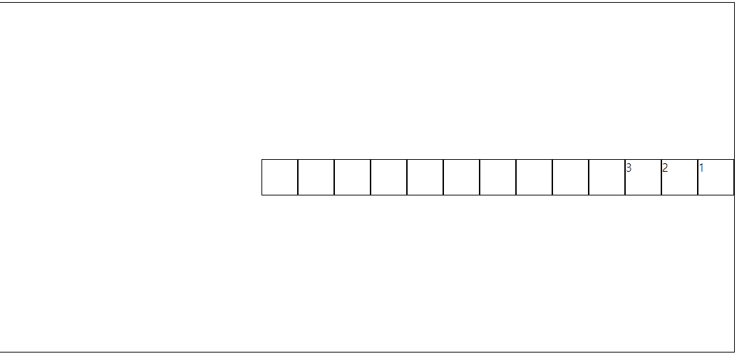
<style>
  display: flex;
</style>
<div class="container">
  <div class="item1">1</div>
  <div class="item2">2</div>
  <div class="item3">3</div>
</div>
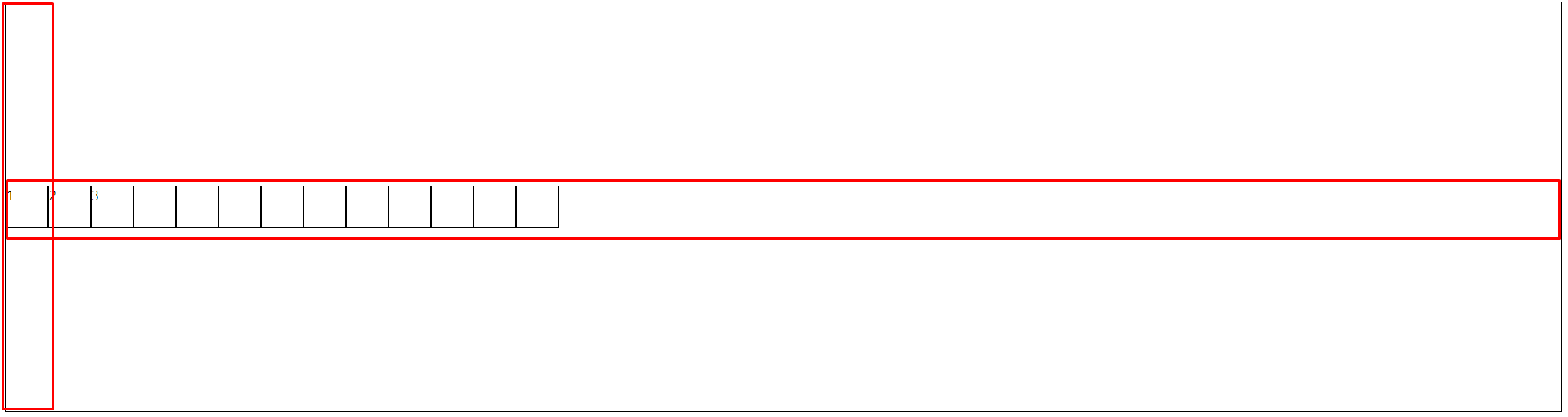
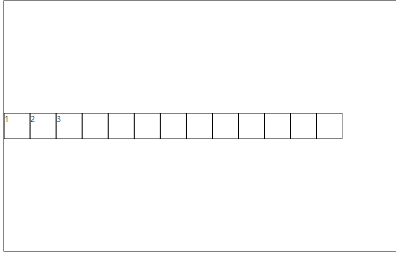
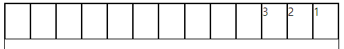
(container 한 줄 전체 차지)<style> display: inline-flex; </style> <div class="container"> <div class="item1">1</div> <div class="item2">2</div> <div class="item3">3</div> </div>
(container가 아이템 크기에 맞춰짐)

justify(align)-content(items)
justify : 정렬된 방향(축)
content : 정렬된 방향(축)에 교차되는 방향(축)/* content는 여러 줄에 대한 설정 */ /* 정렬된 방향의 배치 순서 및 간격 및 위치*/ justify-items: left; /* items는 한 줄에 대한 설정 */ /* 정렬된 방향에 교차되는 부분의 배치 간격 및 위치 */ align-content: center;
가로가 justify, 세로가 align (flex-direction 설정으로 바뀔 수 있음)
justify-direction
/* 배치 기준 축 및 방향(순서) */
flex-direction: row;
flex-direction: column;
/* 역순서 */
flex-direction: row-reverse;
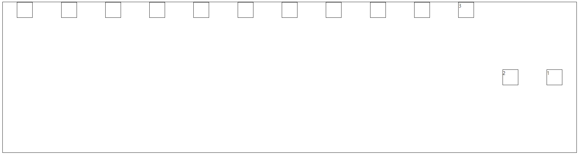
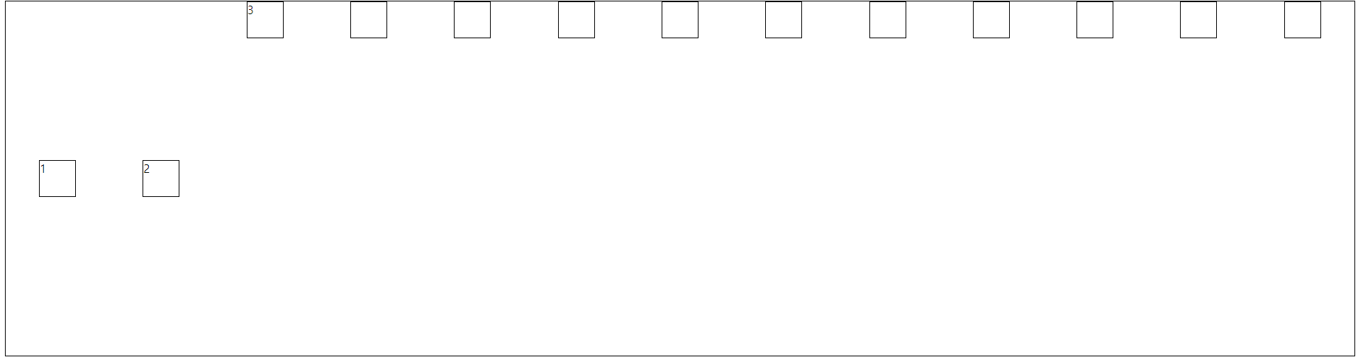
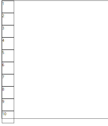
flex-wrap
/* 아이템 넓이 유지 */
/* 랩핑 */
flex-wrap: wrap;
(미적용)
(적용)
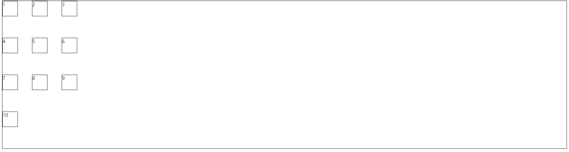
flex-flow
flex-direction, flex-wrap을 합침
flex-flow: wrap column;
align-self
개별 아이템 규칙 지정
align-self: self-start;(align-content로 지정되어 있을 시 적용 X)
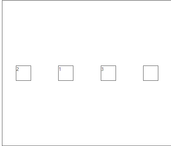
order
배열 순서 바꾸기 (기본적으로 0)
-로 갈수록 앞, +로 갈 수록 뒤order: -1;
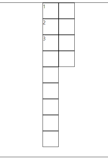
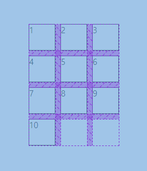
Grid
보통 2줄 이상 정렬할 때 사용
display
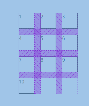
<style>
  .container{
  	display: grid;
  }
</style>
<div class="container">
  <div class="item">1</div>
  <div class="item">2</div>
  <div class="item">3</div>
  <div class="item">4</div>
  <div class="item">5</div>
  <div class="item">6</div>
  <div class="item">7</div>
  <div class="item">8</div>
  <div class="item">9</div>
  <div class="item">10</div>
</div>
grid-template-columns
한 열의 배치할 아이템의 갯수, 크기 등 설정
/* 한 열의 아이템 배치 갯수 */
/* grid-template-columns: auto auto auto auto auto; */
/* grid-template-columns: repeat(5, auto); */
/* grid-template-columns: 2fr 8fr 2fr; */
/* 단 한 개의 fr는 나머지 전부를 뜻 */
grid-template-columns: 100px 100px 1fr;
justify(align)-content(items)
flex와 동일
gap
gap: 10px;
row-gap: 20px;
column-gap: 20px;
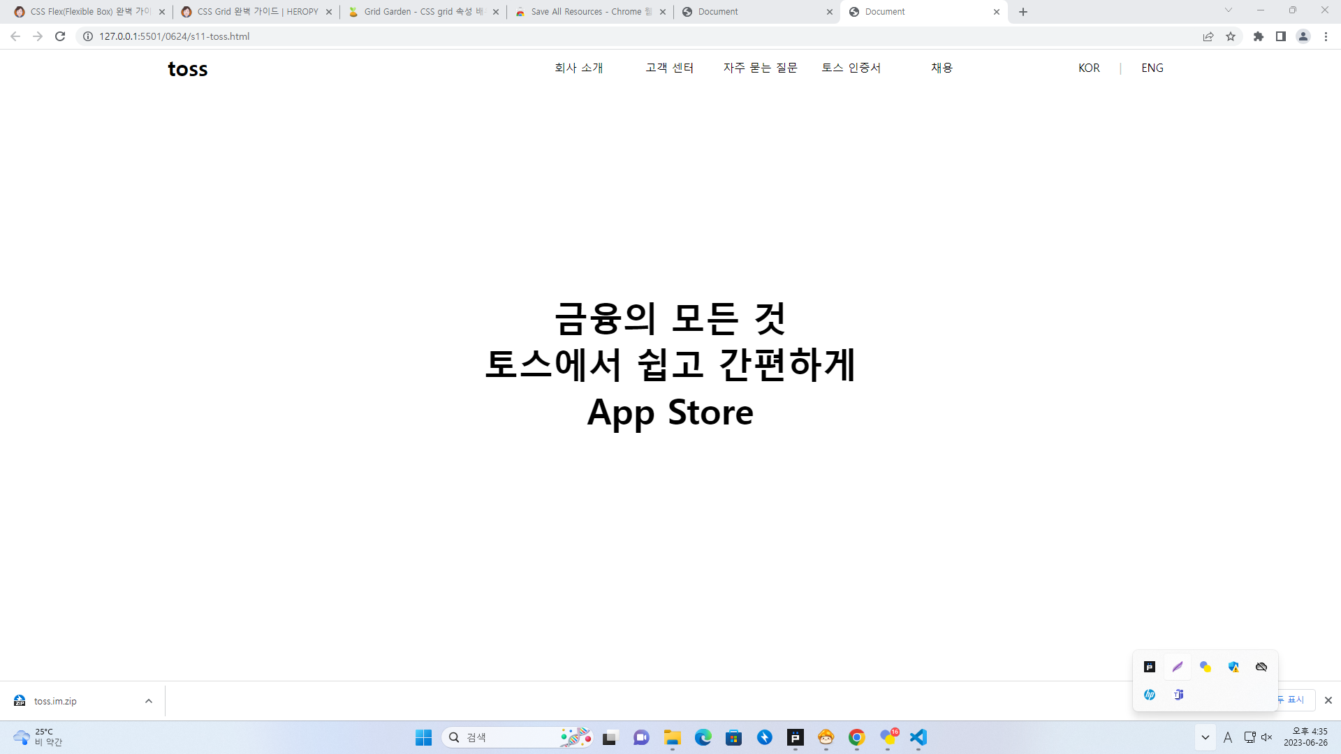
실습
제작
<style>
  body{
  width: 75%;
  margin: auto;
  }
  .navbar{
  display: flex;
  justify-content: space-between;
  height: 50px;
  }
  .logo{
  display: flex;
  align-items: center;
  font-size: 30px;
  font-weight: bold;
  }
  .navi{
  display: flex;
  align-items: center;
  justify-content: right;
  width: 1000px;
  justify-self: flex-end;
  }
  .navi > div{
  width: 130px;
  text-align: center;
  }
  .lang{
  display: flex;
  align-items: center;
  width: 150px;
  justify-content: space-around;
  }
  .content{
  display: flex;
  height: 800px;
  flex-direction: column;
  align-items: center;
  justify-content: center;
  }
  .item{
  /* width: 300px; */
  font-size: 50px;
  font-weight: bold;
  }
</style>
<div class="navbar">
  <div class="logo">
    <p>toss</p>
  </div>
  <div class="navi">
    <div>회사 소개</div>
    <div>고객 센터</div>
    <div>자주 묻는 질문</div>
    <div>토스 인증서</div>
    <div>채용</div>
  </div>
  <div class="lang">
    <div>KOR</div>
    <div style="color: rgb(194, 194, 194);"> | </div>
    <div>ENG</div>
  </div>
</div>
<div class="content">
  <div class="item">금융의 모든 것</div>
  <div class="item">토스에서 쉽고 간편하게</div>
  <div class="item">App Store</div>
</div>
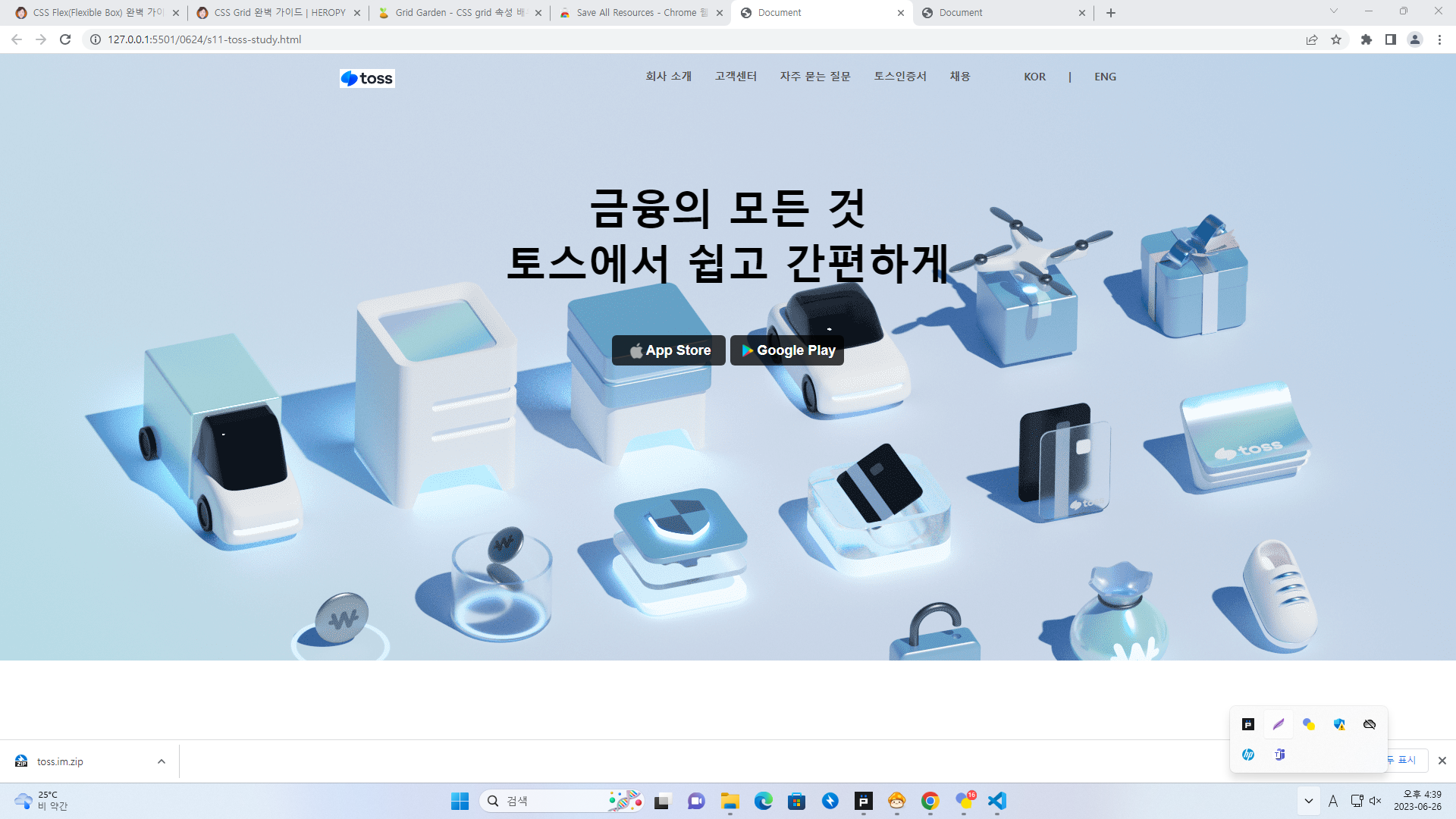
원본
<style>
  * {
  margin: 0;
  padding: 0;
  box-sizing: border-box;
  }
  .center-cover-img {
  background-repeat: no-repeat;
  background-position: center;
  background-size: cover;
  }
  /* section,
  div {
  border: 1px solid red;
  } */
  .main {
  height: 800px;
  background-image: url("./toss/new_main.png");
  }
  .container {
  max-width: 1024px;
  height: 100%;
  margin: auto;
  }
  .logo-nav {
  display: flex;
  justify-content: space-between;
  padding-top: 20px;
  }
  .nav {
  display: flex;
  column-gap: 70px;
  }
  .nav ul {
  list-style-type: none;
  display: flex;
  column-gap: 30px;
  font-size: 14px;
  color: rgb(78, 77, 77);
  font-weight: 600;
  }
  .info {
  margin-top: 120px;
  display: flex;
  flex-direction: column;
  align-items: center;
  }
  .info-msg {
  font-size: 55px;
  font-weight: 600;
  }
  .button-group {
  margin-top: 60px;
  }
  .app-button {
  background-color: rgba(0, 0, 0, 0.75);
  color: white;
  width: 150px;
  height: 40px;
  border-style: none;
  border-radius: 6px;
  }
  .app-button>div {
  display: flex;
  justify-content: center;
  align-items: center;
  font-size: 18px;
  font-weight: 600;
  }
</style>
<section class="main center-cover-img">
  <div class="container">
    <div class="logo-nav">
      <img class="logo" src="./toss/toss-logo.png" height="25" alt="로고" />
      <div class="nav">
        <ul>
          <li>회사 소개</li>
          <li>고객센터</li>
          <li>자주 묻는 질문</li>
          <li>토스인증서</li>
          <li>채용</li>
        </ul>
        <ul>
          <li>KOR</li>
          <li>|</li>
          <li>ENG</li>
        </ul>
      </div>
    </div>
    <div>
      <div class="info">
        <div class="info-msg">금융의 모든 것</div>
        <div class="info-msg">토스에서 쉽고 간편하게</div>
        <div class="button-group">
          <button class="app-button">
            <div>
              <img src="./toss/applekorea.png" height="25" alt="" />
              <span>App Store</span>
            </div>
          </button>
          <button class="app-button">
            <div>
              <img src="./toss/googleplay.png" height="25" alt="" />
              <span>Google Play</span>
            </div>
          </button>
        </div>
      </div>
    </div>
  </div>
</section>

유승한