
라이브러리 설명
그리드를 레이아웃안에서 유저가 크기 조절 가능하도록 만들고싶을 때 사용할 수 있는 라이브러리
사용 예시

공식 문서
사용 방법
설치
npm install react-grid-layout최상위 폴더에서 css 파일 임포트
// index.js
import "/node_modules/react-grid-layout/css/styles.css";
import "/node_modules/react-resizable/css/styles.css";
GridLayout
정해진 크기 내에서 레이아웃을 만들 수 있는 컴포넌트
layout
GridLayout 컴포넌트에는 layout이라는 props가 있다. 해당 데이터는 GridLayout에 들어갈 개별 요소들의 성질을 각각 객체에 담아 배열 형식으로 만든 것이다.
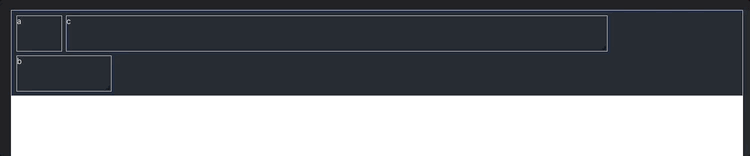
const layout = [
  { i: "a", x: 0, y: 0, w: 1, h: 2, static: true },
  { i: "b", x: 1, y: 0, w: 3, h: 2, minW: 2, maxW: 4 },
  { i: "c", x: 4, y: 0, w: 1, h: 2 },
];
속성값
| key | value type | 설명 | 필수 여부 |
|---|---|---|---|
| i | string | 각 요소의 id값과 일치하는 식별자값 | ✅ |
| x | number | 요소가 어느 x 지점에서 시작할 것인지 | ✅ |
| y | number | 요소가 어느 y 지점에서 시작할 것인지 | ✅ |
| w | number | 요소가 몇칸의 넓이를 차지할 것인지 | ✅ |
| h | number | 요소가 몇칸의 높이를 차지할 것인지 | ✅ |
| minW | number | 요소가 최소 넓이 몇칸을 유지할 수 있는지 | |
| maxW | number | 요소가 최대 넓이 몇칸을 유지할 수 있는지 | |
| minH | number | 요소가 최소 높이 몇칸을 유지할 수 있는지 | |
| maxH | number | 요소가 최대 높이 몇칸을 유지할 수 있는지 | |
| static | boolean | 크기와 위치가 고정됨 | |
| isDraggable | boolean | 드래그 가능 여부 | |
| isResizable | boolean | 크기 조절 가능 여부 | |
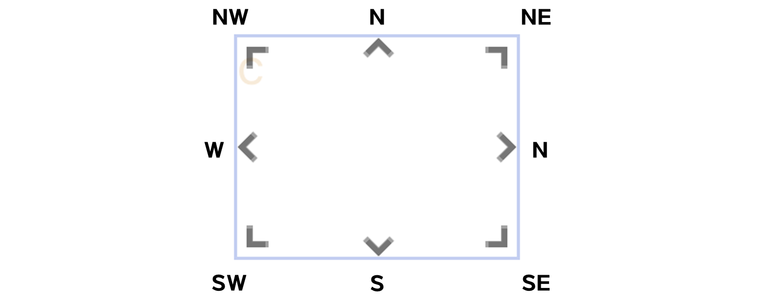
| resizeHandles | array <'s', 'w' , 'e' , 'n' , 'sw' , 'nw' , 'se' , 'ne'> | 사이즈 조절 핸들 위치 배열 |
static이 false인 경우isDraggable : false,isResizable : false로 설정값과 상관없이 덮어쓰기 된다.
예시 코드
import GridLayout from "react-grid-layout";
import "./App.css";

function App() {
  const layout = [
    { i: "a", x: 0, y: 0, w: 1, h: 2, static: true },
    { i: "b", x: 1, y: 0, w: 3, h: 2, minW: 2, maxW: 4 },
    { i: "c", x: 4, y: 0, w: 1, h: 2 },
  ];
  return (
    <div id="container">
      <GridLayout
        className="layout"
        layout={layout}
        cols={12}
        rowHeight={30}
        width={1200}
      >
        <div key="a">a</div>
        <div key="b">b</div>
        <div key="c">c</div>
      </GridLayout>
    </div>
  );
}

export default App;
다른 props 들을 살펴보면 다음과 같다.
cols : 몇개의 열로 레이아웃을 구성할 지 정한다.
rowHeight : 한 행의 높이를 지정할 수 있다.
width : 레이아웃 전체의 넓이를 지정한다.
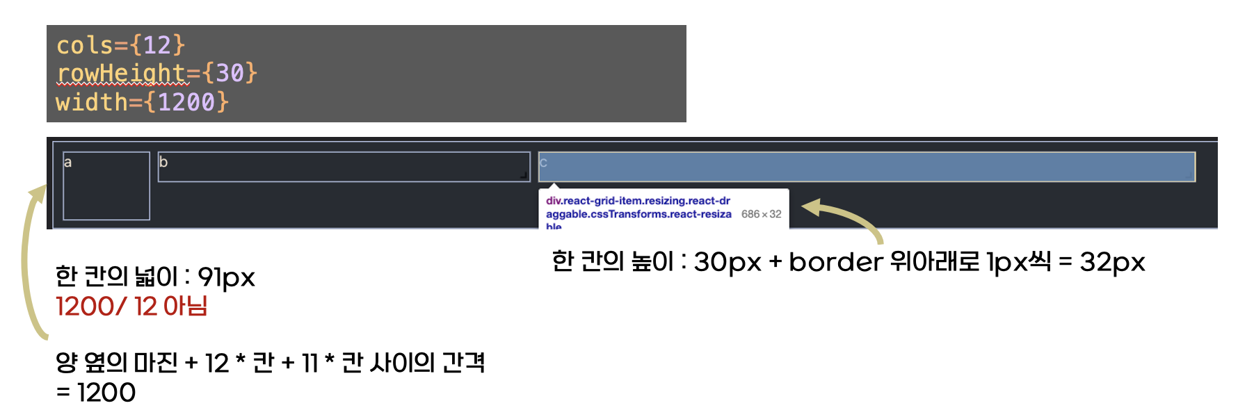
실행 화면
실행 화면에서 보이다싶이 GridLayout의 문제점은 레이아웃의 넓이가 고정되어있어 반응형을 고려하지 못한다는 것이다. 이를 보완하기 위해 반응형 레이아웃을 제공한다.
ResponsiveGridLayout
layouts
 const LAYOUTS = {
    lg: [
      { i: "a", x: 0, y: 0, w: 1, h: 1, minW: 1, maxW: 1, minH: 1, maxH: 2 },
      { i: "b", x: 1, y: 0, w: 1, h: 2, minW: 1, maxW: 1, minH: 1, maxH: 2 },
      { i: "c", x: 2, y: 0, w: 1, h: 1, minW: 1, maxW: 1, minH: 1, maxH: 2 },
    ],
    md: [
      { i: "a", x: 0, y: 0, w: 1, h: 1, minW: 1, maxW: 1, minH: 1, maxH: 2 },
      { i: "b", x: 1, y: 0, w: 1, h: 2, minW: 1, maxW: 1, minH: 1, maxH: 2 },
      { i: "c", x: 0, y: 1, w: 1, h: 1, minW: 1, maxW: 1, minH: 1, maxH: 2 },
    ],
  };
반응형 레이아웃에서는 사이즈별 아이템의 위치를 지정할 수 있기 때문에 사이즈를 키로 한 객체를 layout props 값으로 넘겨준다.
예시 코드
import "./App.css";
import { Responsive, WidthProvider } from "react-grid-layout";
const ResponsiveGridLayout = WidthProvider(Responsive);
function App() {
const LAYOUTS = {
lg: [
{ i: "a", x: 0, y: 0, w: 1, h: 1, minW: 1, maxW: 1, minH: 1, maxH: 2 },
{ i: "b", x: 1, y: 0, w: 1, h: 2, minW: 1, maxW: 1, minH: 1, maxH: 2 },
{ i: "c", x: 2, y: 0, w: 1, h: 1, minW: 1, maxW: 1, minH: 1, maxH: 2 },
],
md: [
{ i: "a", x: 0, y: 0, w: 1, h: 1, minW: 1, maxW: 1, minH: 1, maxH: 2 },
{ i: "b", x: 1, y: 0, w: 1, h: 2, minW: 1, maxW: 1, minH: 1, maxH: 2 },
{ i: "c", x: 0, y: 1, w: 1, h: 1, minW: 1, maxW: 1, minH: 1, maxH: 2 },
],
};
return (
<div>
<ResponsiveGridLayout
className="layout"
layouts={LAYOUTS}
breakpoints={{ lg: 1000, md: 600 }}
cols={{ lg: 3, md: 2 }}
>
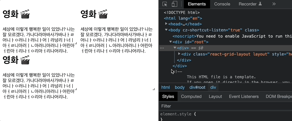
{LAYOUTS.lg.map((el) => (
<div key={el.i} {...el}>
<h1>영화 🎬</h1>
<p>
세상에 이렇게 행복한 일이 있었나? 나는 잘 모르겠다.
가나다라마바사가바나ㅏㄹ어니ㅏㅇ러니ㅏ러니ㅏ어ㅣ라넝리ㅏ너ㅣ아ㅓㄹ니아러ㅣㄴ아러니아러니ㅏ어린아ㅓ린아ㅓ리나ㅓㅇ리아ㅓ리나어리나.
</p>
</div>
))}
</ResponsiveGridLayout>
</div>
);
}
export default App;기본 GridLayout과 같은 형식이지만 breakpoint 지정을 통해 반응형 넓이에 따라 행의 수가 바뀌도록 지정해줄 수 있다.
breakpoints={{ lg: 1200, md: 996, sm: 768, xs: 480, xxs: 0 }}
cols={{ lg: 12, md: 10, sm: 6, xs: 4, xxs: 2 }}
라이브러리를 사용하면서 생긴 궁금증
어떻게 breakpoint가 변경됨을 인식하고 레이아웃을 변경할까?
// react-grid-layout/lib/ResponsiveReactGridLayout.jsx
  componentDidUpdate(prevProps: Props<*>) {
    // Allow parent to set width or breakpoint directly.
    if (
      this.props.width != prevProps.width ||
      this.props.breakpoint !== prevProps.breakpoint ||
      !isEqual(this.props.breakpoints, prevProps.breakpoints) ||
      !isEqual(this.props.cols, prevProps.cols)
    ) {
      this.onWidthChange(prevProps);
    }
}componentDidUpdate는 변동사항이 생기는 경우, Update 이전의 상태값을 props로 넘겨준다. 따라서 넓이가 조정되는 경우, 넓이를 다시 계산하는 함수를 실행하도록 해두었다.
  /**
   * When the width changes work through breakpoints and reset state with the new width & breakpoint.
   * Width changes are necessary to figure out the widget widths.
   */
// 넓이 변경 함수
  onWidthChange(prevProps: Props<*>) {
    const { breakpoints, cols, layouts, compactType } = this.props;
    // 현재 넓이에 따른 breakpoint 찾기
    const newBreakpoint =
      this.props.breakpoint ||
      getBreakpointFromWidth(this.props.breakpoints, this.props.width);

    // 이전 breakpoint
    const lastBreakpoint = this.state.breakpoint;

    // 새로운 breakpoint에 따른 행 갯수
    const newCols: number = getColsFromBreakpoint(newBreakpoint, cols);

    // 레이아웃 객체
    const newLayouts = { ...layouts };

    // Breakpoint 변경된 경우
    if (
      lastBreakpoint !== newBreakpoint ||
      prevProps.breakpoints !== breakpoints ||
      prevProps.cols !== cols
    ) {
      // 만약 최근 레이아웃에 대한 내용이 새로운 레이아웃 객체에 없는 경우를 대비해 레이아웃 클론
      if (!(lastBreakpoint in newLayouts))
        newLayouts[lastBreakpoint] = cloneLayout(this.state.layout);

      // Find or generate a new layout.
      let layout = findOrGenerateResponsiveLayout(
        newLayouts,
        breakpoints,
        newBreakpoint,
        lastBreakpoint,
        newCols,
        compactType
      );

      // This adds missing items.
      layout = synchronizeLayoutWithChildren(
        layout,
        this.props.children,
        newCols,
        compactType,
        this.props.allowOverlap
      );

      // Store the new layout.
      newLayouts[newBreakpoint] = layout;

      // callbacks - 레이아웃 변경에 따른 콜백 실행
      this.props.onLayoutChange(layout, newLayouts);
      this.props.onBreakpointChange(newBreakpoint, newCols);

      this.setState({
        breakpoint: newBreakpoint,
        layout: layout,
        cols: newCols
      });
    }

    const margin = getIndentationValue(this.props.margin, newBreakpoint);
    const containerPadding = getIndentationValue(
      this.props.containerPadding,
      newBreakpoint
    );

    // breakpoint가 아니라 width가 변경된 경우에도 실행되도록
    // 이러면 재귀가 되지 않나..?🤔
    this.props.onWidthChange(
      this.props.width,
      margin,
      newCols,
      containerPadding
    );
  }