01. css3 선택자
1. :root 가장 상위 단계의 부모요소
<style>
	html {font-size: 20px;}
	:root {font-size: 20px;}
	body{font:12px 'Trebuchet MS',sans-serif;}
	h1 {font-size: 1rem;}
</style>
- font-size가 rem인 경우는 html의 폰트 사이즈를 기준으로 조절된다. 여기서 :root는 html과 같다.
2. element+element
<style>
	.wrap h1 + p{background-color: lime;}
</style>
- h1다음에 오는 p만 선택
3. element1~element2
<style>
	.wrap h1 ~ p{background-color: lime;}
</style>
- h1다음에 오는 모든 p선택
4. [attribute^=value]
<style>
	.wrap a[href ^="http"] {background-color: orange;}
</style>
- a중에 http속성값을 가진것만 선택
5. [attribute$=value]
<style>
	.wrap a[href $="pdf"] {background-color: green;}
</style>
- pdf로 끝나는것 선택
6. [attribute*=value]
<style>
	.wrap a[title *="이동"] {color: red;}
</style>
- 이동이 들어있으면 선택
7. :empty
<style>
	.wrap p:empty {border-bottom: 1px solid pink;}
</style>
- 띄어쓰기가 없거나 텍스트가 없으면 선택
8. :nth-child(n) / :nth-child(2n) / :nth-child(3n) ...
<style>
	ul li:nth-child(3) {border-bottom: 3px solid red;}
</style>
- ul의 자손인 li의 3번째 선택
<style>
	ol li:nth-child(3n) {border-bottom: 3px solid red;}
</style>
- ol의 자손인 li의 3번째부터 n를 곱한 간격으로 선택 /예)3,6,9...
9. :first-child / :last-child
<style>
	ul li:first-child {border-bottom: 3px solid red;}
</style>
- ul의 자손인 li의 첫번째 선택
10. nth-child(3n+2)
<style>
	ol li:nth-child(3n+2) {border-bottom: 3px solid red;}
</style>
- ol의 li자손 2번째부터 시작해서 이후 3번씩 이동하면서 선택
11. :nth-last-child(n) / :nth-first-child(n)
<style>
	ol li:nth-last-child(3) {border-bottom: 3px solid red;}
</style>
- 뒤에서 3번째 선택
12. :nth-of-type(n) / :nth-last-of-type(n) / :nth-first-of-type(n)
<style>
	dl dd:nth-of-type(5) {background-color: silver;}
</style>
- dl의 자손인 dd의 5번째 dd선택
참조 : https://cafe.naver.com/wepub
02. css3 그림자 처리
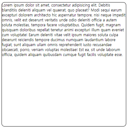
1. text-shadow
<style>
	text-shadow:2px 2px 0 rgba(255,255,255,1), 20px 10px 5px rgba(0,0,0,.4);
</style>
위 코딩이 적용된 웹화면

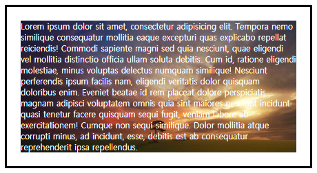
2. box-shadow
<style>
	box-shadow: 10px 10px 20px rgba(0,0,0,.5), inset 5px 5px 30px 10px rgba(255,0,0,.3) }
</style>
위 코딩이 적용된 웹화면

03. css3 말줄임표현
1. text-overflow
-
말줄임을 적용하려면 먼저 크기를 지정하고 줄바꿈(white-space)이 nowrap되어야 가능
-
인라인은 display: block;을 해야 적용된다.
<style>
	.sample {
			display: block;
			overflow: hidden;
			width: 100%;
			white-space: nowrap;
			text-overflow: ellipsis;
		}
</style>
위 코딩이 적용된 웹화면
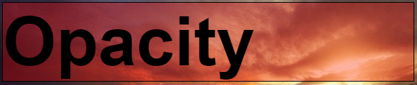
04. css3 투명도 지정
1. opacity
<style>
	#wrap h1.sample2{
			opacity: .4;
			border:1px solid black;
			font-size: 100px;
			color: black;
			background-color: blue;}
</style>
위 코딩이 적용된 웹화면

2. rgba()
<style>
	background-color: rgba(255,0,0,.3);
</style>
위 코딩이 적용된 웹화면
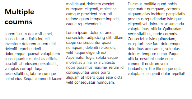
05. css3 멀티 칼럼 지정
1. columns
-
column-span : 칼럼을 병합하여 표현할지를 설정
-
column-count : 몇 개의 칼럼(column)으로 나눌지를 설정
-
column-gap : 칼럼(column) 사이의 간격을 설정
-
column-rule : 스타일을 한 줄에 설정
<style>
  #wrap{
      columns: 100px 3;
      }
</style>
위 코딩이 적용된 웹화면
06. css3 둥근모서리 지정하기
1. border-radius
<style>
		.box {
			width: 400px;
			height: 400px;
			border: 1px solid black;
			border-radius: 10px;
		}
</style>
위 코딩이 적용된 웹화면
07. css3 배경처리
- background
- background-clip: content-box; : 텍스트에만 배경설정하고 텍스트공간을 넘으면 보이지 않는다.
- background-origin: content-box; : 이미지사이즈를 텍스트공간에 맞춘다.
<style>
		.box {
			width: 400px;
			padding:20px;
			border: 3px solid black;
			background: url(img/photo.jpg) no-repeat 0 0/cover;
			background-clip: content-box;
			background-origin: content-box;
			color : white;
</style>
위 코딩이 적용된 웹화면
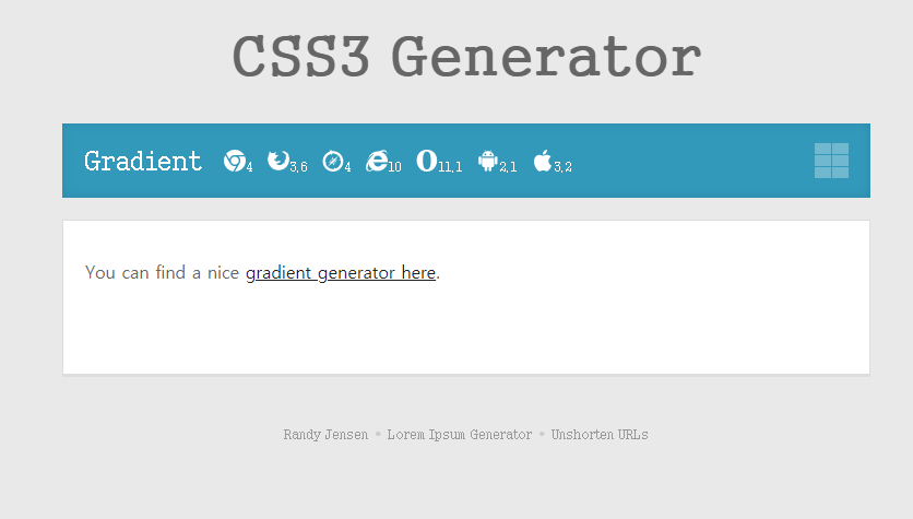
08. css3 그라데이션
- gradient 클릭
- 링크 클릭