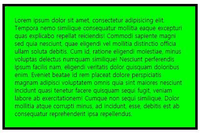
01. css3 박스사이징
1. box-sizing
- 패딩을 넣어도 400PX을 넘지않게 설정
<style>
	.box {
			width: 400px;
			border:5px solid black;
			padding:20px;
			box-sizing: border-box;
			background-color: lime;
		}
</style>
위 코딩이 적용된 웹화면
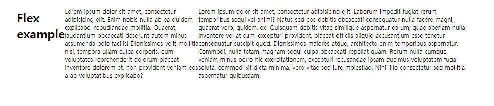
02. css3 플렉스
1. flex
<style>
	#wrap {
			width: 900px;
			margin: 0 auto;
			display: flex;
		}
</style>
위 코딩이 적용된 웹화면
03. css3 트렌지션
1. transition
- transition-property
- transition-duration : 진행시간
- transition-delay : 대기시간
- transition-timing-function : 진행속도 변화지정
- linear | ease | ease-in | ease-out | ease-in-out | steps(1,start/end)
<style>
	.box {
			width: 100px;
			height: 100px;
			background-color: lime;
			transition: all 1s linear;
		}
	.box:hover {
			width: 100%;
			height: 200px;
			background-color: blue;
		}
</style>
참조 : https://developer.mozilla.org/en-US/docs/Web/CSS/timing-function
04. css3 애니메이션
1. animation
- animation-duration : 진행시간
- animation-delay : 대기시간
- animation-name : 이름
- animation-timing-function : 진행속도의 변화 지정
- animation-direction : 진행방향
- normal | reverse | alternate | alternate-reverse
- animation-iteration-count : 진행횟수
- n | infinite
- animation-play-state : 멈추거나 진행
- running | paused
- animation-fill-mode : animation이 끝나면 마지막 설정상태 유지 혹은 초기상태
- forwards | backwards
05. css3 트랜스폼
1. transform
- transform3d/transform3d
- rotate/rotate3d
- scale/scale3d
- skew : 각도에 따라 X축과 Y축에 따른 경사 변형을 지정
- matrix/matrix3d : scaleX,skewY,skewX,scaleY,transrateX,transrateY/http://ds-overdesign.com/transform/matrix3d.html
- perspective : 공간의 깊이 표현
- perspective-origin : perspective의 기준설정
- transform-origin
-
transform-style : 자식 요소를 3D 공간에 배치하거나 2D 평면에 평평하게 배치 할지를 지정
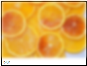
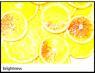
06. css3 filter
1. filter
- blur() : 번짐 효과
- brightness() : 밝게하는 효과
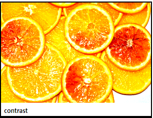
- contrast() : 대비 효과
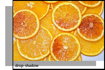
- drop-shadow() : 그림자 효과
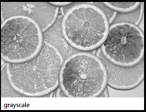
- grayscale() : 흑백 효과
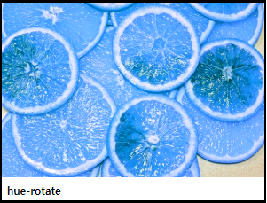
- hue-rotate() : 색변환 효과
-
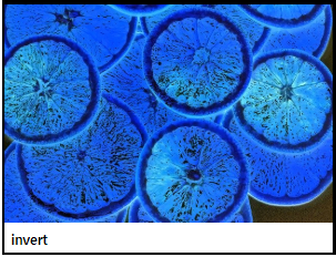
invert() : 반대로 보이게 하는 효과
-
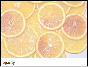
opacity() : 투명도
-
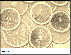
sepia() : 브라운톤의 단색으로 보이게 하는 효과

즐겁게 배우고 꾸준히 블로깅하는 개발자입니다 ;>