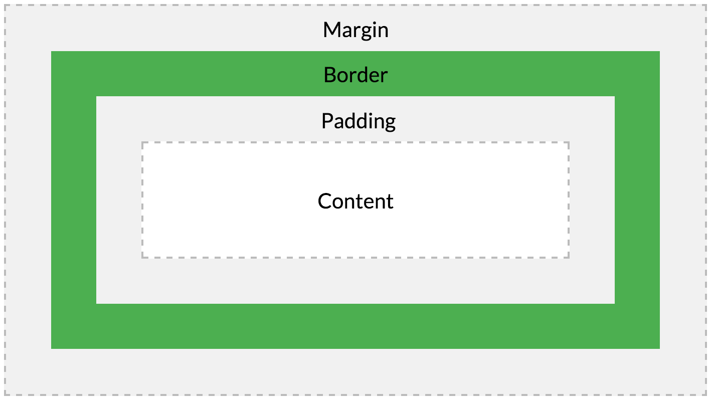
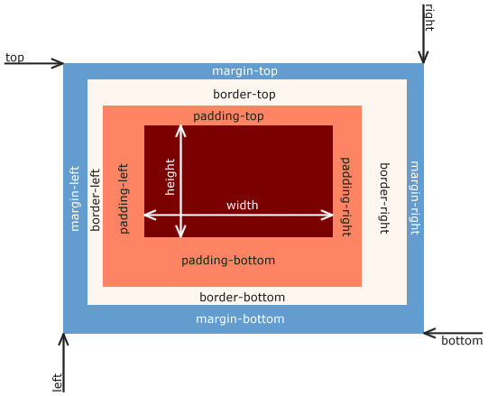
Box Model
모든 HTML element는 box 형태의 영역을 가지고 있다.
이 box는 content, padding, border, margin으로 구성된다.
content- element의 텍스트나 이미지 등의 실제 내용이 위치하는 영역이다.
- width, height property를 갖는다.
padding- border 안쪽에 위치하는 element의 내부 여백 영역이다.
- padding property value는 padding 영역의 두께를 의미하며, 기본색은 transparent이다.
- element에 적용된 배경의 컬러, 이미지는 padding 영역까지 적용된다.
border- border 영역으로 border property value는 테두리의 두께를 의미한다.
margin- border 바깥에 위치하는 element의 외부 여백 영역이다.
- margin property value는 margin 영역의 두께를 의미하며, 기본적으로 transparent하며 배경색을 지정할 수 없다.
브라우저는 box model의 크기(dimension)와 property(색, 배경, 모양 등), 위치를 근거로 하여 렌더링을 실행한다.
웹 디자인은 content를 담을 box model을 정의하고, CSS property를 통해 스타일(배경, 폰트와 텍스트 등)과 위치 및 정렬을 지정하는 것이라 할 수 있다.
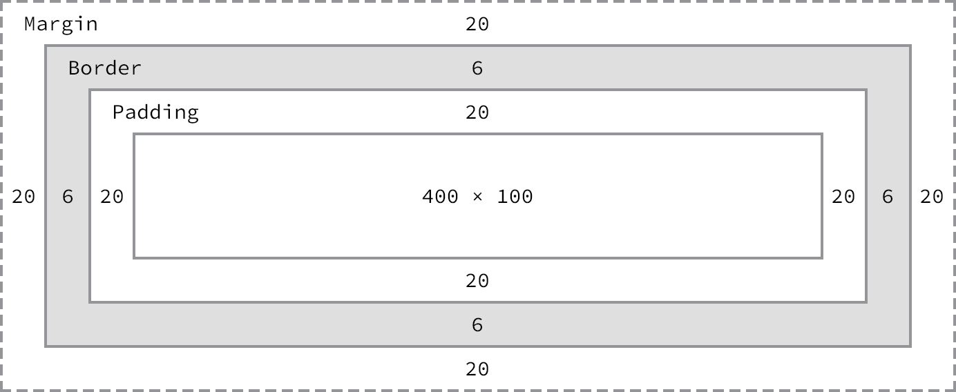
<!DOCTYPE html>
<html>
<head>
<style>
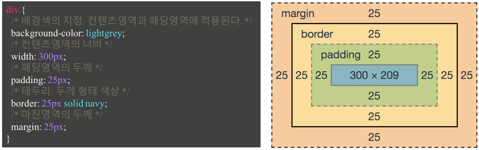
div {
/* 배경색의 지정: 콘텐츠 영역과 패딩 영역에 적용된다. */
background-color: lightgrey;
/* 콘텐츠 영역의 너비 */
width: 300px;
/* 패딩 영역의 두께 */
padding: 25px;
/* 테두리: 두께 형태 색상 */
border: 25px solid navy;
/* 마진 영역의 두께 */
margin: 25px;
}
</style>
</head>
<body>
<h2>Box Model</h2>
<div>Lorem ipsum dolor sit amet, consectetur adipiscing elit, sed do eiusmod tempor incididunt ut labore et dolore magna aliqua. Ut enim ad minim veniam, quis nostrud exercitation ullamco laboris nisi ut aliquip ex ea commodo consequat. Duis aute irure dolor in reprehenderit in voluptate velit esse cillum dolore eu fugiat nulla pariatur. Excepteur sint occaecat cupidatat non proident, sunt in culpa qui officia deserunt mollit anim id est laborum.</div>
</body>
</html>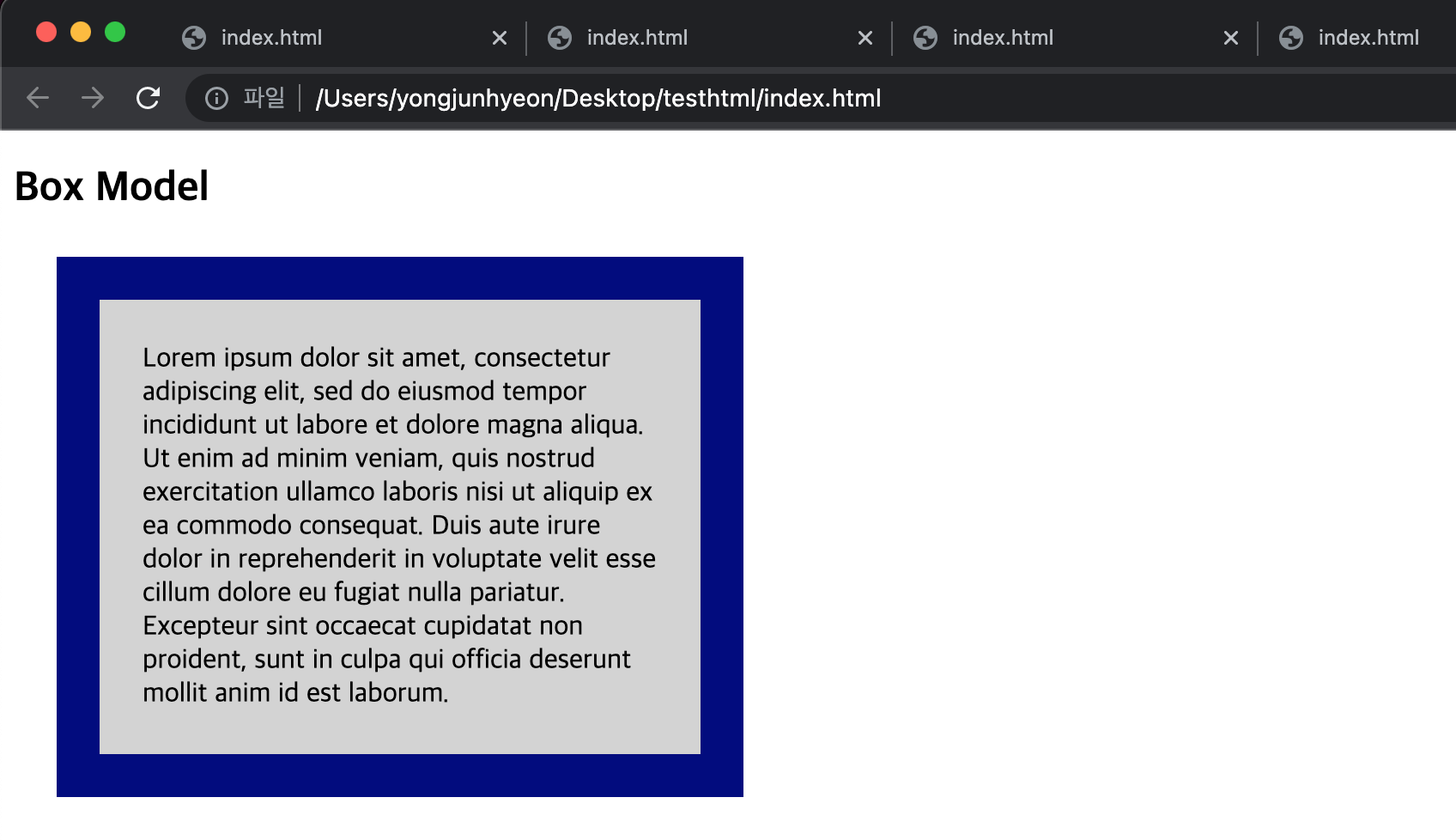
width / height property
element의 너비와 높이를 지정하기 위해 사용한다.
이 때 지정되는 element의 너비와 높이는 content 영역을 대상으로 한다. 이는 box-sizing property에 기본값인 content-box가 적용되었기 때문이다. box-sizing property에 border-box를 적용하면 content 영역, padding, border가 포함된 영역을 width / height property의 대상으로 지정할 수 있다.
만약 width와 height로 지정한 content 영역보다 실제 content가 크면, content 영역을 넘치게 된다는 것에 유의하자.
<!DOCTYPE html>
<html>
<head>
  <meta charset="UTF-8">
  <style>
    div {
      width: 300px;
      height: 100px;
      background-color: cornsilk;
      border: 5px solid navy;
    }
  </style>
</head>
<body>
  <div>
    Lorem ipsum dolor sit amet, consectetur adipisicing elit, sed do eiusmod tempor incididunt ut labore et dolore magna aliqua. Ut enim ad minim veniam, quis nostrud exercitation ullamco laboris nisi ut aliquip ex ea commodo consequat. Duis aute irure dolor in reprehenderit in voluptate velit esse cillum dolore eu fugiat nulla pariatur. Excepteur sint occaecat cupidatat non proident, sunt in culpa qui officia deserunt mollit anim id est laborum.
  </div>
</body>
</html>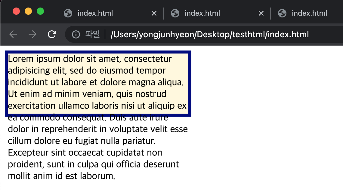
참고로, overflow property를 hidden으로 지정하면, 넘친 content를 감출 수 있다.
기본적으로 width와 height property는 content 영역을 대상으로 element의 너비와 높이를 지정하므로, box 전체 크기는 다음과 같이 계산할 수 있다.
- box 전체 너비 = width + left padding + right padding + left border + right border + left margin + right margin
- box 전체 높이 = height + top padding + bottom padding + top border + bottom borer + top margin + bottom margin
width와 height property의 초기값은 auto로, 브라우저가 상황에 따라 적당한 width와 height 값을 계산할 것을 의미한다.
예를 들어, block level element의 경우, width는 부모 element의 100%, height는 content의 높이 + 약간의 여분이 지정된다.
<!DOCTYPE html>
<html>
<head>
  <meta charset="UTF-8">
  <style>
    div {
      background-color: beige;
    }
  </style>
</head>
<body>
  <div>This is a div</div>
</body>
</html>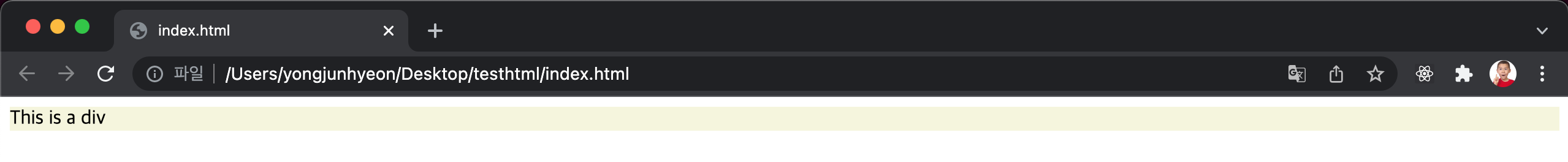
명시적으로 width와 height를 지정하기 위해서는 px나 % 등의 크기 단위를 사용한다.
<!DOCTYPE html>
<html>
<head>
  <meta charset="UTF-8">
  <style>
    div {
      background-color: beige;
      height: 100px;
      width: 50%;
    }
  </style>
</head>
<body>
  <div>This is a div</div>
</body>
</html>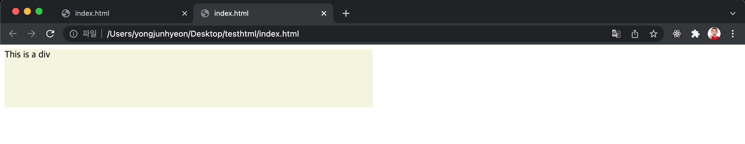
margin / padding property
margin과 padding property는 content의 4개 방향(top, right, bottom, left)에 대하여 지정이 가능하다.
<!DOCTYPE html>
<html>
  <head>
    <style>
      div {
        border: 5px solid red;

        margin-top: 40px;
        margin-right: 30px;
        margin-bottom: 20px;
        margin-left: 10px;

        padding-top: 10px;
        padding-right: 20px;
        padding-bottom: 30px;
        padding-left: 40px;
      }
    </style>
  </head>
  <body>
    <div>Lorem ipsum dolor sit amet, consectetur adipiscing elit, sed do eiusmod tempor incididunt ut labore et dolore magna aliqua. Ut enim ad minim veniam, quis nostrud exercitation ullamco laboris nisi ut aliquip ex ea commodo consequat. Duis aute irure dolor in reprehenderit in voluptate velit esse cillum dolore eu fugiat nulla pariatur. Excepteur sint occaecat cupidatat non proident, sunt in culpa qui officia deserunt mollit anim id est laborum.</div>
  </body>
</html>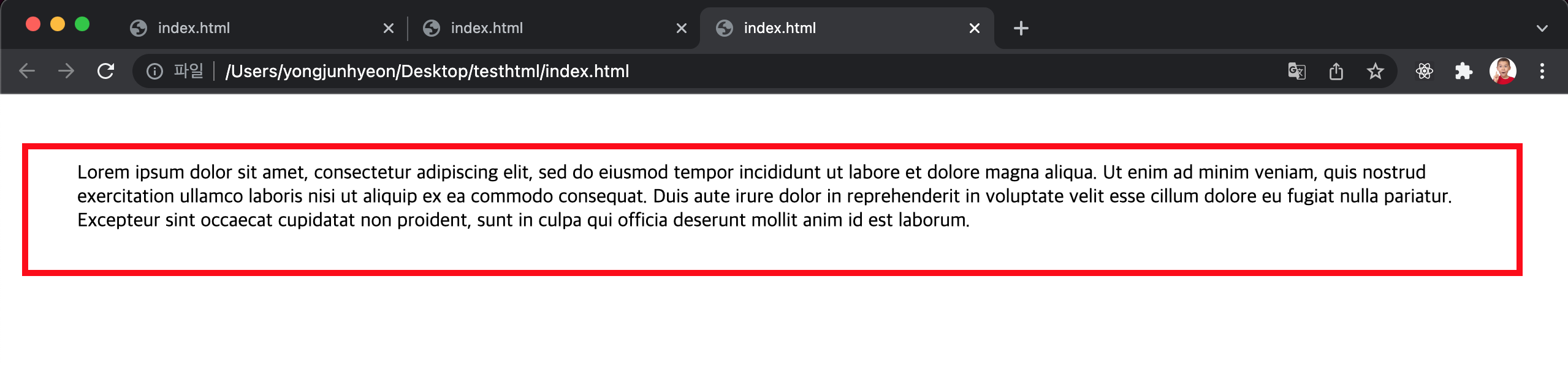
-top, -right, -bottom, -left 네 방향의 property를 각각 지정하지 않고 margin, padding 1개의 property만으로 네 방향의 property를 한 번에 지정할 수 있다. 순서는 top, right, bottom, left 순이다.
예를 들어 보자.
- 4개의 값을 지정할 때
- margin: 25px 50px 75px 100px; 은 아래와 같다.
- margin-top: 25px;
- margin-right: 50px;
- margin-bottom: 75px;
- margin-left: 100px;
- margin: 25px 50px 75px 100px; 은 아래와 같다.
- 3개의 값을 지정할 때
- margin: 25px 50px 75px;
- margin-top: 25px;
- margin-right: 50px; margin-left: 50px;
- margin-bottom: 75px;
- margin: 25px 50px 75px;
- 2개의 값을 지정할 때
- margin: 25px 50px;
- margin-top: 25px; margin-bottom: 25px;
- margin-right: 50px; margin-left: 50px;
- margin: 25px 50px;
- 1개의 값을 지정할 때
- margin: 25px;
- margin-top: 25px; margin-right: 25px; margin-bottom: 25px; margin-left: 25px;
- margin: 25px;
<!DOCTYPE html>
<html>
  <head>
    <style>
      div {
        border: 5px solid red;

        margin:  40px 30px 20px 10px;
        padding: 10px 20px 30px 40px;
      }
    </style>
  </head>
  <body>
    <div>Lorem ipsum dolor sit amet, consectetur adipiscing elit, sed do eiusmod tempor incididunt ut labore et dolore magna aliqua. Ut enim ad minim veniam, quis nostrud exercitation ullamco laboris nisi ut aliquip ex ea commodo consequat. Duis aute irure dolor in reprehenderit in voluptate velit esse cillum dolore eu fugiat nulla pariatur. Excepteur sint occaecat cupidatat non proident, sunt in culpa qui officia deserunt mollit anim id est laborum.</div>
  </body>
</html>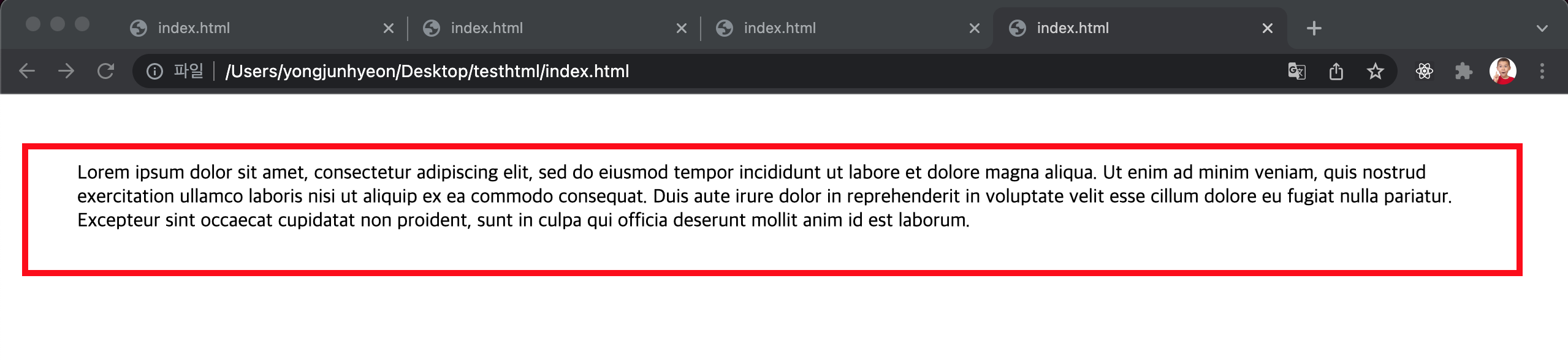
margin property에 auto 키워드를 설정하면 해당 element를 브라우저 중앙에 위치 시킬 수 있다.
<!DOCTYPE html>
<html>
  <head>
    <style>
      div {
        border: 5px solid red;
        width: 600px;
        margin: 0 auto;
      }
    </style>
  </head>
  <body>
    <div>Lorem ipsum dolor sit amet, consectetur adipiscing elit, sed do eiusmod tempor incididunt ut labore et dolore magna aliqua. Ut enim ad minim veniam, quis nostrud exercitation ullamco laboris nisi ut aliquip ex ea commodo consequat. Duis aute irure dolor in reprehenderit in voluptate velit esse cillum dolore eu fugiat nulla pariatur. Excepteur sint occaecat cupidatat non proident, sunt in culpa qui officia deserunt mollit anim id est laborum.</div>
  </body>
</html>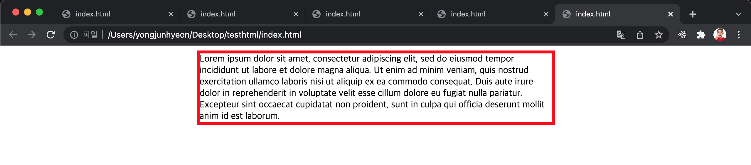
element 너비가 브라우저 너비보다 크면 가로 스크롤바가 만들어진다. 이 문제를 해결하기 위해서 max-width property를 사용할 수 있다.
max-width property를 사용하면 브라우저 너비가 element의 너비보다 좁아질 때 자동으로 element의 너비가 줄어든다. 즉, element 너비의 최대값을 지정한다. 또, 반대 역할을 하는 min-width property는 element 너비의 최소값을 지정한다.
<!DOCTYPE html>
<html>
  <head>
    <style>
      div {
        border: 5px solid red;
        max-width: 600px;
        margin: auto;
      }
    </style>
  </head>
  <body>
    <div>Lorem ipsum dolor sit amet, consectetur adipiscing elit, sed do eiusmod tempor incididunt ut labore et dolore magna aliqua. Ut enim ad minim veniam, quis nostrud exercitation ullamco laboris nisi ut aliquip ex ea commodo consequat. Duis aute irure dolor in reprehenderit in voluptate velit esse cillum dolore eu fugiat nulla pariatur. Excepteur sint occaecat cupidatat non proident, sunt in culpa qui officia deserunt mollit anim id est laborum.</div>
  </body>
</html>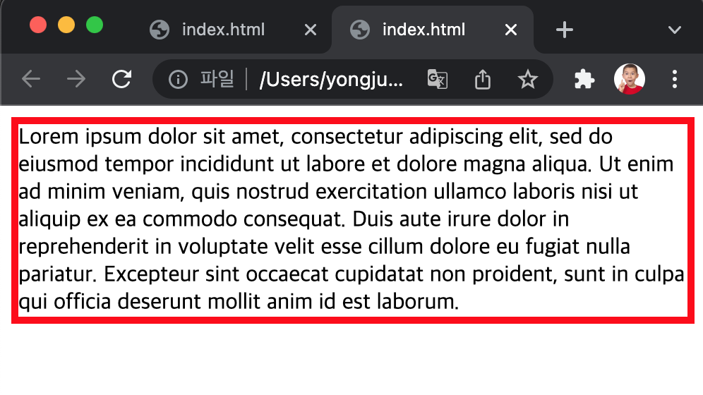
border property
border-style property
테두리 선의 스타일을 지정한다.
<!DOCTYPE html>
<html>
  <head>
    <style>
      p {
        background: palegreen;
        padding: 10px;
      }
      p.dotted { border-style: dotted; }
      p.dashed { border-style: dashed; }
      p.solid  { border-style: solid; }
      p.double { border-style: double; }
      p.groove { border-style: groove; }
      p.ridge  { border-style: ridge; }
      p.inset  { border-style: inset; }
      p.outset { border-style: outset; }
      p.none   { border-style: none; }
      p.hidden { border-style: hidden; }
      p.mix    { border-style: dotted dashed solid double; }
    </style>
  </head>
  <body>
    <h2>border-style Property</h2>

    <p class="dotted">dotted</p>
    <p class="dashed">dashed</p>
    <p class="solid">solid</p>
    <p class="double">double</p>
    <p class="groove">groove</p>
    <p class="ridge">ridge</p>
    <p class="inset">inset</p>
    <p class="outset">outset</p>
    <p class="none">none</p>
    <p class="hidden">hidden</p>
    <p class="mix">dotted dashed solid double</p>
  </body>
</html>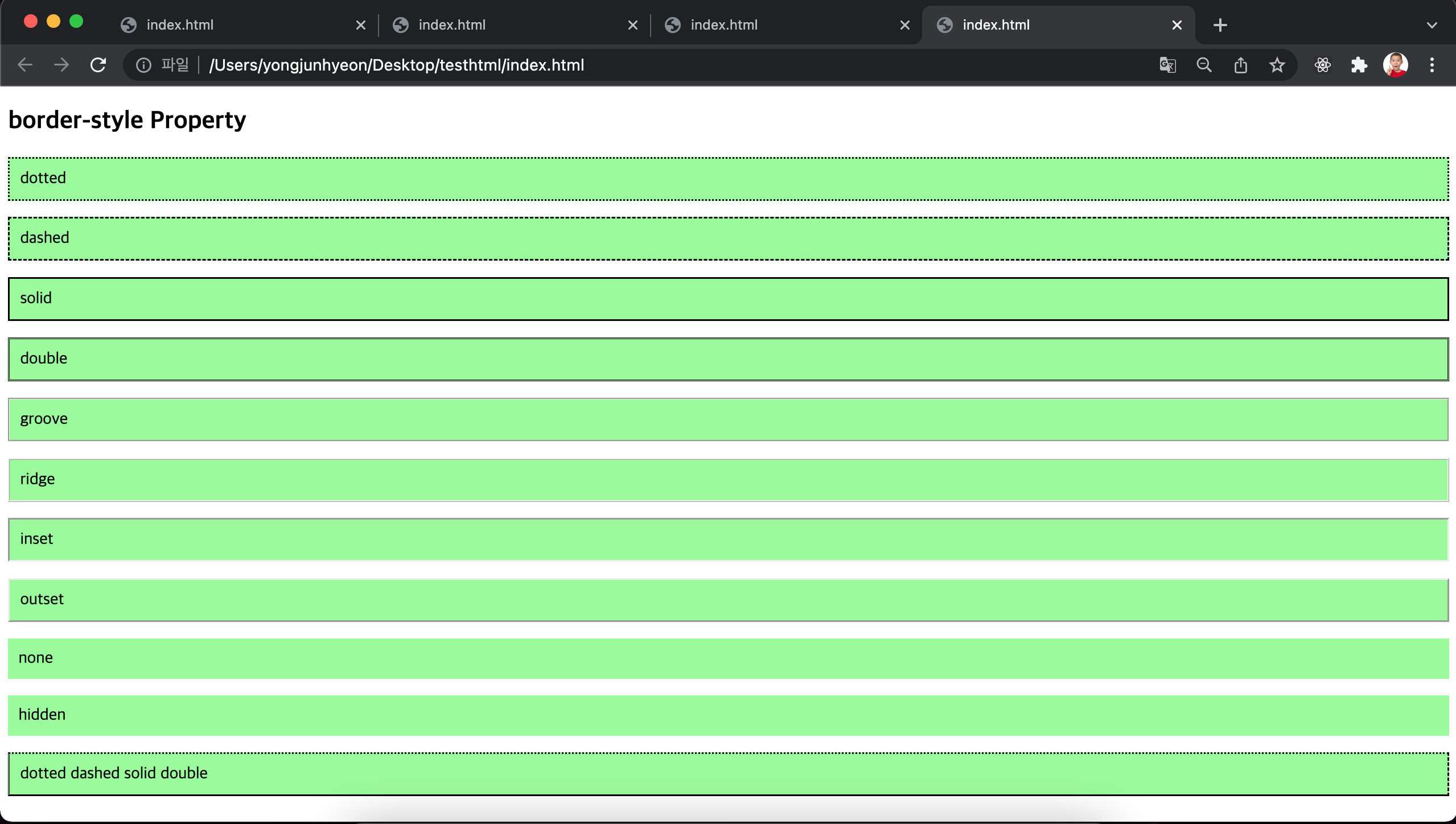
property value의 갯수에 따라 4개 방향(top, right, left, bottom)에 대하여 지정할 수도 있다.
<!DOCTYPE html>
<html>
<head>
  <style>
    p {
      background: palegreen;
      padding: 10px;
    }
    p.d1 {
      /* four sides */
      border-style: dashed;
    }
    p.d2 {
      /* horizontal | vertical */
      border-style: dotted solid;
    }
    p.d3 {
      /* top | horizontal | bottom */
      border-style: hidden double dashed;
    }
    p.d4 {
      /* top | right | bottom | left */
      border-style: none solid dotted dashed;
    }
  </style>
</head>
<body>
  <p class="d1">border-style: dashed;</p>
  <p class="d2">border-style: dotted solid;</p>
  <p class="d3">border-style: hidden double dashed;</p>
  <p class="d4">border-style: none solid dotted dashed;</p>
  </body>
</html>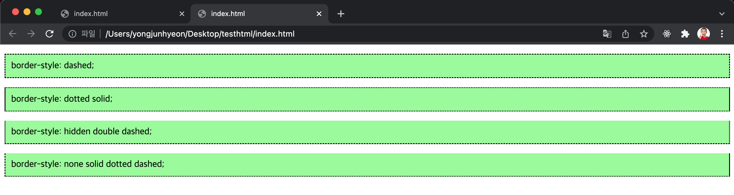
border-width property
테두리의 두께를 지정한다.
property value의 갯수에 따라 4개 방향에 대하여 지정이 가능하다.
border-style property와 함께 사용하지 않으면 적용되지 않는다.
<!DOCTYPE html>
<html>
  <head>
    <style>
      p {
        background: palegreen;
        padding: 10px;
        border-style: solid
      }
      p.one {
        border-width: thin; /* 1px */
      }
      p.two {
        border-width: medium; /* 3px */
      }
      p.three {
        border-width: thick; /* 5px */
      }
      p.four {
        border-width: 15px;
      }
      p.five {
        border-width: 2px 10px 4px 20px;
      }
    </style>
  </head>
  <body>
    <h2>border-width Property</h2>

    <p>initial: 3px</p>
    <p class="one">thin: 1px</p>
    <p class="two">medium: 3px</p>
    <p class="three">thick: 5px</p>
    <p class="four">15px</p>
    <p class="five">2px 10px 4px 20px</p>
  </body>
</html>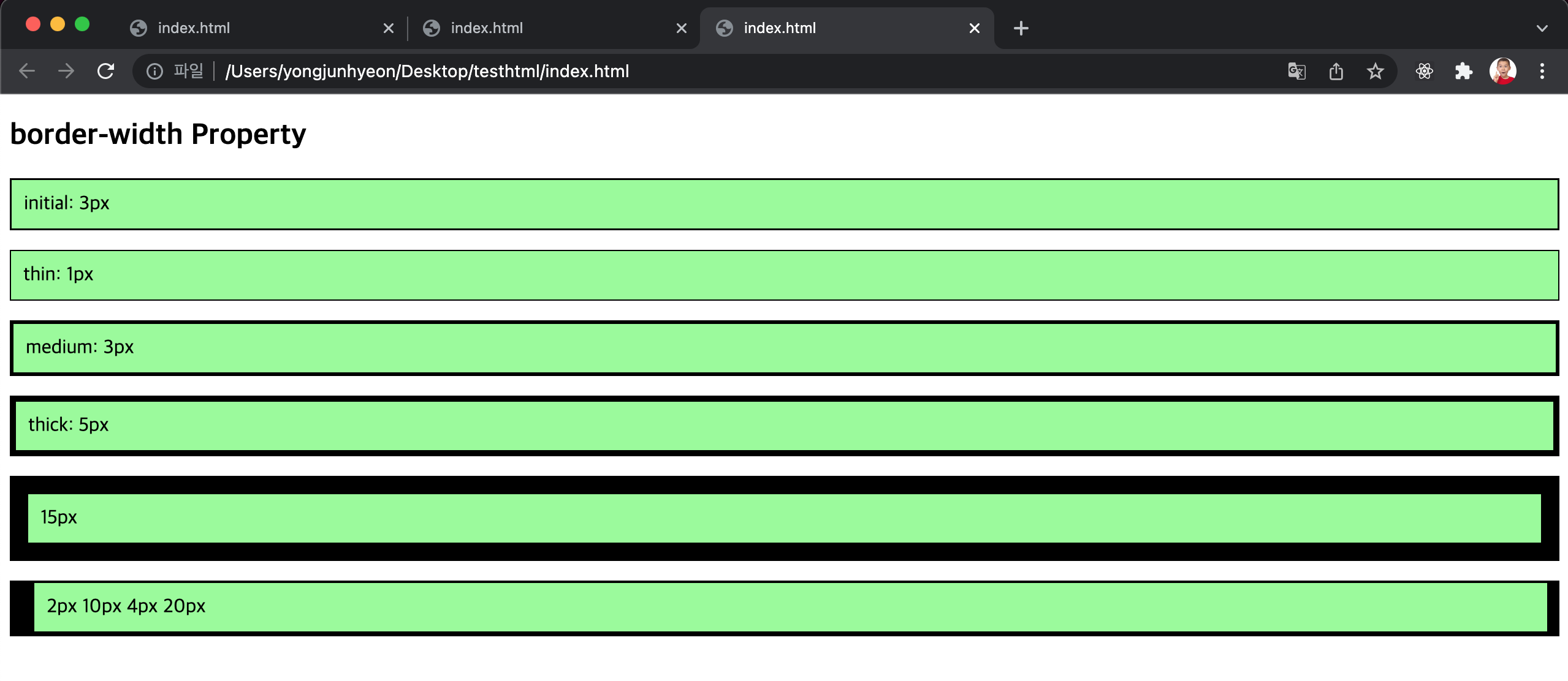
border-color property
테두리의 색상을 지정한다. property value의 갯수에 따라 4개 방향에 대하여 지정이 가능하다.
border-style property와 함께 사용하지 않으면 적용되지 않는다.
<!DOCTYPE html>
<html>
  <head>
    <style>
      p {
        background: palegreen;
        padding: 10px;
        border-style: solid;
      }
      p.one {
        border-color: red;
      }
      p.two {
        border-color: green;
      }
      p.three {
        border-color: red green blue yellow;
      }

    </style>
  </head>
  <body>
    <h2>border-color Property</h2>

    <p class="one">border-color: red</p>
    <p class="two">border-color: green</p>
    <p class="three">border-color: red green blue yellow</p>
  </body>
</html>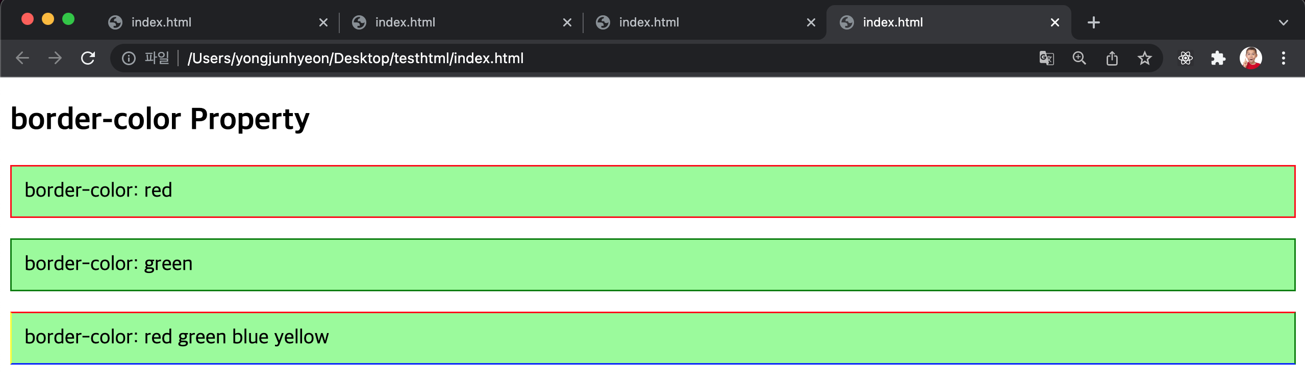
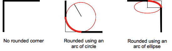
border-radius property
테두리의 모서리를 둥글게 표현하도록 지정한다.
property value는 길이를 나타내는 단위(px, em 등)와 %를 사용한다.
각각의 모서리에 개별적으로 지정할 수도 있고, 4개의 모서리를 한번에 지정할 수도 있다.
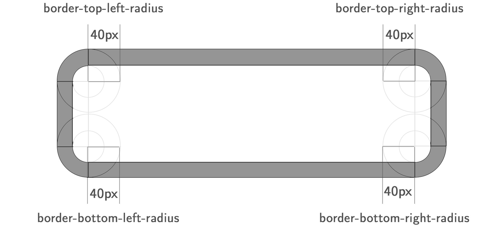
각각의 모서리 굴곡을 적절하게 설정하면, 타원 모양도 가능하다.
<!DOCTYPE html>
<html>
  <head>
    <style>
      div {
        background: #eaeaed;
        color: #666;
        display: inline-block;
        width: 90px;
        height: 90px;
        line-height: 90px;
        margin: 0 14px;
        text-align: center;
      }

      .border-rounded {
        /* 4 꼭지점에 대해 Radius 지정 */
        border-radius: 5px;
      }
      .border-circle {
        border-radius: 50%;
      }
      .border-football {
        /* top-left & bottom-right | top-right & bottom-left */
        border-radius: 15px 75px;
      }
    </style>
  </head>
  <body>
    <div class="border-rounded">5px</div>
    <div class="border-circle">50%</div>
    <div class="border-football">15px 75px</div>
  </body>
</html>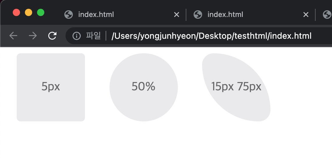
모든 모서리에 동일한 둥근 모서리 설정
<!DOCTYPE html>
<html>
<head>
  <style>
    div {
      background: #eaeaed;
      color: #666;
      width: 150px;
      height: 150px;
      line-height: 150px;
      text-align: center;
    }
    .border-rounded {
      /* 모든 모서리를 동일하게 설정 */
      border-radius: 20px;
    }
  </style>
</head>
<body>
  <div class="border-rounded">border-radius: 20px</div>
</body>
</html>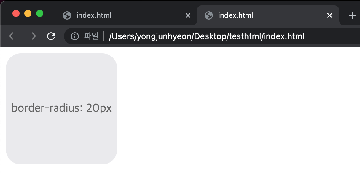
각각의 모서리를 개별적으로 설정. top-left부터 시계 방향.
<!DOCTYPE html>
<html>
<head>
  <style>
    div {
      background: #eaeaed;
      color: #666;
      width: 200px;
      height: 150px;
      line-height: 150px;
      text-align: center;
    }
    .border-rounded {
      /* 각각의 모서리를 개별적으로 설정 */
      border-radius: 10px 40px 40px 10px;
    }
  </style>
</head>
<body>
  <div class="border-rounded">10px 40px 40px 10px</div>
</body>
</html>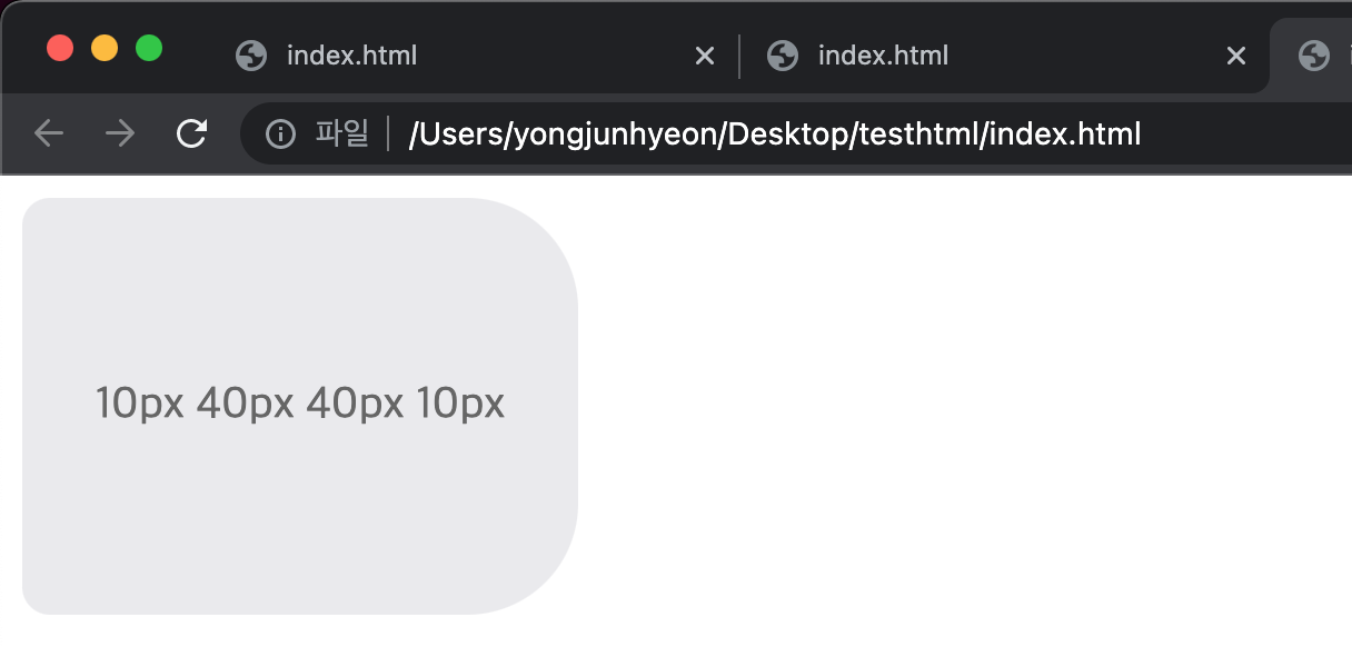
두 개의 반지름을 지정하여 타원형 모서리 설정. 순서대로 x, y축 반지름이다.
<!DOCTYPE html>
<html>
<head>
  <style>
    div {
      background: #eaeaed;
      color: #666;
      width: 300px;
      height: 150px;
      line-height: 150px;
      text-align: center;
    }
    .border-rounded {
      border-top-left-radius: 50px 25px;
    }
  </style>
</head>
<body>
  <div class="border-rounded">border-top-left-radius: 50px 25px</div>
</body>
</html>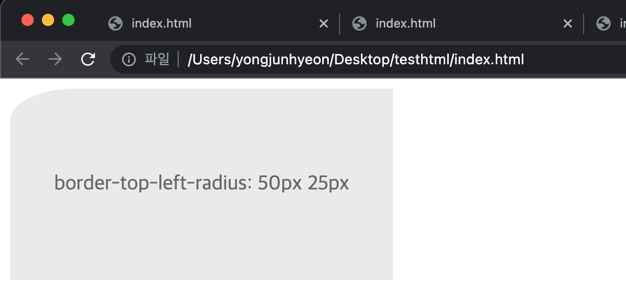
각각의 모서리에 타원형 모서리 설정. top-left부터 시계방향으로 값을 지정하고, x축 / y축 값을 나타낸다.
<!DOCTYPE html>
<html>
<head>
  <style>
    div {
      background: #eaeaed;
      color: #666;
      width: 450px;
      height: 150px;
      padding: 10px;
    }
    .border-rounded {
      border-radius: 10px 20px 30px 40px / 5px 10px 15px 20px;
    }
  </style>
</head>
<body>
  <div class="border-rounded">
    border-radius: 10px 20px 30px 40px / 5px 10px 15px 20px;
    <ul>
      <li>border-top-left-radius: 10px 5px;</li>
      <li>border-top-right-radius: 20px 10px;</li>
      <li>border-bottom-right-radius: 30px 15px;</li>
      <li>border-bottom-left-radius: 40px 20px;</li>
    </ul>
  </div>
</body>
</html>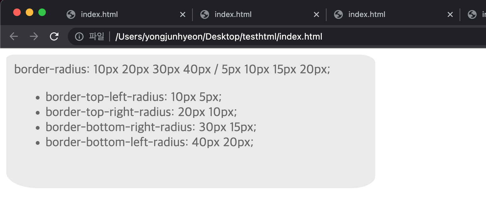
border property
border-width, border-style, border-color를 한 번에 설정하기 위한 property이다.
p {
  /* border-width border-style border-color */
  border: 5px solid red;
}
box-sizing property
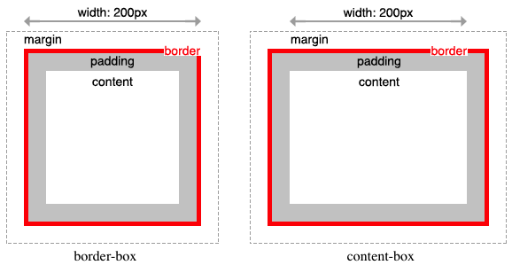
width, height property의 대상 영역을 변경할 수 있다.
값이되는 키워드는 두 가지이다.
- content-box : width, height property의 대상 영역이 content 영역임을 의미한다. 기본값
- border-box : width, height property의 대상 영역이 content 영역 + padding + border 임을 의미한다.
<!DOCTYPE html>
<html>
  <head>
    <style>
      .content-box {
        width: 600px;
        border: 10px solid;
        padding: 50px;
        margin: 50px;
        background-color: red;
      }
      .border-box {
        box-sizing: border-box;
        width: 600px;
        border: 10px solid;
        padding: 50px;
        margin: 50px;
        background-color: red;
      }
    </style>
  </head>
  <body>
  <div class="content-box">content-box</div>
  <div class="border-box">border-box</div>
</body>
</html>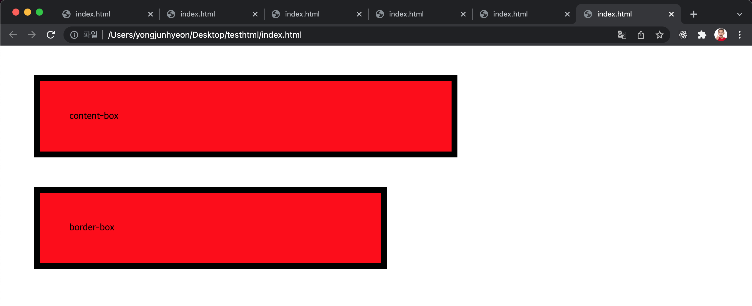
box-sizing property는 상속되지 않으므로, 만약 border-box를 기본값으로 초기화하고 싶으면 아래와 같이 사용한다.
html {
  box-sizing: border-box;
}
*, *:before, *:after {
  box-sizing: inherit;
}
참고문헌
