flex box 에 대해 공부한걸 간단하게 정리한다.
display: flex
부모 요소 내의 자식 요소들의 정렬에 사용된다.
- 부모 요소 - flex containel
- 자식 요소 - flex item
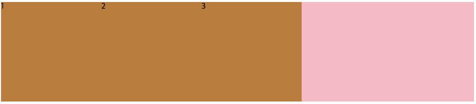
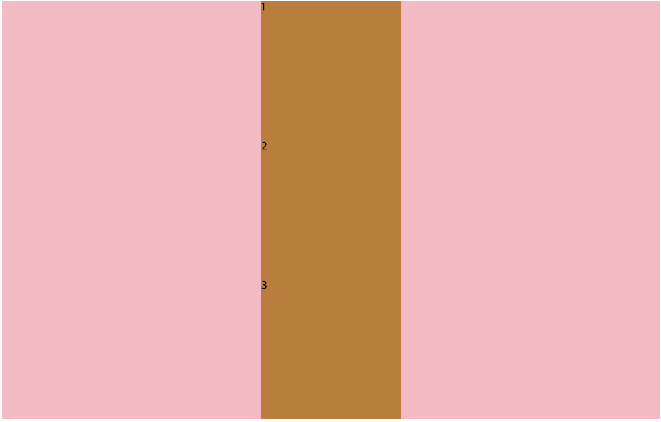
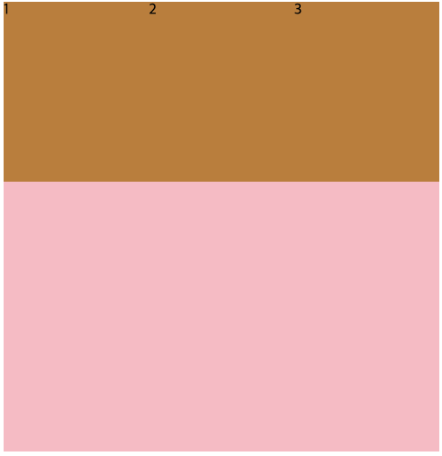
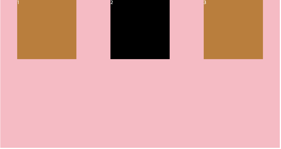
<body>
	<div class="parents">
    		<div class="child">1</div>
        	<div class="child">2</div>
        	<div class="child">3</div>
    	</div>
</body>
위와 같은 html body가 작성되어 있다고 할 때
.parents {
    display: flex;
    background: pink;
}

.child {
    width: 200px;
    height: 200px;
    background: peru;
}
와 같이 css 코드를 작성하면

다음과 같이 핑크색은 부모 요소인 컨테이너이고 그 안에 child 요소가 가로로 나열된다.
만약 parents 에 flex 를 적용하지 않고 body 에 적용하면 바로 아래 자식 요소가 child 가 아니기에 child 요소가 가로로 나열되지 않는다.
가로가 기본값이다.
main axis, cross aixs
이제 정렬하는 기본적인 방법들을 살펴볼 건데 그전에 main axis, cross axis 에 대해 간단하게 알아놓자.
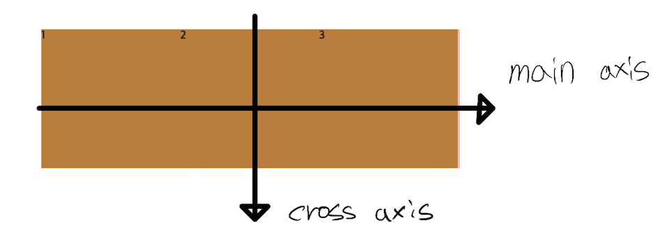
위의 경우는 flex 가 기본값인 row 방향으로 향할 때인데, main axis 가 가로를 cross axis 가 세로를 나타낸다.
하지만
flex 의 방향이 column 이면 axis 의 방향은 main axis 는 세로, cross axis 는 가로를 나타낸다. flex 가 row 방향일 때와는 반대로 된다고 생각하면 된다.
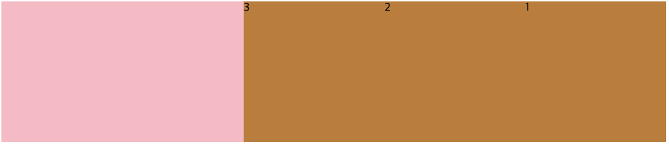
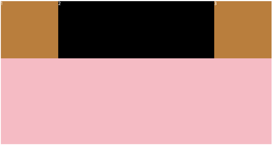
justify-content
containel 내에서 main axis 방향으로 item 을 옮길 때 사용된다.
flex-start: 요소들을 컨테이너의 왼쪽으로 정렬
flex-end: 요소들을 컨테이너의 오른쪽으로 정렬
center: 요소들을 컨테이너의 가운데로 정렬
space-between: 요소들 사이에 동일한 간격을 둔다
space-around: 요소들 주위에 동일한 간격을 둔다
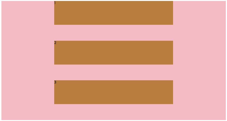
하나만 예를 들어보면
.parents {
	display: flex;
	background: pink;
	justify-content: space-around;
}

.child {
	width: 200px;
	height: 200px;
	background: peru;
}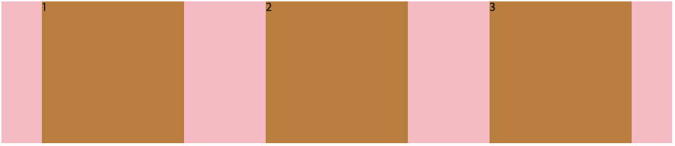
space-between 을 써서 요소들 사이에 동일한 간격을 가질 수 있게 하였다.
align-items
containel 내에서 cross axis 방향으로 item 을 옮길 때 사용된다.
flex-start: 요소들을 컨테이너의 꼭대기로 정렬flex-end: 요소들을 컨테이너의 바닥으로 정렬center: 요소들을 컨테이너의 세로선 상의 가운데로 정렬baseline: 요소들을 컨테이너의 시작 위치에 정렬stretch: 요소들을 컨테이너에 맞도록 늘린다
.parents {
	height: 500px;
	display: flex;
	background: pink;
	align-items: center;
}

.child {
	width: 200px;
	height: 200px;
	background: peru;
}
containel(부모 요소)에 높이를 안 주면 item 높이에 맞춰진다.
그렇게 되면 containel 내에서 cross axis 방향으로 Item 옮기는 의미가 없기에 height: 500px 값을 정해주고 테스트를 해보았다.
align-items: center
라고 선언해 item 들이 cross axis 방향으로 가운데 맞춰진 것을 볼 수 있다.
flex-direction
direction: flex 의 기본값은 row 라고 하였는데
이걸 column 정렬로 바꿔줄 때 다음과 같이 적용한다.
.parents {
	display: flex;
	flex-direction: column;
	background: pink;
	align-items: center;
}

.child {
	width: 200px;
	height: 200px;
	background: peru;
}
정렬 방향이 바뀐 것을 볼 수 있다.
이렇게 column 으로 선언이 되면 cross axis 는 가로 방향, main axis 는 세로 방향이 되어
align-items: center
위의 코드를 썼을 때, 가로 방향 가운데에 item 들이 자리 잡은 것을 볼 수 있다.
reverse
flex 를 사용하면 html 코드를 바꾸지 않아도 item 의 순서를 바꿀 수 있다.
그중 하나가 reverse 인데
.parents {
	display: flex;
	flex-direction: row-reverse;
	background: pink;
	align-items: center;
}

.child {
	width: 200px;
	height: 200px;
	background: peru;
}
flex-direction: row-reverse
와 같이 사용할 수 있다.
각 item 의 순서를 확인해보면 순서가 뒤집어지고 우측에 정렬된것을 확인할 수 있다.
flex-direction: column-reverse
로 선언되면 세로로 정렬되면서 뒤집어진다.
align-self
옮기고 싶은 item 의 부모 요소에 flex 를 선언하고
justify-contentalign-items
등으로 자식 요소에 공통적인 움직임을 부여하는데,
align-self 를 사용하면 containel 내에서 item 의 개별적인 이동이 가능하다.
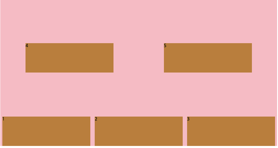
.parents {
	height: 500px;
	display: flex;
	background: pink;
	justify-content: space-around;
}

.child {
	width: 200px;
	height: 200px;
	background: peru;
}

.child:nth-child(2) {
	align-self: center;
}
align-self: center 를 사용해서 2번 아이템만 개별적으로 cross axis 방향 가운데에 위치하게 한 것을 볼 수 있다.
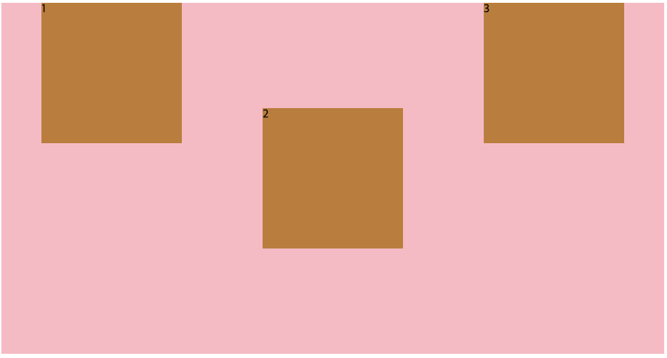
order
item 들의 순서를 바꿀 수 있다.
기본 값은 0으로
order: 1; 등과 같이 값을 정해주면 해당 수의 크기에 따라 순서가 정해진다.
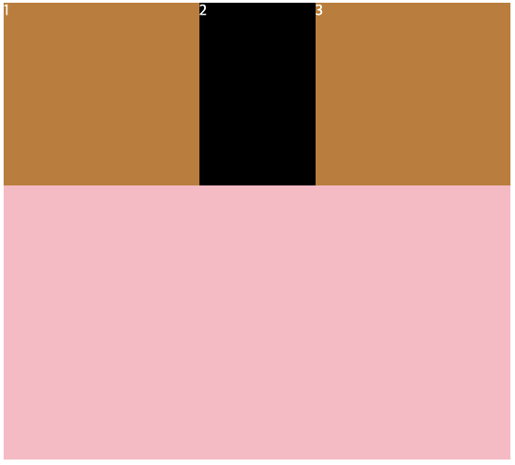
.parents {
	height: 500px;
	display: flex;
	background: pink;
	justify-content: space-around;
}

.child {
	width: 200px;
	height: 200px;
	background: peru;
}

.child:nth-child(1) {
	order: 2;
}

.child:nth-child(2) {
	order: -1;
}
1번 item 은 2
2번 item 은 -1
로 선언해주면 3번 item 은 기본값 0 이기에 위와 같은 item 순서가 만들어진다.
입력한 수들은 큰 의미 없이 내가 임의로 적은 수이다.
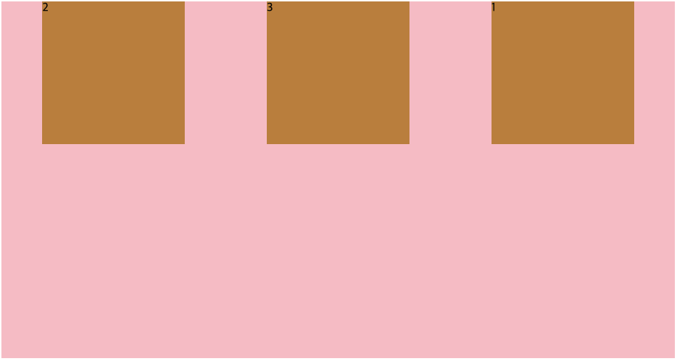
flex-wrap
부모 요소에 적용하는 것으로 기본값은
flex-wrap: nowrap;
이다.
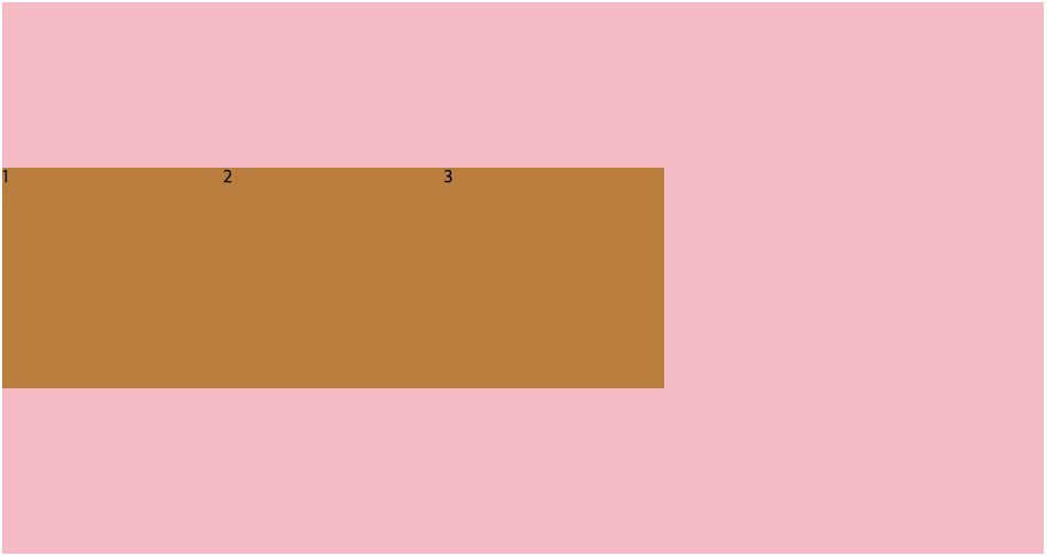
flex 를 사용해서 인터넷 창의 크기를 최대로 줄이거나 해보면 item 에 선언해준 width 의 크기가 무시되고 창의 크기에 맞게 변환되면서 item 들이 무조건 같은 라인에 오는 것을 볼 수 있다.
.parents {
	height: 500px;
	display: flex;
	background: pink;
	justify-content: space-around;
}

.child {
	width: 500px;
	height: 200px;
	background: peru;
}
item 의 width 값을 500px 로 주었는데 사진으로는 구분이 안되지만 창을 최대로 줄인 상태이다.
이처럼 길이가 자동으로 조정이 되면서 같은 라인에 유지된다.
이러한 설정이 기본값으로 되어있는데 이걸 바꿀 수도 있다.
flex-wrap: wrap;
으로 선언하면 된다.
.parents {
	height: 500px;
	display: flex;
	background: pink;
	justify-content: space-around;
	flex-wrap: wrap;
}

.child {
	width: 500px;
	height: 100px;
	background: peru;
}
너비 길이를 지키기 위해 item 들이 아래로 밀려났다.
flex-wrap: wrap-reverse
wrap 도 reverse 로 뒤집을 수 있다.
.parents {
	height: 500px;
	display: flex;
	background: pink;
	justify-content: space-around;
	flex-wrap: wrap-reverse;
}

.child {
	width: 300px;
	height: 100px;
	background: peru;
}
자리가 없으면 아래로 밀려났던 게 반대로 아래부터 시작해서 위로 밀려난다.
flex-flow
flex-direction 과 flex-wrap 은 같이 사용되는 경우가 많아 이 두 가지를 모아놓은 거라고 한다.
1.
flex-direction: column;
flex-wrap: wrap;
flex-flow: column wrap;두 코드가 같은 역할을 하는 코드이다.
공백으로 direction 과 wrap 을 구분한다.
flex-shrink
flex-wrap: nowrap 이 flex 의 기본값으로 공간이 없어도 자동으로 item 의 width 값이 조정되면서 정렬이 되는데
이때, width 이 줄어드는 비율을 각 아이템별로 설정할 수 있다.
.parents {
	height: 500px;
	display: flex;
	background: pink;
	justify-content: space-around;
}

.child {
	width: 300px;
	height: 200px;
	background: peru;
	color: white;
}

.child:nth-child(2) {
	background: #000;
	flex-shrink: 2;
}
창을 줄여놓은 것인데 2번 item 이 양 옆 item 보다 2 배 더 줄어들게 해 놓은 것이다.
위는 하나의 item 에만 사용했지만 각각 비율을 정할 수 있다.
기본값은 1 이다.
flex-grow
item 들의 width 값만큼 충족이 되면 남은 빈 공간들이 생긴다. 그때 그 빈 공간을 해당 item이 차지하게 해주는 역할을 한다.
flex-shrink 와 마찬가지로 item 별로 비율을 정해줄 수 있다.
flex-grow 를 사용 안하면 위와같이 될 때,
.parents {
	height: 500px;
	display: flex;
	background: pink;
	justify-content: space-around;
}

.child {
	width: 200px;
	height: 200px;
	background: peru;
	color: white;
}

.child:nth-child(2) {
	background: #000;
	flex-grow: 2;
}
flex-grow 를 사용하면 이처럼 빈 공간을 자치하게 된다.
flex-basis
item 의 기본 크기를 정해주는 것이다. item이 줄어들거나 늘어나는 창으로 인해 값이 변하기 전의 크기.
width 크기라고는 할 수 없고 main axis 의 크기라고 한다.
application 에서 item 의 크기를 정할 때 width 보다 유용하다고 한다.
flexbox game
css 코드 게임으로 flexbox 를 게임으로 재미있게 맛볼 수 있다.