flex box 로는 그리드 형태를 만들기 어렵다 그러므로 CSS grid 를 공부한다.
distplay: grid
그리드를 사용할 요소의 부모 요소에 선언한다.
grid-template
columns
column 에 위치한 item 들의 위치를 잡아준다.
grid-template-columns: 250px 250px 250px;3 * 3 그리드를 만든다고 할때 부모 요소에 저렇듯 width 값을 설정해서 자리를 잡아줄 수 있다.
3개의 열을 설정한 것이다.
rows
row 에 위치한 item 들의 위치를 잡아준다.
grid-template-rows: 100px 50px 300px;column 과 똑같은 방식으로 설정할 수 있다. 3 개의 행을 설정한 것이다.
auto, repeat()
grid-template-rows 또는 grid-template-columns 은 크기를 한 라인씩 지정도 가능하지만 한번에 지정해줄 수도 있다.
repeat(), auto 가 그 역할을 하는데
grid-template-columns: repeat(4, 200px);
grid-template-rows: 100px repeat(2, 200px) 100px;
우선 repeat() 이다. 괄호 안에 해당 설정을 지정해줄 라인 개수를 적고, 설정 값을 넣어준다.
위의 columns 의 경우 4 개의 열의 너비를 200px 로 정한것이다.
rows 는
첫 번째 라인은 100px
두 번째, 세 번째 라인은 200px
네 번째 라인은 100px
로 부분적으로 공통된 값을 줄 수도 있다.
auto
grid-template-columns: auto 200px;특정 값을 정해주면 창의 크기에 따라 빈공간도 생길텐데 auto 로 설정하면 자동으로 값을 변환한다.
위의 코드는 2번째 라인은 200px 로 하고 나머지를 auto 로 설정한 것이다.
gap
각 item 간의 간격을 설정할 수 있다.
gap: 10px;item 들 간에 위 아래 간격이 10px 로 동일하게 맞춰진다.
위 아래 각각 맞춰줄 수도 있다.
column-gap
column 방향의 item 들간의 간격을 설정한다.
column-gap: 10px;row-gap
row 방향의 item 들간의 간격을 설정한다.
row-gap: 10px;grid-template-areas
그리드 영역의 셀을 수립하고 그들에게 이름을 할당한다.
<!DOCTYPE html>
<html lang="en">
<head>
<link rel="stylesheet" href="styles.css">
<title>(S)CSS Masterclass</title>
</head>
<body>
<div class="grid">
<div class="header"></div>
<div class="content"></div>
<div class="nav"></div>
<div class="footer"></div>
</div>
</body>
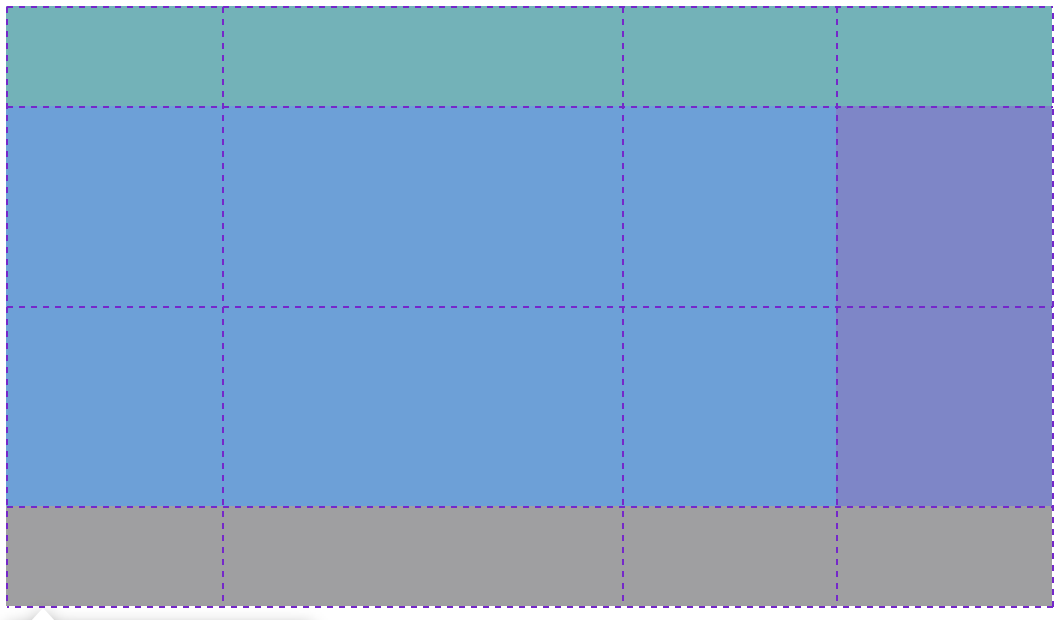
</html>.grid {
display: grid;
grid-template-columns: auto 200px;
grid-template-rows: 100px repeat(2, 200px) 100px;
grid-template-areas:
"header header header header"
"content content content nav"
"content content content nav"
"footer footer footer footer"
;
}
.header {
background-color: #2ecc71;
grid-area: header;
}
.content {
background-color: #3498db;
grid-area: content;
}
.nav {
background-color: #8e44ad;
grid-area: nav;
}
.footer {
background-color: #f38c12;
grid-area: footer;
}grid-template-areas 속성으로 각 영역의 이름을 지정해주고
grid-area 속성을 사용하여 그리드 항목의 이름을 지정한 다음 grid-template-areas 속성의 이름을 참조할 수 있다.
이름을 지정하면 지정된 이름에 맞게 그리드 항목이 grid-template-areas 영역에 표시된다.
"header header header header"
"content content . nav"
"content content . nav"
"footer footer footer footer"
. 을 넣으면 빈공간으로 된다.
grid-column-start, grid-column-end
그리드 항목의 가로 위치 및 영역을 지정해주는 속성이다.
column 라인을 기준으로 지정하며 start 는 시작 지점을 end 는 끝 지점을 지정한다.
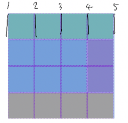
.header {
	background-color: #2ecc71;
	grid-column-start: 1;
	grid-column-end: 5;
}
상단의 초록색 부분을 지정해준 코드다.
grid-row-start, grid-row-end
그리드 항목의 세로 위치 및 영역을 지정해주는 속성이다.
row 라인을 기준으로 지정하며 start 는 시작 지점을 end 는 끝 지점을 지정한다.
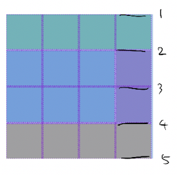
.content {
	background-color: #3498db;
	grid-column-start: 1;
	grid-column-end: 4;
	grid-row-start: 2;
	grid-row-end: 4;
}
중앙의 파란색 영역을 지정해준것이다.
grid-column, grid-row
start 와 end 를 합춰놓은 것이라 할 수 있다.
grid-column start / end 형식이라 할 수 있다.

.header {
	background-color: #2ecc71;
	grid-column: 1 / -1;
}
맨 위 초록색 부분이다.
1. grid-column-start: 1;
grid-column-end: 5;
2. grid-column: 1 / 5;
3. grid-column: 1 / -1;
위 코드가 다 같다.
-1 은 그리드의 끝 라인을 뜻한다. 라인의 끝에서 부터 차례대로 -1, -2, -3 에 해당한다.
.footer {
	background-color: #f38c12;
	grid-column: span 4;
}
맨 아래 주황색 부분이다.
span 을 통해 cell 의 개수를 지정해서 나타낼 수 도 있다.
시작 위치를 지정해줄 필요가 있을때는 grid-column: 4 / span; 와 같은 형식으로도 사용할 수 있다.
grid-area
/ 로 구분지어 grid-row-start, grid-column-start, grid-row-end, grid-column-end 순으로 입력이 가능하다.
order
그리드 요소들이 grid-area, grid-column, grid-row, 기타 등을 사용하지 않고, 표시될 경우 소스코드에 기입된 순서대로 표기됩니다. table 레이아웃에 비해 grid 시스템의 장점인 order 속성을 이용하면 이를 재정의가 가능하다.
기본적으로, 그리드의 모든 요소들은 order의 값이 0이지만, z-index와 같이 양수와 음수의 값 모두 설정이 가능하다.
Line Naming
line 에 이름을 붙여서도 사용이 가능하다.
.grid {
	display: grid;
	gap: 10px;
	grid-template-columns: [first-line] 100px [second-line] 100px [third-line] 100px [fourth-line] 100px [fifth-line];
	grid-template-rows: repeat(4, 100px [kimchi-line]);
}
colums 라인에 각각 이름을 준것이다.
row는 kimchi-line 으로 이름은 지정한 것인데, repeat 으로 지정할 경우 첫번째 라인은 지정이 안된다.
2번 라인 부터 kimchi-line 1 이 된다.
예
.content {
	background-color: #3498db;
	grid-column: first-line / fourth-line;
	grid-row: kimchi-line 1 / kimchi-line 3;
}
중앙의 파란색 부분을 나타낸 코드이다.
fr
px 나 % 와 같은 측정 단위이다.
할당된 범위 내에서의 비율을 나타낸다.

.grid {
	display: grid;
	gap: 10px;
	grid-template-columns: 1fr 2fr 1fr 1fr;
	grid-template-rows: repeat(4, 100px);
}
height 을 지정하지 않고 grid-template-rows 를 repeat(4, 1fr); 로 나타내면 할당된 범위가 없기에 아무것도 표시되지 않는 경우를 가져올 수 있다.
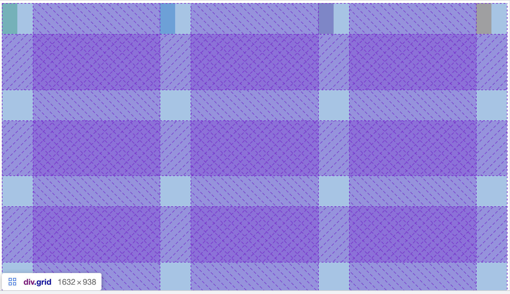
grid-template
grid-template은 grid-template-rows와 grid-template-columns를 조합한 단축 속성이다.
예) grid-template: auto 50px / 20% 1fr;
아래와 같은 형식으로도 사용이 가능하다.
.grid {
	display: grid;
	gap: 10px;
	height: 50vh;
	grid-template:
		"header header header header" 1fr
		"content content content nav" 2fr
		"footer footer footer footer" 1fr / 1fr 1fr 1fr 1fr
	;
}
각 그리드 항목에 grid-area 를 지정해주고 위와 같이 사용이 가능하다.
각 라인 끝에 지정한 수는 가로 길이이고, 마지막 / 뒤에 지정해주는 숫자는 세로 길이이다.
jusify-items
grid 각 항목들의 가로 위치를 잡아준다.
기본값은 stretch 이다. 부모의 범위만큼 grid 항목을 가로로 늘린다.
align-items
grid 각 항목들의 세로 위치를 잡아준다.
기본값은 stretch 이다. 부모의 범위만큼 grid 항목을 세로로 늘린다.
place-items
align-items, jusify-items 를 동시에 적용할 수 있다.
place-items: stretch center; (순서대로 align-items, jusify-items 를 의미한다.)
와 같은 형식으로 지정한다.
justify-content, align-content
justify-items, align-items 는 각각의 grid 항목 내부에 적용되는 거라면
justify-content, align-content 는 grid 전체를 움직인다.
첫 번째 사진은 items
align-items: stretch;
justify-items: center;
두 번째는 content
align-content: space-between;
justify-content: space-between;
place-content
align-content, justify-content 를 동시에 적용할 수 있다.
place-items: end center; (순서대로 align-content, justify-content 를 의미한다.)
와 같은 형식으로 지정한다.
justify-self, alingn-self
justify-items, align-items 와 같은 역할을 하는데 전체 적용이 아닌 그리드 항목에 개별적으로 적용이 가능하다.
place-self
align-self, justify-self 을 동시에 적용 가능
place-self: start end; (순서대로 align-self, jusify-self 를 의미한다.)
와 같은 형식으로 지정한다.
grid-auto-rows, grid-auto-columns
추가되는 content 가 몇개가 되든 지정해준 너비로 생성된다.
grid-template-rows 또는 grid-template-columns 와 같이 쓰게되면
grid-template-rows: repeat(4, 100px);
grid-auto-rows: 200px;
repeat 으로 설정해준 4 라인 까지는 100px 가 적용되고 이후 생성되는 content 에 대해서는 200px 가 적용된다.
grid-auto-flow
flex-direction 과 비슷한 역할을 한다.
grid 의 방향을 바꿔준다.
grid-auto-flow: row;
grid-auto-flow: column;
minmax
최소 최대값을 설정할 수 있다.
grid-template-columns: repeat(4, minmax(100px, 1fr));
위와 같이 사용하면 최소값은 100px 이면서 1fr 의 값을 갖는다.
auto-fit
부모의 크기만큼 block 들이 늘어난다.
grid-template-columns: repeat(auto-fit, minmax(100px, 1fr));
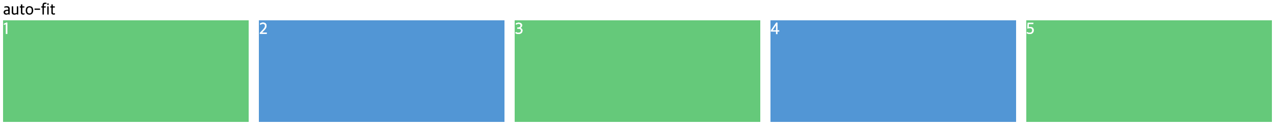
HTML 에 item 을 하나 추가하면 나머지 크기가 줄어들면서 추가된다.
auto-fill
주어진 크기로 부모의 크기만큼 grid block 공간들이 생성된다.
grid-template-columns: repeat(auto-fill, minmax(100px, 1fr));
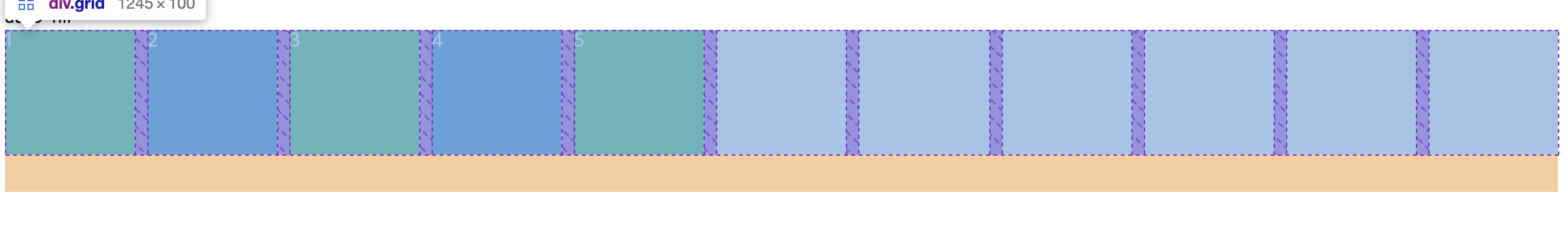
HTML 에 추가한 item 은 5개 뿐인데 나머지 공간이 일정한 크기의 빈공간으로 채워진다.
max-content, min-content
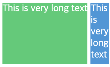
grid-template-columns: max-content min-content;
max-content
content 가 필요한 만큼의 크기로 적용한다. (초록)
min-content
content 가 될 수 있는 최소한의 크기로 적용한다. (파랑)
예
grid-template-columns: repeat(5, minmax(max-content, 1fr));
최소값에 max-content 가 들어가서 box 의 최소 사이즈를 content size 로 만들 수 있다.
grid-template-columns: repeat(auto-fit, minmax(20px, max-content));
최대값에 max-content 가 들어가서 box 를 content size 에 따라 만들 수 있다.
grid game
Reference
https://developer.mozilla.org/en-US/docs/Web/CSS/CSS_Grid_Layout/Grid_Template_Areas
https://nomadcoders.co/css-layout-masterclass/lobby