Achievement Goals
-
다양한 CSS 셀렉터 규칙을 이해할 수 있다.
- 셀렉터
h1 { } , div { } - 전체 셀렉터
* { } - Tag 셀렉터
section, h1 { } - ID 셀렉터
#only { } - class 셀렉터
.widget { } , .center { } - attribute 셀렉터 (암기x)
a[href] { }
p[id="only"] { }
p[class~="out"] { }
p[class|="out"] { }
section[id^="sect"] { }
div[class$="2"] { }
div[class*="w"] { } - 후손 셀렉터
header h1 {} - 자식 셀렉터
header > p { } - 인접 형제 셀렉터
section + p { } - 형제 셀렉터
section ~ p { } - 가상 클래스
a:link { }
a:visited { }
a:hover { }
a:active { }
a:focus { } - 요소 상태 셀렉터
input:checked + span { }
input:enabled + span { }
input:disabled + span { } - 구조 가상 클래스 셀렉터 (암기x)
p:first-child { }
ul > li:last-child { }
ul > li:nth-child(2n) { }
section > p:nth-child(2n+1) { }
ul > li:first-child { }
li:last-child { }
div > div:nth-child(4) { }
div:nth-last-child(2) { }
section > p:nth-last-child(2n + 1) { }
p:first-of-type { }
div:last-of-type { }
ul:nth-of-type(2) { }
p:nth-last-of-type(1) { } - 부정 셀렉터
input:not([type="password"]) { }
div:not(:nth-of-type(2)) { } - 정합성 확인 셀렉터
input[type="text"]:valid { }
input[type="text"]:invalid { }
- 셀렉터
-
후손 셀렉터와 자식 셀렉터의 차이
자식은 1레벨만 아래일때 , 후손은 2레벨 이하들!
-
방향: flex-direction
row가 기본이고, column으로 세로방향이다. row-reverse 를 하면 오른쪽부터 글이 시작되며, column-reverse 를 하면 아래부터 시작된다.
-
얼마나 늘릴 것인가? :flex-grow
flexbox의 정해진 크기내에서 크기에 대한 지분을 할당하는 정도를 표현한다고 생각하면 편할 것 같다
-
얼마만큼의 크기를 갖는가?: flex-basis
flex item의 초기 크기를 설정한다. 주로 auto로 놓고 사용
-
수평 정렬: justify-content
justify-content: center; / Pack items around the center /
justify-content: start; / Pack items from the start /
justify-content: end; / Pack items from the end /
justify-content: flex-start; / Pack flex items from the start /
justify-content: flex-end; / Pack flex items from the end /
justify-content: left; / Pack items from the left /
justify-content: right; / Pack items from the right / -
수직 정렬: align-items
align-items: center; / Pack items around the center /
align-items: start; / Pack items from the start /
align-items: end; / Pack items from the end /
align-items: flex-start; / Pack flex items from the start /
align-items: flex-end; / Pack flex items from the end / -
CSS의 기본적인 셀렉터 #와 .의 차이를 이해하고 있다.
id 와 class 의 차이. 반복되는 태그는 class를 사용. 딱 한번만 사용되는 태그는 id를 사용한다.
-
절대 단위와 상대 단위를 구분할 수 있다.
px 와 em rem 이 있는데 요즘엔 반응형 디자인 때문에 절대단위를 잘 쓰지않고 상대 단위를 사용한다.
-
CSS 박스 모델에 대해 이해하고 있다.
margin -> border -> padding -> contents 순으로 이루어져 있다.
-
박스 측정 기준(content-box, border-box) 두 가지의 차이를 이해하고 있다.
content-box는 테두리와 안쪽여백도 컨텐츠 크기에 합치는 반면 border-box는 합치지 않고 내가 할당한 값 그대로를 반환한다.
-
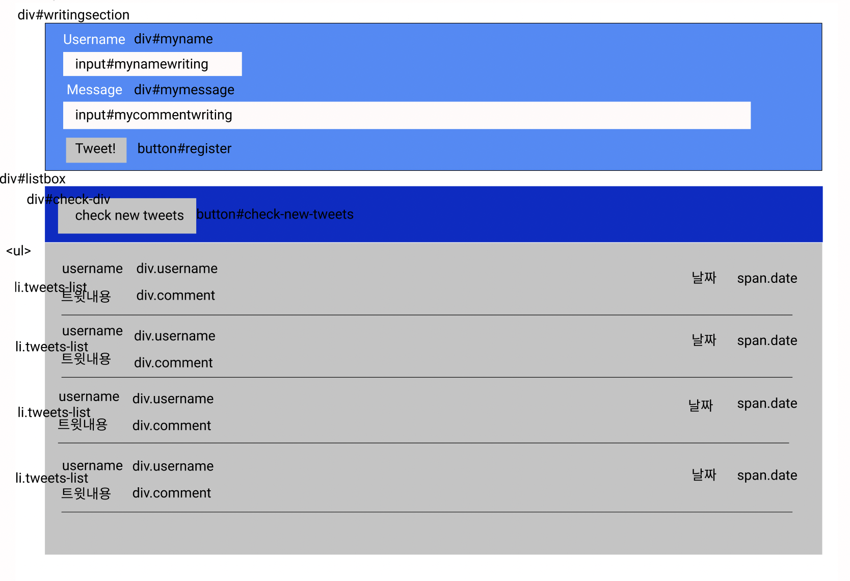
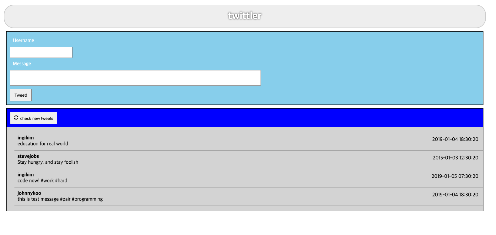
만들고 싶은 앱의 와이어프레임을 그려볼 수 있다.
figma
Whimsical
adalo 등등을 사용한다. -
와이어프레임만 보고 HTML로 코딩할 수 있다.
가능! 하지만 목업도 만들어보는 편이 좋다
-
div 태그 또는 section, header 등의 시맨틱 태그로 영역을 구분하는 이유를 이해할 수 있다.
구글검색엔진이 시맨틱 태그 위주로 저장하고 배포하기 때문, 또 협업이나 유지보수에서 한눈에 이해할 수 있어 용이함.
-
HTML 문서에서 어느 때에 id, 어느 때에 class를 사용해야 하는지 이해할 수 있다.
O
-
프로젝트 구성시 제작순서는?
와이어프레임 제작 -> 와이어프레임에 css구성요소 입히기 -> 목업 -> 하드코딩 -> 프로토타입 순
tail wind 방법론 시간날때 읽어보기
https://wonny.space/writing/dev/hello-tailwind-css