First attempt at figma-jitsu
Clone project site: thanxiety.com. It's a site that gives neat topic prompts for talk (for fam gatherings like Thanksgiving) - and you can choose the type of questions you want (deep talk, politics, pop culture, random gift questions, etc.) Aesthetically pleasing and clean, all designed with a singular functionality in mind. What can go wrong? Well...
Seemed simple yesterday, then realized only later that all the color variations of the pages, as well as the colors of all the navigational elements, modal and filter option windows that change with it, makes this pretty damn complicated to prototype on figma. Simulating randomization wasn't the only tricky issue. The sheer extent of all the possible variations even in its simplest form made it a nightmare to execute within the finite time available.
Of course it only occurred to me once we were knee deep into the project that I hadn't been thinking in terms of what would be the simplest to execute given figma's capacity. I mean, I didn't think that hard, but I guess I was operating still on what might be simplest to clone from a javascript vantage point. How naive that was.
Also realized our project didn't met the basic requirements - there is no 'scroll' event in our page. So oops.
Bare Minimum Requirements:
- Lo-fi prototype + page navigation + scroll event + at least one master component and instance
Advanced:
- Discuss its UI/UX and what could be improved. Then iterate.
- UI: 1. UI design pattern used, 2. Use of column-grid system
- UX: 1. 7 factors of UX (peter morville), 2. User flow
- Usability Eval: 1. Usability Heuristics Check
So we spent all our time, meeting the 'bare minimum' - which alone kept us plenty occupied. We spent most of the day making components. I wasted about an hour looking into inline svgs and how to use them just so that I could replicate the exact look and feel (and what a waste that was, in hindsight!) We first started with the naive expectation that we'd have enough time to implement the seven different scenarios depending on which filters (for 3 different kinds of questions) were checked:
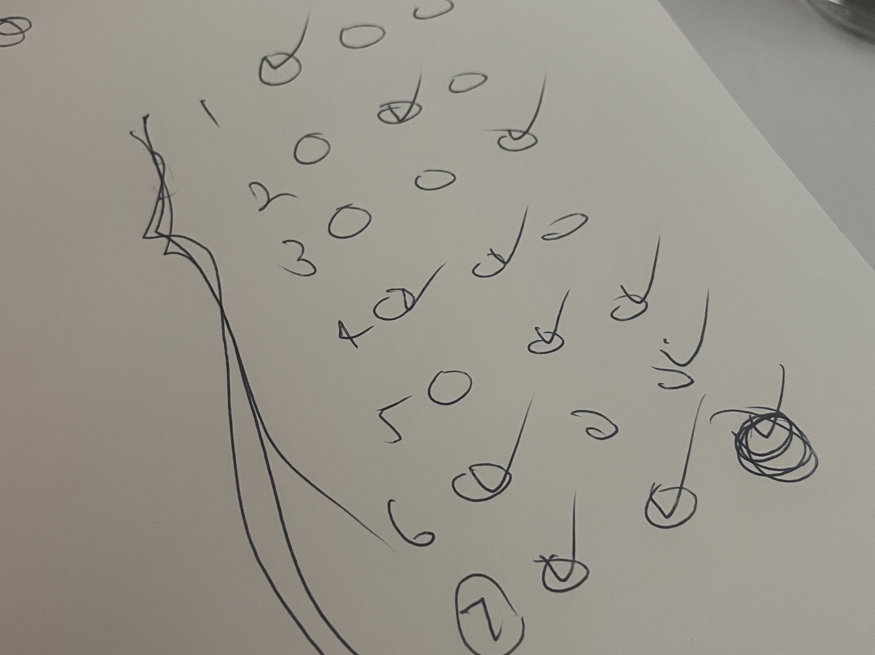
We ended up only simulating the checkbox action (without changing the types of questions shown), and went with just a singular flow/scenario for a total of 6 questions.
The site is basically a constant stream of questions (next, previous button), with options to filter the type of questions, and an 'about' page. We prototyped both the about page and filter options prompt as modal windows, which was simplest. (On the actual site, clicking the filter icon reveals all the filtering options on the top of the page while pushing down the rest of the existing page in the style of an accordion.
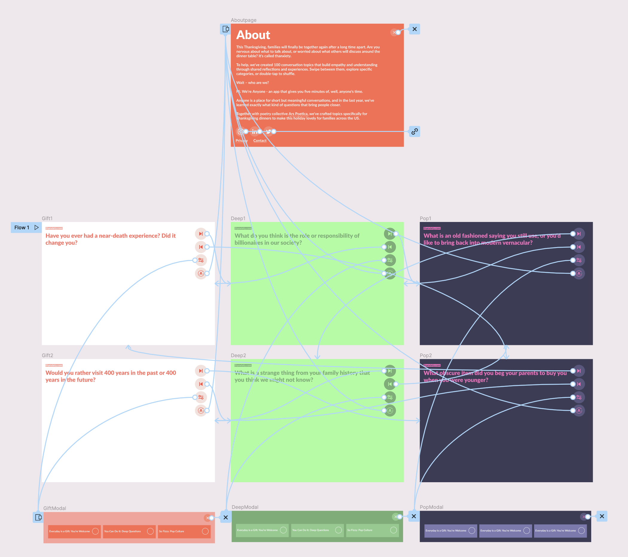
I thought of listing all the questions as variations or swappable instances inside the same component then embedding that component into a stylized text component with color variations, but I realized that wouldn't work unless all the questions were already stylized. There must be an easier way for swapping text within components but we couldn't find one. But it would be ridiculous to create color variations for each an every question as separate components for more than a handful of questions.
I guess the easiest way to do it without breaking any bones would be to create stylized variations of one question, drag that component into the page you want and directly edit the text for that specific page.
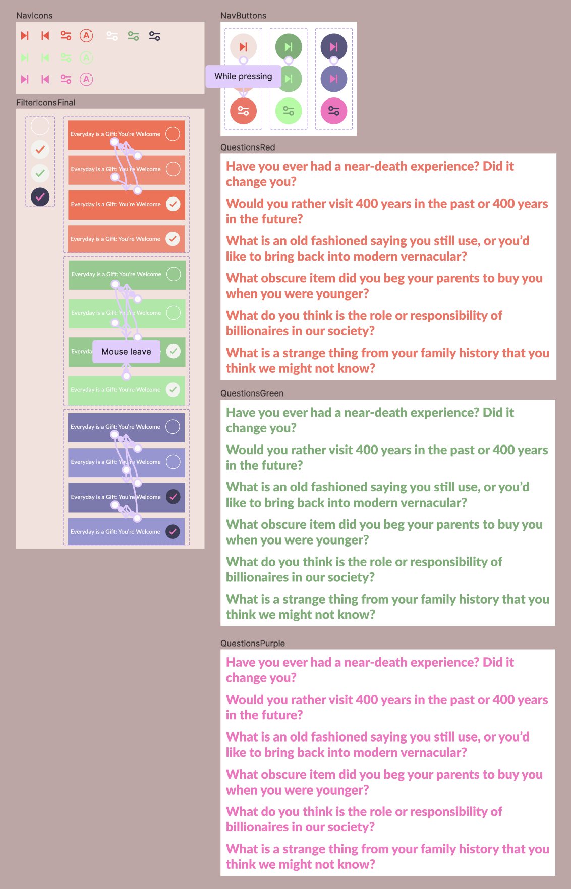
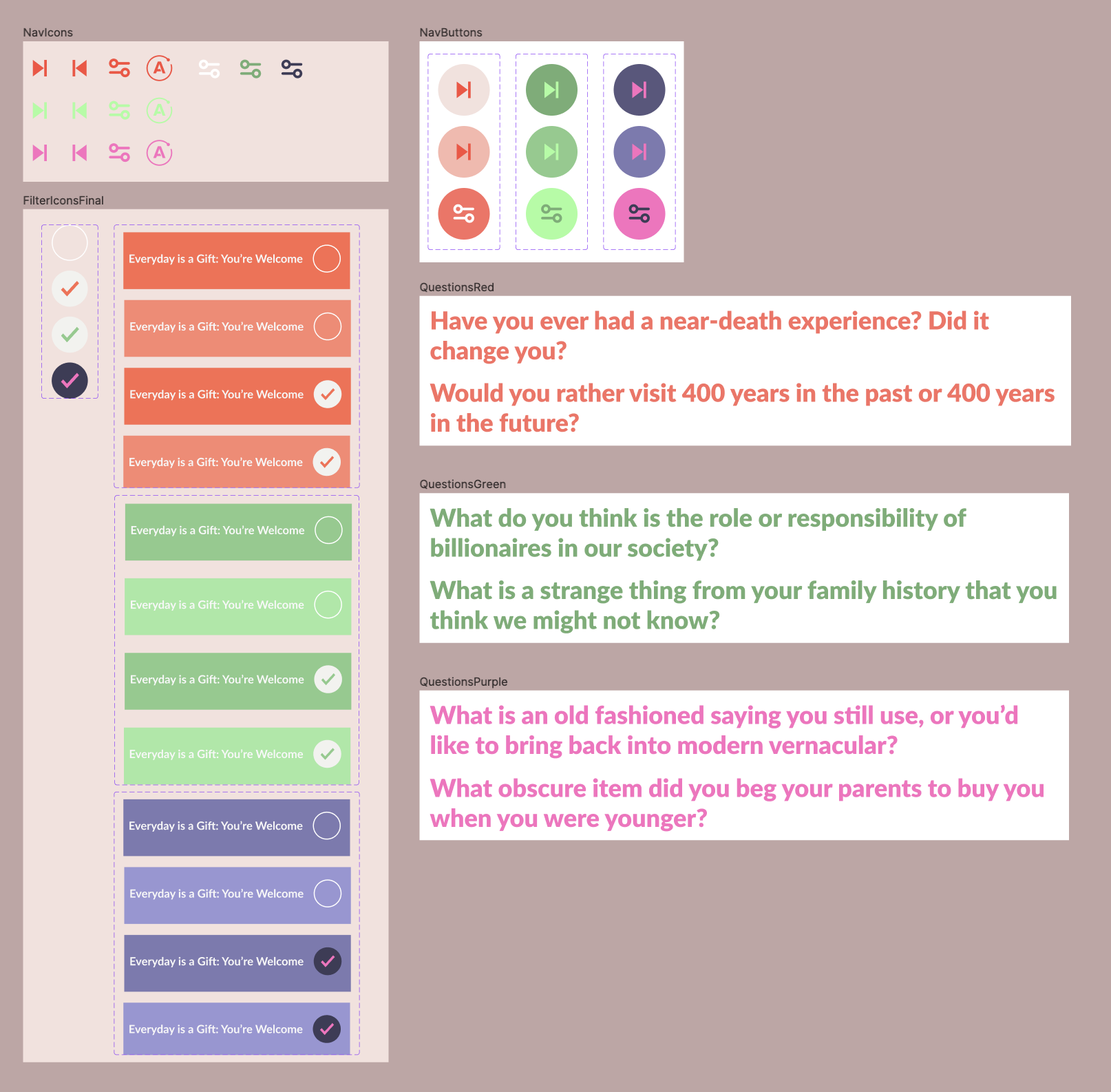
Result
Nothing special but at least it yielded something.
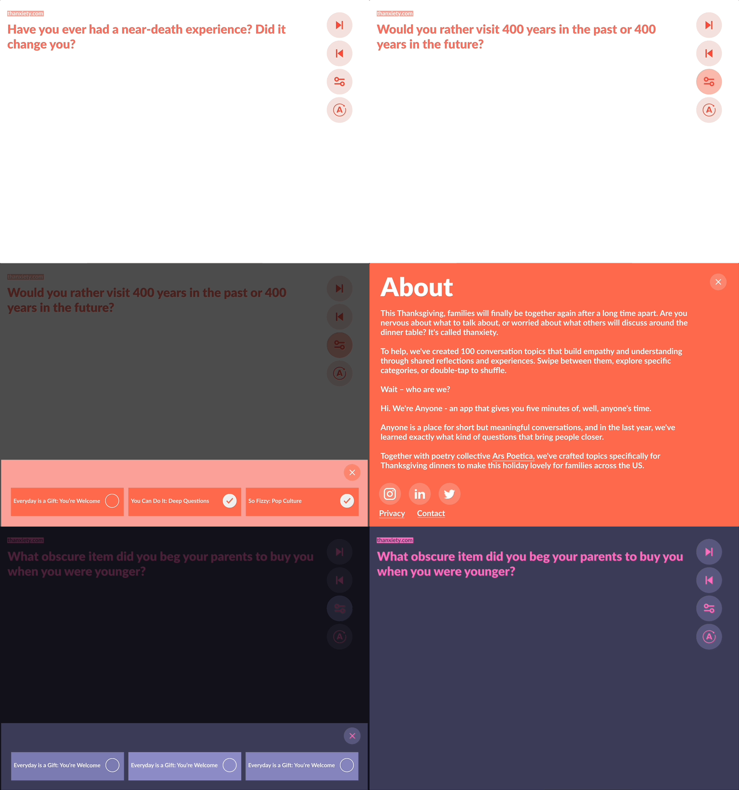
Challenges.. a summary (all that figma cannot do)
Lessons Learned
- Next time, don't choose a site with a ton of various color modes, filtering, and randomized elements which complicate the user flow scenarios.
- Stacking hover transitions on top of click transitions gets hella messy and buggy. Only the pink/purple filter checkboxes worked as it should and I cannot for the life of me figure out why it does not work for the other two variations.
- Have a clear idea of what you're seeking to explore and accomplish by prototyping.
- You do not need to trigger a page transition after closing a modal window.. you just need to trigger a 'close modal' action. - to use smart animations, the element names to animate must remain the same in variants
What Figma Cannot
- Cannot create one prototype that combines all pages in figma
- Cannot trigger multiple actions with click (needs in between..)
- e.g. I couldn’t trigger a button state change and also trigger the modal open window at the same time
References
5 ways to improve your prototyping flow
(Ideas) Create one prototype across the pages in a file
(Ideas) Prototyping: allow multiple actions for a trigger
(Ideas) Component State Dependencies
Property Randomizer
Shuffle
Tutorials
Instance swap menu
A complete guide to Figma component properties: pro tips
Using Figma interactive components to create functional buttons
How to use pages in Figma
Managing multiple pages in design file
Can you highlight text on figma?
How do you use filters in Figma?
Filter & Sort Magical Layouts Smart Animation in Figma
