1. 학습한 내용
1. menu exam => media-query
-position: static, fixed
.intro{
    width: 100%;
    height: 80px;
    display: flex;
    position: fixed; /* 고정 */
}
.intro h1{
    width: 50%;
    height: 100%;
    background-color: aquamarine;
}
.intro nav{
    width: 50%;
    height: 100%;
}
.intro nav ul{
    list-style: none;
    display: flex;
    margin: 0;
    padding: 0;
}
.intro nav ul li{
    width: 33.3333%;
    height: 80px;
}
.intro nav ul li:nth-child(1){
    background-color: blueviolet;
}
.intro nav ul li:nth-child(2){
    background-color: brown;
}
.intro nav ul li:nth-child(3){
    background-color: royalblue;
}

.main{
    width: 100%;
    height: 1000px;
    background-color: tomato;
    padding-top: 80px; }
fixed 한 부분만큼(height 80px) padding-top을 주면 잘려진 부분이 드러나게 된다
768px보다 작을 때 header가 2단으로 바뀌도록 처리
@media (max-width:786px){
    .intro{
        height: 160px;
        flex-direction: column;
        position: static;
    }
flex 방향을 세로로 바꿔준다 => column = 기둥, 세로줄 row = 열, 가로
    .intro h1,
    .intro nav{
        width: 100%;
    }
    .main{
        padding-top: 0;
        background-color: antiquewhite;
    }
    p{
        font-size: 24px;
    }
}
### 2. Grid layout => 격자 형태의 레이아웃을 만드는 2차원 레이아웃 방식 => 그리드 컨테이너 = 그리드 방식으로 레이아웃을 결정할 요소 => display:grid, display:inline-grid => 행(가로row) 열(세로column)
다단 column
<div id="warper">
	<div id="columns">
		<div class="card">
			<img src="./images/img1.jpg">
			<p>Icecream1</p>
		</div>
		<div class="card">
			<img src="./images/img2.jpg">
			<p>Icecream2</p>
		</div>
	</div>
</div>
글자를 가운데 정렬하기 위해 height와 line-height를 같이 맞춰준다
margin은 태그 사이를 띄워줄 때 사용
background-size: cover는 화면 전체 적용할 때 사용
h1{
    width: 100%;
    height: 150px;
    line-height: 150px;
    padding-left: 50px;
    background: url("../images/img6.jpg") no-repeat left top;
    background-size: cover;
    color: white;
}
margin: 50px auto는 높이50xp 띄우고 가운데 정렬
#wrapper{
    width: 90%;
    max-width: 1100px;
    min-width: 760px;
    margin: 50px auto;
}
columns 수 지정, columns 사이 간격 지정
#columns{
    column-count: 2;
    column-gap: 10px;
}
.card{
    display: inline-block;
    width: 200px;
    background-color: #fff;
    box-shadow: 0 1px 1px #ccc;
    padding: 15px;
    padding-bottom: 5px;
}
.card img{
    width: 100%;
    height: 160px;
    border-bottom: 1px solid #ccc;
    padding-bottom: 15px;
    margin-bottom: 5px;
}
.card p{
    padding: 10px;
}
900px 이상
@media (min-width:900px){
    #columns{
        column-count: 3;}
}
1100px 이상
@media (max-width:1100px){
    #columns{
        column-count: 4;}
}
3. Grid system 적용
grid, grid-inline
grid-template-columns 열(세로) 반복되는 수, 사이즈 지정
grid-template-rows 가로(행) 사이즈 지정
grid-gap: 10px(행) 10px(열) 사이 간격 지정
#wrapper{
    display: grid;
    grid-template-columns: repeat(2,200px);
    grid-template-rows: minmax(220px auto);
    grid-gap: 10px 10px;
    justify-content: center;
}
900px 이상
@media (min-width:900px){
    #wrapper{
        justify-content: center;
        grid-template-columns: repeat(3,200px);
    }
}
1100px 이상
@media (max-width:1100px){
    #wrapper{
        justify-content: center;
        grid-template-columns: repeat(4,200px);
    }
}
4.원페이지 사이트 만들기
fab fa-instagram
fab fa-facebook-square
fab fa-facebook-square
=> 이미지문자
<div class="container">
<section class="top">
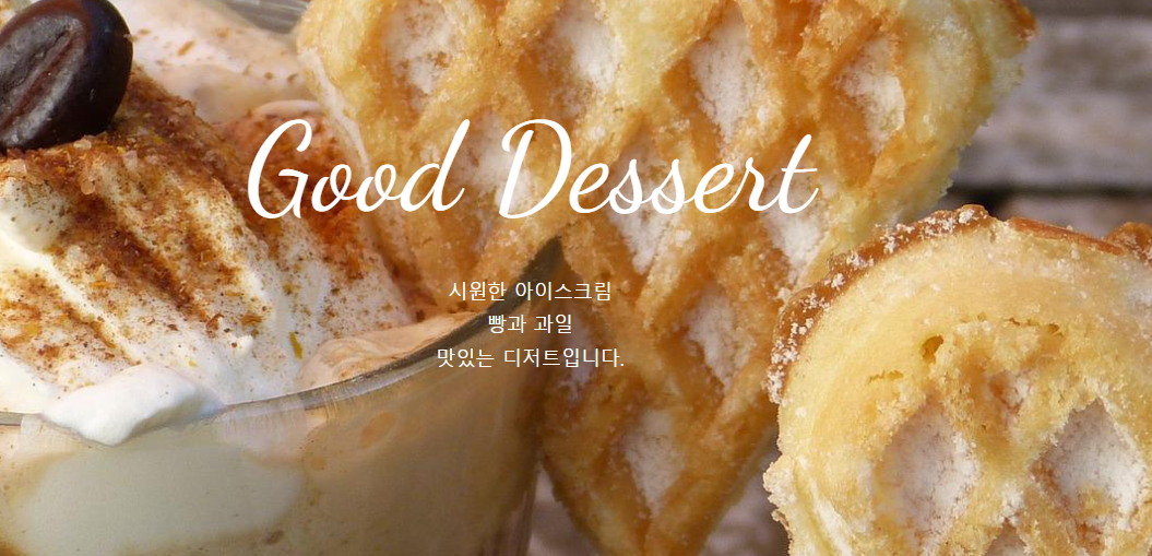
<h1 class="title">Good Dessert</h1>
<p>시원한 아이스크림<br>
빵과 과일<br>
맛있는 디저트입니다.</p>
</section>
<section class="menu">
<h2 class="title">Menu</h2>
</section>
<section class="contact">
<h2 class="title">Contact</h2>
<p>서울시 서초구 서운로 00-00</p>
<p>영업시간: 8:00 ~ 20:00</p>
<a class="btn" href="#">문의사항</a>
<ul class="contact-sns">
<li><a href="#"><i class="fab fa-instagram"></i></a></li>
<li><a href="#"><i class="ㅊ"></i></a></li>
<li><a href="#"><i class="fab fa-twitter"></i></a></li>
</ul>
</section>
</div>css
*{
    box-sizing: border-box;
    padding: 0;
}
html{
    font-size: 100%; /* 16px */
    line-height: 1.15;
}
body{
    font-family: sans-serif;
    margin: 0;
    color: white;
}
a{
    background-color: transparent; /* 투명 */
    text-decoration: none;
}
img{
    border-style: none;
    vertical-align: bottom;
}
h1, h2{
    font-weight: lighter;
    margin: 0;
}
tilte section
.title{
    font-family: 'Dancing Script', cursive;
    font-size: 7rem; /* 112px; */
    margin-bottom: 2rem; /* 32px */
    padding-top: 10vh;
}
p{
    line-height: 1.7;
    font-size: 18px;
}
vh => 내가 키고 있는 화면에 꽉 채운다는 뜻
.container{
    height: 100vh;
    overflow: auto;
    scroll-snap-type: y mandatory;
}
.top{
    background-image: url(../images/img1.jpg);
}
section{
    height: 100vh;
    background-size: cover;
    background-repeat: no-repeat;
    background-position: center;
    text-align: center;
    scroll-snap-align: start;
}
.menu{
    background-image: url(../images/img2.jpg);
}
.contact{
    background-image: url(../images/img3.jpg);
}
.btn{
    background-color: #555;
    font-size: 14px;
    color: #fff;
    padding: 10px 30px;
    border-radius: 6px;
    display: inline-block;
    margin: 32px 0 36px;
}
.btn:hover{
    background-color: #777;
}
.contact-sns{
    display: flex;
    justify-content: center;
}
.contact-sns a{
    display: inline-block;
    background-color: #fff;
    color: #555;
    width: 60px;
    height: 60px;
    margin: 0 8px;
    border-radius: 50%;
    font-size: 32px;
    line-height: 60px;
}
.contact-sns a:hover{
    background-color: rgba(255,255,255,0.5);
}
700px 부터
@media (max-width:700px){
    .title{
        font-size: 64px;
    }
}
2. 학습한 내용 중 어려웠던 점
display의 여러가지 방식들에 대한 이해가 더 필요하다.
이전에 만든 카페 예제에다가 배운것들을 적용해볼 필요가 있다.
그리드를 사용함에 있어 미디어쿼리를 적용했을 때 잘 안맞는 부분이 있어서 찾아봐야겠다.
3.해결방법
미디어쿼리에 대한 연습을 위해 카페 예제에 직접 적용해 보면서 연습할 필요가 있다.
그리드에 대한 내용을 좀 더 찾아보고 연습해 볼 필요가 있다.
4.학습소감
미디어쿼리가 스마트폰을 사용하는 현재에는 필수적인 요소라고 생각되기 때문에 어떻게 적용되고 어떻게 해야 좀 더 깔끔하고 보기 좋게 만들 수 있는지 생각해 볼 필요가 있겠다.