1. 학습한 내용
1.부트스트랩
- 부트스트랩 적용
<link href="https://cdn.jsdelivr.net/npm/bootstrap@5.2.0-beta1/dist/css/bootstrap.min.css" rel="stylesheet" integrity="sha384-0evHe/X+R7YkIZDRvuzKMRqM+OrBnVFBL6DOitfPri4tjfHxaWutUpFmBp4vmVor" crossorigin="anonymous">
<link rel="stylesheet" href="../css/bootstrap.min.css"><script src="https://cdn.jsdelivr.net/npm/bootstrap@5.2.0-beta1/dist/js/bootstrap.bundle.min.js" integrity="sha384-pprn3073KE6tl6bjs2QrFaJGz5/SUsLqktiwsUTF55Jfv3qYSDhgCecCxMW52nD2" crossorigin="anonymous"></script>
<script src="../js/bootstrap.bundle.js"></script>-
컨테이너
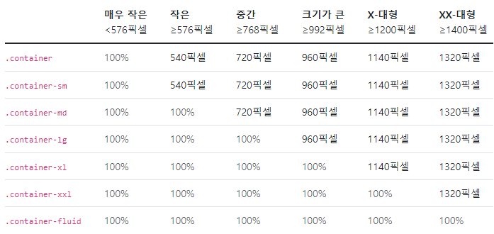
-
그리드
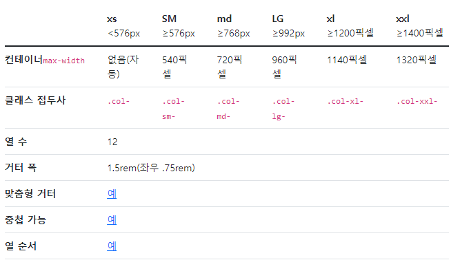
=> 6개의 기본 중단점, 6개의 기본 그리드 계층 => 전체 12개를 기준으로 나눈다
<div class="container">
  <div class="row justify-content-md-center">
    <div class="col col-lg-2">
      1 of 3
    </div>
    <div class="col-md-auto">
      Variable width content
    </div>
    <div class="col col-lg-2">
      3 of 3
    </div>
  </div>
  <div class="row">
    <div class="col">
      1 of 3
    </div>
    <div class="col-md-auto">
      Variable width content
    </div>
    <div class="col col-lg-2">
      3 of 3
    </div>
  </div>
</div>- colum(열)
row align-items-start
row align-items-center
row align-items-end
col align-self-start
col align-self-center
col align-self-end
row justify-content-start
row justify-content-center
row justify-content-end
row justify-content-around
row justify-content-between
row justify-content-evenly- image
-> fluid: max-width: 100%; and height: auto;
<img src="..." class="img-fluid" alt="...">-> img-thumbnail
<img src="..." class="img-thumbnail" alt="...">-> 이미지 정렬
<img src="..." class="rounded float-start" alt="...">
<img src="..." class="rounded float-end" alt="...">
<img src="..." class="rounded mx-auto d-block" alt="...">
<div class="text-center">
  <img src="..." class="rounded" alt="...">
</div>- table
<table class="table">
  <thead>
    <tr>
      <th scope="col">#</th>
      <th scope="col">First</th>
      <th scope="col">Last</th>
      <th scope="col">Handle</th>
    </tr>
  </thead>
  <tbody>
    <tr>
      <th scope="row">1</th>
      <td>Mark</td>
      <td>Otto</td>
      <td>@mdo</td>
    </tr>
    <tr>
      <th scope="row">2</th>
      <td>Jacob</td>
      <td>Thornton</td>
      <td>@fat</td>
    </tr>
    <tr>
      <th scope="row">3</th>
      <td colspan="2">Larry the Bird</td>
      <td>@twitter</td>
    </tr>
  </tbody>
</table>- table 색상
<!-- On tables -->
<table class="table-primary">...</table>
<table class="table-secondary">...</table>
<table class="table-success">...</table>
<table class="table-danger">...</table>
<table class="table-warning">...</table>
<table class="table-info">...</table>
<table class="table-light">...</table>
<table class="table-dark">...</table>

<!-- On rows -->
<tr class="table-primary">...</tr>
<tr class="table-secondary">...</tr>
<tr class="table-success">...</tr>
<tr class="table-danger">...</tr>
<tr class="table-warning">...</tr>
<tr class="table-info">...</tr>
<tr class="table-light">...</tr>
<tr class="table-dark">...</tr>

<!-- On cells (`td` or `th`) -->
<tr>
  <td class="table-primary">...</td>
  <td class="table-secondary">...</td>
  <td class="table-success">...</td>
  <td class="table-danger">...</td>
  <td class="table-warning">...</td>
  <td class="table-info">...</td>
  <td class="table-light">...</td>
  <td class="table-dark">...</td>
</tr>- table 줄무늬(행)
<table class="table table-striped">
</table>- table 줄무늬(열)
<table class="table table-striped-columns">
</table>- table-hover
<table class="table table-hover">
</table>- table-active => 해당 테이블 행,셀 강조
- table-bordered, table-borderless
- table-group-divider => 해당 테이블 밑줄 더 어둡게, 두껍게
- table align-middle,bottom, top => 셀 안의 내용 정렬
etc
2. 부트스트랩 활용
- 부트스트랩의 예제들을 활용해서 웹페이지를 보다 손쉽게 만들어 볼 수 있다
<!doctype html>
<html lang="en">
<head>
<meta charset="utf-8">
<meta name="viewport" content="width=device-width, initial-scale=1">
<title>Bootstrap demo</title>
<link rel="stylesheet" href="../css/bootstrap.min.css">
<link rel="stylesheet" href="https://cdn.jsdelivr.net/npm/bootstrap-icons@1.8.3/font/bootstrap-icons.css">
</head>
<body>
<main>
<h1 class="visually-hidden">Headers examples</h1>
<div class="container">
<header class="d-flex flex-wrap justify-content-center py-3 mb-4 border-bottom">
<a href="/" class="d-flex align-items-center mb-3 mb-md-0 me-md-auto text-dark text-decoration-none">
<svg class="bi me-2" width="40" height="32"><use xlink:href="#bootstrap"/></svg>
<span class="fs-4">Simple header</span>
</a>
<ul class="nav nav-pills">
<li class="nav-item"><a href="#" class="nav-link active" aria-current="page">Home</a></li>
<li class="nav-item"><a href="#" class="nav-link">Features</a></li>
<li class="nav-item"><a href="#" class="nav-link">Pricing</a></li>
<li class="nav-item"><a href="#" class="nav-link">FAQs</a></li>
<li class="nav-item"><a href="#" class="nav-link">About</a></li>
</ul>
</header>
</div>
<div class="px-4 pt-5 my-5 text-center border-bottom">
<h1 class="display-4 fw-bold">Centered screenshot</h1>
<div class="col-lg-6 mx-auto">
<p class="lead mb-4">Quickly design and customize responsive mobile-first sites with Bootstrap, the world’s most popular front-end open source toolkit, featuring Sass variables and mixins, responsive grid system, extensive prebuilt components, and powerful JavaScript plugins.</p>
<div class="d-grid gap-2 d-sm-flex justify-content-sm-center mb-5">
<button type="button" class="btn btn-primary btn-lg px-4 me-sm-3">Primary button</button>
<button type="button" class="btn btn-outline-secondary btn-lg px-4">Secondary</button>
</div>
</div>
<div class="overflow-hidden" style="max-height: 30vh;">
<div class="container px-5">
<img src="https://getbootstrap.com/docs/5.2/examples/heroes/bootstrap-docs.png" class="img-fluid border rounded-3 shadow-lg mb-4" alt="Example image" width="700" height="500" loading="lazy">
</div>
</div>
</div>
<div class="container px-4 py-5" id="custom-cards">
<h2 class="pb-2 border-bottom">Custom cards</h2>
<div class="row row-cols-1 row-cols-lg-3 align-items-stretch g-4 py-5">
<div class="col">
<div class="card card-cover h-100 overflow-hidden text-white bg-dark rounded-4 shadow-lg" style="background-image: url('unsplash-photo-1.jpg');">
<div class="d-flex flex-column h-100 p-5 pb-3 text-white text-shadow-1">
<h2 class="pt-5 mt-5 mb-4 display-6 lh-1 fw-bold">Short title, long jacket</h2>
<ul class="d-flex list-unstyled mt-auto">
<li class="me-auto">
<img src="https://github.com/twbs.png" alt="Bootstrap" width="32" height="32" class="rounded-circle border border-white">
</li>
<li class="d-flex align-items-center me-3">
<svg class="bi me-2" width="1em" height="1em"><use xlink:href="#geo-fill"/></svg>
<small>Earth</small>
</li>
<li class="d-flex align-items-center">
<svg class="bi me-2" width="1em" height="1em"><use xlink:href="#calendar3"/></svg>
<small>3d</small>
</li>
</ul>
</div>
</div>
</div>
<div class="col">
<div class="card card-cover h-100 overflow-hidden text-white bg-dark rounded-4 shadow-lg" style="background-image: url('unsplash-photo-2.jpg');">
<div class="d-flex flex-column h-100 p-5 pb-3 text-white text-shadow-1">
<h2 class="pt-5 mt-5 mb-4 display-6 lh-1 fw-bold">Much longer title that wraps to multiple lines</h2>
<ul class="d-flex list-unstyled mt-auto">
<li class="me-auto">
<img src="https://github.com/twbs.png" alt="Bootstrap" width="32" height="32" class="rounded-circle border border-white">
</li>
<li class="d-flex align-items-center me-3">
<svg class="bi me-2" width="1em" height="1em"><use xlink:href="#geo-fill"/></svg>
<small>Pakistan</small>
</li>
<li class="d-flex align-items-center">
<svg class="bi me-2" width="1em" height="1em"><use xlink:href="#calendar3"/></svg>
<small>4d</small>
</li>
</ul>
</div>
</div>
</div>
<div class="col">
<div class="card card-cover h-100 overflow-hidden text-white bg-dark rounded-4 shadow-lg" style="background-image: url('unsplash-photo-3.jpg');">
<div class="d-flex flex-column h-100 p-5 pb-3 text-shadow-1">
<h2 class="pt-5 mt-5 mb-4 display-6 lh-1 fw-bold">Another longer title belongs here</h2>
<ul class="d-flex list-unstyled mt-auto">
<li class="me-auto">
<img src="https://github.com/twbs.png" alt="Bootstrap" width="32" height="32" class="rounded-circle border border-white">
</li>
<li class="d-flex align-items-center me-3">
<svg class="bi me-2" width="1em" height="1em"><use xlink:href="#geo-fill"/></svg>
<small>California</small>
</li>
<li class="d-flex align-items-center">
<svg class="bi me-2" width="1em" height="1em"><use xlink:href="#calendar3"/></svg>
<small>5d</small>
</li>
</ul>
</div>
</div>
</div>
</div>
</div>
<script src="../js/bootstrap.bundle.js"></script>
<footer class="d-flex flex-wrap justify-content-between align-items-center py-3 my-4 border-top">
<p class="col-md-4 mb-0 text-muted">© 2022 Company, Inc</p>
<a href="/" class="col-md-4 d-flex align-items-center justify-content-center mb-3 mb-md-0 me-md-auto link-dark text-decoration-none">
<svg class="bi me-2" width="40" height="32"><use xlink:href="#bootstrap"/></svg>
</a>
<ul class="nav col-md-4 justify-content-end">
<li class="nav-item"><a href="#" class="nav-link px-2 text-muted">Home</a></li>
<li class="nav-item"><a href="#" class="nav-link px-2 text-muted">Features</a></li>
<li class="nav-item"><a href="#" class="nav-link px-2 text-muted">Pricing</a></li>
<li class="nav-item"><a href="#" class="nav-link px-2 text-muted">FAQs</a></li>
<li class="nav-item"><a href="#" class="nav-link px-2 text-muted">About</a></li>
</ul>
</footer>
</body>
</html>2. 학습한 내용 중 어려웠던 점
부트스트랩의 사용법들을 여러가지 보던 중 개념들을 보기 쉽게, 그리고 예제들을 만들어 보여주고있어서 이해하기 쉽고 좋았다. 다만 그럼에도 아직 실 적용부분에서 헷갈리는 부분들이 많은 것 같다.
3. 해결방법
웹 페이지를 만들어보면서 어떻게 작동하는가, 이것 저것 사용하고 넣어봐야겠다.
4. 학습소감
부트스트랩이라는 방식이 아주 편하고 무엇보다 처음 접하는 사람들에게 쉽게 다가갈수 있도록 해주는 것 같다. 응용할 수 있는 부분들을 잘 살펴봐야겠다.

코딩공부중