1. 학습한 내용
1. Cat-blog 마무리
aside 부분
outline-offset
- 윤곽선과 요소의 가장자리 또는 테두리 사이에 공백을 추가하는 것
letter-spacing <===> word-spacing - 문자사이 간격 <===> 단어사이 간격
aside{
    margin-top: 1rem;

}
.side-box{
    margin-bottom: 4rem;
    border: 1px solid #ccc;
    outline: 2px solid #ccc;
    outline-offset: 4px;
    border-radius: 6px;
    padding: .875rem;
    position: relative;
}
.side-box::before{
    display: block;
    width: 2rem; /* 16px(rem=기본은 16px, 상대적인 크기, 기준값이 있어야 한다) x 2 */
    height: 2rem;
    text-align: center;
    background-color: #fff;
    position: absolute;
    top: -1rem;
    left: 0;
    right: 0;
    margin: auto;
}
.side-box a:hover{
    color: #7ac69f;
}
.side-box h3{
    font-family: 'Amatic SC', cursive;
    font-size: 1.875rem;
    letter-spacing: .1rem;
    text-align: center;
    margin: .875rem 0 1.125rem;
}
목록 부분
/***************** 목록 ****************************/
.side-box li{
    border-bottom: 1px dashed #ccc;
    padding: 1rem .25rem;
    display: flex;
}
.side-box li:last-child{
    padding-bottom: .5rem;
    border-bottom: 0;
}
.side-box li:first-child{
    padding-top: 0;
}
.side-box li::before{
    display: inline-block;
    content: '';
    background: #93d8d0;
    width: 8px;
    height: 8px;
    border-radius: 50%;
    margin: 6px 10px 0 0;
}
.side-box li a{
    flex: 1; /* 비율 */
    line-height: 1.4;
}
form 부분
/***************** 폼 *******************/
.newsletter-form{
    display: flex;
    margin-top: 1.5rem;
}
.newsletter-form input[type='email']{
    border: 2px solid #ccc;
    border-radius: 10px 0 0 10px;
    background-color: #fff;
    padding: 1rem;
    width: 75%;
}
.newsletter-form input[type='email']:placeholder{
    color: #ccc;
}
.newsletter-form input[type='submit']{
    background-color: #eda1a1;
    border-radius: 0 10px 10px 0;
    color: #fff;
    cursor: pointer;
    padding: 1.1rem;
    margin-left: -5px;
}
.newsletter-form input[type='submit']:hover{
    background-color: #e38787;
}
popolar posts 부분
/******************* popular posts ******************/
.popular-posts{
    margin-bottom: 2rem;
}
footer 부분
/************* footer ****************/
footer{
    background-color: #949087;
    text-align: center;
    padding: 3rem;
}
footer ul{
    display: flex;
    justify-content: center;
    margin-bottom: 2rem;
}
footer li{
    margin: 0 12px;
}
footer a:hover{
    color: #c7c3ba;
}
footer small{
    color: #c7c3ba;
    font-size: .875rem;
}
미디어쿼리 부분
- 600px의 크기가 되었을 때 화면에 어떻게 보여지는지에 대한 설정 값(위 코드 포함)
/************ Desktop size *****************/
@media (min-width: 600px){
.container{
display: flex;
justify-content: space-between;
margin-bottom: 4rem;
padding: 1rem 2.5rem 2.5rem;
}
header{
height: 190px;
}
.page-title{
margin: 1rem 0 2rem;
}
.page-desc{
font-size: 1.125rem;
margin-bottom: 4rem;
}
section{
width: 68%;
margin-bottom: 0;
}
.post-thumb{
margin: 0 3rem 1.5rem 0rem;
shape-outside: circle();
float: left;
}
.post-img{
width: 220px;
height: 180px;
}
aside{
width: 26%;
}
.popular-posts{
position: sticky;
top: 1rem;
}
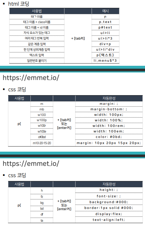
}2. CSS 라이브러리
1. emmet
2. CSS 함수
- calc를 이용하면 계산식의 결과를 속성값으로 지정할 수 있다
- 각 지정 크기만큼 공간을 차지, 브라우저가 늘어나도 여백이 생기지 않는다
- 박스 3개를 가로 정렬할 때 연산 => calc(100% / 3)
- 계산 단위가 달라도 연산이 가능하다 (100vh는 전체를 의미)
커스텀 속성(변수)과 조합
- number: 500이라는 크기의 공간의 이름 --number, 단 하나의 값만을 저장
- number라는 변수를 선언, 지정만 해놓는 것, 쓸 때는 var사용
- 변수라는 상자를 만든 것은 자주, 반복적으로 사용할 때 사용하기 위한 것
- 변수를 쓸 수 있는 범위는 괄호로 한정되어 있다
- 문서 제일 위에 root를 사용하고 선언, 변수를 사용하면 어디서든 쓸 수 있음을 의미
- 대소문자 구분함
- 커스텀 속성에 속성명을 넣을 수는 없다(숫자만 넣을 수 있다)
- 커스텀 속성을 호출한 뒤 단위를 덧붙이면 적용되지 않는다(단위 없이 써야 한다)
=> calc함수를 사용해서 padding: calc(var(--main-padding) * 1rem); 해결가능
		:root{
            --number: 500;
        }
        div{
            background-color: #0bd;
            height: calc(100vh - 100px);
            width: calc(var(--number) * 1px);
            padding: 16px;
        }
        p{
            /*  --number: 500; number라는 변수를 선언, 지정만 해놓는 것 *
            width: calc(var(--number) * 1px);
            background-color: red;
            padding: 16px;
        }
3. Sass
- css를 보조하는 새로운 도구
- 파일 확장자: .scss, .sass
- sass 장점
=> 셀렉터 부모 자식 관계를 네스트로 구현
=> 변수로 값 다시 사용하기
=> 파일을 분할해서 관리
4. mixin
- mixin: 미리 저장한 스타일을 필요한 곳에서 불러와 재사용 가능
@mixin circle {
width: 80px;
height: 80px;
border-radius: 50%;
}
div { @include circle;}- mixin으로 스타일 재사용하기
=> 인수 사용하기: 전해지는 값, 여러개도 사용가능
=> 속성값이 들어가는 부분에 변수로 처리
=> 초기값을 설정해 놓을 수 있다
@mixin circle($size:80px){
width: $size;
height: $size;
border-radius: 50%;
}
div {
@include circle(60px);
}
5. font 표시 단위
- em = 부모 요소 기준
- em은 div를 중접할 경우 글자 크기가 중첩된다는 단점을 가진다
- 이를 방지하기 위해 중첩을 사용하지 않거나 rem사용
 <div class="wrapper">
        <div>3em 크기의 제목
            <div>1.5em 크기의 텍스트
                <div>16px 크기의 텍스트입니다.</div>
            </div>
        </div>
    </div>
6. SVG
- 화질에 영향을 받지 않는 벡터 이미지
- 스타일 수정 용이
- xml 기반의 문서
- 애니메이션, css3 효과 적용 가능
- 로고와 아이콘, 데이터 시각화에 사용
<img src="./images/account_circle_black_24dp.svg" width="48" height="48"><svg xmlns="http://www.w3.org/2000/svg" enable-background="new 0 0 24
24" height="24px" viewBox="0 0 24 24" width="24px"
fill="#000000"><g><rect fill="none" height="24"
width="24"/></g><g><path d="M12,2C6.48,2,2,6.48,2,12s4.48,10,10,10s10-
4.48,10-10S17.52,2,12,2z M12,6c1.93,0,3.5,1.57,3.5,3.5S13.93,13,12,13
s-3.5-1.57-3.5-3.5S10.07,6,12,6z M12,20c-2.03,0-4.43-0.82-6.14-
2.88C7.55,15.8,9.68,15,12,15s4.45,0.8,6.14,2.12
C16.43,19.18,14.03,20,12,20z"/></g></svg>7. Animate.css
- 사용하기 쉬운 css애니메이션 라이브러리
- https://animate.style/
2. 학습한 내용 중 어려웠던 점
- 블로그 부분에서 아직은 내가 하고 싶고 구상하는 모습으로 변화해서 나타내는데 어려움을 겪고 있다.
- emmet부분은 코드 작성에 있어서 큰 도움이 될 것 같다.
- css의 여러부분들을 새롭게 배우게 되었는데 아직은 완전히 이해하기는 어렵다. 특히 calc쪽.
3. 해결방법
- calc쪽은 아직 좀 더 배워봐야 이해할 수 있을 것 같다.
- 블로그는 전반적으로 크기를 새로 짜보고 움직여야 내가 원하는 모습으로 바꿀 수 있을 것 같아서 이리저리 해봐야 할 것 같다.
- css에 대해 새롭게 알게 된 부분들을 적용할 수 있다면 블로그에 적용해봐야 할 것 같다.
4. 학습소감
- 조금 따라갔다 싶으면 뭔가 멀어지고 답답해지는 느낌이다. 지금은 그저 내가 원하는대로 구성하고 만들 수 있어야만 이 답답함을 해소할 수 있을 것 같다. 어떻게든 만들어봐야겠다.

코딩공부중