절대 경로
- 열려 있는 프로젝트 폴더를 기준으로 탐색
- (/)는 대상이 되는 위치의 하위를 뜻함
- 맨 왼쪽에는 (/)를 사용함.
- 경로가 깔끔하다
- 프로젝트 폴더가 바뀌면 다시 경로를 세팅해야 한다.
상대경로
- 현재 파일을 기준을 경로를 탐색
- (.)은 현재 위치를 뜻함
- (..)은 현재 위치의 상위를 뜻함
- (/)는 대상이 되는 위치의 하위를 뜻함
- 맨 왼쪽에 (.)또는 (..)을 사용함
- 경로가 복잡해진다.
- 기준이 되는 현재 파일의 위치가 변경이 되면 다시 경로를 세팅해야 한다.
<!DOCTYPE html>
<html lang="en">
<head>
<meta charset="UTF-8">
<meta name="viewport" content="width=device-width, initial-scale=1.0">
<link rel="stylesheet" href="./style/s10.css">
<title>Document</title>
</head>
<body>
<div class="container">
<div class="item1">1</div>
<div class="item2">2</div>
<div class="item3">3</div>
<div class="item1"></div>
<div class="item1"></div>
<div class="item1"></div>
<div class="item1"></div>
<div class="item1"></div>
<div class="item1"></div>
<div class="item1"></div>
<div class="item1"></div>
<div class="item1"></div>
<div class="item1"></div>
</div>
</body>
</html>플렉스(flex)
보통은 1줄을 정렬할 때 사용
justify-content : 정렬된 방향에 여백을 어떻게 배치할 것이냐
align-item : 크로스된 방향의 위치를 어떻게 배치할 것이냐
justify-content: space-around;
justify-content: space-evenly;
align-items: center;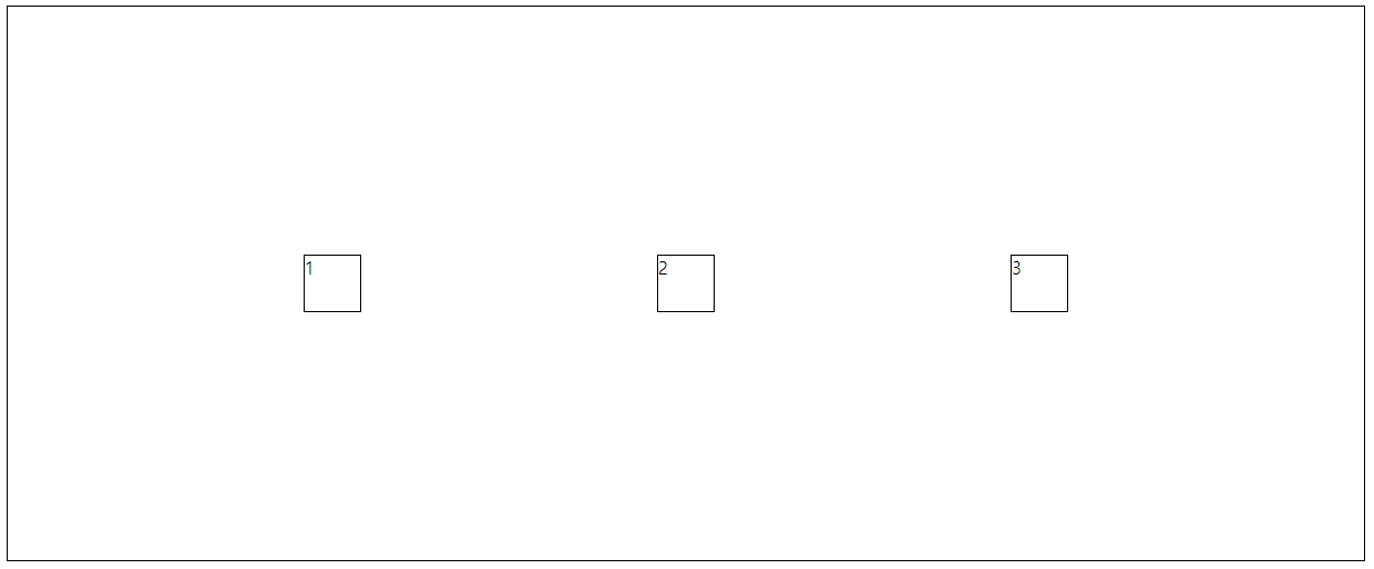
.container {
    border-width: 1px;
    border-color: black;
    border-style: solid;
    display: flex;
    height: 500px;
    flex-direction: column;
    justify-content: space-evenly;
    align-items: center;
}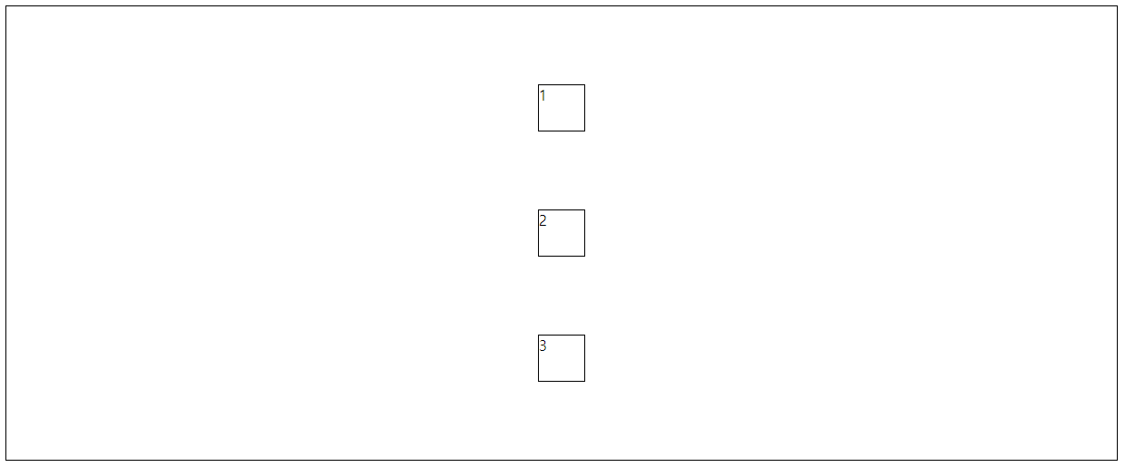
.container {
    border-width: 1px;
    border-color: black;
    border-style: solid;
    display: flex;
    height: 500px;
    flex-direction: column-reverse;
    justify-content: space-evenly;
    align-items: center;
}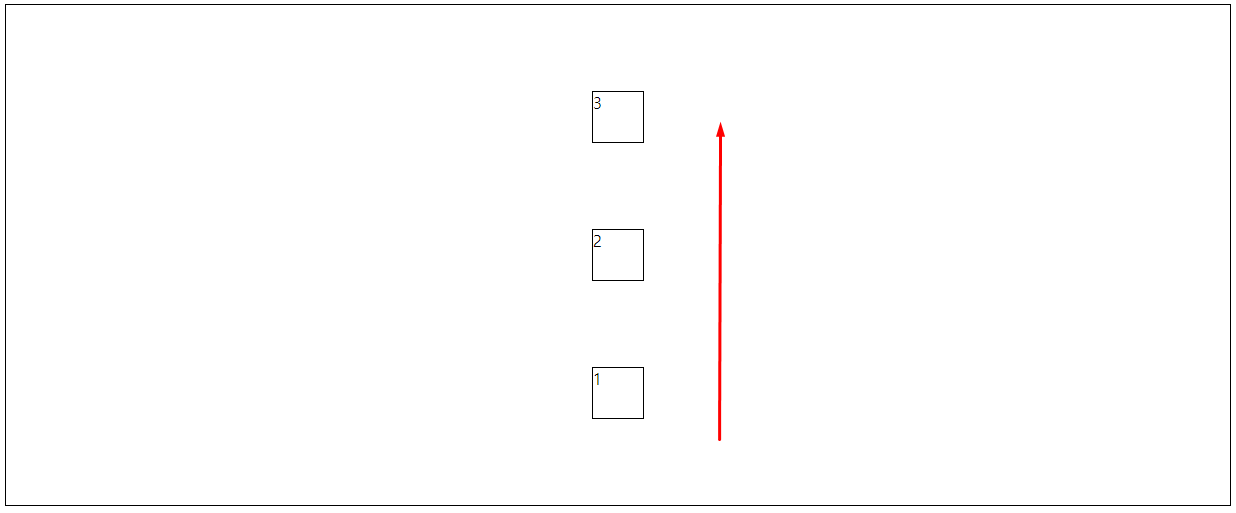
아래에서 위로 정렬이 되는 것
.container {
    border-width: 1px;
    border-color: black;
    border-style: solid;
    display: flex;
    height: 500px;
    flex-direction: row-reverse;
    justify-content: space-evenly;
    align-items: center;
}
.container {
    border-width: 1px;
    border-color: black;
    border-style: solid;
    display: flex;
    height: 500px;
    flex-direction: row;
    /* content는 여러줄에 대한 설정 */
    justify-content: space-evenly;
    /* items는 한줄에 대한 설정 */
    align-items: center;
    flex-wrap: wrap;
}
.container {
    border-width: 1px;
    border-color: black;
    border-style: solid;
    display: flex;
    height: 500px;
    flex-direction: row;
    /* content는 여러줄에 대한 설정 */
    justify-content: space-evenly;
    /* items는 한줄에 대한 설정 */
    align-content: center;
    flex-wrap: wrap;
}
더 많은 것은
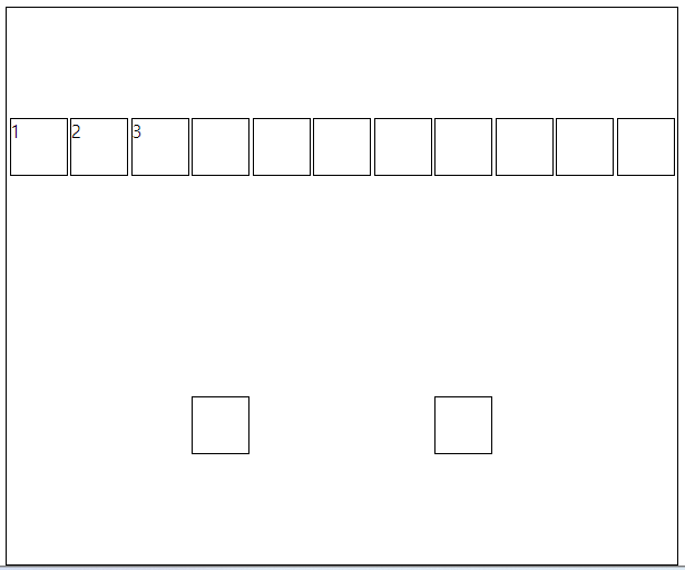
그리드(grid)
여러 줄을 사용할 때
기본적으로 12칸을 기준으로 함
<style>
div {
border: 1px solid black;
}
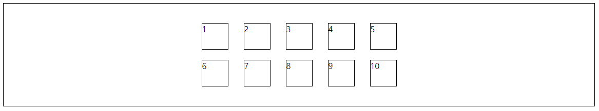
.container {
display: grid;
grid-template-columns: auto auto auto auto auto;
}
.item{
width: 50px;
height: 50px;
}
</style>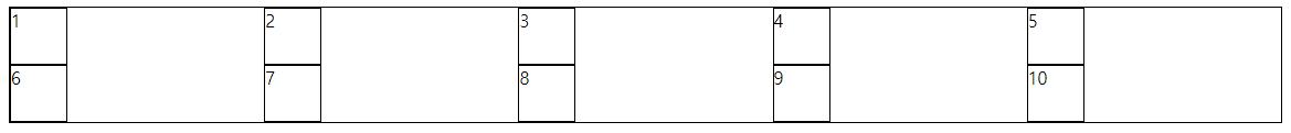
        .container {
            display: grid;
            height: 200px;
            grid-template-columns: auto auto auto auto auto;
            justify-content: center;
            align-content: center;
        }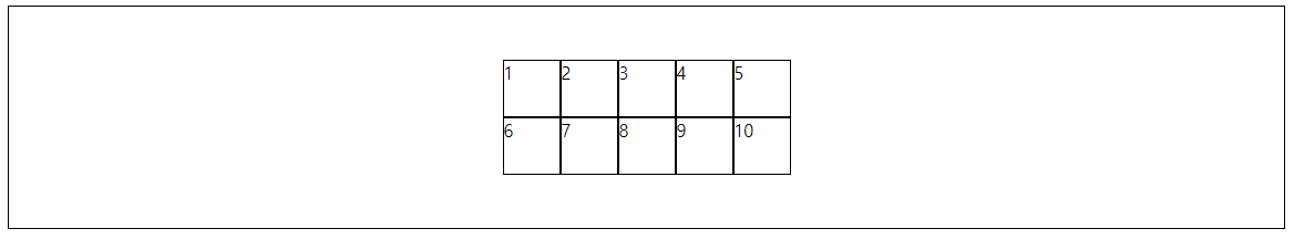
        .container {
            display: grid;
            height: 200px;
            grid-template-columns: auto auto auto auto auto;
            justify-content: center;
            align-content: center;
            gap: 10px; /*상하좌우*/
            row-gap: 20px; /*세로*/
            column-gap: 30px; /*가로*/
        }
grid-template-columns: 2fr 8fr 2fr;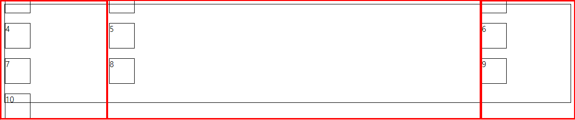
12칸중에 자기가 배치하고 싶은대로 지정하는 것
grid-template-columns: 100px 100px 1fr;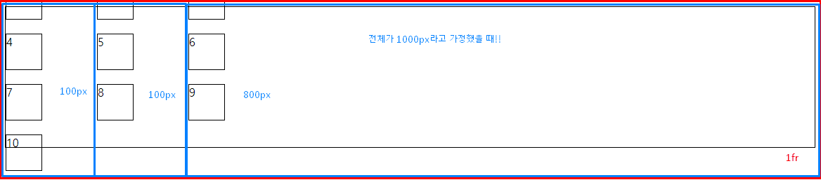

미래가 기대되는 풀스택개발자 공부 이야기~~