font
font-family
font-family 속성을 사용하면 글꼴을 지정할 수 있다.
띄어쓰기가 있는 글꼴은 쌍따옴표로 감싸야 한다.
형식
font-family:<글꼴1>, <글꼴2>, ...<글꼴 유형>;예시
p {
  font-family: BatangChe, "Times New Roman";
}
마지막에는 반드시 글꼴 유형(generic-family)을 작성하도록 권장한다.
(사용자 지정 폰트를 가져오지 못했을 때 사용하기 위해서)
글꼴 유형 종류
serif - 삐침이 있는 명조 계열의 글꼴
sans-serif - 삐침이 없고 굵기가 일정한 고딕 계열의 글꼴
monospace - 텍스트 폭과 간격이 일정한 글꼴
fantasy - 화려한 글꼴
cursive - 손으로 쓴 것 같은 필기체 계열의 글꼴
웹 폰트
font-size
텍스트 크기를 변경하고 싶을 때 사용하는 속성
형식
font-size: <크기>;예시
p {
  font-size: 14px;
}
font-weight
텍스트의 굵기를 변경하고 싶을 때 사용한다.
형식
font-weight: <크기> or <속성값>;예시
p {
  font-weight:100;
  font-weight:600;
  font-weight:900;

  font-weight:normal;
  font-weight:bold;
}
font-style
텍스트의 스타일을 지정한다.
형식
font-style: <속성값>;예시
p {
  font-style:normal;
  font-style:italic;
  font-style:oblique;
}
color
텍스트의 색상을 지정한다.
형식
color: <속성값> or <RGB> or <HEX>;예시
p{
  color:red;
}
text-align
텍스트를 정렬할 때 사용한다.
justify는 화면 넓이에 맞춰서 텍스트를 펼친다.
형식
text-align: <속성값>;예시
p{
  text-align: left;
  text-align: center;
  text-align: right;
  text-align: justify;
}
text-decoration
텍스트를 꾸며 주기 위해 사용한다.
형식
text-decoration: <속성값>;예시
p{
  text-decoration: none;
  text-decoration: line-through;
  text-decoration: overline;
  text-decoration: underline;
}
속성값
line-through - 중간선
overline - 텍스트 위 선
underline - 텍스트 아래 선
letter-spacing
자간을 조절할 때 사용한다.
형식
letter-spacing: <크기>;예시
p{
  letter-spacing:15px;
}
line-height
텍스트 한 줄의 높이를 지정한다.
형식
line-height: <크기> or <속성값>;예시
p{
  line-height: normal;
  line-height: 1;
  line-height: 200%;
  line-height: 16px;
}
실습 파일
<!DOCTYPE html>
<html lang="en">
  <head>
    <meta charset="UTF-8" />
    <meta name="viewport" content="width=device-width, initial-scale=1.0" />
    <style>
      @import url(//fonts.googleapis.com/earlyaccess/hanna.css);

      * {
        font-family: "Hanna", fantasy;
      }
      h1{
        font-size: 100px;
      }
      .w100{
        font-weight: 100;
        font-style: normal;
        text-decoration: line-through;
        letter-spacing:15px;

      }
      .w600{
        font-weight: 600;
        font-style: italic;
        text-decoration: overline;
      }
      .w900{
        font-weight: 900;
        font-style: oblique;
        text-decoration: underline;
      }
    </style>
    <title>Document</title>
  </head>
  <body>
    <h1>안녕하세요</h1>
    <div class="w100">홍길동100</div>
    <br>
    <div class="w600">홍길동600</div>
    <br>
    <div class="w900">홍길동900</div>
    <br>
  </body>
</html>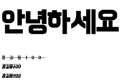
박스 모델
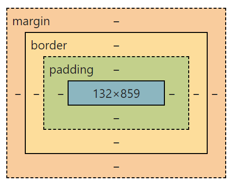
사람과 옷으로 비유하면
content - 사람
padding - 옷의 두께
border - 옷의 외부 디자인
margin - 거리두기
margin
요소 사이의 거리를 벌리거나 좁힌다.
사람과 옷으로 비유하면 사회적 거리두기를 강화하거나 약화하는 것에 해당한다.
형식
margin-top:<크기>;
margin-right:<크기>;
margin-bottom:<크기>;
margin-left:<크기>;
margin:<margin-top> <margin-right> <margin-bottom> <margin-left>;
margin:<margin-top> <margin-right> <margin-bottom>;
margin:<margin-top & margin-bottom> <margin-right & margin-left>;
margin:<margin-top & margin-right & margin-bottom & margin-left>;
예시
p {
margin-top: 10px;
margin-right: 10px;
margin-bottom: 10px;
margin-left: 10px;
margin: 10px 10px 10px 10px;
margin: 10px 10px;
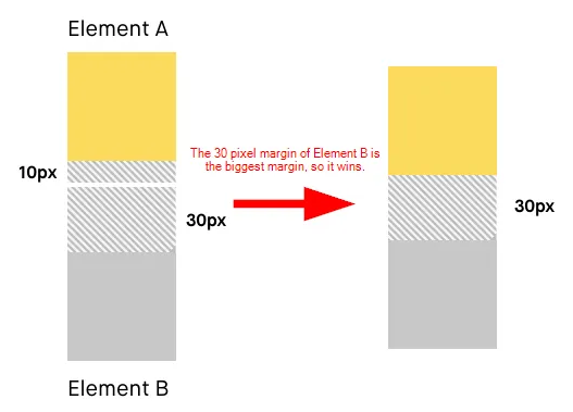
}margin 겹침 현상
마진이 서로 만났을 때 가장 큰 마진 값으로 겹쳐져 버리는 현상이다.
감기 때문에 사회적 거리두기를 하는 두 사람 A와 B로 예를들면
A는 사회적 거리두기를 1미터 하기로 했다.
B는 사회적 거리두기를 2미터 하기로 했다.
A와 B가 만나면 벌려야하는 거리는?
1미터
2미터
3미터
정답
2미터
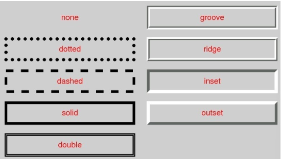
border
요소의 테두리를 담당한다.
사람과 옷으로 비유하면 옷의 무늬에 해당한다.
형식
border-width:<크기>;
border-style:<속성값>;
border-color: <색상>;

border-<방향>-<내용>: 값;

border:<border-width> <border-style> <border-color>;
예시
p {
  border-width: 1px;
  border-style: solid;
  border-color: red;

  border-bottom-style: dotted;

  border:1px solid red;
}
padding
요소 내부의 두께를 담당한다.
사람과 옷으로 비유하면 옷의 두께이다.
형식
padding-top:<크기>;
padding-right:<크기>;
padding-bottom:<크기>;
padding-left:<크기>;
padding:<padding-top> <padding-right> <padding-bottom> <padding-left>;
padding:<padding-top> <padding-right> <padding-bottom>;
padding:<padding-top & padding-bottom> <padding-right & padding-left>;
padding:<padding-top & padding-right & padding-bottom & padding-left>;
예시
p {
  padding-top: 10px;
  padding-right: 10px;
  padding-bottom: 10px;
  padding-left: 10px;
  padding: 10px 10px 10px 10px;
  padding: 10px 10px;
}
content
요소의 데이터이다.
사람과 옷으로 비유하면 사람에 해당한다.
content 자체를 다루는 속성은 없으나 넓이나 높이를 조절할 수 있다.
형식
width: <속성값>;
height: <속성값>;
예시
p {
  width: 100px;
  height: 50px;
}
box-sizing
요소의 높이와 넓이를 재는 기준이다.
content기준으로 할 것이냐
border를 기준으로 할 것이냐
사람과 옷으로 비유하면 나와 내 옷까지 포함한게 내 덩치와 키인지, 내 몸으로만 잰 것이 내 덩치와 키인지 기준을 정하는 것이다.
형식
box-sizing:<속성값>;예시
p {
  box-sizing:border-box;
  box-sizing:content-box;
}
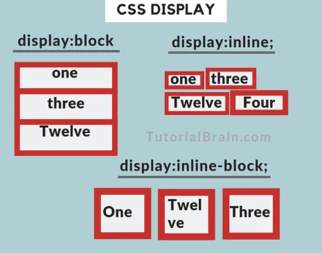
display
태그의 박스 모델 표시 형식이다.
block은 가로 한 줄을 차지한다.
inline은 요소의 너비를 box-size 만큼 차지한다.
inline-block은 inline처럼 요소의 너비가 box-size 만큼만 차지하지만, 그 외의 성격은 블록 성격을 가지는 복합적인 성격을 말한다. 그래서 img 태그를 사용할 때 웹 브라우저의 수평 공간이 남아 있으면 한 줄로 배치된다.
형식
display: <속성값>;예시
p {
  display: block;
}
border-radius
border-radius
실습
<!DOCTYPE html>
<html lang="en">
  <head>
    <meta charset="UTF-8" />
    <meta name="viewport" content="width=device-width, initial-scale=1.0" />
    <style>
      .con1 {
        /* margin-top: 50px;
            margin-right: 100px;
            margin-bottom: 150px;
            margin-left: 200px; */
        margin: 50px 100px;
        /* border-width: 5px;
            border-style: dashed;
            border-color: red; */

        border: 5px dashed red;
        padding: 50px;
        background-color: beige;
        /* background-color 는 border를 벗어나지 않는다. margin을 채울 수 없다. */
      }
      .con2 {
        margin-top: 200px;
      }
    </style>
    <title>Document</title>
  </head>
  <body>
    <div class="con1">content</div>
    <div class="con2">content2</div>
  </body>
</html>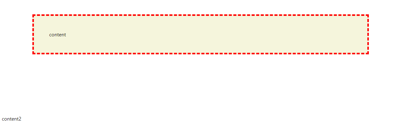
background
background-color
요소의 배경에 색상을 넣을 수 있다.
형식
background-color:<색상값>;예시
p {
  background-color:red;
}
background-image
요소의 배경에 이미지를 넣을 수 있다.
형식
background-image:url('이미지 경로');예시
p {
background-image:url('images/coffee.jpg');
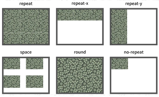
}background-repeat
이미지 반복 설정을 변경한다.
형식
background-repeat:<속성값>;예시
p {
  background-repeat:no-repeat;
}
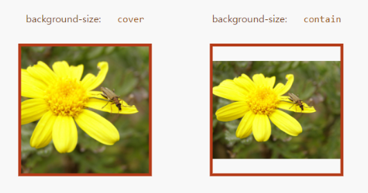
background-size
이미지 크기를 지정해서 처리한다.
형식
background-size:auto|cover|contain|<너비 높이>;예시
p {
  background-size:cover;
}
background-position
삽입하려는 이미지의 위치를 지정한다.
형식
background-position:<x 위치> <y 위치>;예시
p {
  background-position:100%;
}
background-attachment
요소에 삽입된 이미지를 스크롤할 때 작동 방식을 지정한다.
형식
background-attachment:<속성값>;예시
p {
  background-attachment:fixed;
}
실습
<!DOCTYPE html>
<html lang="en">
<head>
    <meta charset="UTF-8">
    <meta name="viewport" content="width=device-width, initial-scale=1.0">
    <style>
        .first{
            background-image: url('https://i.natgeofe.com/n/548467d8-c5f1-4551-9f58-6817a8d2c45e/NationalGeographic_2572187_square.jpg');
            height: 1000px;
            background-repeat:no-repeat;
            background-size:cover;
            background-position: center;
            background-attachment:fixed;
        }


    </style>
    <title>Document</title>
</head>
<body>
    <div class="first" style="color: white;">
        ddddddddddddf
    </div>
</body>
</html>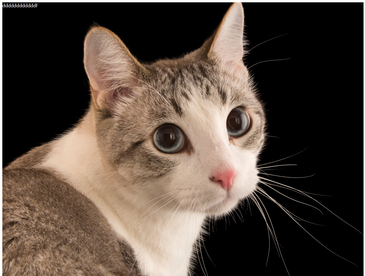
position
포지션은 정말 필요할 때에만 최소한으로 사용하는 것이 좋다.
예를들어, 플로팅 버튼, 네비게이션 등등
static - 요소를 기본 방식대로 배치
relative - 요소를 기본 방식대로 배치 + 좌표 속성을 사용
absolute - 요소를 절대적인 방식으로 배치
fixed - 요소를 절대적인 방식으로 배치 + 스크롤 고정
sticky - 요소를 절대적인 방식으로 배치 + 지정한 좌표에서 스크롤 고정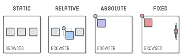
형식
position:<속성값>;예시
p {
  position:relative;
}
z-index
겹쳐진 요소의 z축 위치를 조절한다.
기본이 0
다른 것에 비해서 위쪽에 배치되려면 상대적으로 큰 숫자를 설정한다.
다른 것에 비해서 아래 쪽에 배치되려면 상대적으로 작은 숫자나 마이너스 숫자를 설정한다.
형식
z-index:<정숫값>;예시
p {
z-index: -1;
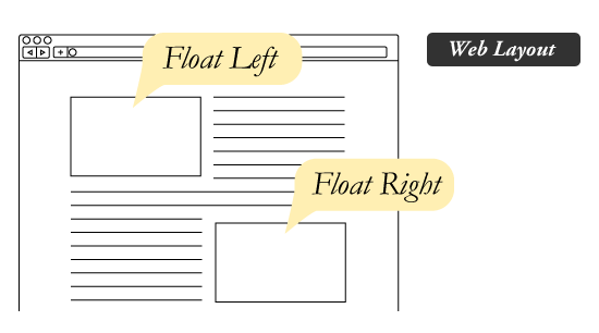
}float
요소 사이에 들어가는 요소를 만들 때 사용한다.
block 요소도 float를 이용해 inline과 유사하게 만들 수 있다.
형식
float:<속성값>; 예시
p {
  float:left;
}
clear
float 속성을 해제할 때 사용한다.
형식
clear:<속성값>;예시
p {
  clear:left;
}
참고자료
https://codecrunch.org/css-position-23ad6d0cc5f9
https://jwss.tistory.com/13
실습
<!DOCTYPE html>
<html lang="en">
  <head>
    <meta charset="UTF-8" />
    <meta name="viewport" content="width=device-width, initial-scale=1.0" />
    <style>
      .ib {
        display: inline-block;
        height: 100px;
        width: 100px;
        margin: 10px;
        background-color: coral;
      }
      .second{
        /* margin-top: 35px; */
        position: relative;
        top: 25px;
        /* left: 25px; */
      }
      .third{
        position: absolute;
        background-color: blue;
        top: 0;
        left: 0;

      }
      .first{
        position:relative;
        z-index: 1;
        /* static인 경우 z-index 안먹힘. */
      }
    </style>
    <title>Document</title>
  </head>
  <body>
    <div class="ib first">1</div>
    <div class="ib second">2</div>
    <div class="ib third">3</div>
    <div class="ib">4</div>
  </body>
</html>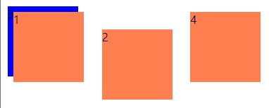
transition
CSS에서 한 요소에 적용된 스타일 속성값을 다른 속성값으로 변하게 하는 것
전환
:hover 는 transition의 일종이다.
버튼 클릭 모션은 transition의 일종이다.
transition-property
전환 효과를 적용할 속성.
기본적으로는 선택 하지 않아도 된다.
형식
transition-property:<속성값>, <속성값>;예시
p {
  transition-property:background-color;
}
transition-duration
전환 효과의 지속 시간을 설정한다.
형식
transition-duration:<시간>;예시
p{
  background-color: red;
}
p:hover {
  background-color: blue;
  transition-property:background-color;
  transition-duration:1s;
}
transition-delay
전환 효과의 발생 대기 시간을 설정한다.
형식
transition-delay:<시간>;예시
p{
  background-color: red;
}
p:hover {
  background-color: blue;
  transition-property:background-color;
  transition-duration:1s;
  transition-delay:1s;
}
transition-timing-function
전환 효과의 진행 속도를 지정한다.
형식
transition-timing-function:<속성값>;;예시
p{
  background-color: red;
}
p:hover {
  background-color: blue;
  transition-property:background-color;
  transition-duration:1s;
  transition-delay:1s;
  transition-timing-function:ease;
}
animation
전환 효과 속성보다 더 정확하고 부드럽게 전환 효과를 제어
keyframes / animation-name / animation-duration
키 프레임에는 시작과 종료에 해당하는 최소 2개 시점에 대한 스타일이 정의되어야 한다.
지정할 스타일 시트에 animation-name과 animation-duration을 넣어준다.
형식
 @keyframes <키 프레임명>{
  0%{/* CSS 코드 */}
  n%{/* CSS 코드 */}
  100%{/* CSS 코드 */}
}
예시
  @keyframes bgchange {
    0% {
      background-color: red;
    }
    25% {
      background-color: orange;
    }
    50% {
      background-color: yellow;
    }
    100% {
      background-color: green;
    }
  }

div{
  width:100px;
  height:100px;
  background-color:red;
  animation-name:bgchange;
  animation-duration:5s;
}
animation-iteration-count
애니메이션 반복 횟수를 정한다.
무한 반복일 경우 infinite를 넣는다.
형식
animation-iteration-count: <정수> or <infinite>;예시
  @keyframes bgchange {
    0% {
      background-color: red;
    }
    25% {
      background-color: orange;
    }
    50% {
      background-color: yellow;
    }
    100% {
      background-color: red;
    }
  }

  div {
    width: 100px;
    height: 100px;
    background-color: red;
    animation-name: bgchange;
    animation-duration: 5s;
    animation-iteration-count: infinite;
  }
animation-delay
애니메이션이 시작되는 시간을 지연시킨다.
형식
animation-delay:<지연 시간>;예시
  @keyframes bgchange {
    0% {
      background-color: red;
    }
    25% {
      background-color: orange;
    }
    50% {
      background-color: yellow;
    }
    100% {
      background-color: red;
    }
  }

  div {
    width: 100px;
    height: 100px;
    background-color: red;
    animation-name: bgchange;
    animation-duration: 5s;
    animation-iteration-count: infinite;
    animation-delay:3s;
  }
animation-fill-mode
애니메이션이 끝나도 원래대로 돌아가지 않게 할 수 있다.
형식
animation-fill-mode:<속성값>;예시
  @keyframes bgchange {
    0% {
      background-color: red;
    }
    25% {
      background-color: orange;
    }
    50% {
      background-color: yellow;
    }
    100% {
      background-color: red;
    }
  }

  div {
    width: 100px;
    height: 100px;
    background-color: red;
    animation-name: bgchange;
    animation-duration: 5s;
    animation-fill-mode: forwards;
  }
animation-direction
애니메이션 진행 방향을 바꿀 수 있다.
형식
animation-direction:<속성값>;예시
  @keyframes bgchange {
    0% {
      background-color: red;
    }
    25% {
      background-color: orange;
    }
    50% {
      background-color: yellow;
    }
    100% {
      background-color: green;
    }
  }

  div {
    width: 100px;
    height: 100px;
    background-color: red;
    animation-name: bgchange;
    animation-duration: 5s;
    animation-direction:reverse;
  }
animation-play-state
애니메이션을 일시중지하거나 재시작 할 수 있다.
자바스크립트가 필요하기 때문에 생략
실습
- 애니메이션이 있어서 실행해서 보길...
<!DOCTYPE html>
<html lang="en">
  <head>
    <meta charset="UTF-8" />
    <meta name="viewport" content="width=device-width, initial-scale=1.0" />
    <style>
      h1 {
        background-color: red;
        width: 200px;
        transition-property: width;
        transition-delay: 1s;
        transition-duration: 1s;
      }
      h1:hover {
        background-color: greenyellow;
        width: 500px;
        transition-property: background-color;
        transition-duration: 5s;
      }
      @keyframes bgchange {
        0% {
          background-color: red;
        }
        25% {
          background-color: orange;
        }
        50% {
          background-color: yellow;
        }
        75% {
          background-color: green;
        }
        100% {
          background-color: red;
        }
      }
      h2{
        animation-name: bgchange;
        animation-duration: 5s;
        animation-iteration-count: infinite;
        animation-fill-mode: forwards;
        animation-direction:alternate-reverse
      }
    </style>
    <title>Document</title>
  </head>
  <body>
    <h1>트랜지션</h1>
    <br />
    <h2>애니메이션</h2>
  </body>
</html>
transform
요소에 특정 변형 효과를 지정할 수 있다.
참고자료