이미지 최적화란
이미지를 빠르게 로드하여 사용자 경험을 향상시키는 것을 의미합니다. 이미지를 최적화하는 방법은 여러 가지가 있습니다.
- 이미지 크기 줄이기
- 이미지 압축 방법 변경하기(webp 등)
- 사이즈 적절하게 설정하기
- Cumulative Layout Shift(CLS) 제거하기
저는 Next.js 라이브러리를 사용해서 이미지 최적화를 진행했는데요. 시리즈에 걸쳐서 이미지 최적화를 한 경험을 소개하려고 합니다.
이번에 다룰 내용은 Next.js 13 이전과 Next.js 13의 Image 컴포넌트의 차이입니다.
Next.js Image 컴포넌트
Next.js 가 13 버전이 나오면서 app 폴더가 생기고 굵직한 변경사항이 많이 추가되었습니다. Image 컴포넌트도 Next.js 13 이전과 이후로 나뉘게 됩니다. 공식 문서에 있는 13 버전 업데이트 노트에 Image 컴포넌트의 변경에 대해서도 중요하게 다루고 있습니다.
The new Image component:
- Ships less client-side JavaScript
- Easier to style and configure
- More accessible requiring
alttags by default- Aligns with the Web platform
- Faster because native lazy loading doesn't require hydration
Faster because native lazy loading doesn’t require hydration 에 주목을 해보면 버전이 바뀌면서 hydration 을 수행하지 않는다는 것을 알 수 있습니다. 렌더링 방식이 어떻게 변경되었길래 이전엔 hydration이 필요했고, 지금은 필요하지 않을까요? 그래서 첫 번째 문장처럼 javascript 를 덜 사용하게 된 걸까요?
Image 컴포넌트의 용법과 용례는 공식 문서에 있기 때문에 링크를 통해 참고해주시면 되겠습니다. 이 글에서는 실제 동작과 간단한 원리에 대해 짚어보려고 합니다. (링크: Next.js 13 이전의 Image, Next.js 13 Image)
Next.js 12 버전 이하의 Image
13버전이 나오면서 이전에 사용하던 컴포넌트는 next/legacy/image 로 위치가 변경되었습니다. 12버전까지 사용하던 용법대로 사용하고자 하면 다음과 같이 import 해와야 합니다.
import Image from 'next/image'; // next 12 이하 Image 컴포넌트
import Image from 'next/future/image' // next 12.2 부터 next 13 버전 Image 컴포넌트 사용할 때
Next.js 13 버전 Image
Next.js 13 버전에서 새롭게 나온 Image 컴포넌트를 사용하는 방법은 다음과 같습니다.
import Image from 'next/image';이전 버전이 next/image/legacy 로 이동하면서 최신 Image 컴포넌트를 사용하는 방법 자체는 그대로 유지되었습니다.
실제 렌더링 시의 차이점
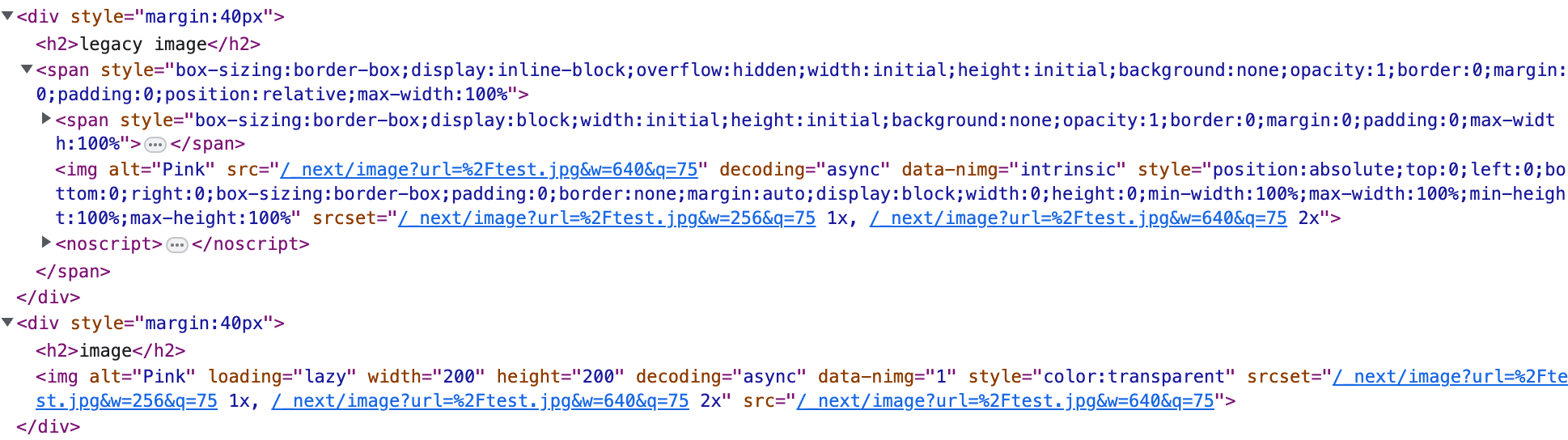
간단하게 Next.js 에서 두 가지 컴포넌트를 렌더링해보겠습니다.
import LegacyImage from 'next/legacy/image';
import Image from 'next/image';

const Test = () => {
  return (
      <div style={{display: 'flex'}}>
          <div style={{margin: '40px'}}>
              <h2>legacy image</h2>
              <LegacyImage
                  src='/test.jpg'
                  width={200}
                  height={200}
                  alt='Pink'
              />
          </div>

          <div style={{margin: '40px'}}>
              <h2>image</h2>
              <Image
                  src='/test.jpg'
                  width={200}
                  height={200}
                  alt='Pink'
              />
          </div>
      </div>
  );
};

export default Test;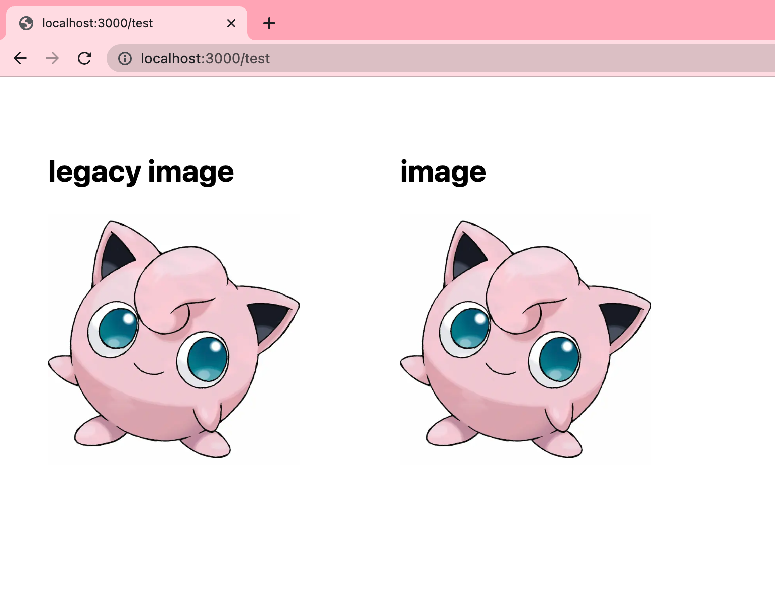
겉으로 보기에는 동일하게 생겼습니다. 그러나 개발자 모드를 켜서 살펴보면 DOM tree 가 다른 것을 알 수 있습니다.
legacy image 의 경우에는 이미지 DOM의 최상단에 **span** 태그가 존재합니다. 또한. span 태그 하위에 img 태그의 형제로 하나의 span 태그가 더 있습니다. 이것들의 역할은 뭘까요?
Next.js 12 버전의 Image 구현
Image 컴포넌트를 사용했을 때 화면에 렌더링된 HTML 코드는 다음과 같습니다.
<span style='box-sizing:border-box;display:inline-block;overflow:hidden;width:initial;height:initial;background:none;opacity:1;border:0;margin:0;padding:0;position:relative;max-width:100%'>
<span style='box-sizing:border-box;display:block;width:initial;height:initial;background:none;opacity:1;border:0;margin:0;padding:0;max-width:100%'>
<img
style='display:block;max-width:100%;width:initial;height:initial;background:none;opacity:1;border:0;margin:0;padding:0'
alt=''
aria-hidden='true'
src='data:image/svg+xml,%3csvg%20xmlns=%27http://www.w3.org/2000/svg%27%20version=%271.1%27%20width=%27200%27%20height=%27200%27/%3e'
/>
</span>
<img
alt='Pink'
src='/_next/image?url=%2Ftest.jpg&w=640&q=75'
decoding='async'
data-nimg='intrinsic'
style='position:absolute;top:0;left:0;bottom:0;right:0;box-sizing:border-box;padding:0;border:none;margin:auto;display:block;width:0;height:0;min-width:100%;max-width:100%;min-height:100%;max-height:100%'
srcSet='/_next/image?url=%2Ftest.jpg&w=256&q=75 1x, /_next/image?url=%2Ftest.jpg&w=640&q=75 2x'
/>
<noscript>
<img
alt='Pink'
loading='lazy'
decoding='async'
data-nimg='intrinsic'
style='position:absolute;top:0;left:0;bottom:0;right:0;box-sizing:border-box;padding:0;border:none;margin:auto;display:block;width:0;height:0;min-width:100%;max-width:100%;min-height:100%;max-height:100%'
srcSet='/_next/image?url=%2Ftest.jpg&w=256&q=75 1x, /_next/image?url=%2Ftest.jpg&w=640&q=75 2x'
src='/_next/image?url=%2Ftest.jpg&w=640&q=75'
/>
</noscript>
</span>CLS 해결
Next.js 12까지는 Image 컴포넌트를 사용할 때 span 태그로 감싸고 투명한 png 를 로드합니다. 이 때 투명한 이미지의 크기를 결정하기 위해서 Image 컴포넌트는 width, height 를 필수 props 로 전달해야 합니다. 그리고 이미지가 로딩이 되면 투명 이미지에 absolute 속성을 준 진짜 img 태그가 보이는 형태로 만들어져 있습니다.
그 이유는 CLS 를 해결하기 위해서라고 생각됩니다. 이미지가 로딩되기 전에 투명이미지로 크기를 잡아놓고, 이미지가 로딩되면 화면에 보이도록 한 것입니다.
lazy loading 구현
lazy loading 은 어떻게 구현했을까요? **loading=’lazy’**가 있긴 하지만 noscript 내에 있는 img 태그만 있는 것으로 보아 스크립트가 동작하는 상황(일반적)에서는 Next.js 에서 따로 처리를 해준다는 것을 추측할 수 있습니다.
next/dist/client/legacy/image.js 파일을 통해 라이브러리를 뜯어봅시다.
let isLazy = !priority && (loading === 'lazy' || typeof loading === 'undefined');isLazy 라는 변수를 두어서 지연로딩을 할 지 관리를 하고 있습니다.
if (src.startsWith('data:') || src.startsWith('blob:')) {
    // https://developer.mozilla.org/en-US/docs/Web/HTTP/Basics_of_HTTP/Data_URIs
    unoptimized = true;
    isLazy = false;
}
if (typeof window !== 'undefined' && loadedImageURLs.has(src)) {
    isLazy = false;
}
dataURI 를 사용하는 이미지의 경우 lazy loading 을 제거했는데, Next.js 에서 사용하는 투명 png 파일이 이에 해당합니다.
const [setIntersection, isIntersected, resetIntersected] = (0, _useIntersection).useIntersection({
    rootRef: lazyRoot,
    rootMargin: lazyBoundary || '200px',
    disabled: !isLazy
});
intersection observer 를 사용해서 lazy loading 을 구현했습니다. lazyBoundary 가 없는 경우에 default 로 ‘200px’ 을 rootMargin으로 가지므로 이미지로부터 200px 거리가 뷰포트 내에 들어왔을 때 이미지를 로드할 것입니다.
const isVisible = !isLazy || isIntersected;
if (isVisible) {
    imgAttributes = generateImgAttrs({
        config,
        src,
        unoptimized,
        layout,
        width: widthInt,
        quality: qualityInt,
        sizes,
        loader
    });
}
isVisible 값을 두어서 lazyLoad 가 아니거나 intersected 되었으면 이미지가 화면에 보이도록 했습니다.
return /*#__PURE__*/ _react.default.createElement(_react.default.Fragment, null, /*#__PURE__*/ _react.default.createElement("span", {
    style: wrapperStyle
}, hasSizer ? /*#__PURE__*/ _react.default.createElement("span", {
    style: sizerStyle
}, sizerSvgUrl ? /*#__PURE__*/ _react.default.createElement("img", {
    style: {
        display: 'block',
        maxWidth: '100%',
        width: 'initial',
        height: 'initial',
        background: 'none',
        opacity: 1,
        border: 0,
        margin: 0,
        padding: 0
    },
    alt: "",
    "aria-hidden": true,
    src: sizerSvgUrl
}) : null) : null, /*#__PURE__*/ _react.default.createElement(ImageElement, Object.assign({}, imgElementArgs))), priority ? // Note how we omit the `href` attribute, as it would only be relevant
// for browsers that do not support `imagesrcset`, and in those cases
// it would likely cause the incorrect image to be preloaded.
//
// https://html.spec.whatwg.org/multipage/semantics.html#attr-link-imagesrcset
/*#__PURE__*/ _react.default.createElement(_head.default, null, /*#__PURE__*/ _react.default.createElement("link", Object.assign({
    key: '__nimg-' + imgAttributes.src + imgAttributes.srcSet + imgAttributes.sizes,
    rel: "preload",
    as: "image",
    href: imgAttributes.srcSet ? undefined : imgAttributes.src
}, linkProps))) : null);
마지막으로 react.default.createElement로 아까 보았던 것처럼 span 태그로 감싸진 img 컴포넌트를 만들어서 반환하게 됩니다.
Next.js 13 버전의 Image 구현
Next.js 13 버전의 Image 컴포넌트를 사용했을 때는 이전 버전과는 다르게 img 태그 하나만 화면에 렌더링된 것을 확인할 수 있습니다. 그렇다면 내부적으로는 어떻게 동작할까요?
<img
alt='Pink'
loading='lazy'
width='200'
height='200'
decoding='async'
data-nimg='1'
style='color:transparent'
srcSet='/_next/image?url=%2Ftest.jpg&w=256&q=75 1x, /_next/image?url=%2Ftest.jpg&w=640&q=75 2x'
src='/_next/image?url=%2Ftest.jpg&w=640&q=75'
/>CLS 해결
if (!fill) {
    if (!widthInt && !heightInt) {
        widthInt = staticImageData.width;
        heightInt = staticImageData.height;
    } else if (widthInt && !heightInt) {
        const ratio = widthInt / staticImageData.width;
        heightInt = Math.round(staticImageData.height * ratio);
    } else if (!widthInt && heightInt) {
        const ratio = heightInt / staticImageData.height;
        widthInt = Math.round(staticImageData.width * ratio);
    }
}
width, height 값이 있다면 해당 값을 사용해서 비율을 맞추게 됩니다. width, height 둘 중 하나의 값만 있다면 비율을 계산해서 없는 값을 계산하게 됩니다.
해당 값을 img 에 넘기면 width, height 크기를 잡아놓기 때문에 layout shift 가 생기지 않습니다.
lazy loading 구현
Next 13 버전에서는 래핑없이 decoding=’async’, loading=’lazy’ 옵션을 주어서 해결했습니다. 내부적으로는 isLazy 변수를 만들어서 loading 옵션을 바로 지정하도록 코드가 구성되어 있습니다.
let isLazy = !priority && (loading === 'lazy' || typeof loading === 'undefined');
...
loading = isLazy ? 'lazy' : loading;
결론
Next 13 에서는 Image 컴포넌트 로딩 방식이 변경되었고 특히 CLS 를 해결하는 방식과 lazy loading 을 구현하는 방식이 변경되었습니다.
- lazy laoding: intersection observer 사용하다가 img 의 기본 property인 loading 으로 구현 방법 변경 → 자바스크립트 사용량 줄어듦 → hydration 불필요
- CLS 방지: span으로 감싸고 투명 이미지를 불러와서 absolute 로 이미지 위치를 잡는 것 제거, img 기본 property인 width, height 사용해서 구현 → 스타일링 간편해짐
The new Image component:
- Ships less client-side JavaScript
- Easier to style and configure
- Faster because native lazy loading doesn't require hydration
공식 문서에서 이야기한 개선 방법이 어떤 방법으로 해결되었는지 살펴보았습니다.
다음에는…
Next.js 13 버전을 활용하여 이미지 로드를 개선한 사례에 대해 소개하도록 하겠습니다.


궁금했는데 정리된글 잘 보고 갑니다. 다음 글도 기다려 지네요 ^^