
1. Flex(align-content)
-
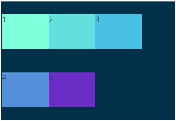
행이나 열이 여러 개 이상일 때 교차축을 기준으로 컨테이너 안의 아이템을 정렬한다.
-
행이나 열이 1개라면 적용되지 않습니다.
| 속성 | 내용 |
|---|---|
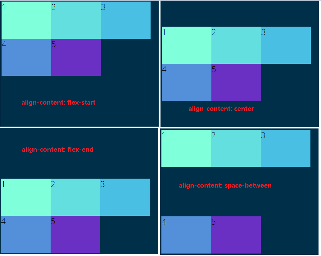
| align-content: flex-start | 교차축을 기준으로 아이템을 시작점으로 정렬 |
| align-content: flex-end | 교차축을 기준으로 아이템을 끝점으로 정렬 |
| align-content: center | 교차축을 기준으로 아이템을 중앙으로 정렬 |
| align-content: space-between | 교차축을 기준으로 아이템 사이에 여백이 생김 |
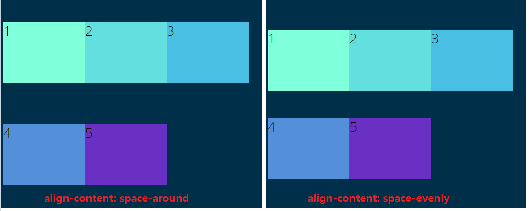
| align-content: space-around | 교차축을 기준으로 아이템에 일정한 둘레가 생김, 컨테이너와 요소 간에는 절반의 둘레 |
1.1 align-content
<body>
    <h1>Let's Play With Flexbox</h1>

    <section id="container">
        <div style="background-color: #80ffdb">1</div>
        <div style="background-color: #64dfdf">2</div>
        <div style="background-color: #48bfe3">3</div>
        <div style="background-color: #5390d9">4</div>
        <div style="background-color: #6930c3">5</div>
    </section>
</body>
body {
font-family: 'Open Sans', sans-serif;
}
#container {
background-color: #003049;
width: 90%;
height: 500px;
margin: 0 auto;
border: 5px solid #003049;
display: flex;
flex-direction: row;
justify-content: flex-start;
flex-wrap: wrap;
align-items: center;
}
#container>div {
width: 200px;
height: 150px;
font-size: 2em;
}
1.1.1 align-content: flex-start ~ space-evenly
#container {
 /* 생략 */
    flex-direction: row;
    justify-content: flex-start;
    flex-wrap: wrap;
    align-items: center;
    align-content: flex-start;

    /*
    align-content: center;
    align-content: flex-end;
    align-content: space-between;
    align-content: space-around;
    align-content: space-evenly;
    */
}
2. align-self
-
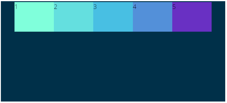
align-items속성과 비슷하지만, 아이템을 단일로 적용하거나 여러 개의 요소를
개별적으로 다른 속성을 지정해서 배치할 수 있다. -
align-items보다 우선순위가 높다. -
flex컨테이너 자체에서는 사용하지 않고, 개별로 요소를 적용할 때 사용합니다. -
교차축을 기준으로 정렬합니다.
<body>
    <h1>Let's Play With Flexbox</h1>

    <section id="container">
        <div style="background-color: #80ffdb">1</div>
        <div style="background-color: #64dfdf">2</div>
        <div style="background-color: #48bfe3">3</div>
        <div style="background-color: #5390d9">4</div>
        <div style="background-color: #6930c3">5</div>
    </section>
</body>
body {
font-family: 'Open Sans', sans-serif;
}
#container {
background-color: #003049;
width: 90%;
height: 500px;
margin: 0 auto;
border: 5px solid #003049;
display: flex;
flex-direction: row;
flex-wrap: wrap;
align-items: flex-start;
justify-content: center;
}
#container>div {
width: 200px;
height: 150px;
font-size: 2em;
}
2.1 align-self: property value
#container {
/* 생략 */
display: flex;
flex-direction: row;
flex-wrap: wrap;
align-items: flex-start;
justify-content: center;
}
#container>div {
width: 200px;
height: 150px;
font-size: 2em;
}
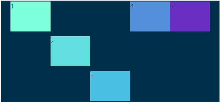
#container>div:nth-of-type(1) {
align-self: flex-start;
/* 1번 아이템은 교차축의 시작 부분으로 */
}
#container>div:nth-of-type(2) {
align-self: center;
/* 2번 아이템은 교차축의 중앙 부분으로 */
}
#container>div:nth-of-type(3) {
align-self: flex-end;
/* 3번 아이템은 교차축의 끝 부분으로 */
}

프론트엔드 개발자가 되기 위한 학습 과정을 정리하는 블로그