내일부터 위코드에서 1차 프로젝트가 시작된다.
조가 어떻게 짜일지 정말 궁금하다. 사람들 성향이 너무나도 달라서 트러블이 일어나는것 아닌지 걱정되기도 한다.
개인적으로 원하는 사람이 있지만 되면 정말 좋고 안되면 내 일을 묵묵히 하면 되는것이기 때문에 크게 받을 필요는 없다고 생각한다. 내 사람들이 스트레스 받지 않기만 바랄뿐..🙁
프로젝트에 들어가기전에 몇가지를 미리 해보는게 좋을것 같아서 그 중 하나인 Modal을 구현해본것을 포스팅해본다.
이번 4주차 실습 항목으로 Monster라는 state, props, component, fetch에 대해서 리뷰해볼수 있는 것을 주었는데, 나는 이 과제에 Modal을 추가해보는 것으로 진행해보았다.
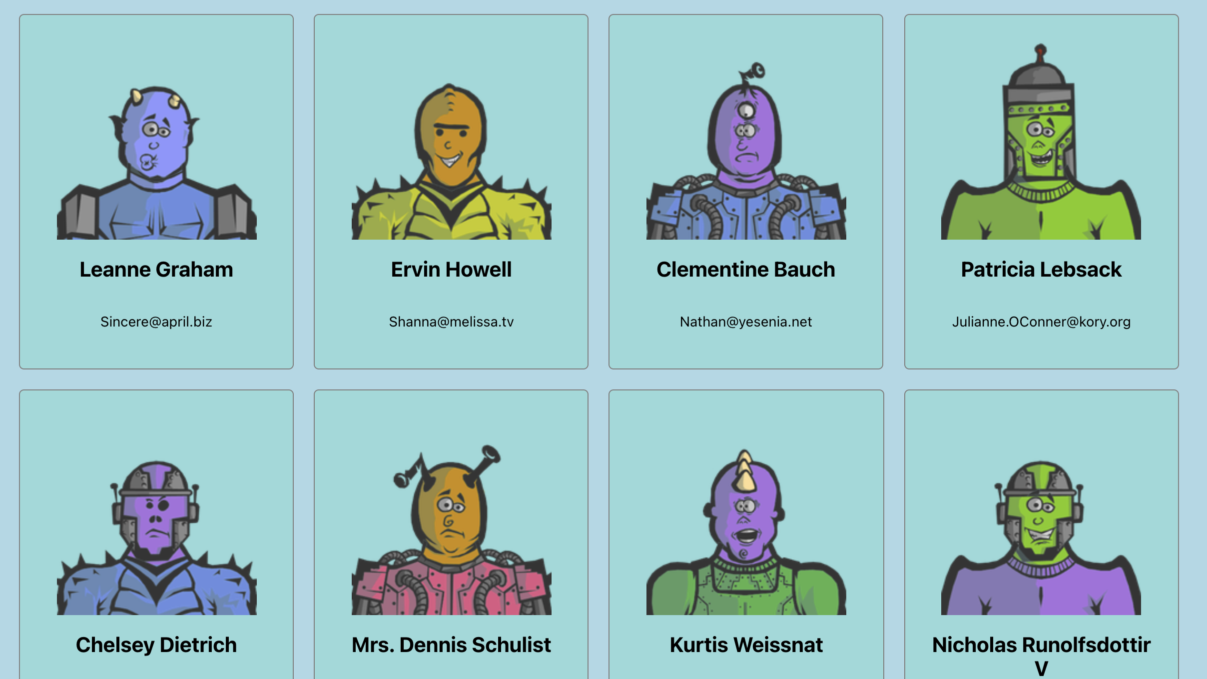
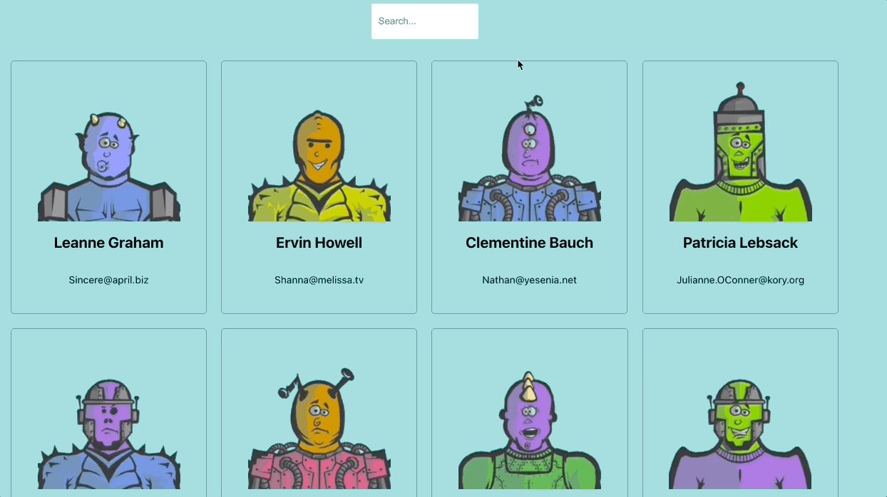
위 화면이 monster 과제를 전부 완료하면 나타나는 창이다.
Modal을 구성할 때 가장 먼저 고려해야할 부분은 Modal 태그를 어디에다가 집어넣는가이다.
위 과제의 Component 구성은 아래와 같이 되어있다.
Monster(메인) -> CardList(나열된 카드들) -> Card(카드 안에 내용들)맨 처음 코드를 작성했을 땐 CardList에 카드가 나열되니까 정보 받은거 구분해서 띄워주면 되겠지? 라고 생각해서 작성했는데 막상 Modal 창을 만들고 띄워보니까 Monster에서 map으로 돌려서 cardList가 생성되니 몬스터 배열에서 맨 끝에 있는 몬스터의 데이터만 출력이 되는것이다. 문제의 Modal을 Card로 옮기고 다시 만들어보았다.
구현
State와 연관 함수
constructor() {
    super();
    this.state = {
      modal: false,
    };
  }

toggleModal = () => {
  this.setState({
    modal: !this.state.modal,
  });
};
Modal의 상태는 Boolean 값으로 관리하고 True일 경우 Modal창이 나타난다.
toggleModal은 클릭시 현재 Boolean값의 반대로 되게 하는 기능을 하는 함수이다.
Modal.scss
body.active-modal {
  overflow-y: hidden;
}

.btn-modal {
  padding: 10px 20px;
  display: block;
  margin: 100px auto 0;
  font-size: 18px;
}

.modal,
.overlay {
  width: 100vw;
  height: 100vh;
  top: 0;
  left: 0;
  right: 0;
  bottom: 0;
  position: fixed;
  z-index: 1;
}

.overlay {
  background: rgba(49, 49, 49, 0.8);
}

.modal-content {
  position: absolute;
  top: 40%;
  left: 50%;
  display: flex;
  justify-content: space-between;
  transform: translate(-50%, -50%);
  line-height: 1.4;
  background: #f1f1f1;
  padding: 14px 28px;
  border-radius: 3px;
  max-width: 700px;
  min-width: 300px;
  z-index: 200;

  > .monster-image {
    width: 50%;
    border: 1px solid black;
    border-radius: 50%;
  }

  > .monster-info {
    display: flex;
    flex-direction: column;
    justify-content: center;

    > .monster-name {
      font-weight: 700;
      text-decoration: underline;
    }
  }
}

.close-modal {
  position: absolute;
  top: 10px;
  right: 10px;
  padding: 5px 7px;
}
Modal.js
import React from 'react';
import './Modal.scss';

class Modal extends React.Component {
  render() {
    const { id, name, company, website, toggleModal } = this.props;

    return (
      <>
        <div className="modal">
          <div className="overlay" onClick={() => toggleModal()}></div>
          <div className="modal-content">
            <img
              src={`https://robohash.org/${id}?set=set2&size=180x180`}
              alt="Monster Profile"
              className="monster-image"
            />
            <div className="monster-info">
              <p className="monster-name">{name}</p>
              <p className="monster-email">
                <span>🏢</span> {company}
              </p>
              <p className="monster-website">
                <span>🌐</span> {website}
              </p>
            </div>
          </div>
        </div>
      </>
    );
  }
}

export default Modal;overlay는 Modal창이 켜졌을 때 주변 배경을 어둡게 하기 위해 Layer를 하나 위에 덮어씌운거라고 생각하면 된다. overlay위에 Modal 창이 나타나게 된다.
Modal창이 나타나면 꺼지게 하는걸 어떻게 구현할까라는걸 30분넘게 고민했는데, 고민할 필요가 없었던 사항이었다. 그냥 overlay 레이아웃이 바깥에 있으니 거기다가 toggleModal click event를 주면 끝인것이다.
결과