
화면에 그래프를 띄우는(plt.show) 것도 좋지만, 실제 업무에서는 이 그래프를 이미지 파일(png, jpg)로 저장해서 메일이나 보고서에 첨부해야 한다.
- plt.savefig('이름.png'): 현재 화면에 있는 그래프를 파일로 저장한다.
import pandas as pd
import matplotlib.pyplot as plt
import seaborn as sns
class AutoReportGenerator:
def __init__(self, file_path: str):
self.df = pd.read_csv(file_path)
print(f"--- {file_path} 분석 시작 ---")
def clean_data(self):
avg_score = self.df['score'].mean()
self.df['score'] = self.df['score'].fillna(avg_score)
self.df = self.df[(self.df['age'] >= 0) & (self.df['age'] <= 120)]
print("데이터 정제 완료.")
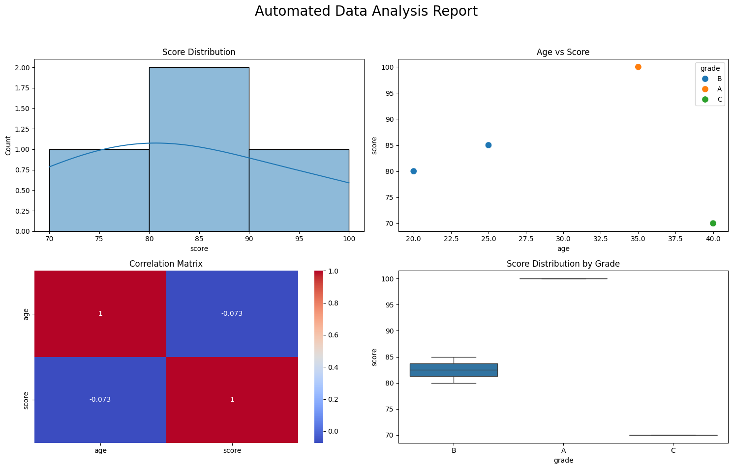
def create_visual_report(self, save_name: str):
fig, axes = plt.subplots(2, 2, figsize=(15, 10))
fig.suptitle('Automated Data Analysis Report', fontsize=20)
numeric_df = self.df.select_dtypes(include=['number'])
sns.histplot(data=self.df, x='score', kde=True, ax=axes[0, 0])
axes[0, 0].set_title('Score Distribution')
sns.scatterplot(data=self.df, x='age', y='score', hue='grade', s=100, ax=axes[0, 1])
axes[0, 1].set_title('Age vs Score')
sns.heatmap(numeric_df.corr(), annot=True, cmap='coolwarm', ax=axes[1, 0])
axes[1, 0].set_title('Correlation Matrix')
sns.boxplot(data=self.df, x='grade', y='score', ax=axes[1, 1])
axes[1, 1].set_title('Score Distribution by Grade')
plt.tight_layout(rect=[0, 0.03, 1, 0.95])
plt.savefig(save_name)
print(f"보고서가 '{save_name}'으로 저장되었습니다.")
plt.show()
# --- 실행부 ---
reporter = AutoReportGenerator('test_data.csv')
reporter.clean_data()
reporter.create_visual_report('final_report.png')
데이터 로드 -> 정제 -> 분석/시각화 -> 파일 저장

AI/ML Engineer 🧑💻