
AI 엔지니어가 보고서를 쓸 때 그래프를 10개씩 따로 보내지 않는다. 하나의 캔버스에 논리적으로 배치하여 데이터의 흐름을 한 번에 보여준다. 이름 위해 Matplotlib의 subplots 기능을 사용한다.
서브플롯의 개념
커다란 도화지를 격자로 나누는 것이다.
- 예: plt.subplots(2, 2) -> 2행 2열, 총 4개의 칸을 만든다.
- 각 칸을 선택해서 원하는 그래프를 그려 넣으면 된다.
import pandas as pd
import matplotlib.pyplot as plt
import seaborn as sns

class DataDashboard:
    def __init__(self, file_path: str):
        self.df = pd.read_csv(file_path)
        self.numeric_df = self.df.select_dtypes(include=['number'])

    def draw_dashboard(self):
        fig, axes = plt.subplots(2, 2, figsize=(15, 10))
        fig.suptitle('Comprehensive Data Analysis Dashboard', fontsize=20)

        # 1. 0행 0열: 히스토그램 (score 컬럼)
        sns.histplot(data=self.df, x='score', kde=True, ax=axes[0, 0])
        axes[0, 0].set_title('Score Distribution')

        # 2. 0행 1열: 산점도 (age vs score, 색상은 grade)
        sns.scatterplot(data=self.df, x='age', y='score', hue='grade', s=100, ax=axes[0, 1])
        axes[0, 1].set_title('Age vs Score')

        # 3. 1행 0열: 히트맵 (상관계수 행렬)
        sns.heatmap(self.numeric_df.corr(), annot=True, cmap='coolwarm', ax=axes[1, 0])
        axes[1, 0].set_title('Correlation Matrix')

        # 4. 1행 1열: 박스플롯 (grade별 score 분포)
        sns.boxplot(data=self.df, x='grade', y='score', ax=axes[1, 1])
        axes[1, 1].set_title('Score Distribution by Grade')

        # 그래프끼리 겹치지 않게 tight_layout을 호출하세요.
        plt.tight_layout(rect=[0, 0.03, 1, 0.95])
        plt.show()

# --- 실행부 ---
dashboard = DataDashboard('test_data.csv')
dashboard.draw_dashboard()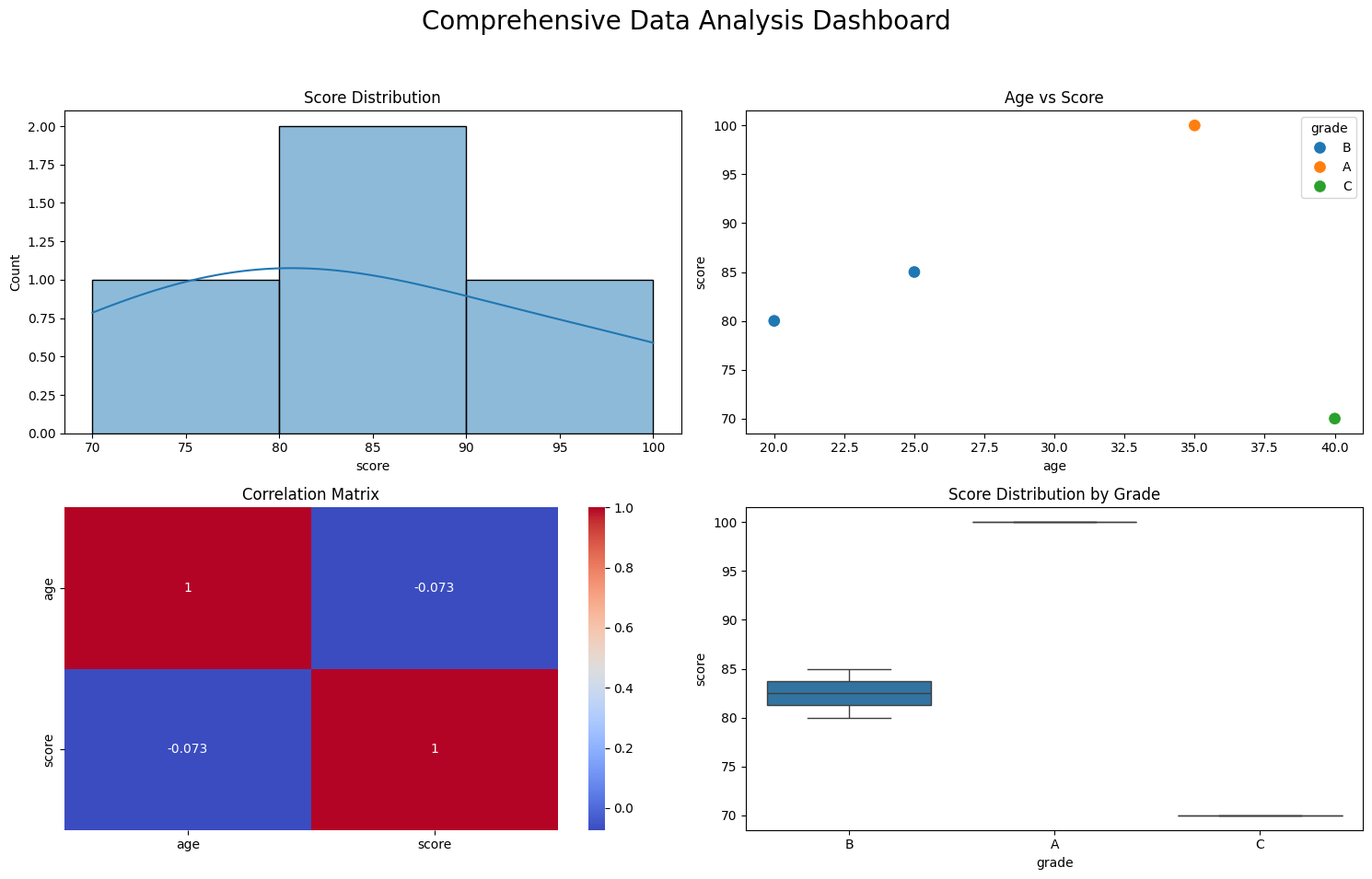
여러 지표를 조합해 하나의 인사이트를 도출

AI/ML Engineer 🧑💻