EDA
- 탐색적 데이터 분석 : 전체적으로 데이터를 살펴본다
- 어떤 경향성을 갖는지 확인
- 객관적 시각을 유지
- 인공지능을 학습시킬 피처 선택
EDA 요소
- 데이터
- 데이터 살펴보기 : numpy, pandas
- cheatsheet
- 시각화 : matplotlib, seaborn, plotly
- 피처 선정
데이터 살펴보기
- numpy, pandas, matplolib
불필요한 경고창 끄기
- warning message : depreated
# 불필요한 경고창 끄기
# warning message : deprecated
import warnings
warnings.filterwarnings('ignore')
데이터 훑어보기
# 데이터 훑어보기
df.info()
# 숫자형 데이터의 경우에만 유의미
df.describe()
# 데이터의 처음 5개의 표본을 출력
df.head()
데이터 전처리
- 결측치 채우기
- 필요 없는 컬럼 삭제
- 컬럼 형변환
- 행 데이터를 자르거나, 반환하거나, 빈칸을 제거
교차검증
- corr
- cov
그래프
- matplotlib
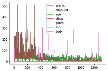
# plt를 이용해서 그래프
df.plot()
타이타닉
EDA : 어떤 요소가 결과에 영향을 미치느냐?
- 타이타닉 : 어떤 경우. 어떤 사람이 생존 혹은 사망했을 것인가?
- 요인 => 나머지(새로운 사람)의 생존과 사망을 예측
- 1. 상관관계 분석
- 2. 예측을 통해 -> 실제 수치를 확인
- 3. 여러가지 데이터를 섞어서 그래프를 그려본다 - 데이터 우리가 원하는 형태로 가공
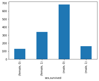
# 바차트
df.groupby(['sex', 'survived']).count()['name'].plot.bar()
# 성별에 영향이 있을수도 있다
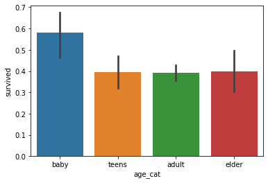
# 히스토그램
df['age'].plot.hist(bins=20)
# 연령대에 따른 -> 생존 사망 구분
age_cat = pd.cut(df['age'], bins=[0, 10, 20, 50, 100], labels=['baby','teens','adult','elder'])

sns
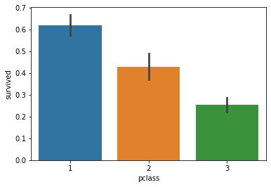
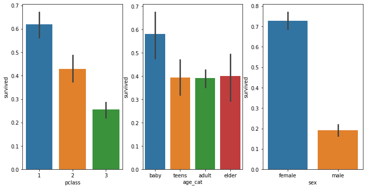
import seaborn as sns
sns.barplot('age_cat', 'survived', data=df)
# 연령대 기준 : 영유아의 경우 다른 연령대에 비해서 생존율이 높다
sns.barplot('pclass', 'survived', data=df)
# 객실 등급이 생존에 영향을 준다
sns.barplot('sex', 'survived', data=df)
# 성별에도 영향이 있다
# 사망자의 연령대 분포
sns.kdeplot(df['age'][(df['survived']==0) & (df['age'].notnull())], shade=True)
# 생존자의 연령대 분포
sns.kdeplot(df['age'][(df['survived']==1) & (df['age'].notnull())], shade=True)

- 객실 등급별 비율, 티켓 가격에 따른 생존
- 성별, 연령대
- 성별, 나이, 객실등급(티켓 가격)
fig = plt.figure(figsize=(12,6))
ax1 = fig.add_subplot(2,2,1)
ax2 = fig.add_subplot(2,2,2)
ax3 = fig.add_subplot(2,2,3)
ax4 = fig.add_subplot(2,2,4)
sns.countplot(x = 'sex', data=df, ax=ax1)
sns.countplot(x = 'sex', hue='survived', data=df, ax=ax2)
sns.countplot(x = 'sex', hue='pclass', data=df, ax=ax3)
sns.countplot(x = 'sex', hue='age_cat', data=df, ax=ax4)
fig

plt.bar(df.groupby(['pclass'])['survived'].mean().index,
       df.groupby(['pclass'])['survived'].mean(),
       color = ['blue','red','green'])
plt.xticks([1,2,3])
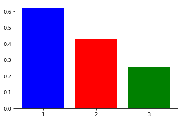
fig = plt.figure(figsize=(12,6))
ax1 = fig.add_subplot(1,3,1)
ax2 = fig.add_subplot(1,3,2)
ax3 = fig.add_subplot(1,3,3)
sns.barplot(x='pclass', y='survived', data=df, ax=ax1)
sns.barplot(x='age_cat', y='survived', data=df, ax=ax2)
sns.barplot(x='sex', y='survived', data=df, ax=ax3)
결측치 다루기
빈칸 채우기
- 평균, 최대, 최소 끌어다 채우기
- 원본데이터를 찾아서 채우기
- 빈칸을 제거 : 생존 -> 이름
타이타닉 데이터에서 결측치 채우기
- * 나이만
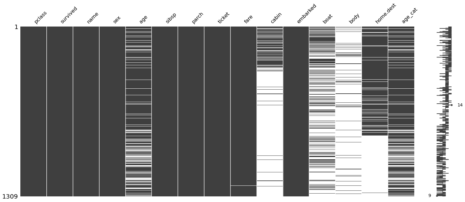
- 결측치 확인하기
import missingno as msno
df.isnull().sum()
msno.matrix(df)
plt.show()
msno.bar(df)
plt.show()


- 결측치 채우기
#df.fillna()
#df['age'].fillna()
df['age'].interpolate(method='values')
msno.matrix(df)
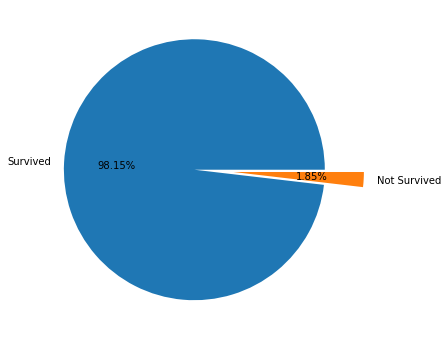
# 보트에 탑승한 승객
is_boat = df['boat'].notnull()
fig = plt.figure(figsize=(12,6))
ax = fig.add_subplot(1,1,1)
# 보트에 탑승해서 생존한 승객
df[is_boat]['survived'].value_counts().plot.pie(
    explode=[0,0.3],
    autopct="%0.2f%%",
    labels = ['Survived', 'Not Survived'],
    ax=ax
)
ax.set_ylabel('')

가보자가보자~