Seaborn(데이터 시각화 라이브러리)
- seaborn은 matplotlib 기반의 시각화 라이브러리
- 유익한 통계 기반 그래픽을 그리기 위한 고급 인터페이스 제공
데이터 불러오기, 회귀선 있는 산점도, 히스토그램, 커널 밀도 그래프
Seaborn 데이터 불러오기
- seaborn 라이브러리에서 제공하는 titanic 데이터 불러오기
- seaborn의 load_dataset() 함수를 이용
# seaborn 불러와서 sns로 사용
import seaborn as sns
# titanic 데이터 불러오기
titanic = sns.load_dataset('titanic')
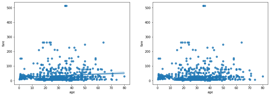
Seaborn 선형 회귀선 있는 산점도
- regplot() 함수 : 선형 회귀선이 있는 산점도
- x축 변수
- y축 변수
- 데이터 셋
- axe 객체
- fit_reg : 선형회귀선 표시 여부
- 선형 회귀선
- 간단한 선형 데이터 집합에 사용되는 가장 적합한 직선(= 추세선)
- 데이터를 시간 축으로 봤을 때, 데이터의 값이 장기적으로 어떻게 변하는지 직선으로 표현한 것
import matplotlib.pyplot as plt
# 그래프 객체 생성 (figure에 2개의 서브 플롯을 생성)
fig = plt.figure(figsize=(15,5))
ax1 = fig.add_subplot(1, 2, 1)
ax2 = fig.add_subplot(1, 2, 2)
# 산점도에 선형회귀선 표시(fit_reg=True)
# x축 변수, y축 변수, 데이터 셋, axe 객체(1번째 그래프)
sns.regplot(x='age', y='fare', data=titanic, ax=ax1)
# 산점도에 선형회귀선 미표시(fit_reg=False)
# x축 변수, y축 변수, 데이터 셋, axe 객체(2번째 그래프)
sns.regplot(x='age', y='fare', data=titanic, ax=ax2, fit_reg=False)
plt.show()
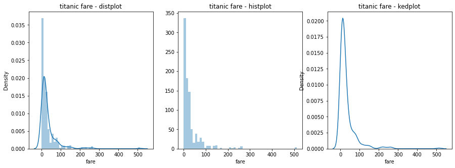
Seaborn 히스토그램과 커널 밀도 그래프
- distplot( ) 함수 : 히스토그램과 커널 밀도 그래프
- 분포를 그릴 데이터 변수
- hist : True는 히스토그램 표시, False는 히스토그램 표시 안 함
- kde : True는 커널 밀도 그래프 표시, False는 커널 밀도 그래프 표시 안 함
- axe 객체
- histplot( ) 함수 : 히스토그램(하나의 변수 데이터의 분포를 확인할 때 사용하는 함수)
- kdeplot( ) 함수 : 커널 밀도 그래프(그래프와 x축 사이의 면적이 1이 되도록 그리는 밀도 함수)
# 그래프 객체 생성 (figure에 3개의 서브 플롯을 생성)
fig = plt.figure(figsize=(15, 5))
ax1 = fig.add_subplot(1, 3, 1)
ax2 = fig.add_subplot(1, 3, 2)
ax3 = fig.add_subplot(1, 3, 3)
# distplot
# 히스토그램과 커널 밀도 그래프 표시
# 분포를 그릴 데이터 변수, axe 객체(1번째 그래프)
sns.distplot(titanic['fare'], ax=ax1)
# histplot
# 분포를 그릴 데이터 변수, 커널 밀도 그래프 표시 안 함, axe 객체(2번째 그래프)
#sns.histplot(x='fare', data=titanic,  ax=ax2)
sns.distplot(titanic['fare'], kde=False, ax=ax2)
# kdeplot
# 분포를 그릴 데이터 변수, 히스토그램 표시 안 함, axe 객체(3번째 그래프)
#sns.kdeplot(x='fare', data=titanic, ax=ax3)
sns.distplot(titanic['fare'], hist=False, ax=ax3)
# 차트 제목 표시
ax1.set_title('titanic fare - distplot')
ax2.set_title('titanic fare - histplot')
ax3.set_title('titanic fare - kedplot')
plt.show()
범주형 데이터의 산점도, 빈도, 조인트, 관계 그래프
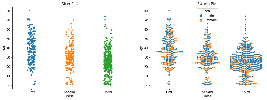
Seaborn 범주형 데이터의 산점도
- stripplot( ) 함수 : 데이터 포인트가 중복되어 범주별 분포를 시각화
- stripplot( ) 함수의 파라미터
- x축 변수
- y축 변수
- 데이터 셋
- axe 객체
- hue : 특정 열 데이터로 색상을 구분하여 출력
- swarmplot( ) 함수 : 데이터의 분산까지 고려하여 데이터 포인트가 서로 중복되지 않도록 시각화. 즉, 데이터가 퍼져 있는 정도를 입체적으로 파악 가능
- swarmplot( ) 함수의 파라미터
- x축 변수
- y축 변수
- 데이터 셋
- axe 객체
- hue : 특정 열 데이터로 색상을 구분하여 출력
# 그래프 객체 생성 (figure에 2개의 서브 플롯을 생성)
fig = plt.figure(figsize=(15, 5))
ax1 = fig.add_subplot(1, 2, 1)
ax2 = fig.add_subplot(1, 2, 2)
# 이산형 변수의 분포 - 데이터 분산 미고려
# x축 변수, y축 변수, 데이터 셋, axe 객체(1번째 그래프)
sns.stripplot(x='class', y='age', data=titanic, ax=ax1)
# 이산형 변수의 분포 - 데이터 분산 고려 (중복 X)
# x축 변수, y축 변수, 데이터 셋, axe 객체(2번째 그래프), 성별로 색상 구분
sns.swarmplot(x='class', y='age', data=titanic, ax=ax2, hue='sex')
# 차트 제목 표시
ax1.set_title('Strip Plot')
ax2.set_title('Swarm Plot')
plt.show()
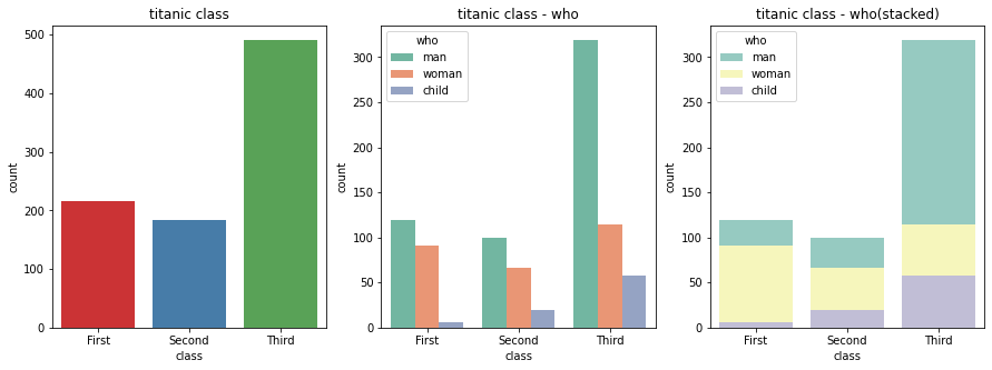
Seaborn 빈도 그래프
- countplot( ) 함수 : 각 범주에 속하는 데이터의 개수를 막대 그래프 시각화
- x축 변수
- palette
- 데이터 셋
- axe 객체
- hue : 특정 열 데이터로 색상을 구분하여 출력
# 그래프 객체 생성 (figure에 3개의 서브 플롯을 생성)
fig = plt.figure(figsize=(15, 5))
ax1 = fig.add_subplot(1, 3, 1)
ax2 = fig.add_subplot(1, 3, 2)
ax3 = fig.add_subplot(1, 3, 3)
# class별 인원 파악
# x축 변수, 데이터 셋, axe 객체(1번째 그래프)
sns.countplot(x='class', palette='Set1', data=titanic, ax=ax1)
# hue 옵션에 'who' 추가
# x축 변수, 데이터 셋, axe 객체(2번째 그래프)
sns.countplot(x='class', hue='who', palette='Set2', data=titanic, ax=ax2)
# dodge=False 옵션 추가 (축 방향으로 분리하지 않고 누적 그래프 출력)
# x축 변수, hue, 데이터 셋, axe 객체(3번째 그래프)
sns.countplot(x='class', hue='who', palette='Set3', dodge=False, data=titanic, ax=ax3)
# 차트 제목 표시
ax1.set_title('titanic class')
ax2.set_title('titanic class - who')
ax3.set_title('titanic class - who(stacked)')
plt.show()
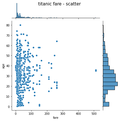
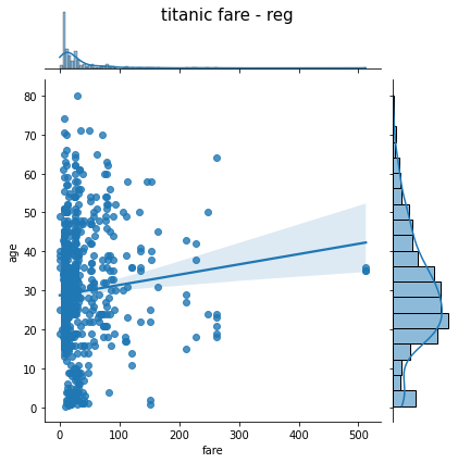
Seaborn 조인트 그래프
- jointplot( ) 함수 : 산점도를 기본으로 표시, x-y축에 각 변수에 대한 히스토그램을 동시에 시각화
- x축 변수
- y축 변수
- 데이터 셋
- kind = 'reg' : 선형 회귀선 추가
- kind = 'hex' : 육각 산점도 추가
- kind = 'kde' : 커널 밀집 그래프 추가
# 조인트 그래프 - 산점도(기본값)
# x축 변수, y축 변수, 데이터 셋
j1 = sns.jointplot(x='fare', y='age', data = titanic)
j1.fig.suptitle('titanic fare - scatter', size=15)
plt.show()
# 조인트 그래프 - 회귀선(kind = 'reg')
# x축 변수, y축 변수, 데이터 셋
j2 = sns.jointplot(x='fare', y='age', kind='reg', data=titanic)
j2.fig.suptitle('titanic fare - reg', size=15)
plt.show()
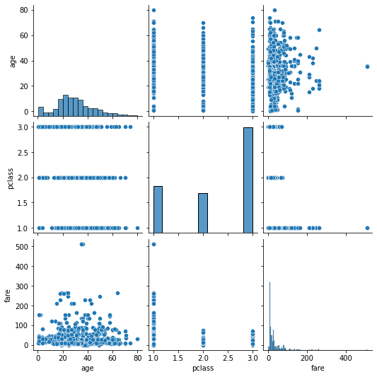
Seaborn 관계 그래프
- pairplot( ) 함수
- 인자로 전달되는 데이터프레임의 열(변수)을 두 개씩 짝 지을 수 있는 모든 조합에 대해서 표현
- 열은 정수/실수형이어야 함
- 3개의 열이라면 3행 x 3열의 크기로 모두 9개의 그리드 생성
- 각 그리드의 두 변수 간의 관계를 나타내는 그래프를 하나씩 그림
- 같은 변수끼리 짝을 이루는 대각선 방향으로는 히스토그램 시각화
- 서로 다른 변수 간에는 산점도 시각화
# titanic 데이터셋 중에서 분석 데이터 선택하기
titanic_pair = titanic[['age', 'pclass', 'fare']]
# 3개의 열이라면 3행 x 3열의 크기로 모두 9개의 그리드 생성
# 각 그리드의 두 변수 간의 관계를 나타내는 그래프를 하나씩 그림
# 같은 변수끼리 짝을 이루는 대각선 방향으로는 히스토그램 시각화
# 서로 다른 변수 간에는 산점도 시각화
sns.pairplot(titanic_pair)

가보자가보자~