Matplotlib(데이터 시각화 라이브러리)
- matplotlib은 파이썬에서 데이터를 차트나 플롯으로 시각화하는 라이브러리
- matplotlib.pyplot 모듈의 함수를 이용하여 간편하게 그래프를 만들고 변화를 줄 수 있다
숫자입력, 축 레이블 설정, 범례 표시, 축 범위 및 선 종류 설정
matplotlib 숫자 입력
- 한 개의 숫자 리스트 입력
- 한 개의 숫자 리스트 형태로 값을 입력하면 y값으로 인식
- x 값은 기본적으로 [0, 1, 2, 3]으로 설정됨
- 파이썬 튜플, 넘파이 배열 형태도 가능
- plt.show() 함수는 그래프를 화면에 나타나도록 함
- 두 개의 숫자 리스트 입력
- 두 개의 숫자 리스트 형태로 값을 입력하면 순서대로 x, y 값으로 인식
- 순서쌍(x, y)으로 매칭된 값을 좌표펴연 위에 그래프 시각화
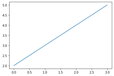
한 개의 숫자 리스트 입력
import matplotlib.pyplot as plt
# 하나의 숫자 리스트 입력
# 리스트의 값들이 y 값들이라고 가정하고 x값 [0, 1, 2, 3]을 자동으로 만들어냄
# plt.show( ) 함수는 그래프를 화면에 나타나도록 함
plt.plot([2, 3, 4, 5])
plt.show()
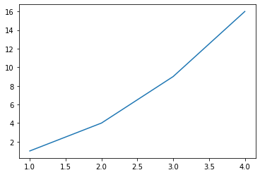
두 개의 숫자 리스트 입력
# 두 개의 숫자 리스트 입력
# 첫 번째 리스트의 값은 x값, 두 번째 리스트의 값은 y로 적용됨
# 순서쌍(x, y)으로 매칭된 값을 좌표평면 위에 그래프 시각화
plt.plot([1, 2, 3, 4], [1, 4, 9, 16])
plt.show()
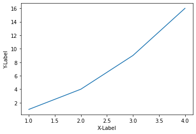
matplotlib 축 레이블 설정
- xlabel() 함수를 사용하여 그래프의 x축에 대한 레이블 표시
- ylabel() 함수를 사용하여 그래프의 y축에 대한 레이블 표시
# xlabel() 함수에 'X-Label' 입력하여 x축에 대한 레이블 표시
# ylabel() 함수에 'Y-Label' 입력하여  y축에 대한 레이블 표시
plt.plot([1, 2, 3, 4], [1, 4, 9, 16])
plt.xlabel('X-Label')
plt.ylabel('Y-Label')
plt.show()
matplotlib 범례(Legend) 설정
- 범례(Legend)는 그래프에 데이터의 종류를 표시하기 위한 텍스트
- lengend() 함수를 사용해서 그래프에 범례 표시
- plot() 함수에 label 파라미터 값으로 삽입
# plot() 함수의 label 매개변수에 'Square(제곱)' 문자열 입력
# legend() 함수를 사용해서 그래프에 범례 표시
plt.plot([1, 2, 3, 4], [1, 4, 9, 16], label = 'Square')
plt.xlabel('X-Label')
plt.ylabel('Y-Label')
plt.legend()
plt.show()

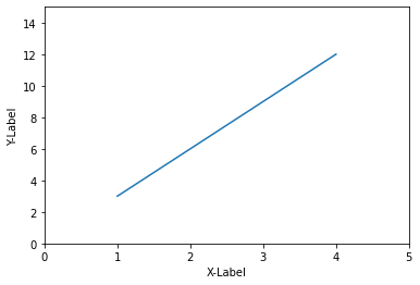
Matplotlib 축 범위 설정
- xlim() : X축이 표시되는 범위 지정 [xmin, xmax]
- ylim() : Y축이 표시되는 범위 지정 [ymin, ymax]
- axis() : X, Y축이 표시되는 범위 지정 [xmin, xmax, ymin, ymax]
- 입력 값이 없으면 데이터에 맞게 자동으로 범위 지정
xlim, ylim
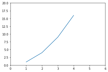
# X축의 범위: [xmin, xmax] = [0, 5]
# Y축의 범위: [ymin, ymax] = [0, 20]
plt.plot([1, 2, 3, 4], [3, 6, 9, 12])
plt.xlabel('X-Label')
plt.ylabel('Y-Label')
plt.xlim([0, 5])
plt.ylim([0, 15])
plt.show()
axis
# axis() : X, Y축이 표시되는 범위 지정 [xmin, xmax, ymin, ymax]
plt.plot([1, 2, 3, 4], [1, 4, 9, 16])
plt.axis([0, 6, 0, 20])
plt.show()
Matplotlib 선 종류 설정
- plot() 함수의 포맷 문자열 사용
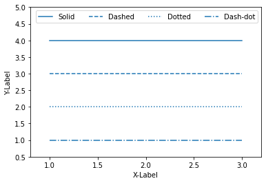
- '-' (Solid), '- -' (Dashed), ' : ' (Dotted), ' -. ' (Dash-dot)
- plot() 함수의 linestyle 파라미터 값으로 삽입
- '-' (solid), '- -' (dashed), ' : ' (dotted), ' -. ' (dashdot)
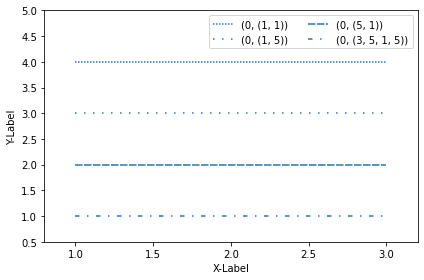
- 튜플을 사용하여 선의 종류 커스터마이즈
- (0, (1, 1)) [dotted], (0, (5, 5)) [dashed], (0, (3, 5, 1, 5)) [dashdotted]
plot
# plot() 함수의 포맷 문자열 사용
# plot() 함수의 linestyle 값으로 삽입
# 축 이름, 범위, 범례 설정
plt.plot([1, 2, 3], [4, 4, 4], '-', color='C0', label='Solid')
plt.plot([1, 2, 3], [3, 3, 3], '--', color='C0', label='Dashed')
plt.plot([1, 2, 3], [2, 2, 2], linestyle='dotted', color='C0', label='Dotted')
plt.plot([1, 2, 3], [1, 1, 1], linestyle='dashdot', color='C0', label='Dash-dot')
plt.xlabel('X-Label')
plt.ylabel('Y-Label')
plt.axis([0.8, 3.2, 0.5, 5.0])
plt.legend(loc='upper right', ncol=4)
plt.show()
튜플을 사용하여 선의 종류 커스터마이즈
# 튜플을 사용하여 선의 종류 커스터마이즈
# 축 이름, 범위, 범례 설정
# tuple(offset, (on_off_seq))
# offset : 플롯의 간격 띄우기를 조정
plt.plot([1, 2, 3], [4, 4, 4], linestyle=(0, (1, 1)), color='C0', label='(0, (1, 1))')
plt.plot([1, 2, 3], [3, 3, 3], linestyle=(0, (1, 5)), color='C0', label='(0, (1, 5))')
plt.plot([1, 2, 3], [2, 2, 2], linestyle=(0, (5, 1)), color='C0', label='(0, (5, 1))')
plt.plot([1, 2, 3], [1, 1, 1], linestyle=(0, (3, 5, 1, 5)), color='C0', label='(0, (3, 5, 1, 5))')
plt.xlabel('X-Label')
plt.ylabel('Y-Label')
plt.axis([0.8, 3.2, 0.5, 5.0])
plt.legend(loc='upper right', ncol=2)
plt.tight_layout()
plt.show()
마커, 색상, 타이틀 설정, 눈금 표시, 막대그래프, 산점도 및 다양한 그래프
Matplotlib 마커 설정
- 기본적으로는 실선 마커
- plot() 함수의 포맷 문자열 (Format string)을 사용해서 마커 지정
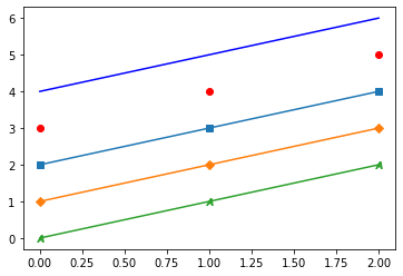
- 'ro’는 빨간색 (‘red’)의 원형 (‘circle’) 마커를 의미
- 'k^’는 검정색 (‘black’)의 삼각형 (‘triangle’) 마커를 의미
- plot() 함수의 marker 파라미터 값으로 삽입
- 's'(square), 'D'(diamond)
# 'b' blue, 'ro' red+circle
# 's' square, 'D' diamond
# '$문자$' 문자 마커
plt.plot([4, 5, 6], "b")
plt.plot([3, 4, 5], "ro")
plt.plot([2, 3, 4], marker="s")
plt.plot([1, 2, 3], marker="D")
plt.plot([0, 1, 2], marker='$A$')
plt.show()
Matplotlib 색상 설정
- plot() 함수의 포맷 문자열 (Format string)을 사용해서 색상 지정
- plot() 함수의 color 파라미터 값으로 삽입
- 다양한 색상 링크 참고
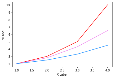
# 'r' red, 'violet', 'dodgerblue'
plt.plot([1, 2, 3, 4], [2.0, 3.0, 5.0, 10.0], 'r')
plt.plot([1, 2, 3, 4], [2.0, 2.8, 4.3, 6.5], color = 'violet')
plt.plot([1, 2, 3, 4], [2.0, 2.5, 3.3, 4.5], color = 'dodgerblue')
plt.xlabel('X-Label')
plt.ylabel('Y-Label')
plt.show()
Matplotlib 타이틀 설정
- title() 함수를 이용하여 타이틀 설정
- title() 함수의 loc 파라미터 값으로 위치 설정
- loc 파라미터 : {‘left’, ‘center’, ‘right’}
- title() 함수의 pad 파라미터 값으로 타이틀과 그래프와의 간격(포인트 단위) 설정
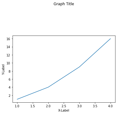
plt.plot([1, 2, 3, 4], [1, 4, 9, 16])
plt.xlabel('X-Label')
plt.ylabel('Y-Label')
plt.title('Graph Title', loc='center', pad=100)
Matplotlib 눈금 표시
- xticks(), yticks() 함수는 각각 X축, Y축에 눈금 설정
- xticks(), yticks() 함수의 label 파라미터 값으로 눈금 레이블 설정
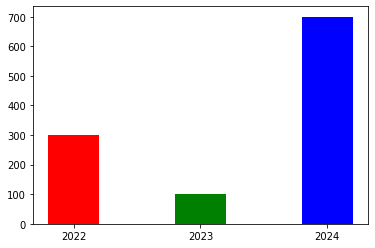
Matplotlib 막대 그래프
- bar() 함수 이용하여 막대 그래프 시각화
- bar() 함수의 color 파라미터 값으로 색상 설정
- bar() 함수의 width 파라미터 값으로 막대 폭 설정
# years는 X축에 표시될 연도이고, values는 막대 그래프의 y 값
# xticks(x, years) : x축의 눈금 레이블에 '2022', '2023', '2024' 순서대로 설정
# color와 width로 막대 그래프 파라미터 설정
x = [1, 2, 3]
years = ['2022', '2023', '2024']
values = [300, 100, 700]
plt.bar(x, values, color=['r', 'g', 'b'], width=0.4)
#plt.bar(x, values, color=['r', 'g', 'b'], width=0.8)
plt.xticks(x, years)
plt.show()
Matplotlib 산점도
- scatter() 함수 이용하여 산점도 시각화
- scatter() 함수의 color 파라미터 값으로 마커의 색상 설정
- scatter() 함수의 size 파라미터 값으로 마커의 크기 설정
# numpy의 random 모듈의 rand 함수를 통해 숫자 랜덤하게 생성
# color와 size로 산점도 파라미터 설정
import numpy as np
np.random.seed(0)
n = 50
x = np.random.rand(n)
y = np.random.rand(n)
size = (np.random.rand(n) * 20)**2
colors = np.random.rand(n)
plt.scatter(x, y, s=size, c=colors)
plt.show()

Matplotlib 다양한 그래프 종류
- matplotlib.pyplot.bar( ) : 막대 그래프
- matplotlib.pyplot.barh( ) : 수평 막대 그래프
- matplotlib.pyplot.scatter( ) : 산점도
- matplotlib.pyplot.hist( ) : 히스토그램
- matplotlib.pyplot.errorbar( ) : 에러바
- matplotlib.pyplot.pie( ) : 파이 차트
- matplotlib.pyplot.matshow( ) : 히트맵
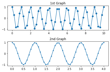
Matplotlib subplot 이용한 여러 개 그래프 시각화
- subplot() 함수는 영역을 나눠 여러 개의 그래프 시각화
- plt.subplot(row, column, index)
- tight_layout() 함수는 모서리와 서브플롯의 모서리 사이의 여백(padding)을 설정
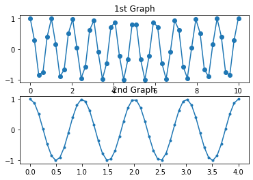
linspace
# linspace : 몇등분할지 생각하면 디폴트는 50
# np.linspace(0, 10) : 0부터 10까지 50등분한 결과를 배열로 반환
x1 = np.linspace(0, 10)
x1
# linspace : 몇등분할지 생각하면 디폴트는 50
# np.linspace(0, 4) : 0부터 4까지 50등분한 결과를 배열로 반환
x2 = np.linspace(0, 4)
x2
subplot, tight_layout
# y값은 역동적인 그래프를 위한 np.cosine 함수 이용
# np.pi 함수로 원주율(파이) 값 사용
y1 = np.cos(2 * np.pi * x1)
y2 = np.cos(2 * np.pi * x2)
# subplot
# nrows=2, ncols=1, index=1
plt.subplot(2, 1, 1)
plt.plot(x1, y1, 'o-')
plt.title('1st Graph')
# subplot
# nrows=2, ncols=1, index=2
plt.subplot(2, 1, 2)
plt.plot(x2, y2, '.-')
plt.title('2nd Graph')
# tight_layout() 함수는 모서리와 서브플롯의 모서리 사이의 여백(padding)을 설정
plt.tight_layout()
plt.show()
# tight_layout() 함수 지운 결과 비교
# tight_layout() 함수는 모서리와 서브플롯의 모서리 사이의 여백(padding)을 설정
y1 = np.cos(2 * np.pi * x1)
y2 = np.cos(2 * np.pi * x2)
plt.subplot(2, 1, 1)
plt.plot(x1, y1, 'o-')
plt.title('1st Graph')
plt.subplot(2, 1, 2)
plt.plot(x2, y2, '.-')
plt.title('2nd Graph')
plt.show()
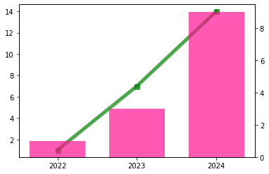
Matplotlib 한 좌표 평면 위에 다른 종류의 그래프 시각화
-
plt.subplots() 함수는 여러 개 그래프를 한 번에 가능
-
plt.subplots() 함수의 디폴트 파라미터는 1이며 즉 plt.subplots(nrows=1, ncols=1) 의미
-
plt.subplots() 함수는 figure와 axes 값을 반환
-
figure
- 전체 subplot 의미
- 서브플롯 안에 몇 개의 그래프가 있던지 상관없이 그걸 담는 전체 사이즈를 의미
-
axe
- 전체 중 낱낱개 의미
- ex) 서브플롯 안에 2개(a1,a2)의 그래프가 있다면 a1, a2 를 일컬음
-
.twinx() 함수는 ax1과 축을 공유하는 새로운 Axes 객체 생성
import matplotlib.pyplot as plt
import numpy as np
# x는 X축에 표시될 연도이고, y1, y2는 y 값
x = ['2022', '2023', '2024']
y1 = np.array([1, 7, 14])
y2 = np.array([1, 3, 9])
# plt.subplots() 함수는 여러 개 그래프를 한 번에 가능, 객체 생성
# plt.subplots(nrows=1, ncols=1) = plt.subplots()
fig, ax1 = plt.subplots()
# -s(solid line style + square marker), alpha(투명도)
ax1.plot(x, y1, '-s', color='green', markersize=7, linewidth=5, alpha=0.7)
# .twinx() 함수는 ax1과 축을 공유하는 새로운 Axes 객체 생성
ax2 = ax1.twinx()
ax2.bar(x, y2, color='deeppink', alpha=0.7, width=0.7)
#plt.twinx()
#plt.bar(x, y2, color='deeppink', alpha=0.5)
plt.show()
그래프를 이미지로 저장하기
- savefig()함수를 사용
plt.barh(count_by_subject.index, count_by_subject.values, height=0.7, color='blue')
plt.title('books by subject')
plt.xlavel('number of books')
plt.ylabel('subject')
for idx val in count_by_subject.items():
	# annotate(값, 좌표)로 그래프의 값 출력
	plt.annotate(val, (val, idx), xytext=(2,0), textcoords='offset points', fontsize=8, va='center', color='green')
plt.savefig('books_by_subject.png') # show()함수 이전에 호출해서 저장
plt.show()
가보자가보자~