그래프 색깔 변경하기
- 기존 그래프
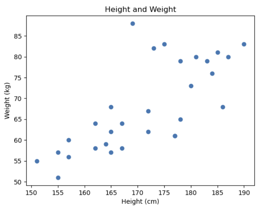
plt.scatter(height_array, weight_array)
plt.title('Height and Weight')
plt.xlabel('Height (cm)')
plt.ylabel('Weight (kg)')
plt.show()- 색 변경
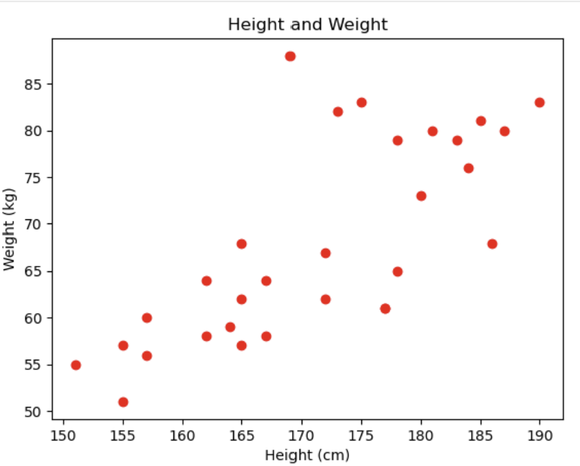
plt.scatter(height_array, weight_array, c = 'red')
plt.title('Height and Weight')
plt.xlabel('Height (cm)')
plt.ylabel('Weight (kg)')
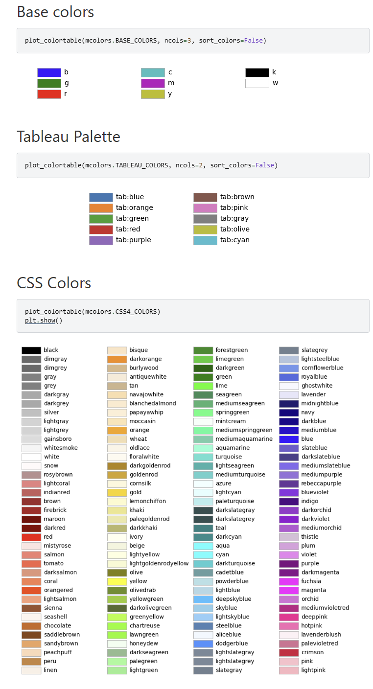
plt.show()=> 위 코드처럼 RGB 튜플이나, HEX 코드, HTML에서 사용하는 색이름도 입력 가능하다. 아래 색상표를 참고하자.
그래프 모양 변경하기
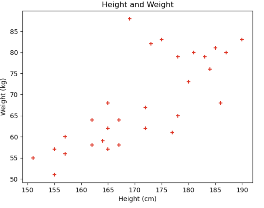
plt.scatter(height_array, weight_array, c = 'red', marker = '+')
plt.title('Height and Weight')
plt.xlabel('Height (cm)')
plt.ylabel('Weight (kg)')
plt.show()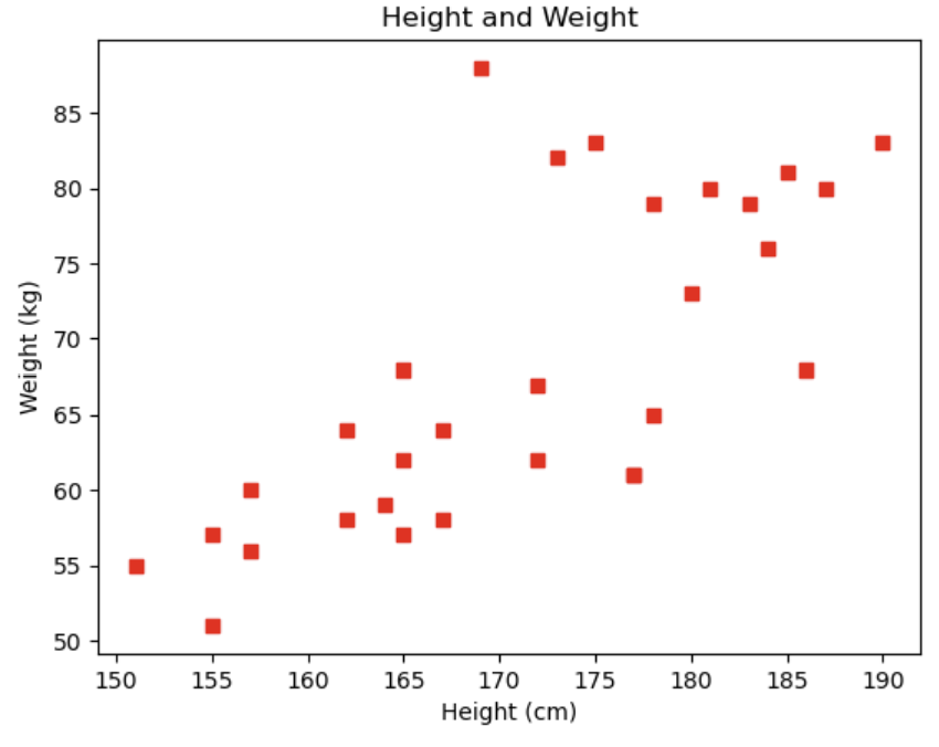
plt.scatter(height_array, weight_array, c = 'red', marker = 's')
plt.title('Height and Weight')
plt.xlabel('Height (cm)')
plt.ylabel('Weight (kg)')
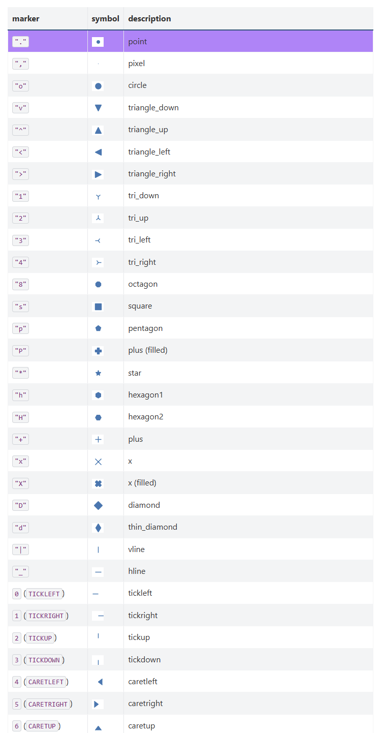
plt.show()=> 위 코드처럼 'marker = '를 통해 그래프 모양 변경이 가능하다. 아래 표를 참고하자.

멋있는 어른이 되고싶은 정만이의 벨로그