CSS 필수 개념2
1. position
위치 속성 - HTML 요소들이 기본적인 흐름에서 벗어나 좌표값에 의해 배치하고자 할 때
relative
요소를 상대적으로 배치
        .box:nth-child(1) {
        position: relative;
        left: 100px;
        right: 100px;
      }
.box:nth-child(1) {
position: relative;
/*top: 50%;
right: 50%;
transform: translate(-50%, -50%);*/
}
.box:nth-child(2n) {
position: sticky;
background-color: blue;
}absolute
요소를 절대적으로 배치
.box:nth-child(1) {
        position: absolute;
        top: 50%;
        right: 50%;
        transform: translate(-50%, -50%);
      }
fixed
요소를 절대적으로 배치하지만, 스크롤해도 위치 고정
sticky
요소를 절대적으로 배치하지만, 지정한 좌표의 임계점에 이르면 fixed처럼 고정됨
    ````html
    .box:nth-child(1) {
    position: sticky;
    top: 100px;
    right: 100px;
  }
  ````
좌표값
- top, right, bottom, left 속성
예제1
* {
        padding: 0;
        margin: 0;
        box-sizing: border-box;
      }

      .wrap {
        padding: 1rem;
        border: 1px solid black;
        margin: 100px 50px;
        height: 500px;
        position: relative;
      }

      .box {
        width: 40px;
        height: 40px;
        background-color: red;

        position: absolute;
        top: 0;
        left: 0;
      }
예제2
* {
        padding: 0;
        margin: 0;
        box-sizing: border-box;
      }

      .wrap {
        padding: 1rem;
        border: 1px solid black;
        margin: 100px 50px;
        height: 500px;
      }

      .box {
        width: 50px;
        height: 50px;
      }

      .box--red {
        background-color: red;
      }

      .box--blue {
        background-color: blue;
        float: left;
      }
2. float
clear
특정 방향의 플로팅된 요소 옆에 놓이지 않도록 함
.box--red {
        background-color: red;
        float: left;
      }

      .box--blue {
        background-color: blue;
        float: left;
      }

      .box--green {
        background-color: green;
        clear: left;
      }
clear: both
양쪽에 플로팅된 요소를 모두 피함
 .wrap {
        padding: 1rem;
        border: 1px solid black;
        margin: 100px 50px;
      }

      .wrap:after {
        content: " ";
        display: block;
        clear: both;
      }
overflow: auto
- 컨텐츠의 양이 가변적이어서 스크롤바를 보여줘야 할지 말지 미리 결정하기 어려운 경우
- 컨텐츠의 크기가 주어진 공간을 넘어가는 경우에만 스크롤바가 생김
* {
        padding: 0;
        margin: 0;
        box-sizing: border-box;
      }

      .wrap {
        padding: 1rem;
        border: 1px solid black;
        height: 150px;
        margin: 100px 50px;
        overflow: auto;
      }

      .wrap:after {
        content: " ";
        display: block;
        clear: both;
      }

      .box {
        width: 50px;
        height: 50px;
      }

      .box--red {
        background-color: red;
      }

      .box--blue {
        background-color: blue;
      }
3. 전환 속성
전환이 안 되는 것도 있음
transition-property
전환 효과 대상 속성
transition
.box {
        width: 100px;
        height: 100px;
        background-color: red;
        transition: all 2s;
}
ease-in
 .box {
        width: 100px;
        height: 100px;
        background-color: red;
        transition: background-color 2s linear, width 2s ease-in;
        }

.box:hover {
        width: 100%;
        background-color: blue;
      }
opacity
.box {
        width: 100px;
        height: 100px;
        background-color: red;
        transition: all 2s linear;
        opacity: 1;
}
 .box:hover {
        opacity: 0;
      }
transition-duration
전환 효과의 지속 시간 (s)
transition-delay
전환 효과의 딜레이를 지정
transition-timing-function
전환 효과의 진행 속도
- linear
처음 속도와 마지막 속도가 일정 - ease
처음에는 속도가 점점 빨라지다가 중간부터 느려짐 - ease-in
처음에는 속도가 느리지만, 완료될 때까지 점점 빨라짐 - ease-out
처음에는 속도가 빠른데, 점점 느려짐 - ease-in-out
처음에는 속도가 느리지만, 점점 빨라지다가, 결국 느려짐
transition: <property> <duration> <timing-function> <delay>
4. 애니메이션 - 키프레임
키프레임
애니메이션이 진행되는 과정에서 특전 시점에 발생해야하는 여러 작업을 정의하는 문법
animation-name:
키프레임을 지정
animation-duration:
애니메이션의 진행 시간
animation-delay:
애니메이션의 지연 시간
* {
        padding: 0;
        margin: 0;
        box-sizing: border-box;
      }

      .box {
        width: 100px;
        height: 100px;
        background-color: black;

        animation-name: bgchange;
        animation-duration: 5s;
        animation-delay: 2s;
      }

      @keyframes bgchange {
        0% {
          background-color: red;
        }
        20% {
          background-color: orange;
        }
        50% {
          background-color: yellow;
        }
        100% {
          background-color: green;
        }
      }
animation-fill-mode: forwards
애니메이션이 끝났을 때 상태 고정
.box {
        width: 100px;
        height: 100px;
        background-color: black;

        animation-name: bgchange;
        animation-duration: 1s;
        animation-delay: 1s;
        animation-fill-mode: forwards;
      }
animation-iteration-count: 카운트
.box {
        width: 100px;
        height: 100px;
        background-color: black;

        animation-name: bgchange;
        animation-duration: 1s;

        animation-fill-mode: forwards;
        animation-iteration-count: 3;
      }
5. transform
transform: translate
.box {
        width: 100px;
        height: 100px;
        background-color: black;
        transform: translate(100px, 100px);
      }
transform: rotate
.box {
        width: 100px;
        height: 100px;
        background-color: black;
        position: absolute;
        left: 50%;
        right: 50%;
        transform: rotate(90deg);
      }
.wrap {
width: 100px;
height: 100px;
border: 2px solid black;
margin: 100px;
}
.box {
width: 100px;
height: 100px;
background-color: black;
transform: rotate(45deg);
}transform-origin
.wrap {
        width: 100px;
        height: 100px;
        border: 2px solid black;
        margin: 100px;
      }

      .box {
        width: 100px;
        height: 100px;
        background-color: black;
        transform: all 0.5s;
        transform-origin: left top;
      }

      .box:hover {
        transform: rotate(45deg);
      }
💫 변형: 상자 안에 hi 글자
  .wrap {
        width: 100px;
        height: 100px;
        border: 2px solid black;
        margin: 100px;
        position: relative;
      }
      .wrap::after {
        content: "hi";
        position: absolute;
        top: 50%;
        left: 50%;
        transform: translate(-50%, -50%);
        font-size: 2rem;
      }

      .box {
        width: 100px;
        height: 100px;
        background-color: black;
        transform: all 0.5s;
        transform-origin: left top;
      }

      .box:hover {
        transform: rotate(70deg);
      }
💫 실습 3개
1.스피너
2.호버
3.심플랜딩
translateY(n)
플렉스
https://studiomeal.com/archives/197
1. 플렉스
CSS3
display:flex
 .flex-container {
        width: 300px;
        height: 200px;
        background-color: #c4c4c4c4;
        border: 1px solid black;
        display: flex;
      }

      .flex-item {
        color: white;
        background-color: #ff5252;
        float: left;
        width: 25%;
        height: 100%;
      }

      .flex-item:nth-child(2n) {
        background-color: #bf5e5e;
      }
flex-direction: column, row, column-reverse, row-reverse
- flex-direction: row;
 .flex-container {
        width: 300px;
        height: 200px;
        background-color: #c4c4c4c4;
        border: 1px solid black;
        display: flex;
        flex-direction: row;
      }

      .flex-item {
        color: white;
        background-color: #ff5252;
      }

      .flex-item:nth-child(2n) {
        background-color: #bf5e5e;
}- flex-direction: column;
.flex-container {
        width: 300px;
        height: 200px;
        background-color: #c4c4c4c4;
        border: 1px solid black;
        display: flex;
        flex-direction: column;
      }

      .flex-item {
        color: white;
        background-color: #ff5252;
      }

      .flex-item:nth-child(2n) {
        background-color: #bf5e5e;
}- flex-direction: column-reverse;
flex-wrap:
플렉스 아이템의 줄바꿈 여부를 결정
justify-content
.flex-container {
        width: 300px;
        height: 200px;
        background-color: #c4c4c4c4;
        border: 1px solid black;
        display: flex;
        flex-direction: column;
        justify-content: space-between;

      .flex-item {
        color: white;
        background-color: #ff5252;
      }

      .flex-item:nth-child(2n) {
        background-color: #bf5e5e;
      }
align-items: center;
 body {
        display: flex;
        justify-content: center;
        align-items: center;
        height: 100vh;
      }

      .flex-container {
        width: 300px;
        height: 200px;
        background-color: #c4c4c4c4;
        border: 1px solid black;
        display: flex;
        flex-direction: row;
        justify-content: center;
        align-items: center;
      }

      .flex-item {
        color: white;
        background-color: #ff5252;
      }

      .flex-item:nth-child(2n) {
        background-color: #bf5e5e;
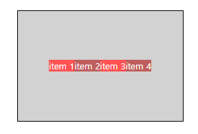
      }
2. grid
grid-template-colums
열 (세로줄)
grid-template-columns: 1fr 1fr;
grid-template-columns: 50px 50px;
grid-template-rows
행 (가로줄)
 body {
        display: flex;
        justify-content: center;
        align-items: center;
        height: 100vh;
      }

      .grid-container {
        width: 300px;
        height: 200px;
        background-color: #c4c4c4c4;
        border: 1px solid black;

        display: grid;
        grid-template-columns: 1fr 1fr;
        grid-template-rows: 1fr 1fr;
      }

      .grid-item {
        color: white;
        background-color: #ff5252;
      }

      .grid-item:nth-child(2) {
        background-color: #bf5e5e;
      }

      .grid-item:nth-child(3) {
        background-color: #bfb05e;
      }

      .grid-item:nth-child(4) {
        background-color: #5ebf8a;
}- grid-template-columns: repeat(4, 1fr);
grid-template-columns: repeat(2, 1fr);
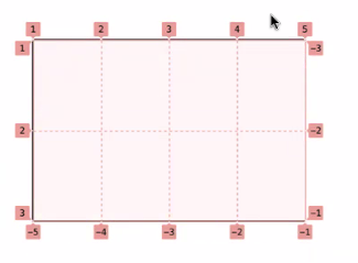
- grid-template-columns: repeat(4, 1fr);
grid-template-columns: repeat(2, 1fr);
row-gap: 20px;
column-gap: 20px;
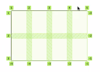
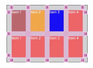
💫 그리드는 표이다
- display: grid;
grid-template-columns: repeat(4, 1fr);
grid-template-rows: repeat(2, 1fr);
row-gap: 20px;
column-gap: 20px;
padding: 20px;
💫 실습: 뉴스
겉에는 패딩
border-top: 5px doubled;
💫 구조에 맞게
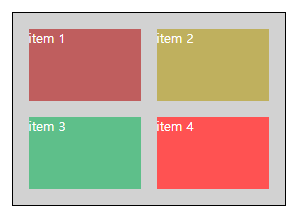
  <article class="grid-container">
      <section class="grid-item">item 1</section>
      <section class="grid-item">item 2</section>
      <section class="grid-item">item 3</section>
      <section class="grid-item">item 4</section>
</article>- .grid-item:nth-child(1) {
background-color: #bf5e5e;
grid-column: 1 / span 3;
}
- 4개
body {
        display: flex;
        justify-content: center;
        align-items: center;
        height: 100vh;
      }

      .grid-container {
        width: 300px;
        height: 200px;
        background-color: #c4c4c4c4;
        border: 1px solid black;

        display: grid;
        grid-template-columns: repeat(2, 1fr);
        grid-template-rows: repeat(2, 1fr);
        row-gap: 20px;
        column-gap: 20px;
        padding: 20px;
      }

      .grid-item {
        color: white;
        background-color: #ff5252;
      }

      .grid-item:nth-child(1) {
        background-color: #bf5e5e;
      }

      .grid-item:nth-child(2) {
        background-color: #bfb05e;
      }

      .grid-item:nth-child(3) {
        background-color: #5ebf8a;
      }
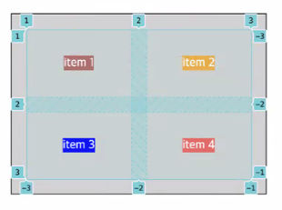
align-items
부모한테
.grid-container {
        width: 300px;
        height: 200px;
        background-color: #c4c4c4c4;
        border: 1px solid black;

        display: grid;
        grid-template-columns: repeat(2, 1fr);
        grid-template-rows: repeat(2, 1fr);

        justify-items: center;
        align-items: center;

        row-gap: 20px;
        column-gap: 20px;
        padding: 20px;
      }
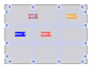
💫
Flex 실습 사이트
https://flexboxfroggy.com/#ko
Grid 실습 사이트
https://cssgridgarden.com/#ko
💫 1차 팀활동 10/18~
스크럼: 매일 진행, 어떤 개념이 어려웠어요, 팁 공유, 아침 일찍 진행해서 지각 안 하게 서로 깨워주기
RBF: 1주 동안 공부한 개념 중에 주제 정함, 모두가 동일하게 교차 검증, 강사님께 주제 조언 구하기 가능
시간: 주말동안 공부하고 월요일에 정하기 / 지난주 금~목요일까지 공부했던 것 중에 금요일에 정하기
팀미팅: 팀끼리 스터디하는 느낌
-> 발표자 정하기, 돌아가면서
팀장 정하기