
<Typography />
텍스트, 문장, 단락들을 표현하는 컴포넌트이다. 기사/블로그/노트에서 제목이나 단락 내용을 표시해야 할 때, 복사/편집/줄임표 텍스트가 필요할 때 사용한다.
다음과 같은 세부 컴포넌트가 있다.
- Title : 제목을 작성할 때 사용
- Text : 텍스트를 작성할 때 사용
- Link : 링크를 가진 텍스트에 사용
- Paragraph : 문단을 작성할 때 사용
각각의 컴포넌트에는 copyable, editable, type, strong, italic 등 여러 추가 기능이 있다.
    <Typography.Title>h1. Ant Design</Title>
    <Typography.Title level={2}>h2. Ant Design</Title>
    <Typography.Title level={3}>h3. Ant Design</Title>
    <Typography.Title level={4}>h4. Ant Design</Title>
    <Typography.Title level={5}>h5. Ant Design</Title>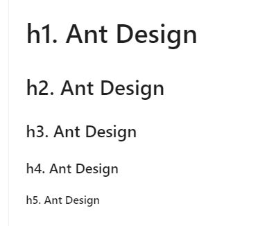
<Space />
컴포넌트가 서로 달라붙지 않도록 하고 통일된 공간을 설정할 때 사용한다.
  <Space>
    Space
    <Button type="primary">Button</Button>
    <Upload>
      <Button icon={<UploadOutlined />}>Click to Upload</Button>
    </Upload>
    <Popconfirm title="Are you sure delete this task?" okText="Yes" cancelText="No">
      <Button>Confirm</Button>
    </Popconfirm>
  </Space>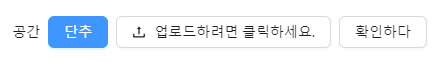
<Layout />
페이지의 전체 레이아웃을 처리한다. 각각의 Layout은 스타일 형식에 따라 여러번 중첩 구성이 가능하다.
Layout에는 다음과 같은 세부 컴포넌트가 있다.
- Layout : 모든 부모 컨테이너에 배치될 수 있는 레이아웃 wrapper
- Header : 상단 레이아웃 wrapper
- Sider : 사이드바 wrapper
- Content : 콘텐츠 레이아웃
- Footer : 하단 레이아웃 wrapper
<Layout>
  <Header style={headerStyle}>Header</Header>
    <Layout hasSider>
      <Sider style={siderStyle}>Sider</Sider>
      <Content style={contentStyle}>Content</Content>
    </Layout>
  <Footer style={footerStyle}>Footer</Footer>
</Layout>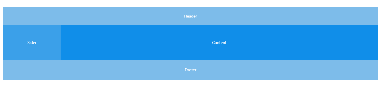
<Grid />
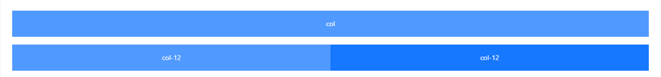
12 Grid System을 기반으로 디자인 영역을 24개 섹션으로 나누어 모든 영역이 안정적으로 배치될 수 있도록 row와 col의 프레임을 정의한다.
<>
  <Row>
    <Col span={24}>col</Col>
  </Row>
  <Row>
    <Col span={12}>col-12</Col>
    <Col span={12}>col-12</Col>
  </Row>
</>
<Progress />
어떤 작업의 진척도를 그림형태로 나타내준다.
<Progress type="circle" percent={75} />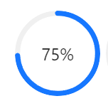

안녕하세요! 26살 프론트엔드 개발자입니다! (2024/03 ~)