
<Paper />, <Box />
<Paper />는 종이의 물리적 속성을 나타내는 컴포넌트이고, <Box /> 는 구현해야할 css유틸리티가 있으면 사용하는 wrapper 용도의 컴포넌트이다.
<Box
  sx={{
    display: 'flex',
      flexWrap: 'wrap',
        '& > :not(style)': {
          m: 1,
            width: 128,
              height: 128,
        },
        }}
  >
  <Paper elevation={0} />
  <Paper />
  <Paper elevation={3} />
</Box>
<Box />의 sx 속성
모든 style property를 입힐 수 있다.
<Grid />
mui는 기존 <Grid /> 컴포넌트에서 버그 수정과 디자인을 개선한 새로운 <Grid /> 컴포넌트를 출시했다.
import Grid from '@mui/material/Grid'; 			 // Grid version 1
import Grid from '@mui/material/Unstable_Grid2'; // Grid version 2
import { Box, Grid, Paper, styled } from '@mui/material';
import React, { FC } from 'react';
const Item = styled(Paper)(({ theme }) => ({
backgroundColor: theme.palette.mode === 'dark' ? '#1A2027' : '#fff',
...theme.typography.body2,
padding: theme.spacing(1),
textAlign: 'center',
color: theme.palette.text.secondary,
}));
const Mui: FC = () => {
return (
<div style={{ width: 1000 }}>
<Box component='div' sx={{ width: '100%', textAlign: 'center' }}>
<Grid container rowSpacing={1} columnSpacing={{ xs: 1, sm: 2, md: 3 }}>
<Grid xs={6}>
<Item>1</Item>
</Grid>
<Grid xs={6}>
<Item>2</Item>
</Grid>
<Grid xs={6}>
<Item>3</Item>
</Grid>
<Grid xs={6}>
<Item>4</Item>
</Grid>
</Grid>
</Box>
</div>
);
};
export default Mui;-
<Box />의 component 속성
Box를 어떤 컴포넌트(엘리먼트)로 취급할 지 나타낸다 -
<Grid />의 rowSpacing 속성
수직 공간을 정의한다 -
<Grid />의 columnSpacing 속성
수평 공간을 정의한다.

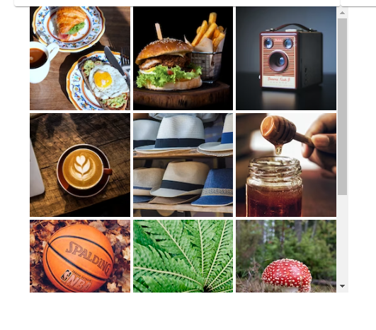
<ImageList />
<div>
  <ImageList sx={{ width: 500, height: 450 }} cols={3} rowHeight={164}>
    {itemData.map((item) => (
      <ImageListItem key={item.img}>
        <img
          src={`${item.img}?w=164&h=164&fit=crop&auto=format`}
          srcSet={`${item.img}?w=164&h=164&fit=crop&auto=format&dpr=2 2x`}
          alt={item.title}
          loading="lazy"
          />
      </ImageListItem>
    ))}
  </ImageList>
</div>-
cols 속성
몇개의 열을 줄지 정한다 -
rowHeight
row의 높이를 px단위로 정한다.
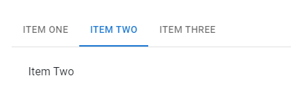
<Tabs />
쉬운 탐색 탭메뉴이다
  const [value, setValue] = useState<number>('1');

  const handleChange = (event: React.SyntheticEvent, newValue: string) => {
    setValue(newValue);
  };

  return (
    <Box sx={{ width: '100%', typography: 'body1' }}>
      <TabContext value={value}>
        <Box sx={{ borderBottom: 1, borderColor: 'divider' }}>
          <TabList onChange={handleChange} aria-label="lab API tabs example">
            <Tab label="Item One" value="1" />
            <Tab label="Item Two" value="2" />
            <Tab label="Item Three" value="3" />
          </TabList>
        </Box>
        <TabPanel value="1">Item One</TabPanel>
        <TabPanel value="2">Item Two</TabPanel>
        <TabPanel value="3">Item Three</TabPanel>
      </TabContext>
    </Box>
);-
TabContext 컴포넌트
Tab의 부모 컴포넌트이다. -
TabList 컴포넌트
탭 메뉴 목록 리스트 컴포넌트이다.
- TabPanel 컴포넌트
<TapContext />에 들어갈 중심 내용이다.

안녕하세요! 26살 프론트엔드 개발자입니다! (2024/03 ~)