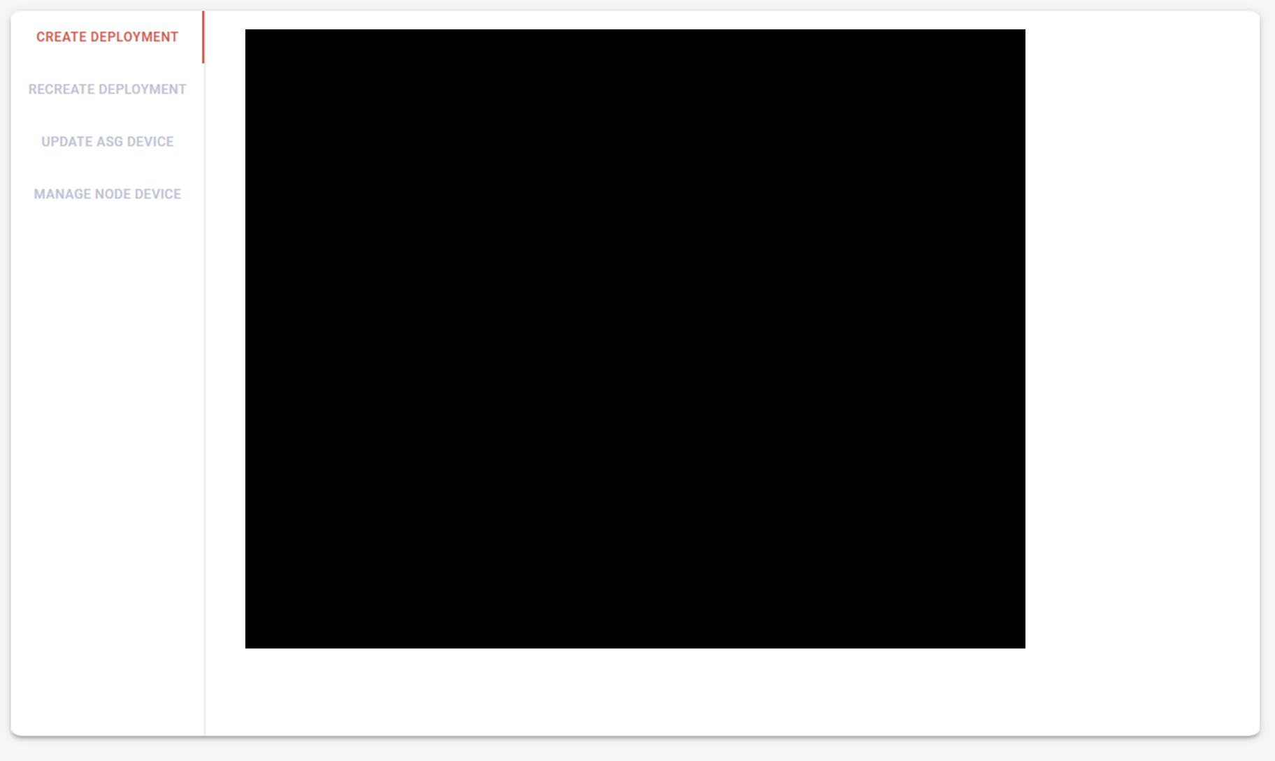
Tabs Style 적용
tabs backgroud color 설정
AppBar 컴포넌트에 style 설정
<AppBar position="static" style={{ backgroundColor: "#bac3d5" }}>tabs의 indicator color 설정
Tabs에 TabIndicatorProps style 설정
TabIndicatorProps={{ style: { background: "#1e3269" } }}클릭된 탭 글자 색상 변경
useStyles에서 customStyleOntab, activeTab 설정
  customStyleOnTab: {
    fontSize: "15px",
    color: "#7D9CC1"
  },
  activeTab: {
    fontSize: "16px",
    fontWeight: "600",
    color: "#1e3269"
  }
Tab에서 삼항 연산자를 사용해서 value 값에 따라서 기본 탭을 설정하거나, 액티브 탭을 설정.
              <Tab
                label={
                  <span
                    className={value === 0 ? classes.activeTab : classes.customStyleOnTab}
                  >
                    Create Deployment
                  </span>
                }
              />
customTab 전체 코드
import React from "react";
import PropTypes from "prop-types";
import { makeStyles } from "@material-ui/styles";

import { useTheme } from "@mui/material/styles";
import Tabs from "@mui/material/Tabs";
import Tab from "@mui/material/Tab";
import Typography from "@mui/material/Typography";
import Box from "@mui/material/Box";
import { HeaderMain } from "components/HeaderMain";
import { Divider } from "@material-ui/core";

import CreateTab from "./components/CreateTab";
import RecreateTab from "./components/RecreateTab";
import UpdateTab from "./components/UpdateTab";
import ManageTab from "./components/ManageTab";

const useStyles = makeStyles((theme) => ({
  root: {
    padding: theme.spacing(3)
  },
  header: {
    padding: theme.spacing(3)
  },
  tabCont: {
    padding: theme.spacing(3)
  },
  divider: {
    background: "#e3e3e3"
  },
  customStyleOnTab: {
    fontSize: "12px",
    color: "#bac3d5"
  },
  activeTab: {
    fontSize: "12px",
    fontWeight: "600",
    color: "#d75b51"
  },
  textIndent: {
    textIndent: "15px"
  }
}));

function TabPanel(props) {
  const { children, value, index, ...other } = props;

  return (
    <div
      role="tabpanel"
      hidden={value !== index}
      id={`vertical-tabpanel-${index}`}
      aria-labelledby={`vertical-tab-${index}`}
      {...other}
    >
      {value === index && (
        <Box sx={{ p: 3 }}>
          <Typography>{children}</Typography>
        </Box>
      )}
    </div>
  );
}

TabPanel.propTypes = {
  children: PropTypes.node,
  index: PropTypes.number.isRequired,
  value: PropTypes.number.isRequired
};

const DeviceFotaView = () => {
  const theme = useTheme();
  const classes = useStyles();
  const [value, setValue] = React.useState(0);

  const handleChange = (event, newValue) => {
    setValue(newValue);
  };

  const desc = `FOTA (Firmware Over The Air) refers to distributing a device's firmware over a network in a variety of ways.`;

  return (
    <div className={classes.root}>
      <div className={classes.header}>
        <HeaderMain title="FOTA" />
      </div>
      <div style={{ marginLeft: 12 }}>
        <Typography variant="body1">
          <p className={classes.textIndent}>{desc}</p>
        </Typography>
      </div>
      <div className={classes.tabCont}>
        <Box
          bgcolor="white"
          borderRadius="1%"
          sx={{
            flexGrow: 1,
            bgcolor: "background.paper",
            display: "flex",
            height: "100%",
            boxShadow: 3
          }}
        >
          <Tabs
            orientation="vertical"
            TabIndicatorProps={{
              style: { background: "#d75b51" }
            }} // indicator color
            classes={{ indicator: classes.customStyleOnTab }}
            value={value}
            onChange={handleChange}
            variant="scrollable"
          >
            <Tab
              label={
                <span
                  className={value === 0 ? classes.activeTab : classes.customStyleOnTab}
                >
                  {" "}
                  Create Deployment
                </span>
              }
            />
            <Tab
              label={
                <span
                  className={value === 1 ? classes.activeTab : classes.customStyleOnTab}
                >
                  {" "}
                  Recreate Deployment
                </span>
              }
            />
            <Tab
              label={
                <span
                  className={value === 2 ? classes.activeTab : classes.customStyleOnTab}
                >
                  {" "}
                  Update ASG Device
                </span>
              }
            />
            <Tab
              label={
                <span
                  className={value === 3 ? classes.activeTab : classes.customStyleOnTab}
                >
                  {" "}
                  Manage Node Device
                </span>
              }
            />
          </Tabs>
          <Divider orientation="vertical" className={classes.divider} flexItem />
          <TabPanel value={value} index={0} dir={theme.direction}>
            <CreateTab />
          </TabPanel>
          <TabPanel value={value} index={1} dir={theme.direction}>
            <RecreateTab />
          </TabPanel>
          <TabPanel value={value} index={2} dir={theme.direction}>
            <UpdateTab />
          </TabPanel>
          <TabPanel value={value} index={3} dir={theme.direction}>
            <ManageTab />
          </TabPanel>
        </Box>
      </div>
    </div>
  );
};

export default DeviceFotaView;
실행 화면
참고 자료

Frontend Developer